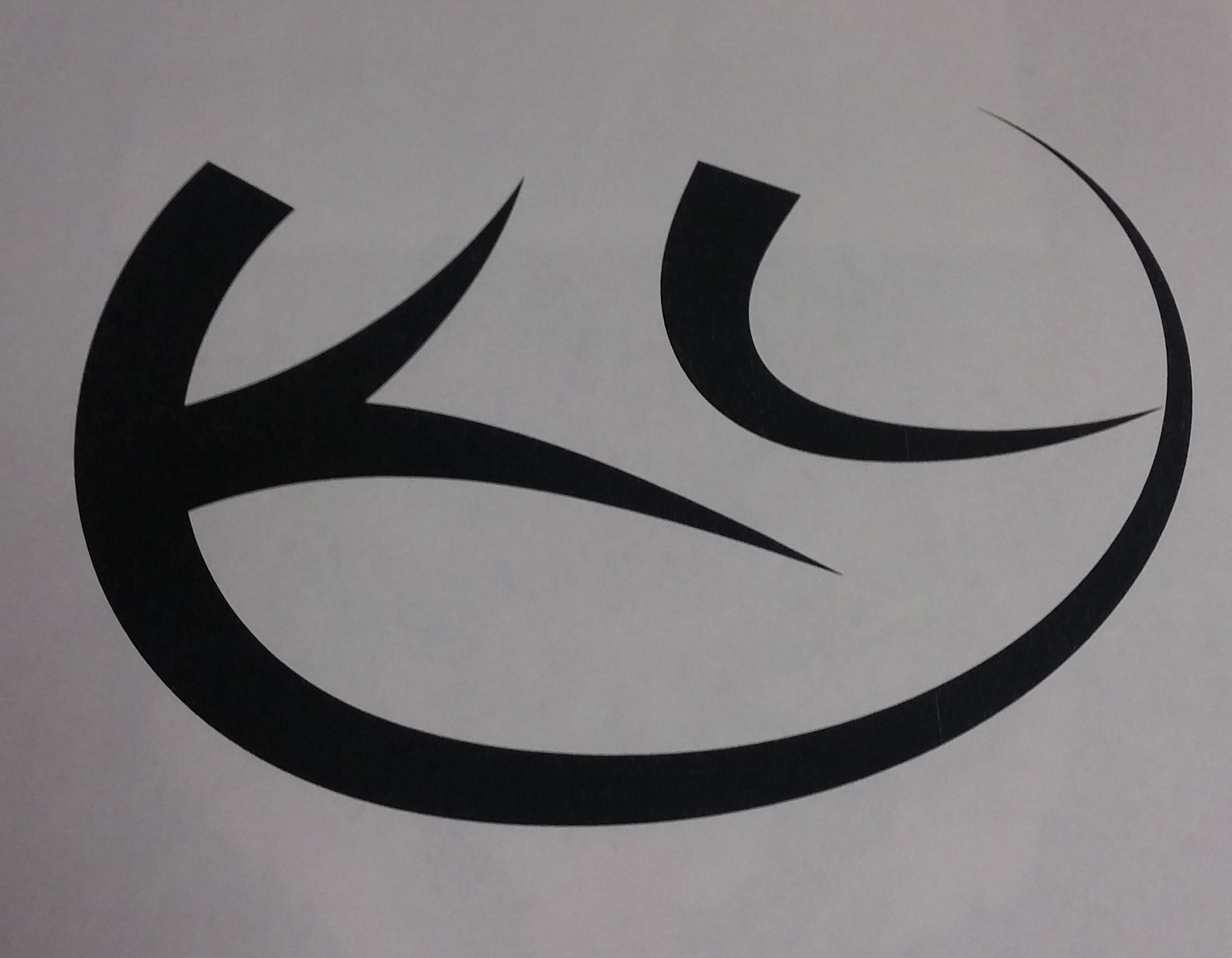
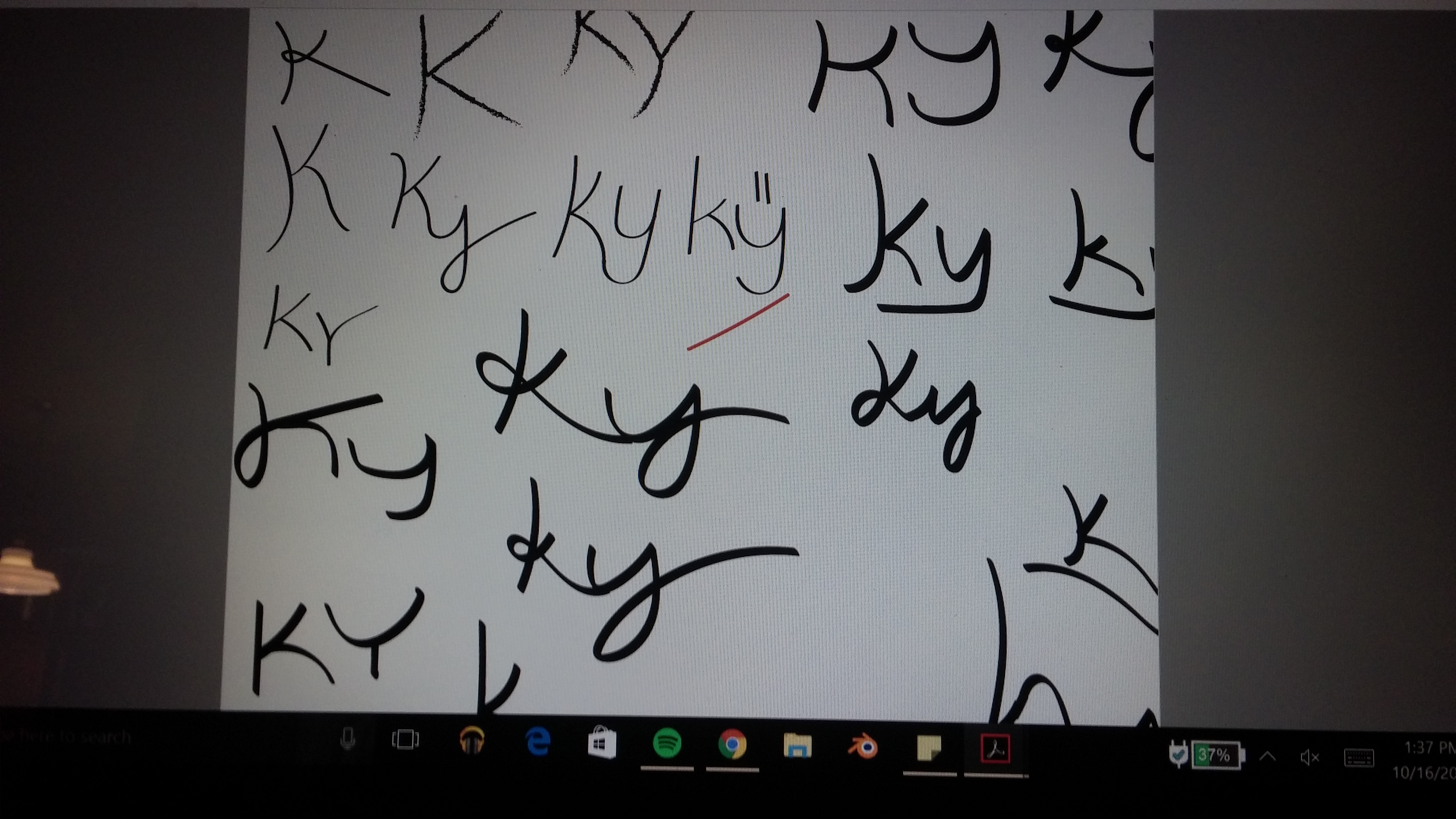
A couple of weeks ago in Intro to Graphic Design we did a project where we designed the initials of our name, while incorporating three personality traits that we thought described ourselves. These traits had to be expressed somehow in the design we created. This project challenged us to use two simple letter forms and turn them into what represents us. I used the three traits: fun, modern, and laid back, and my initials are KY. I started out by doing a ton of thumbnails using Illustrator. I was able to edit fonts and copy them quickly to make slight variations to each one. I also did some using the paintbrush tool by hand.

Emotional content in artwork is a huge factor, and you can convey a lot through the emotions you use in your work. Something as simple as the Nike logo which has the famous check mark. They used this because the check mark itself is positive, the line points up and to the right almost like a smiley face which people will see as friendly. This is also known as gestalt theory. So this project was a good way to practice showing emotion in our artwork using basic shapes and forms.