Yup, it’s that time of year again. It rolls around only once, just about the time of the semester when the work I seem to have been on top of for the past eight weeks is suddenly atop my chest, crushing me like a four hundred pound sumo wrestler. Cue the reluctance to make even a sad attempt to overcome the load, but alas, portfolio reviews have come, and it’s time for the underdog to make her move.
So, yes, that’s a little melodramatic. The stress and the work load are definitely real, but its nothing I can’t handle, and quite frankly, I was pretty excited for my portfolio review, once I got past the process of selecting a couple of pieces from each studio art class I had taken since the fall of my freshman year. I was a little overwhelmed with the sheer number of pieces I had created in that short of a time, and struggled to choose the ones that showcased my craftsmanship and aesthetic preferences most successfully. It made me think back to another WhereCreativityWorks post written by our sculpture blogger, Matt Shamnoski – Regarding the Body (of Work). I liked reflecting on how far I had come as an aspiring artist, and made me even more curious as to what the critics would say in regards to the body of work I had elected to show. Was it cohesive enough? Could I sell it and be proud that my name was on it?
In the end the critics seemed to be relatively pleased with what I had to show! They felt that I had shown significant signs of improvement within the past couple of years and, in regards to my most current work, I was making really interesting choices and executing them well. So without further adieu, I’d like to share with you a piece they thought was particularly of note.
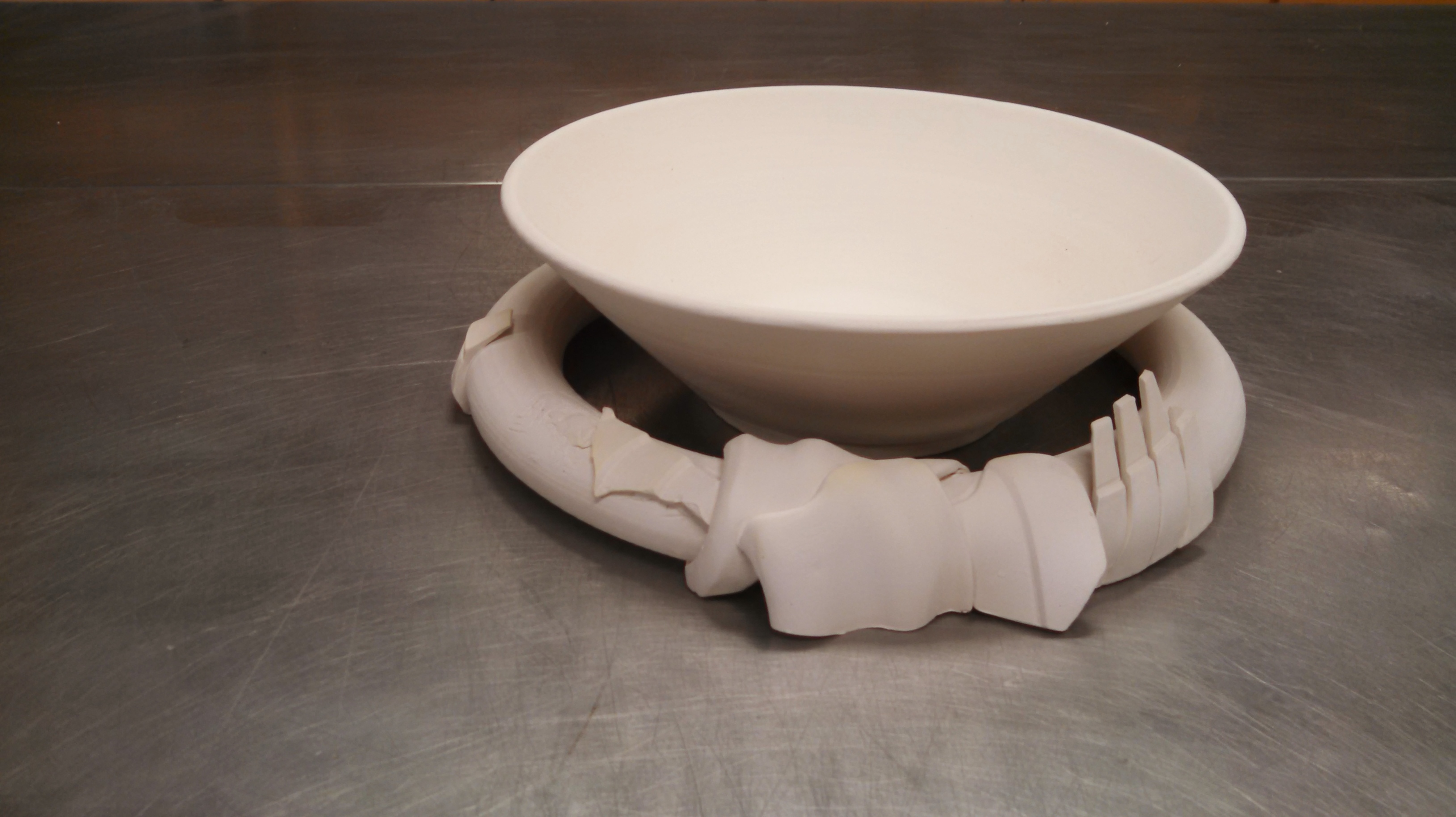 Firstly, this is a piece inspired by Frank Gehry’s architecture, although it doesn’t appear to be. I really love the undulating metal planes in his designs that seem to meet in the most precarious arrangements, so with that in mind I set out to create a kind of foot or setting for a wide mouthed bowl. I threw a lot of simple vessels with wavy profiles which I planned to cut cross sections of at different angles. In doing so, I created small slabs of high relief I intended to attach to one another, creating a decorative foot for the bowl. However, it became apparent in designing this setting that I would need another element that I could drape the slabs over for a more structurally stable piece. So I threw a doughnut with a diameter wide enough that the bowl could sit in it comfortably.
I intended to cover the entire ring with decorative slabs, but in discussing the design with my professor, we decided that the project would be more successful with only a few slabs to accent the ring for some variety. Unfortunately, some of the slabs cracked off in the bisque firing, but the critics in my portfolio review seemed to like the result. Some of the lines from my scoring were exposed and created a bit more of a rugged look for the ring in combination with some of the jagged edges of the slabs that had broken.
The above photo shows the piece bisqued and not glaze fired. I had every intention to make this a functional vessel, so naturally the next step would be to glaze the piece. However, through more discussion, the idea arose to maintain this piece as a sculptural one as is. No color. No clear glaze. No shine. I do really enjoy the uniformity that arises as a result of clean, plain white. There are some really interesting shadows that are created as a result of the slabs that protrude over the negative space between the bowl and the ring. I think it helps connect the two separate pieces. Still, I was uncomfortable with keeping it in the bisque state, so I decided to high fire the piece with no glaze. A few of my attachments had after all broken off of it, and there were a lot of different ideas that arose from making this piece that I wanted to try again. So as a test, I decided to give it a shot. It hasn’t been removed from the kiln yet, but I’ll be sure to update you about it and some other projects from earlier this semester in a post in the near future!
I was wondering if any of you had thoughts about other possible alterations I could make to this design? Should I play with color? Perhaps black and white would be more successful? Should I experiment with the height of the walls of the bowl? How about the height of the doughnut? Should I have continued and placed slabs over the doughnut until I could no longer see it? Let me know what you think!