I work as a choreographer and instructor at a local dance studio in my area. To help out I also offer to create the programs, tickets, and shirt designs for our Jr. and Sr. shows for both winter and spring performances. I love creating these because I only have two restrictions: 1.) the template sizes for programs and tickets and 2.) all secondary text must be the same font as the studio’s logo. I was given an additional requirement for this project as well; the colors needed to be pink and black.
The hardest part about designing the covers is that the design needs to be simple enough to be printed in one solid color for the t-shirts and fit on the tickets without being too much. However, I still need it to be interesting and get the theme of the show across. Usually I accomplish this by having one or two main vector images and, if needed, a simple background. Sometimes we only use the title of the show as the main focus and add images to the text.
Last year, the design included vectors of the three main leads and a background image was not needed. This year, we have one main lead along with secondary characters. Because of this, I decided to spotlight our main character and include a background. Usually with the shows, an idea automatically comes to mind or the artistic directors (Michelle and Ashley) already have an idea. With this one, I had a general idea, but I was not sure what the layout would be. As I always do, I started with different thumbnail sketches. The show this year is about a dancer who goes to New York City to start a dancing career and how she works her way up to the top. So, I decided to focus on our lead in a ballet pose (its a passé relevé if you wanted to know) with a New York skyline behind her. I wanted to make the skyline have a watercolor splash kind of look, but I realized that would not translate well on the t-shirts.
Once I was happy with one of my sketches, I created a final copy and then scanned it so I could work on the vectors and add text. From there, I was able to finalize the layout for the program and the t-shirt.
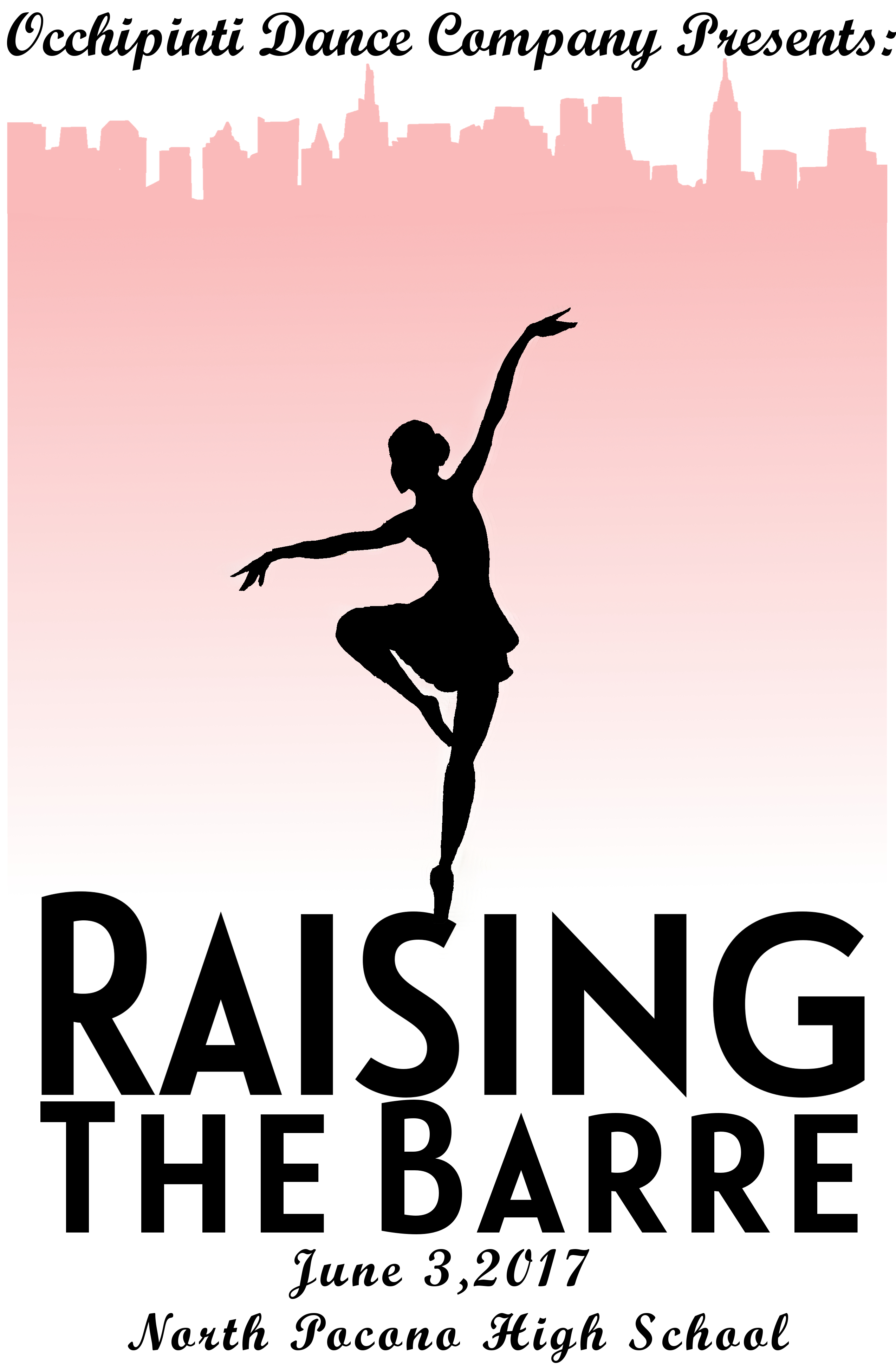
Final t-shirt design and program cover
For the tickets this year, I decided to do something different. I took an unused idea, a ballet barre going through the text, and used that for the tickets instead of copying and pasting the program design onto the ticket template. I felt if I used the skyline on a vertical ticket, it would be too tight, but if I used the dancer on a horizontal ticket it would also be too tight. So, focusing on the text with a symbol for ballet was the way to go. The show is called “Raising the Barre” as in a ballet barre (pronounced bar) used for warm-ups so I felt it was only fitting that one was included in the design. I used the skyline as well, but decided to fade the intensity of the pink so the text was the main focus.
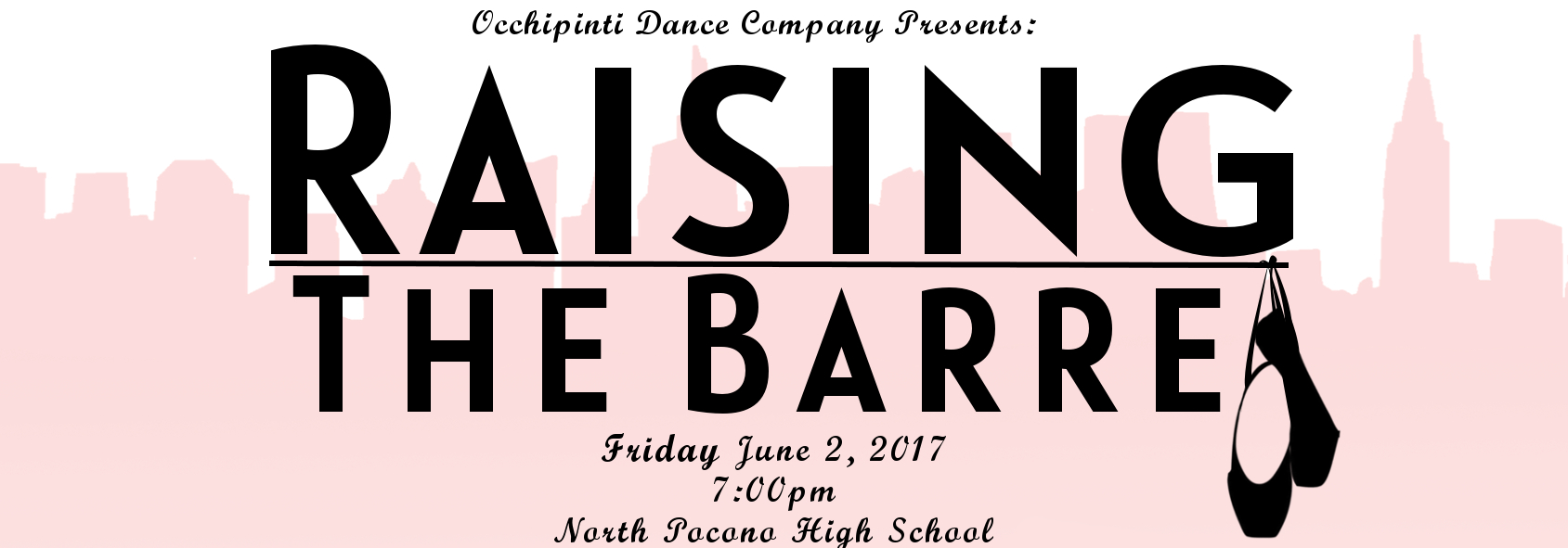
Final ticket design
With projects like these, my main goal is to make whomever I am creating for happy with the final images. Michelle and Ashley love it, so I’d consider this one a success!
Until next time!
~Jordan