Hey guys! I hope you all had a great week and are getting into a groove for the semester. It’s been a bit of a struggle for me with my hectic schedule, but I’ve survived so far, lol! For this week’s post, I have some logo development and final products to share with you guys for my restaurant rebrand.
In my last post, I shared my ideas and sketches for my new Red Robin logo. Since then, I have digitized those ideas and finalized the restaurant’s design. Here are my initial digital designs based on my sketches:

I think these came out really great, but some of them just didn’t work for a final logo. From these designs, I narrowed my options to three that I needed to adjust and refine. I made a lot of logos during my refinement period; I’m not going to show you all of them, but people really liked the burger design with the bird on it, so I went with that. I did, however, change the logo typeface to match the overall vibe I wanted for my rebrand. Here is my final logo design for Red Robin:
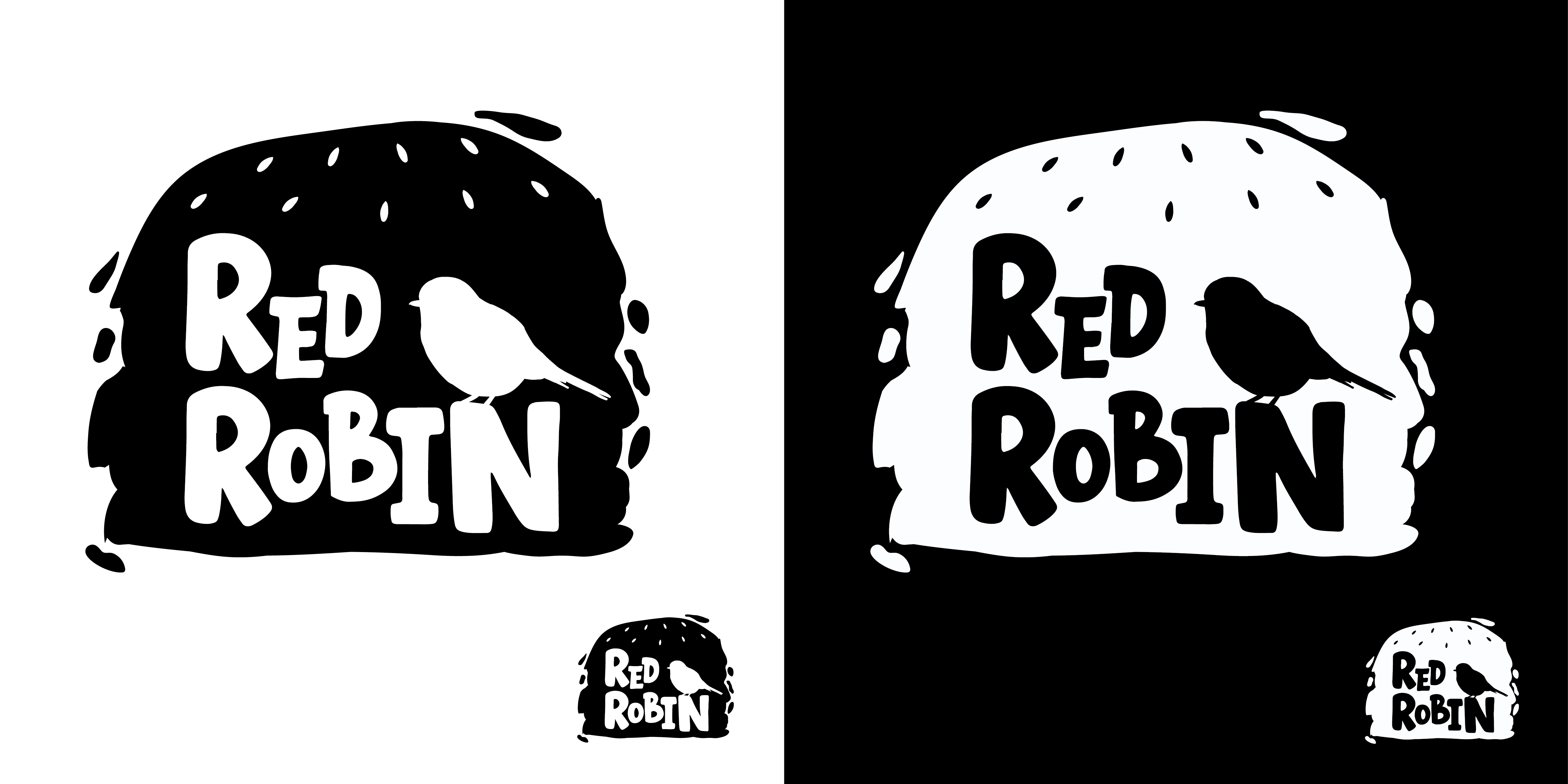
I absolutely loved how this design came out. I think it captures the friendly, welcoming vibe I wanted for Red Robin. Along with the logo development, I also designed a style guide based on my rebrand vision. A style guide is a set of standards and rules for writing, formatting, and designing media. My style guide needed to represent my rebrand vision and include all the type, colors, and extra assets the company can use in its branding. Overall, my style guide turned out to be several pages long (25, I think), so I am not going to include the entire thing. However, I will show you guys the first three pages so you can see a sample of the design.


As you can see, I chose a very basic, primary-color palette for my rebrand. I think it fits the vibe so well, and I love how it came out. I also used the sauce spread graphic that I made for one of my logo designs, but I used it as a header graphic instead. It was too good not to use. The overall feeling that I wanted my rebrand to give was very friendly, fun, and welcoming of all people, which I think is perfectly represented in my logo and style guide!
I would love to hear what you guys think of my rebrand project so far, so please feel free to leave a comment. I can’t wait to share more as the project develops over the semester.
Thanks for reading!
– Cecelia 🙂