Hey, everyone! This week, I have a real interesting post for you guys! My most recent branding project was based on branded items/swag for the restaurant, and I had a great time coming up with ideas. Designing the items and creating the mockups were so much fun, and I am super happy with how it all came out.
When I was thinking of what branded items to include, I knew that I wanted to expand upon the basic designs required for this project. For the basics, I designed a set of coasters, gift cards, mug/glass, and takeout bag. To further elevate my branding, I decided to include a T-Shirt design for servers/employees to wear, a takeout box, gift card packaging, and both a mug and glass. In my designs, I featured the logo as the primary focus and added embellishments to further my brand style.
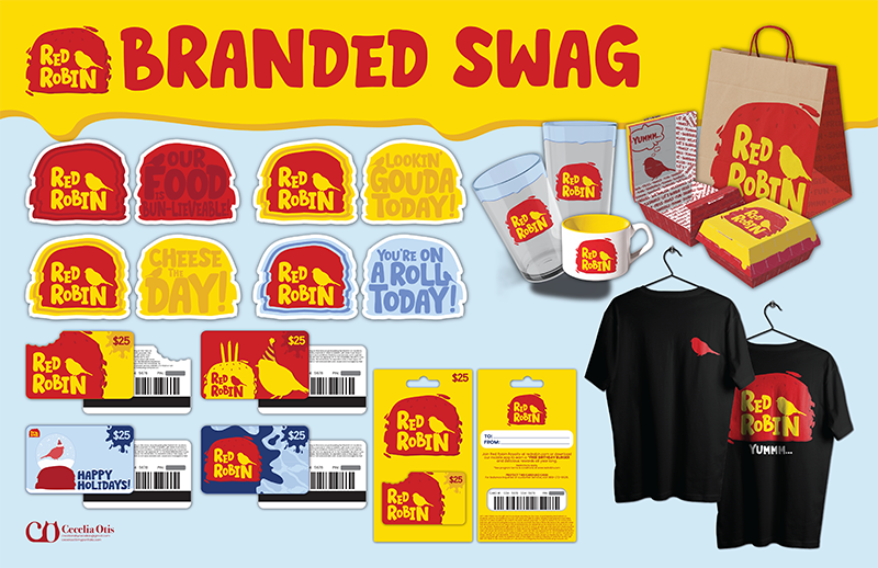
Here is a more detailed breakdown of each item design:
• Coasters: For thecoasters, I wanted to emphasize the restaurant logo on one side, but do something fun on the other. On the fun side, I decided to find some food/burger puns to tie into the playful vibe of the rebrand.
• Gift Cards: For the gift cards, I really wanted to emphasize the fun style of the rebrand, while reinforcing continuity across the designed items. I designed two generic gift cards for any occasion and two holiday/celebration cards. Each card has its own vibe/personality, while staying in line with my branded style.
• Takeout Bag/Box: With the takeout items, I wanted to design a takeout burger box to go with my takeout bag. I wanted the box to coincide with the restaurant branding instead of just using generic styrofoam/cardboard packages. For the bag, I decided to use a kraft paper bag that is 100% recyclable or reusable to promote sustainability. I placed the logo on the front of the bag, using the asymmetrical placement for a more dynamic design.
• Mug/Glass: Although there is not much items on the menu in whichyou would need a mug, I thought that it would be a good item to have that customers can purchase if they want. For the beverages, I designed a glass featuring the restaurant logo and a drippy embelishment around the rim.
• Server Shirt: For the server’s/employee’s shirt, I chose to place the bird graphic on the upper left corner on the front of the shirt and use the full restaurant logo on the back. The idea is that the servers and employees would wear this shirt as a part fo their work uniform. I chose to put it on a black shirt so that any stains or spills that may occur will not be visible on the fabric.
Overall, I think everything came out great and remains cohesive with my rebrand of Red Robin. I would love the hear your thoughts on my designs, so please leave a comment!
Thanks for reading, and I’ll see you all next time!
– Cecelia 🙂