Hey, everyone! I hope you all have been well these past few weeks. Things have kind of ramped up a bit in my classes, but we’re getting through it one day at a time. Last week, I shared with you the logo development and style guide for my Red Robin rebrand. This week, I have my restaurant business collateral to show you guys!
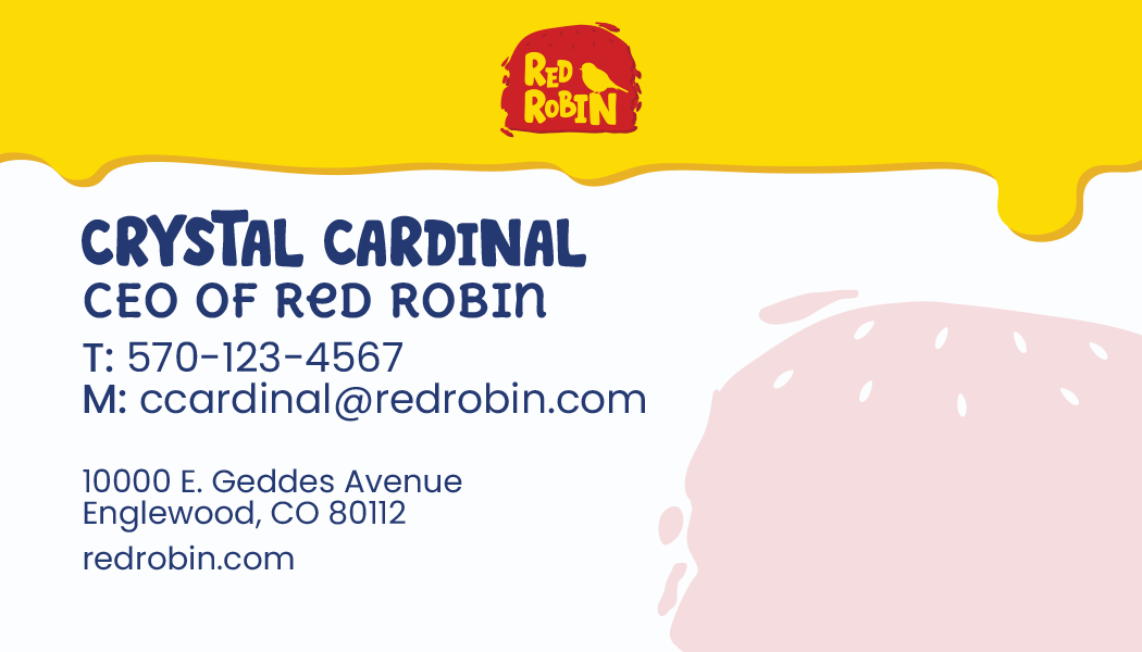
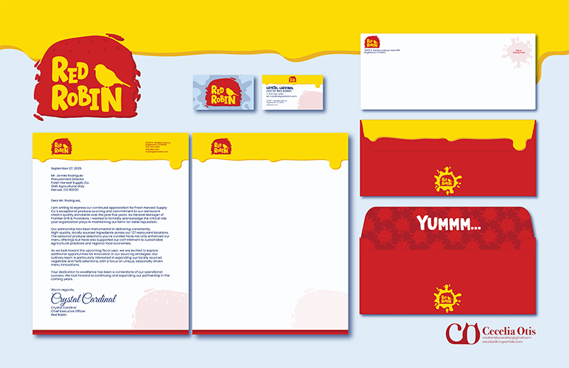
For this part of the rebrand project, I designed a letterhead, a second page, a business card, and an envelope using the new branding. I started my business suite with the business card design. I think it was the easiest way to figure out what direction I wanted to take to align with my rebrand. For the front design, I wanted it to reflect the cover that I did for my style guide and tie in all the colors that I chose. On the back, I used the drip graphic at the top of the card, almost like sauce/mustard dripping down the letter. To further emphasize the burger design, I also used the corner burger graphic in the bottom corner of the card.
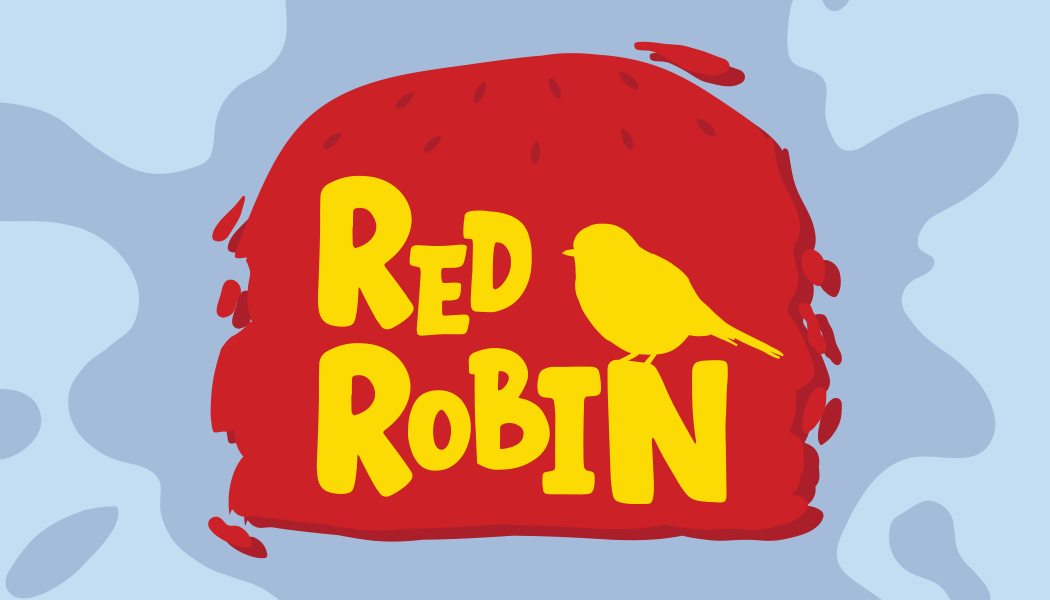
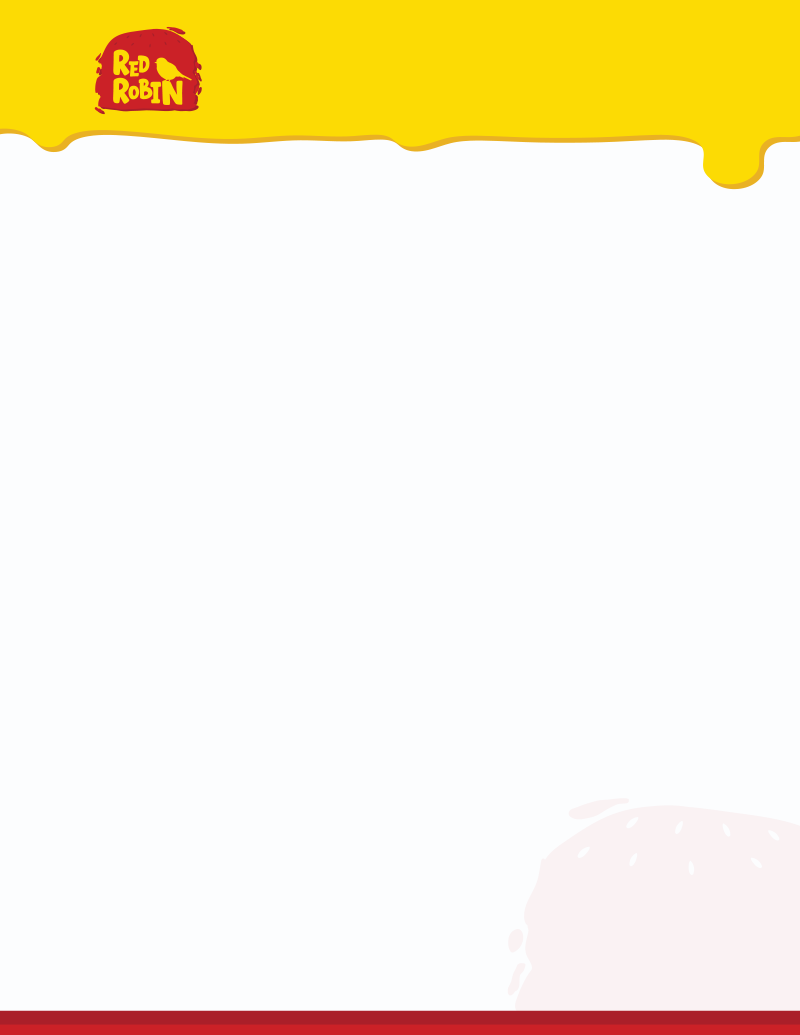
For the letterhead and second page, I wanted to reinforce the drip graphic at the top of the page, as it is on the business card. I placed the logo in the upper-left corner and added the company information on the other side. I used the same graphics from the business card to emphasize continuity in the brand and the design.

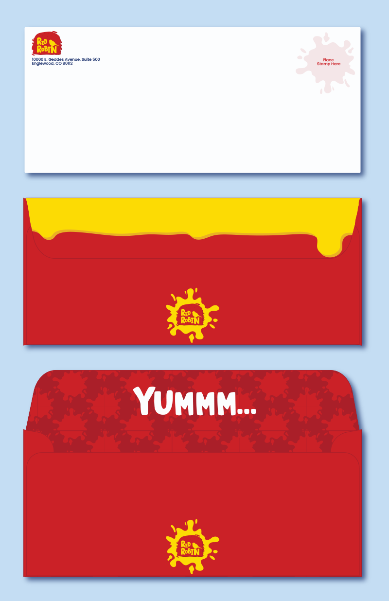
For my envelopes, I wanted the front to be as simple as possible to meet mailing system requirements, but I wanted the back to be super interesting and fun. I placed the logo and return address in the upper left-hand corner, as usual, and used one of my splat graphics to indicate stamp placement. On the back, I chose an all-red background to make it stand out, and placed the same drip graphic on the flap so that, when it is folded/closed, it looks like it is dripping down. I also placed the logo on the back of the envelope to continue building brand recognition. To further elevate my envelope design, I thought it would be fun to create a pattern for the inside. Again, I used the splatter graphic to create a cool design and placed the “YUMMM…” slogan of Red Robin on the inside of the flap. This creates a great customer experience while also elevating the new rebrand.
For this project, I created a one-sheeter featuring all the business collateral designs to showcase the full suite. To add interest to the page itself (and reinforce branding), I added the drip graphic at the top of the sheet and placed the logo in the upper left-hand corner. I also added my design branding/information to the bottom of the page so people know this is my work. I am really proud of my work on this project so far. I think these past two years at Marywood have helped me discover my style and hone my design skills. Throughout my time here, I have seen major improvement in myself, and I am excited to continue on in this career.
Thanks for reading this week’s post! Next, we’re working on our restaurant menus, so hopefully I’ll have some progress to share with you guys. Leave a comment on what you think of my rebrand so far; I would love to hear your thoughts!
Have a great week!
– Cecelia 🙂