For the Honey Bee Harvest Festival that was held in Scranton this past Sunday, I helped create prints to showcase! In order to do this we locked the type press design and ran through some test sheets of the type. Once the type was in place and font was chosen, it was time to pick colors and background for the type. The overall color scheme was a yellow, orange and white background with black type on top.
In order to create the background honeycombs, I took an embedded and embossed sheet with the designs of the hexagons, flowers, and stars and ran it through the press with the final sheets of paper to print and press in the design.
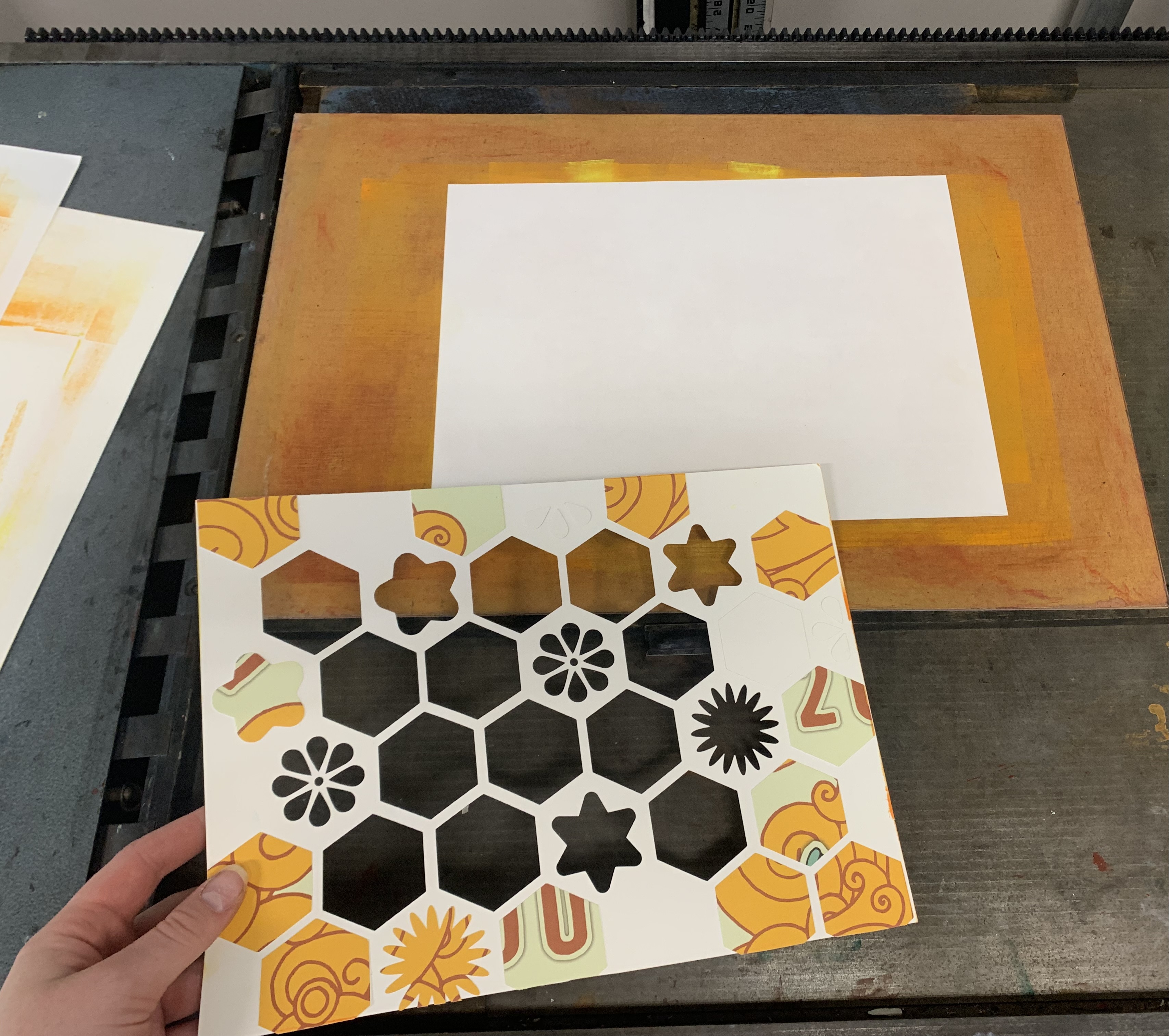
In order to print these I first inked my color scheme on a thin wood block. I then put a clean sheet of paper on the press for the final design to be printed on. Next, I put a scrap piece of paper on top, and set the design sheet with hexagons over that to keep the ink from smearing, and keep the workstation clean. Lastly, I put multiple pieces of paper on top to even out pressure between the press to push the design onto the ink, and onto my final paper.
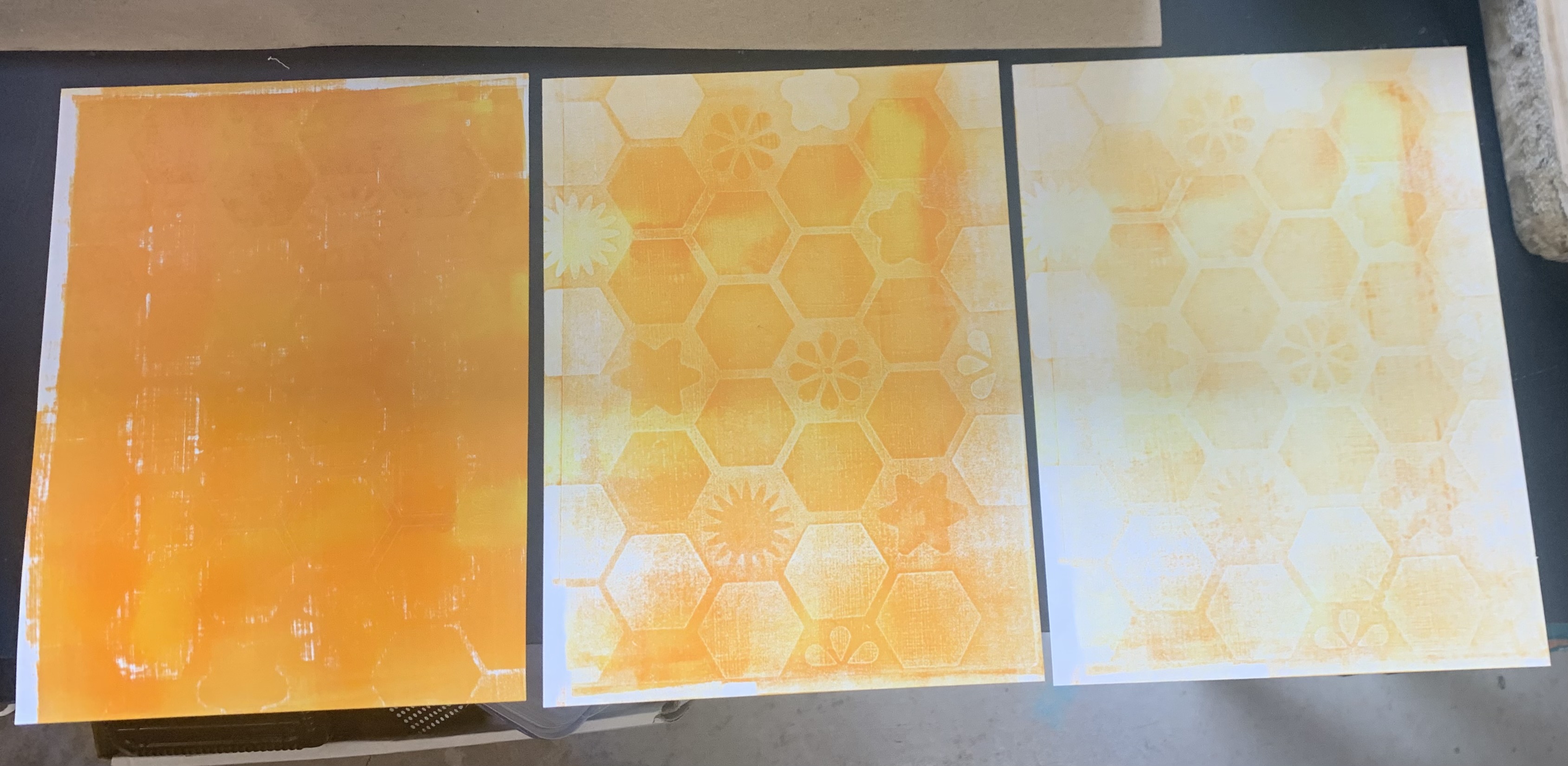
I used the ink for three sheets of paper before reinking my wood surface. As shown in the images, the first sheet is very ink heavy and doesn’t have much definition of the design, the second sheet is a balanced pigmented design, and the last sheet is more of a ghost print in regards to the design. I loved how these turned out, and they were created for a very good cause!
