Hi everyone! Happy end of the semester! This semester really flew by, I don’t know about anyone else, but it was a great one for me and I have made so many portfolio pieces in all of my classes that I am proud of! This last week in screen printing our last project was to make 9 of the same prints that we would trade with the class. We decided on a theme of “magic”, so basically we had free range to create a print that related to that theme, whatever we thought that might be.
For my print, I decided to go the nature route of magic. I think that nature is so fascinating and how things grow and evolve seems like magic to me. So I started on Illustrator to create a black and white graphic I could photo emulsify onto a screen. I wanted it to have a whimsical feel because that also gives me magic vibes, so I started drawing a flower with roots coming out of the bottom, with a moon, sun, and some stars around it as well. I thought that represented the process of a flower growing, along with some other elements of nature that seem like magic to me, like how the sun, moon, and the stars are so bright and visible from Earth. Then I decided to give it a border, that sort of framed it like those Tarot reading cards you might have seen. That reflects magic to me as well so I thought it was perfect.
Here is my design that I went with. I thought that the design was lacking something with just the one shape, so I decided to flip it upside down and reflect it a bunch of ways so that it created 4 in one big square, but only one of them is legible the right way.
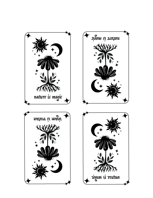
After I was done with the graphic, it was time to print it! I photo emulsified it onto my screen and then decided I wanted to use some green colors that reflected the nature vibe. I chose a light, earthy green colored paper to print on, and then mixed some green ink so that I could create a gradient with the specific colors I wanted. I used a light green color on top and then a deeper, earthier one on the bottom as I printed them through the screen. Honestly, because the lines in this print were so thin it was giving me some issues while I was making so many copies of it. It started drying through the screen so some of the prints came out a little blotchy where the thin lines should be, but I was still able to get 9 good ones after some trial and error! Then for fun I experimented with yellow colored ink on brown paper and it honestly looked even better, the contrast was so high it looked so cool together. Then I cut them out with fun scissors that gave some texture to the edge and pasted them onto dark green paper for some more dimension. But here are the finished products!


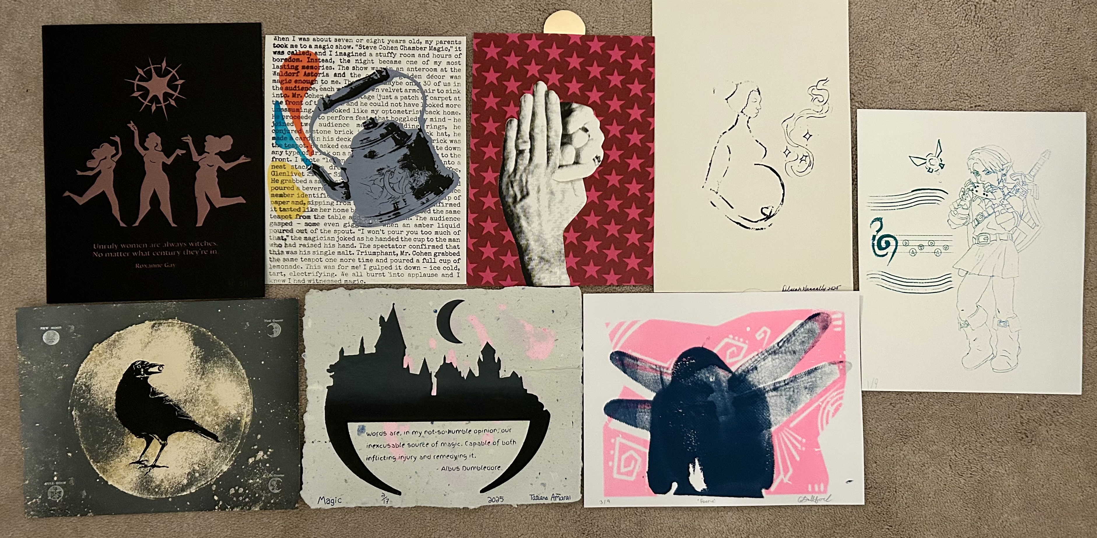
Overall this was so fun to create and print, and it was fun doing an exchange with all of my classmates! Here are some of the other prints that I received from my classmates and what they interpreted magic as, they are all so talented!
I really enjoyed this class this semester, and I’m looking forward to taking an etching class next semester, so there will be many more blogs and projects from me next year too! Hope everyone has a great holiday and break!!
Ella