Visiting the 2026 Senior Art Show at the opening reception on Saturday, April 18, 2026, and currently exhibited throughout the Insalaco Center for Studio Arts at Marywood University, was an amazing experience. I truly enjoyed everyone’s work with all the different media and styles. Exhibition dates: April 18 – May 16, 2026


For this blog post, I decided to focus on just the Art Therapy seniors’ pieces. Each graduating senior in the Art Therapy department had to make an art portfolio, including some written work, their artist statement, and the role of an art therapist. I asked those who wanted to participate in this blog post to pick a favorite piece they did and give me a small blurb about it (i.e., the process, media choice, meaning, etc.) and, if they wanted, their artist statement from their portfolio. Click the right facing arrows below to reveal each artist’s information. My commentary about each student’s work is listed below their names in italics.
The Art Therapy Seniors are: Tatiana Amaral, Lila Anderson, Emily Fairchild, Elizabeth Gething, Madi Grose, MJ Haynes, Delaney Kerr, Chloe Kiernan, Oliver Lampke, Rachel Rodriguez, Ever Soltis, Julia Strohm, Julia Zadzura, and Jenna Zerilli.

Tatiana Amaral
“Colorful Academy,” oil on canvas
About the artist
My name is Tatiana Amaral. I am a Senior Art Therapy Major with a minor in psychology. After I graduate with my Bachelors degree, I plan to continue my studies into the masters program offered here at Marywood University. When I create art, I often need some kind of background sound, whether that is sound from the classroom, music or videos, the sound helps keep my mind from getting out of the artistic focus. I have several art styles and mediums I love to use. Painting, digital, and traditional have been a handful of my favorites so far. I find digital art to be easy to use when I am idea planning or working on personal creation. Painting for me, while I find it a bit messier and tougher to us, is one of my favorites because of the processes and the methods used to get a clean blend or proper shading. Painting is also the easiest way to practice color theory in real time. Traditional art has always been a classic for me. I often use this to jot down quick ideas or plan ideas I had when I’m out in public.
About the piece
When I was making that painting, I was still getting used to working with oil paints and knew I wanted to mess around with blending as well as testing how all the colors mixed together. I chose that spot as the chairs were a good accent of color with the colorful trees as it was nearing the start of winter. To me, this painting is an achievement of being able to master something new and keep the same colorful appearance I like to use in most of my personal art.
I enjoyed looking at this piece because there’s so much dimension on the chairs, and it truly drew my eyes right to the chairs. The balance of the primary colors right front, and center really make this piece stand out.
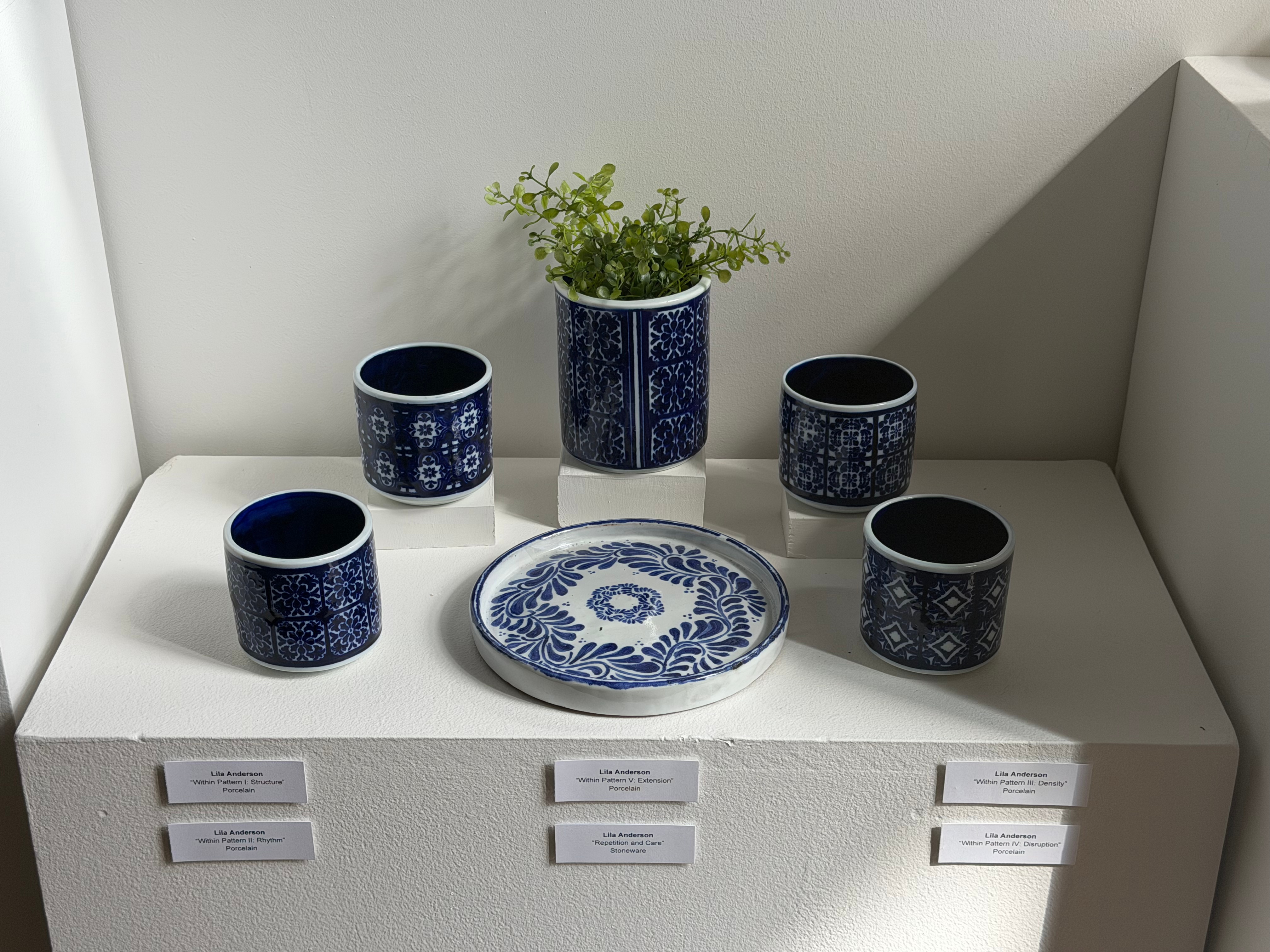
Lila Anderson
“Within Pattern,” porcelain series
“Repetition and Care,” stoneware ceramics
Seeing these pieces were truly breath taking. The attention to detail on every single one of these pieces is truly amazing. These pieces are beautiful and I see why Lila chose these to add for the blog.
Emily Fairchild
“The Flow of Color,” acrylic paint on plaster
About the artist
As an artist and aspiring art therapist, I have learned how art making acts as a tool for self-growth and internal reflection. My creative process truly revolves around letting buried emotions, memories, and connections breathe. Exploring themes of resilience, vulnerability, and growth is crucial to transformation within oneself. It is about the feelings and thoughts that often cannot be described. I aim to explore those emotions through composition, pigment, and texture.
As someone who enjoys detail and control, I always find myself using colored pencil, graphite, and even acrylic painting. The tactile experience of using these mediums allows for layering, texture, depth, and blending. The more you act on the piece the more it develops right before your eyes.
As a senior Art Therapy major, I have had the honor of working with diverse populations over the course of my time at Marywood University, including children, individuals with intellectual disabilities, and veterans. My experiences have only furthered my belief in the unspoken language of art. Acting in an art making process encourages the process of connection and understanding. I plan on continuing my passion through post-graduate study in the Marywood University Art Therapy Master’s Program. My goal is to create a space where individuals will always feel seen and empowered through not just art therapy, but through all creative arts therapies and expressive therapies.
It is not always about what’s created, but also the process and how you go there. Any piece I make is a reflection of my commitment to my interest in healing and growth. Anything can be found in the act of creating, whether its bursting with color or reaching out softly in hues.
About the piece
During my internship, my class and I had the privilege of working with a large group of bubbly, life-filled clients. Although I only had an hour to engage with them, I was reminded yet again how art can go beyond language, background, and circumstance. Despite any challenges these individuals may have faced or are currently dealing with, they carried such an unwavering sense of positivity, joy, and curiosity. Their conversation and laughter filled the room before their bodies did.
In reflection of working with this group of clients, I created an art piece that is nothing but vibrant colors and dynamic movement. It symbolizes the contagious energy that bursts from their presence. I wanted to depict a joy that seemed to almost overflow beyond the paper edges. I was reminded that resilience and light can coexist in the face of hardship. Professionally, it enhanced my understanding of how crucial it is to meet the clients where they are at currently. Look to see one’s strengths and not just their struggles. Although I was one of many guiding the experience, these clients taught me it’s not only about processing pain and confusion, but also about celebrating the small moments of joy that sustain us.
I was in the Mixed Media class with Emily when she made this, and her ambition while making this was amazing. Before I even knew the background of this piece, I knew she was passionate about it and that it meant something to her. Now that I’m learning about the background, I can see why she chose to create this piece during her internship.
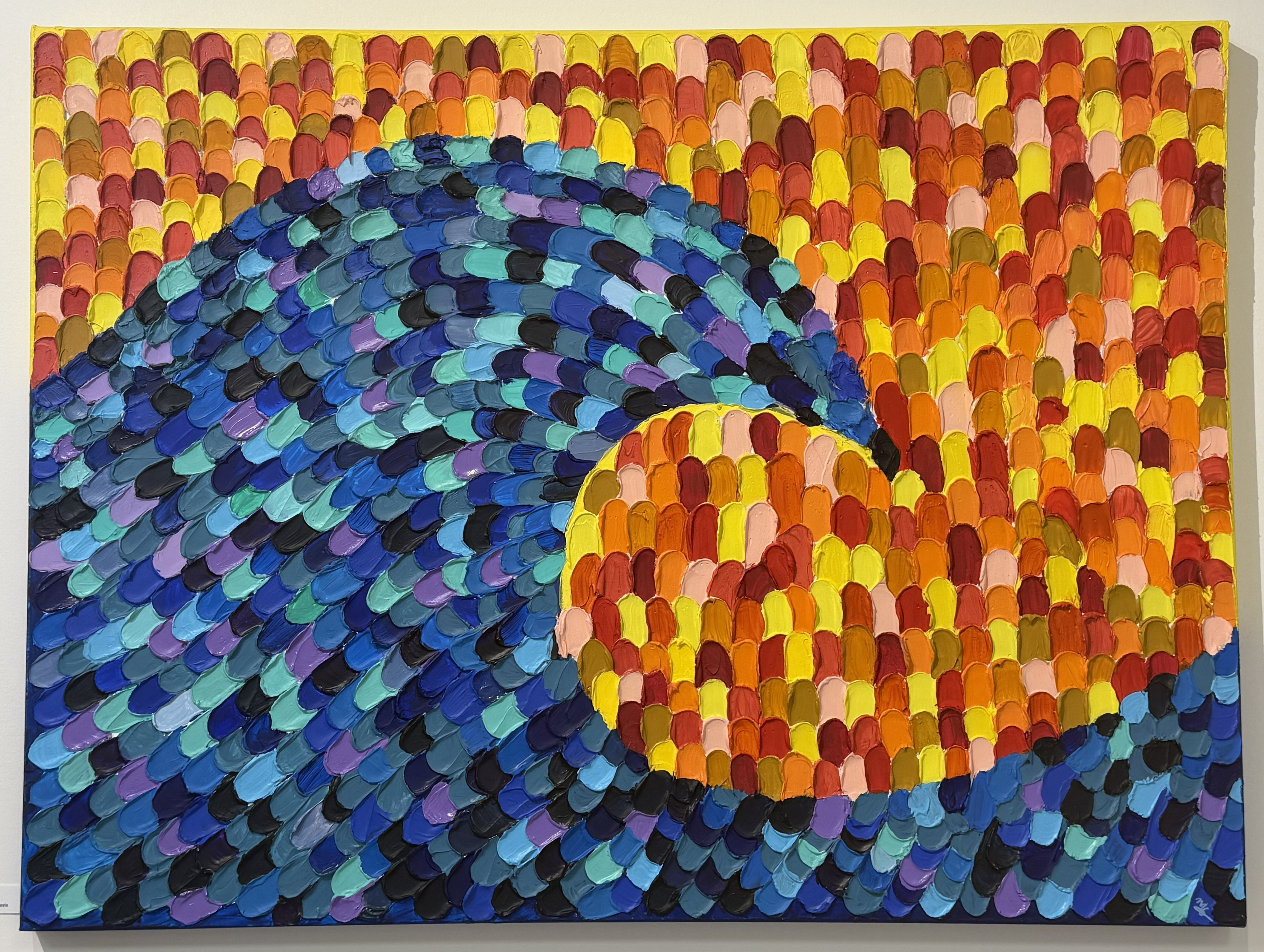
Madi Grose
“The Wave,” acrylic paint and modeling paste
This piece was truly amazing to look at. This piece is swatches of acrylic paint with modeling paste. The way that the swatches create movement within the piece makes it eye-catching. The texture was incredible on this piece.
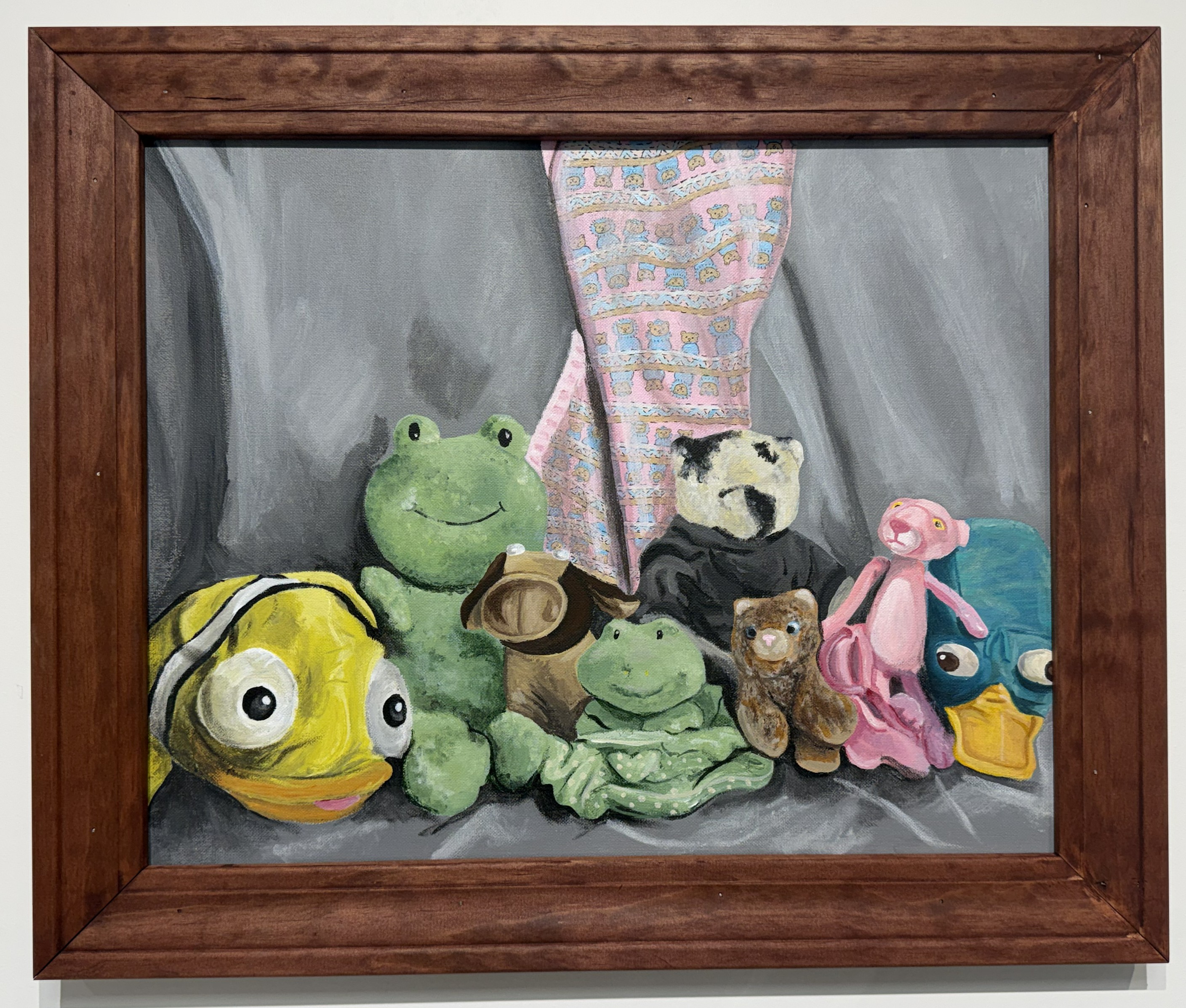
MJ Haynes
“A Child’s Safe Place,” acrylic on canvas
About the piece
The piece is derived from the art therapy directive of finding your safe place in your mind for you to always go back to in traumatic moments to ground yourself. I named the piece “A Child’s Safe Place” to allude to the directive but also to nod to the fact that pictured are my stuffed animals from when I was a kid. Growing up, my mom was out of town a lot and it was hard for me to sleep because I was so anxious. So I would surround myself with so many (like probably 15+) stuffed animals in order to bring my anxiety down and try to fall asleep.
In terms of the process, I found all of my actual stuffed animals in my parents attic, and arranged them in a still life. I used my Fiancé’s camera to take a picture so I could work on it whenever I had time. I tinted my canvas and drew construction lines in a similarly colored pencil. Over the course of 4-5 days in minimum of 4 hour increments, I painted in acrylic paint while referring to the still life photo when I needed. Lastly, I used a micron pen to add small details in my baby blanket and called it a day.
My dad made the frame for me and I stained it then added the canvas and the hanger to get it “exhibition ready”.
This piece is very detailed, and it is truly incredible to look at. I appreciated this piece as the stuffed animals in the piece are his, and it feels very meaningful to him. I really like the detail this piece has, and it does bring a sense of safety, as I also grew up with a lot of stuffed animals, as I am sure most of you have too. Even though this piece is special to MJ, it does seem like anyone who views it can also connect to this piece and the meaning behind it.
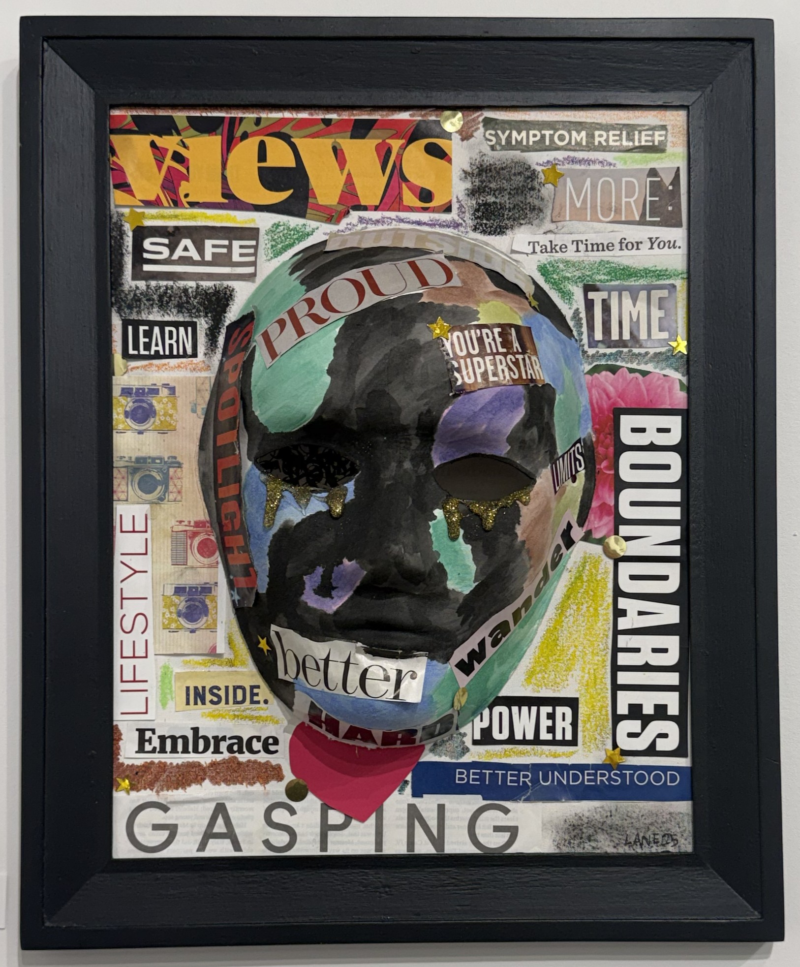
Delaney Kerr
“Not Everything is Visible,” collage
About the artist
Art has always been something close to my heart and a steady presence throughout my life. When I was younger, I had a court-appointed counselor who would unofficially make art with me during our sessions to help me feel more comfortable. That experience stayed with me, and as I grew older, art, no matter the form, became a coping mechanism during difficult times. No matter what was happening around me, I knew I could make art and be in my own world for a little while. Those feelings and experiences are what drew me to art therapy. I want to help others through art, the way it has helped me and continues to help me. Art is a powerful form of expression when feelings and thoughts can’t be put into words, and I believe it truly helps people grow and transform mentally and emotionally, just as it did for me.
Art therapy is a complex yet simple method of therapy that uses creative expression to explore emotions, experiences, and events that may not be easy to verbalize at first. It is not about making “good” art, it is about processing life. The value lies in the process, not the final product. Because of this, art therapy can be used with any population at any skill level. During art therapy, the therapist’s role is to hold a safe, welcoming, and supportive space while understanding that no single method works for everyone, as well as different clients’ needs may require different approaches.
For my career, I have always pictured myself working with younger children who may be experiencing abuse, neglect, addicted parents, or similar challenges. I’ve always imagined doing this work within a state or county setting. Later, once that career is well established, I would love to have my own studio where I can run sessions or host open studios for the community.
As for why Marywood University, when I picture graduate school, this is where I see myself continuing my education. After earning my associate degree at a community college, followed by one semester at another university, coming to Marywood, it was the first time I felt at home during college. It’s the first time I’ve truly enjoyed being at a university, and for that I’m grateful. I hope to continue my time here as I move forward on this path.
This piece was one I didn’t say anything as soon as I looked at it. Part of me felt like I needed to sit in silence at first for this piece to truly grasp the concept, meaning, and just the piece as a whole. This piece says so many words, physically and emotionally. The title also makes this piece very powerful. I am thankful that Delaney chose this piece, as it drew my and many others’ attention when they looked at it. As art therapists, it is important to note that “not everything is visible” when dealing with clients. This message is really strong, and it is very important to keep this message in mind.
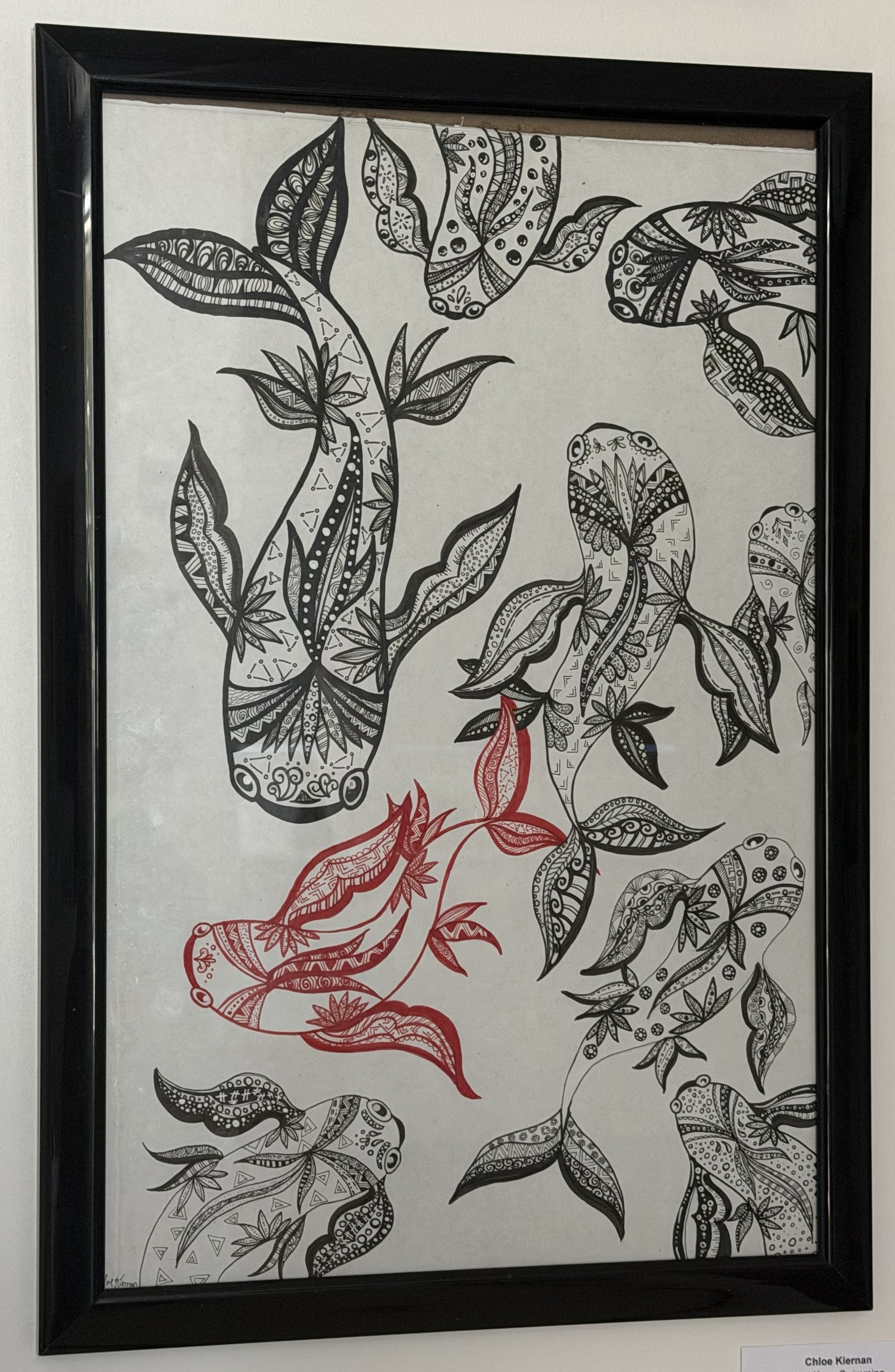
Chloe Keienan
“Just Keep Swimming,” marker
About the artist
I am Chloe Kiernan. I am a senior Art Therapy Major with a double minor in Psychology and Art History at Marywood University. Coming into college, I knew I wanted to keep art in my life but use it in a way that I can help aid in healing others. Whether that was helping somebody with a mental or physical disability. But also not limited to helping others in other forms of capacity that may feel the need to seek extra care and support through their personal challenges. And this is why Art Therapy is the major I chose to pursue during undergrad. Mental health is a stigma I feel that needs to be addressed more and something I am truly passionate about advocating for. That includes advocating for myself and others to expand their knowledge on this area. My creative process always starts with an idea then I personally add my own creative twist on it. I am mainly an abstract artist but during my time here at Marywood, I have discovered that I love to create with mixed media materials. Having this skill is so fun for me and it is rewarding because I can tell a new story each time I present an art piece I am working on. It is important to try new mediums and discover what mediums are fit for you and what makes you feel the most comfortable. As I get ready to graduate with my Bachelor’s in Arts in Art Therapy and hopefully pursue my education to a Master’s level in a field expanding my skills I obtained in psychological counseling, I look forward to seeing where my education leads me into finding the best job possible in my career.
About the piece
“Just Keep Swimming” is one of my favorite pieces I have created during my time at Marywood. I created it during my junior year for the MUSATA: The Art of the Art Therapist show back in Spring of 2025. I have always been drawn to koi fish and the style of zentangle line work. So it was naturally easy for me to put the two together. When creating the piece, I wanted to find a way to incorporate a single color to make the piece more alive. The color red became the obvious choice. The piece also is a symbol of mental health awareness of those who struggle with anxiety. As a person with mental health challenges, I wanted the fish to draw in all sorts of directions to symbolize the many emotions and thoughts a person with anxiety faces everyday and having one fish being a different color than the rest. That one fish being different than the rest represents the individual who has those feelings of anxiety, as someone with everyday anxiety can feel like a target or even feel alone. Overall, this piece is very meaningful in different ways and being able to share my love and chance to advocate for the mental health stigma through my art is what makes this piece one of my absolute favorites.
I really liked this piece. The details within the koi fish are so beautiful. I really feel like the one red koi fish in the piece makes it that much more eye-catching. After reading the meaning behind the piece, it makes it that much more meaningful.
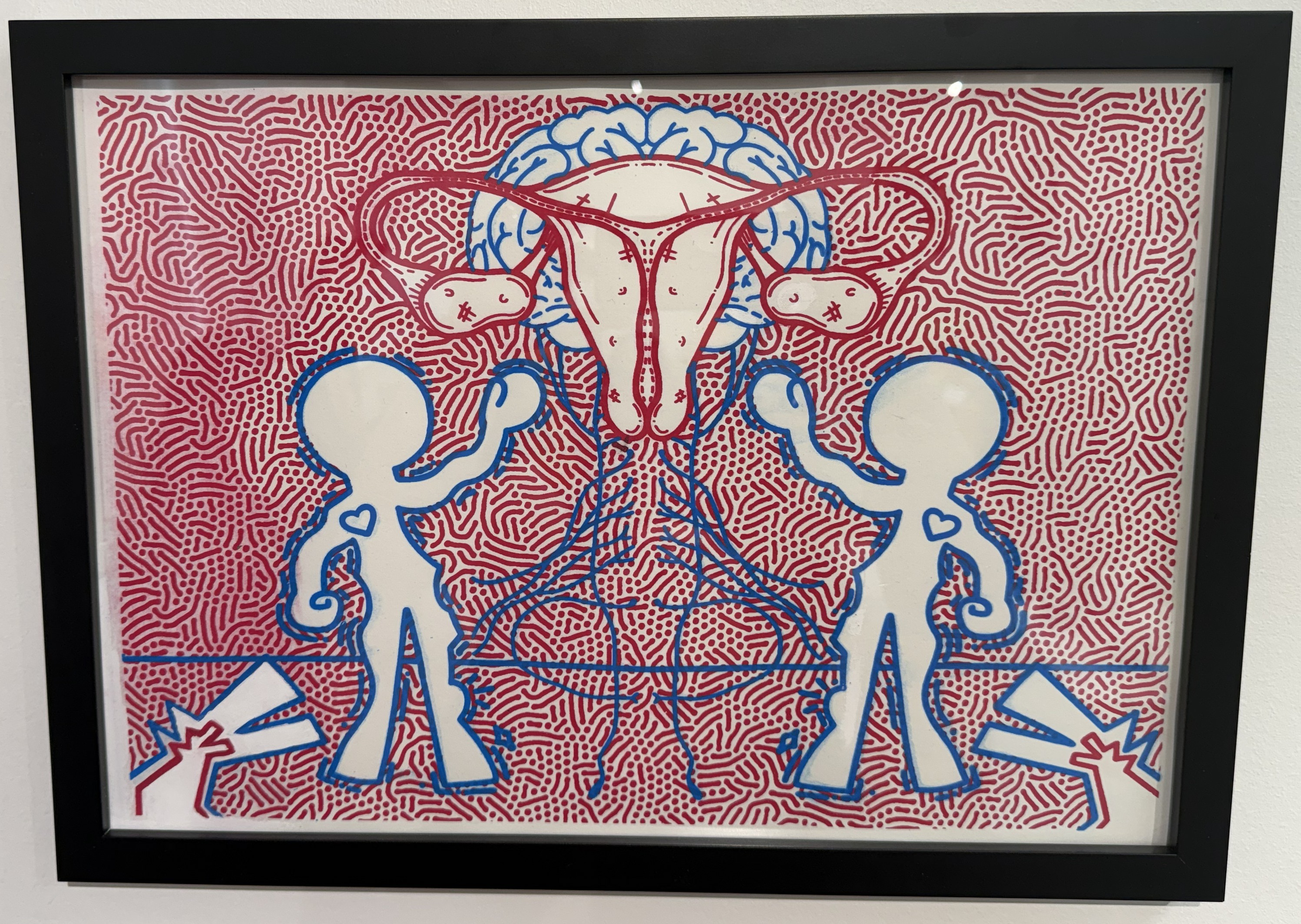
Oliver Lampke
“Hysteria,” printed with ink
About the artist
My name is Oliver Lampke, and I am a transgender senior Art Therapy major here at Marywood University. I plan on continuing my education at Marywood in the pursuit of a Masters degree in Art Therapy, before ideally going on to work with underprivileged adolescents and young adults. When creating art I utilize many different mediums including sculpture, painting, and mixed-media, among many others. This diversity of mediums is central to my art process as it allows me to express themes like disillusionment, loss of autonomy, loneliness, overstimulation, and more in diverse ways that allow for deeper connection with varying audiences. One person may not find a flat painting as impactful or easy to understand as a sculpture, and vice versa. Another integral part to my art is making things that the viewer may not find “beautiful” in the traditional sense. I significantly enjoy creating art that is strange, sometimes grotesque, and often slightly unsettling. I don’t just want people to see my art but to be gripped and confronted by it in a way that isn’t possible by “beautifying” every aspect of it. Writing isn’t always the best way to make a point or tell a story, sometimes things must be shown. It is this principle that I heavily apply to my creative process alongside a preference for vibrant and heavily saturated colors. My main drive for this unique style is that I have often been bullied and ostracized among my peers for being “weird” or “abnormal”, and it took me many years to find the beauty that stemmed from within those differences. I have found that it is often in the strangest of places that we find the most meaning. I believe these differences are not things to shy away from, but to fully embrace. In this way I hope that every “nerd” or “outcast” can find themselves represented in my work, and be comforted in the fact that art is art no matter how you make it. In the words of Meet the Robinsons, “Keep moving forward” and never stop trying.
About the piece
Hysteria started as a concept for a class I took while studying in Italy, where we had to create a piece in a similar style to a famous print artist. I chose Keith Haring due to his unique combination of brilliant colors and frenetic lines alongside his vast activism work within the LGBTQ+ community. To make the piece work as a screen print I worked on two different color layers. I always try to weave a message I find important into each of my pieces, with this one centering around the frequent judgement of women as being “over emotional”. This generalization once laid the groundwork for incarceration for women in asylums under the pretenses of being “Hysterical”. Despite steps forward being made to dismantle this false idea of women, this mindset is still prevalent within our society today.
This piece is so powerful, and I truly appreciate the openness of the meaning, history, and the influential part of the journey to make this piece. It is truly an amazing piece, with an amazing story and meaning behind it. I feel like this piece has a powerful statement to it.

Julia Strohm
“Blue Flower Pot,” stonware ceramics
About the piece
This ceramic piece I threw and shaped on the wheel. I later glazed the pot using San Miguel and painted the blue flowers with underglaze. I chose this color scheme because the colors are cohesive, and I was inspired by flowers I saw over the summer.
I really like this piece because of its simplicity, yet complex style. The detailing is so beautifully done, and the piece itself is gorgeous. The simple flowers make it look so pretty and eye-catching. I really enjoyed seeing this piece in the show.
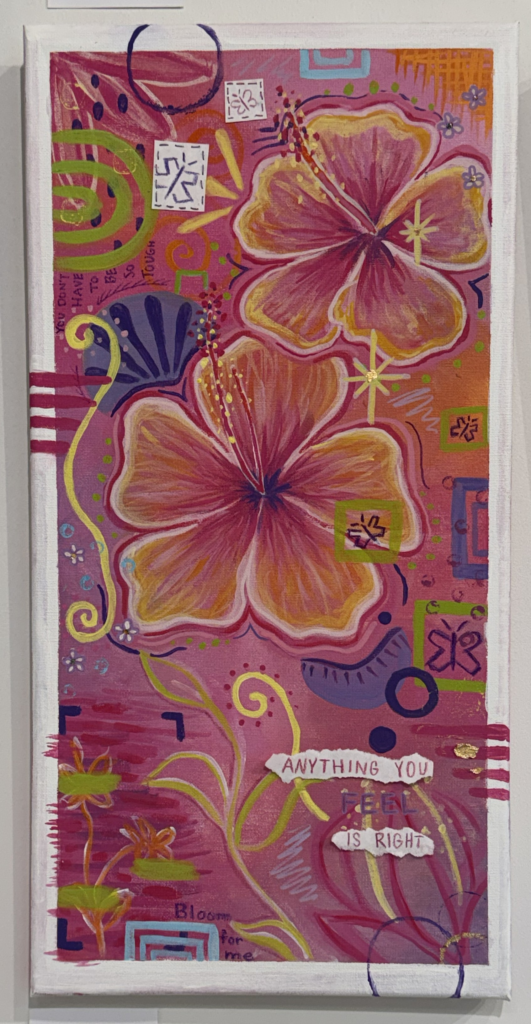
Jenna Zerilli
“Bloom For Me,” acrylic paint, gold foil, and sewn elements
About the piece
One of my favorite pieces I did was called “Bloom For Me”. It was an explorative piece for me, and opened up my eyes to a new way of creating. I used mixed media on the piece, including acrylic paint, sewn-elements, and gold foil. The process was really fun for me, as I experimented with a bunch of different symbols, techniques, and compositional elements. I had actually never created a piece like this before, and it opened my eyes to a new way of creating art that implements importance of not only the product, but the process too. This piece, titled “Bloom For Me,” is representational of how I have bloomed in terms of my art making, and an inspiration to viewers to also be open to experimenting and growing in terms of their hobbies, work, and even their lives!
I was really drawn to this piece the second I saw it. Between some elements going “out of bounds”, the color choice, and the saying, “Anything you feel is right.” I feel like, as art therapists, that is a very important concept for us to get across to our clients. This piece is very powerful, and I really like the message that is coming across.
The 2026 Senior Show as a whole was beautifully organized and presented, and I really appreciate the art therapy seniors participating in my blog post this week. It not only means a lot to me, but to those who are reading. They get to not only get a glimpse of the artists’ favorite pieces, but also some of the shared meaning and backstory to these pieces. You don’t get that everyday, or even at most galleries. Sharing details about your work that you want people to know is so important because it can really bring in the attention to certain aspects of the piece. Looking at a piece itself, the name of the piece, and then trying to come up with your own idea of what the meaning is, might not be as powerful as understanding the meaning behind it.
I thank all the art seniors who shared a little bit about the pieces they chose, and I can’t wait to look at these pieces in person, knowing the backstory. If you get a chance to, stop in to the Suraci Gallery, first floor, Insalaco and try to look at these Art Therapy pieces through the lens of the artist, not just as a viewer. Additional senior work is on view in the Mahady and Kresge Galleries in the same building through May 18, 2026. You can also read about the show on the school’s news blog, The Wood Word.
That’s all for now, see you next time!
~Emma
Interested in studying Art Therapy?
Art Therapy – Bachelor of Arts
Marywood’s art therapy program is designed to meet the needs of those interested in a career that includes both a commitment to art-making and a commitment to serving others. It will introduce you to the human service profession of art therapy at a pre-professional level.
LEARN MORE
The Master of Arts in Art Therapy is a 60-credit program that follows guidelines for art therapy training recommended by the American Art Therapy Association. Degrees are available in Art Therapy and Studio Arts in Ceramics, Sculpture, Painting, Printmaking, and Photography.
LEARN MORE
APPLY TODAY
To learn more about the Art Department or to schedule a visit, email us at art@marywood.edu or call 570-348-6278 and chat with us.
Note: First-time freshmen who apply before our annual Nov 15 submission deadline will be granted priority consideration for the Art Talent Award when they submit their portfolio for review.