One of the projects I had in my book illustration class this semester was to create a book cover that promoted one of the seven deadly sins. This semester was stressful for me and I think everyone would agree. I decided to pick a sin based on what I felt which was frustration, so naturally, I chose Wrath. Professor Hall was the coordinator behind the project and gave me full artistic freedom to use any media in order to complete the project. I had about three weeks to flesh out my idea, present it to Professor Hall and my classmates for feedback, and then post the finished product on the class’s private Facebook page. Due to Covid-19, our class would meet every Friday at 9:30 am on Zoom, and then once a month on campus, and because we had limited classroom time I would use Photoshop to create my book cover.
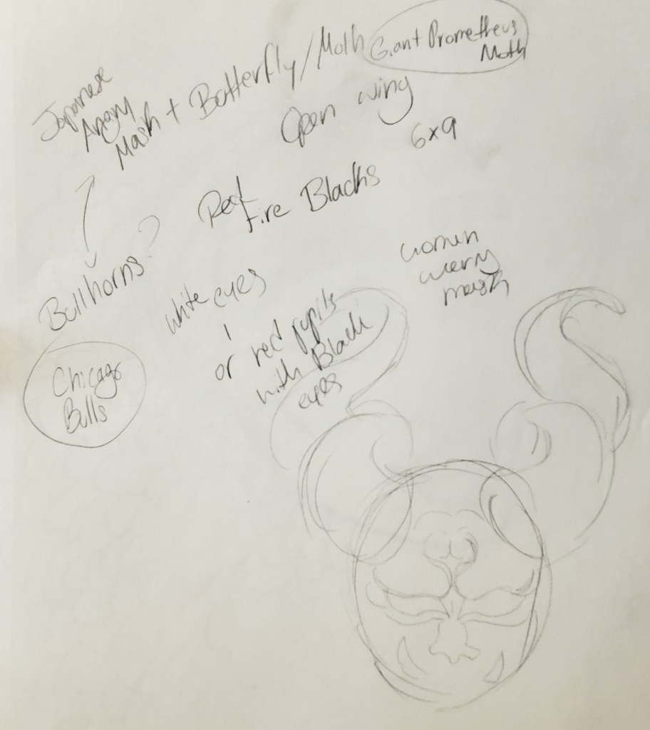
The concept of my illustration was inspired by traditional Japanese Dragon masks (Hannya), Woodblock prints, and Samurai helmets. I made an inspiration board in Adobe Illustrator with pictures I found on the internet, and I used my sketchbook to construct several thumbnails in order to find a satisfying idea.
When choosing a color palette I referenced another artist’s rendition of the sin wrath as well as recognizing what color the emotion anger was commonly associated with, which ended up being red. Then for the text, I wanted to use a typeface that was striking, bold, and would also represent the Asian influence that was in my illustration. Once I understood what design, palette, and text I wanted to use, I translated my idea into Photoshop where I fully rendered my concept.
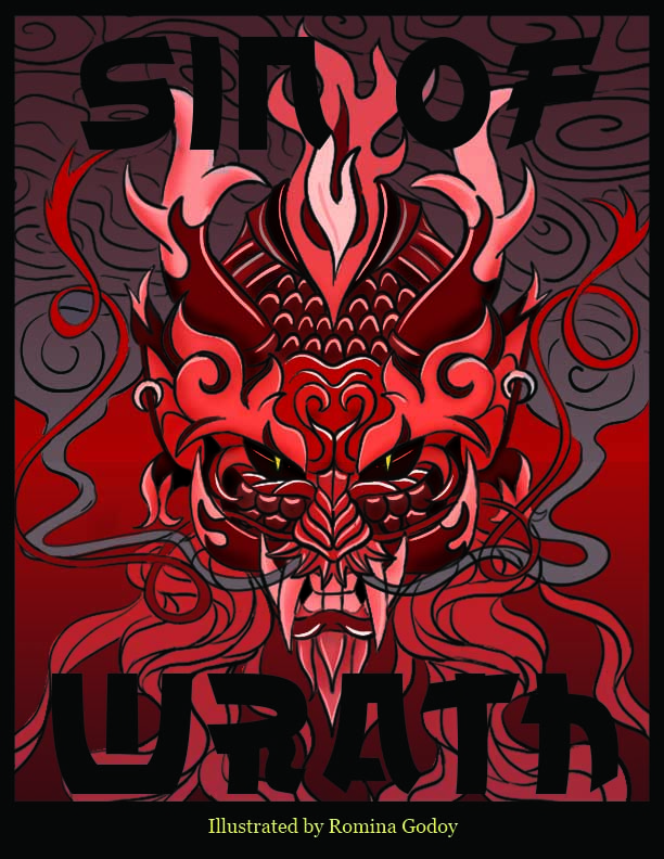
I ended up really liking what I made for this assignment. I feel that my illustration has a clear communication of what is supposed to be. This is Wrath, it is angry, it is ruthless, and it is scary. Professor Hall really help me with this project and was pleased with what I produced. I proudly share this illustration, and I do plan on making the other 6 sins in a similar format in the future.