I drew three separate pieces this week. Looking at a number of older advertisements from the 50s and 60s, I was inspired. I used Guinness as the topic because of the interesting and witty tag-lines as to why you should drink “this brand of alcohol”. Using a number of references, I crafted these without the tag-line.
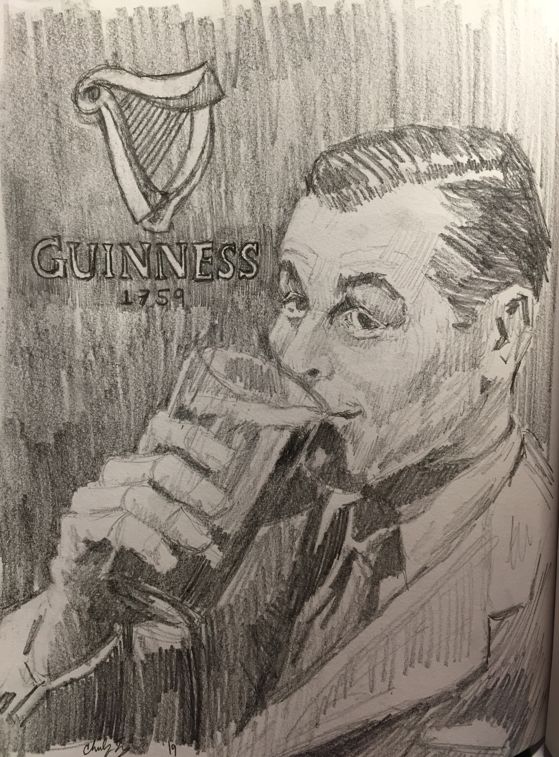
In each illustration, I wanted to make the viewer almost feel what the person is feeling… satisfaction, relaxation, and refreshed. By buying that product you too will experience this. By closing in more on the face and expression, you are immediately pulled in. 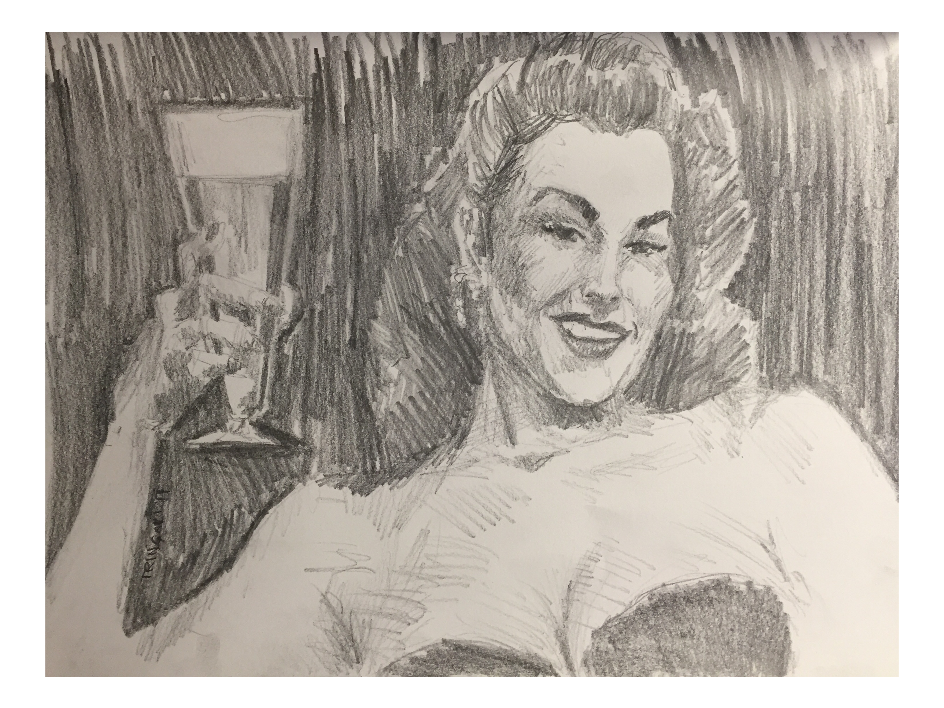 The line work was very hastily done and I focused especially on shadows and highlights. Shading in the background forced the figures into the foreground and made them more prominent if the background was left white. I left out the Guinness logo in the illustration with the woman because I did drew it before thinking of placement. In the future I will be finding the location of the type prior to drawing the piece.
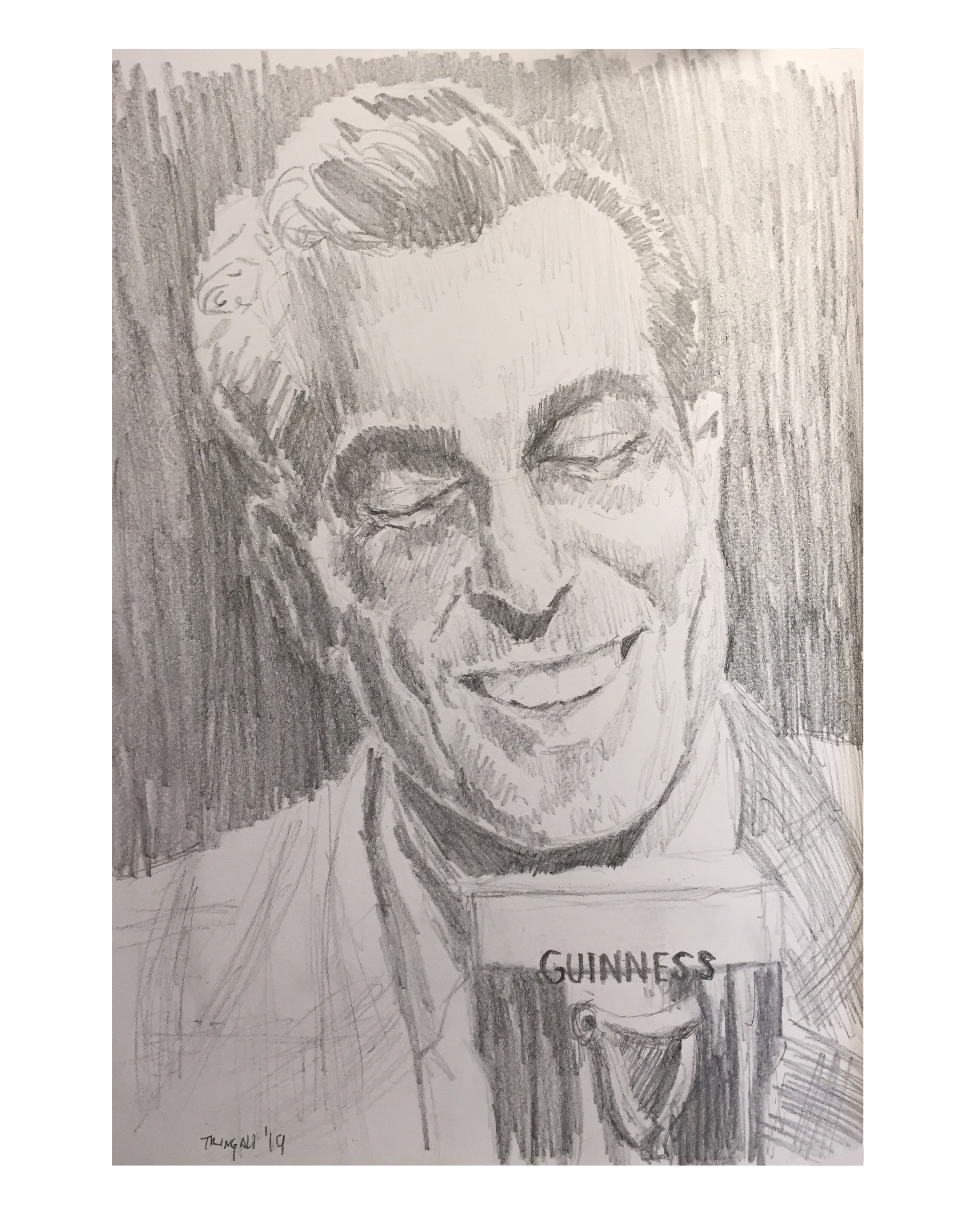
In this piece, I like how the illustration came out, but like the woman, I did not figure out the type until after. I was lucky that I could throw it on the glass, but I think it’s too small. A big solution that I have to figure out is to get better lighting when photographing my work. The reasoning as to why I will be doing this is because the shadows and reflections alter what the drawing actual looks like. Especially in the one above; the whole top of the piece is too light. It should be as dark as the shadows on the Guinness glass.
I am satisfied with these illustrations, and will push them further in the future… adding color and perfecting the roughness or perhaps keeping the hastiness.