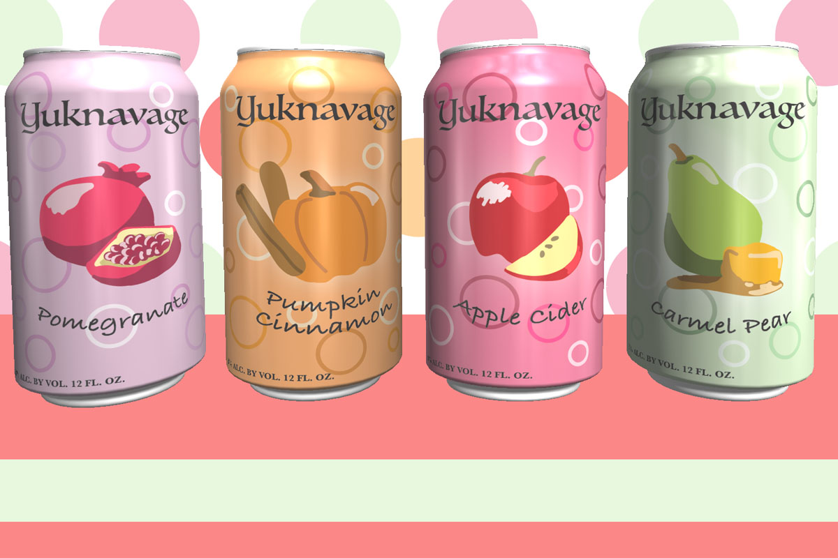
Over the past couple of weeks I had been working on a project for Computer Graphics I class. The goal of this project was to create a label for a soda can and also an advertisement for the can to be placed in. For my can idea I decided to go with margarita flavors because the combination of flavors I wanted to use would not work well as a soda.
I went with a fall theme of flavors consisting of pomegranate, caramel pear, apple cider, and pumpkin cinnamon. I started with the can design in Illustrator and used the paint tool to sketch out the fruit I would be putting on each can. I added circle rings and a solid color background, then I was ready to move on to the 3D portion of the project.
This part had to be done in Photoshop so I transferred my artwork over. Then I added the labels to each of the four cans and arranged them in a way that looked appealing. After I had put each of my labels on a can, it was time to tackle the advertisement background. What I had in mind was to make it simple using the same colors I had used on the actual cans. I reused the circles and made them solid instead of being a ring. I also added two solid bars at the bottom using the same colors that I used in the circles.
I really enjoyed this project and the process of making it look like an actual advertisement. It was a great way to think differently about how I was making my artwork. It also expanded my knowledge on the many uses of Photoshop!