Something that is a major part of my design process is gathering inspiration. I make some of my best pieces when I collect ideas, concept, or color from other great work. A lot of art is made from this constant flow of inspiration and sharing ideas. In History of Visual Communications we are ending the semester talking all about plagiarism in art and what a confusing topic it really is. In academia, it is quite black and white, you copied someone else’s words or writing without giving credit, you are done. In art, it is so much more vague.
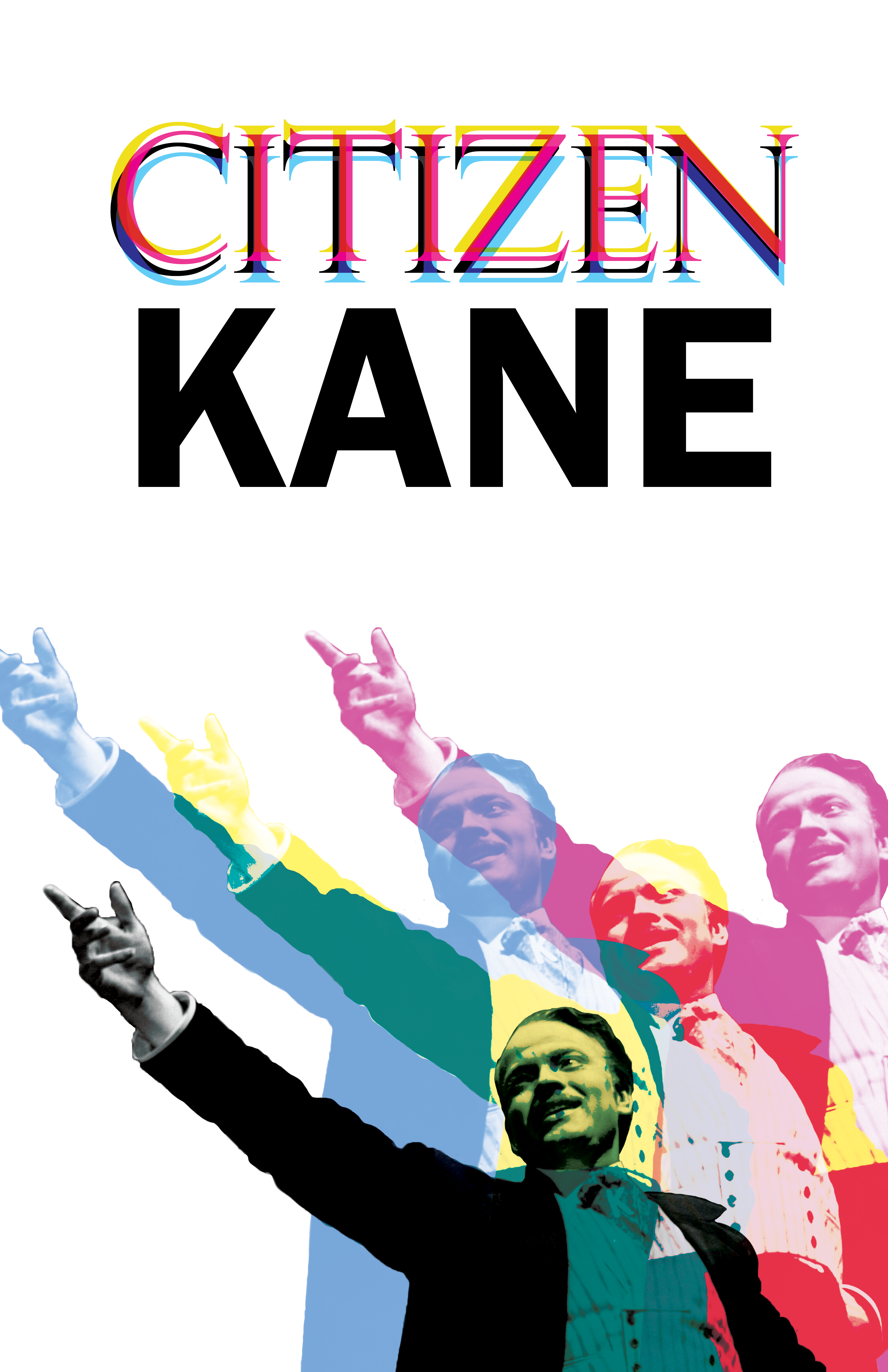
This class we are doing a final essay and a recreation of a past work, using this concept of homage vs plagiarism. The essay is its own thing, but I want to share what I am doing for the project. We could make any type of art using a piece or artist as inspiration and to play the line between copying and creating something new. I used Bradbury Thompson. He is well known for his overlapping bright colors and using old illustrations.


I wanted to take the concept of the overlapping colors, and the colors themselves and remake a movie poster that I already make for this class. Instead of old illustrations I chose an iconic still from the movie. I then in photoshop recolored and duplicated the figure, and chose different fonts. I wanted to also keep the white space, because I think that is essential to having the colors pop and contrast well.
Overall I think this was a fun piece to make. Going at it like a homage, or trying to show that I was inspired by a certain artist was different than the regular way of looking at making a design. Though for any commercial work this is something I don’t think I will utilize.