Hi, I am Annachiara Chacchia and I am so excited to be the new painting blogger for Where Creativity Works. For my first post I want to talk about the experiences I had in my first painting class, Painting I with Steven Alexander.
I was really excited to start my first painting class at the beginning of the semester, especially because I am a painting major. The first class was just a demo so I didn’t actually get to paint, but the rest of the year was no let down.
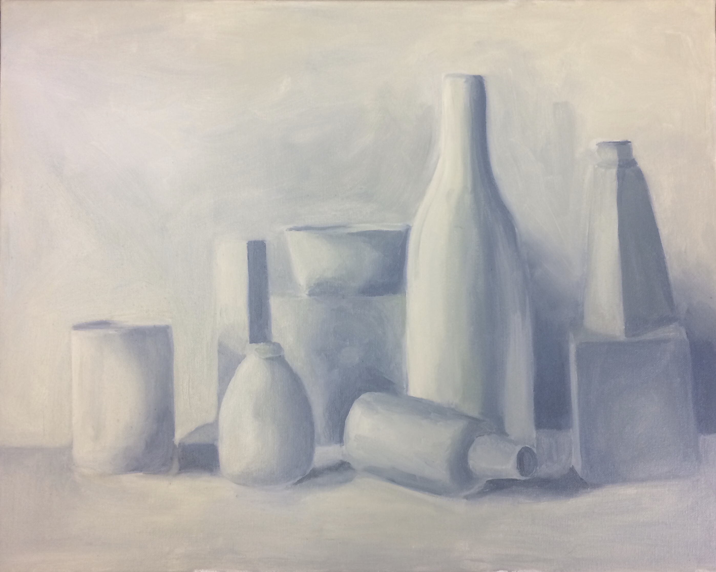
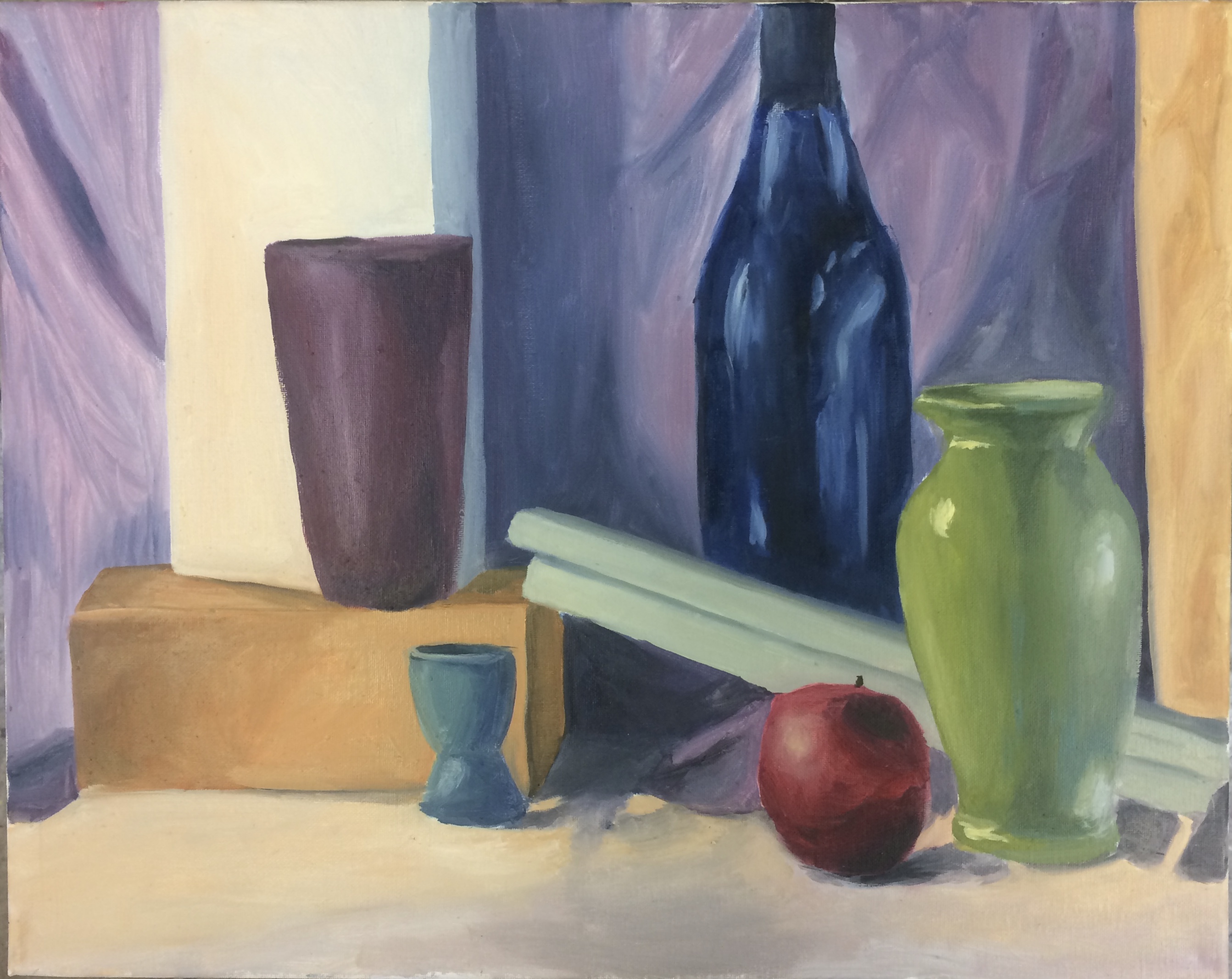
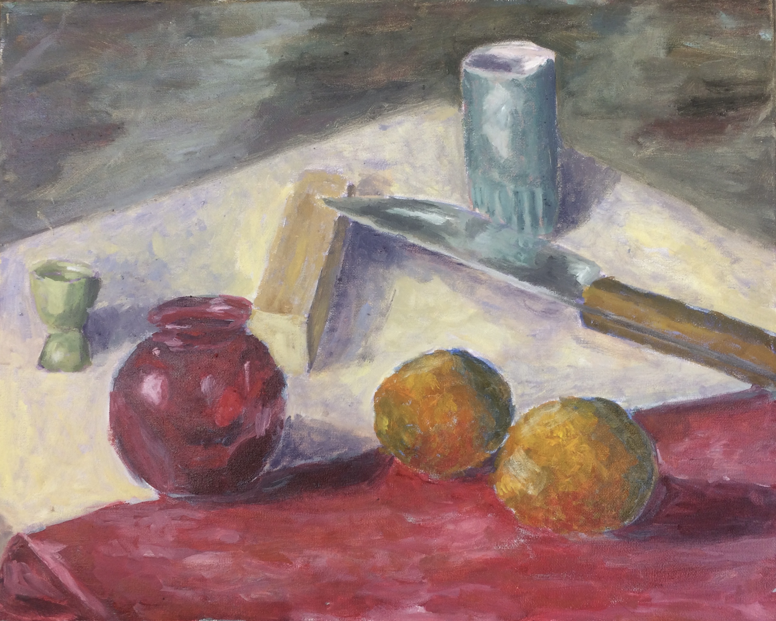
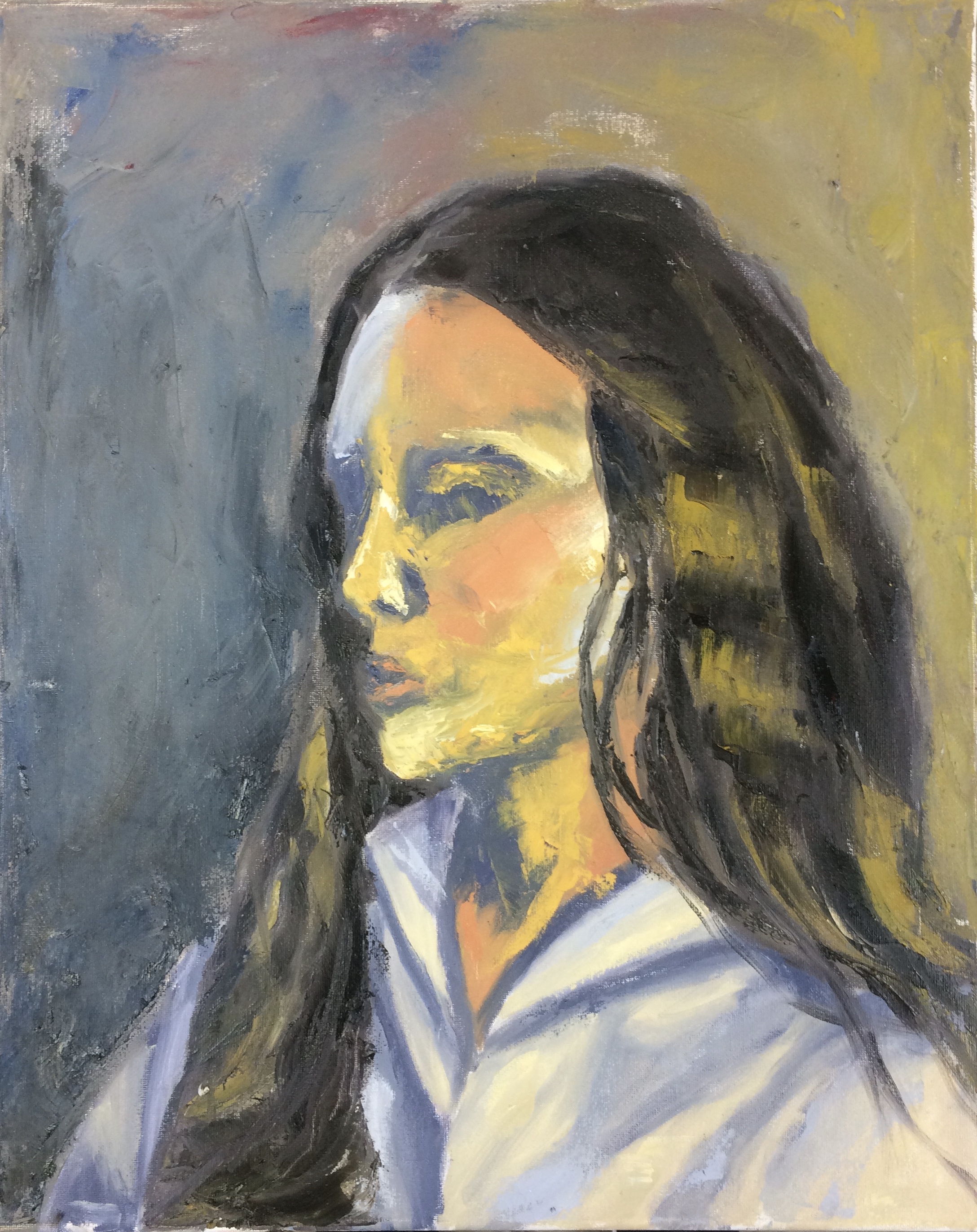
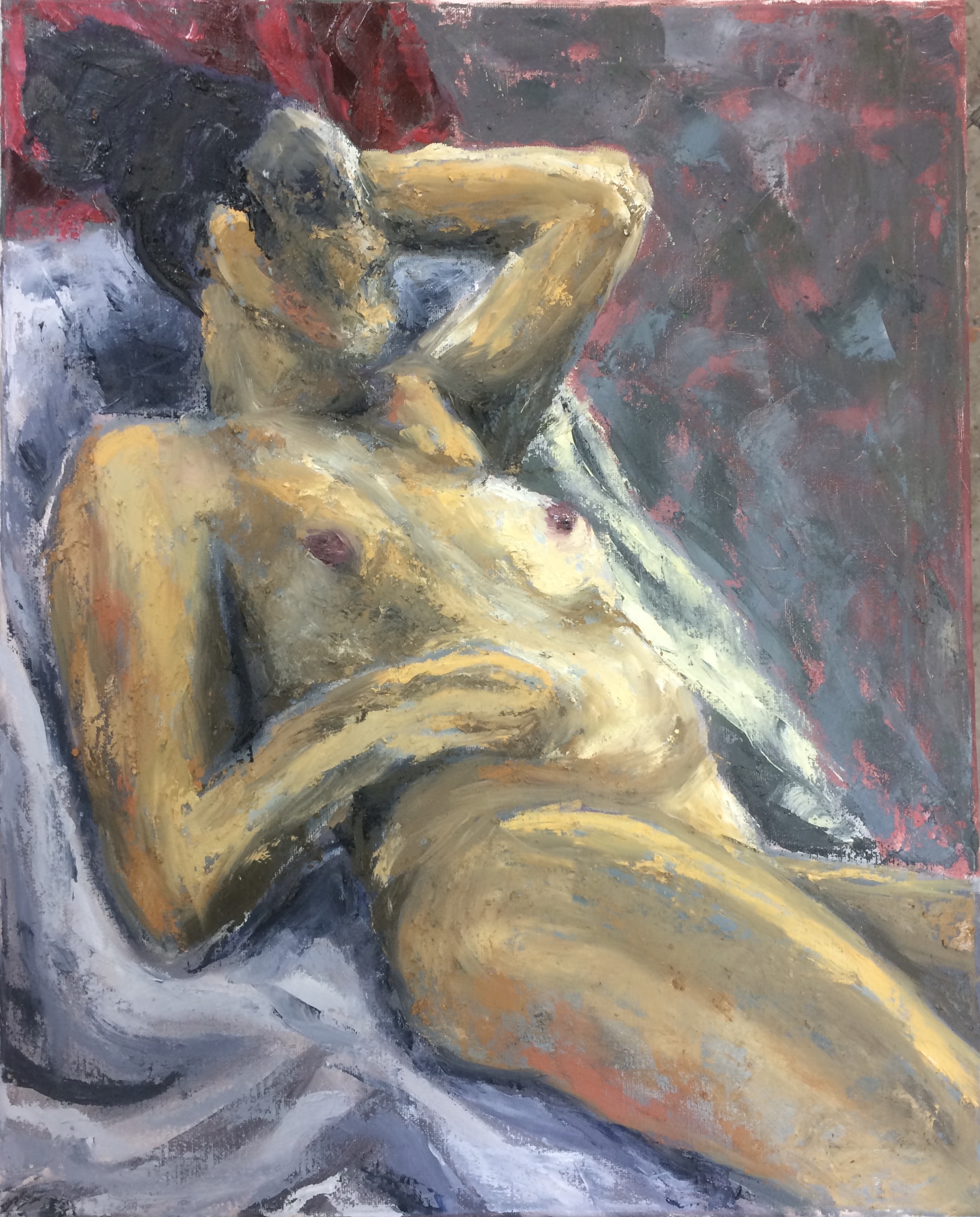
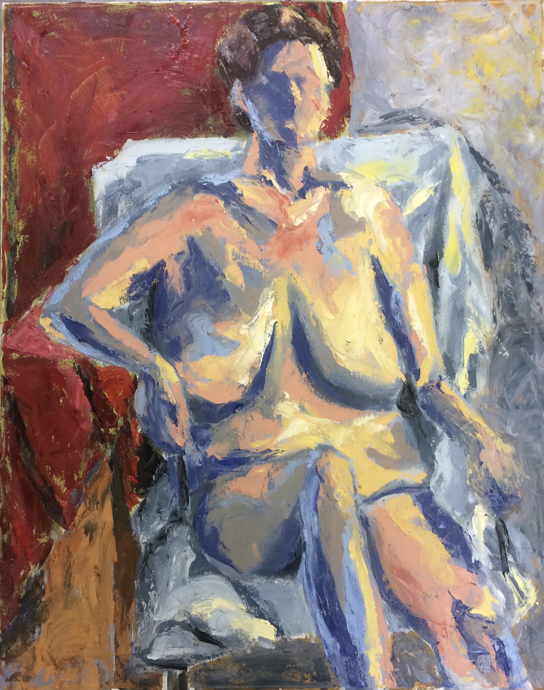
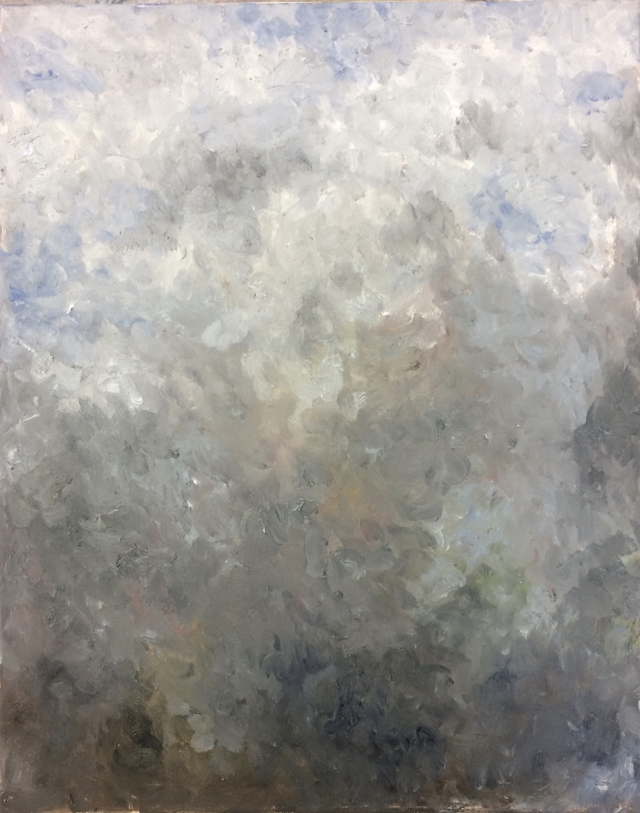
During the semester we worked exclusively with oil paints, painting a small variety of subjects. We started off with still life’s and then moved on to exterior/interior paintings. I really enjoyed doing the still life’s because that is predominately what I did in high school, so I was familiar with it. We soon moved on to figure and portrait paintings where a model would come in for 1-2 days and we had to do a quick oil sketch. After that we did some abstract paintings.

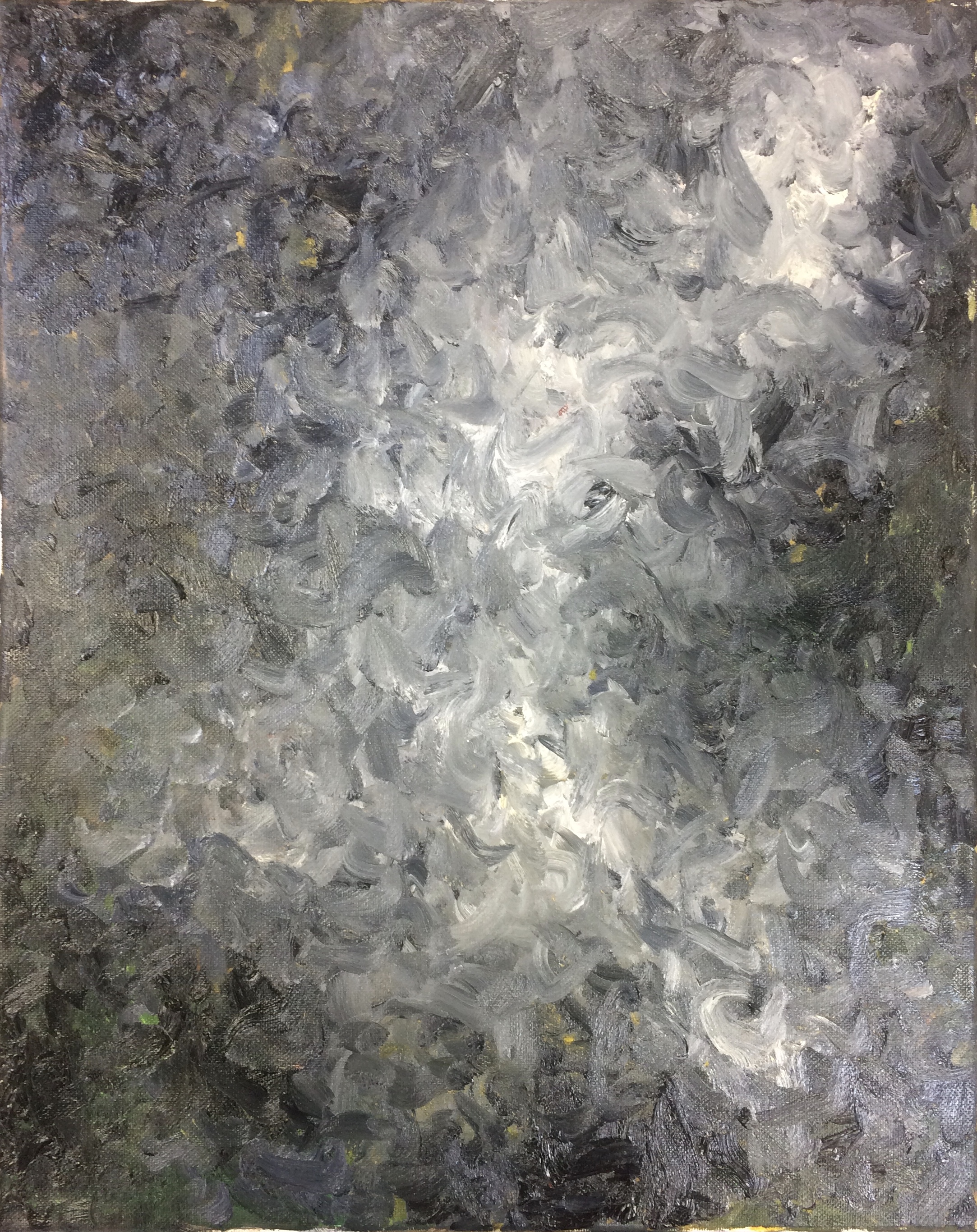
Working with oil paint was really interesting, I hadn’t had much experience with it before. Their paint takes a long time to dry as in that way you can make a lot of changes but that also means you have to wait a while to paint over it.
One of the thing that I found really interesting was the idea of an under painting. Painting the opposite color of what you see underneath is a great way to make your colors pop. For example if painting a red vase, green shades of paint would be applied underneath the local color which is the red that is seen. I used this for all of my paintings after I learned. I really liked the hint of color you see behind the visual color.
Painting I is required for most art majors as apart of their Foundation Year classes, but I would suggest it to anyone who is interested in art. You learn about composition and translating real life objects on to canvas with only paint. You can also play around with color, which is that part that I enjoyed the most.
Until next time, keep dreaming up colors.
There are specific colors that are opposite each other. When you want to use complementary colors to make colors pop, see if you can observe the specific complementary. One way to observe it is to stare: stare at the color that you want to enhance — just stare, and stare some more, and stare some more. Then look at a white wall (or white paper, etc.) and note what color you see. It’s easier to do at first if you isolate the color whose opposite you’re trying to find.
While it’s true that any green will make red more contrasty, certain specific greens for certain specific reds maximize the effect. Learning to see such effects also “rewires” your brain — the more that you practice seeing color specificity, the better you get at it. And it’s also really fun! The after image that you see is produced by the cells of the eye — it’s a sort of cognitive color! It’s related to cell excitation and fatigue.
https://www.verywellmind.com/what-is-an-afterimage-2795828
After images will help you learn to find and use opposite colors generally in all color groups red/green, yellow/violet and blue/orange.
Very interesting this after image idea that the website talked about. It’s something I will have to test and experiment with it my next paintings. This mixture of science and art makes me think about Georges Seurat’s A Sunday Afternoon on the Islan of La Grande Jatte, where he experimented with pointillism to put next to one another opposite vibrant colors to trick the eye into seeing an even brighter color. This of course didn’t turn out so well since the painting is not especially known for its vibrancy.
One cannot know for sure because he wrote little that was very specific about his art, but I suspect that Bonnard was super aware of color specificity as regards contrasts of various sorts. His paintings are very luminous. Don’t know if he was seeing after images, per se, but he was very color sensitive and a great experimenter with color.
Beautiful work! PBS has a series called Civilization on Tuesday night’s — and last night’s segment was a world history of art. I loved just about all the fabulous examples of art–primitive to modern–but my favorite piece shown brought together mind, motion, stillness and expectation – it was the stunning Japanese minimalist painting, “Cracked Ice.”
I really like seeing the progression of art history too! I’m considering minoring in it. I looked at the Japanese painting “cracked ice” – very nice line work and I think the tittle adds to it’s beauty, although personally I enjoy things with more color.