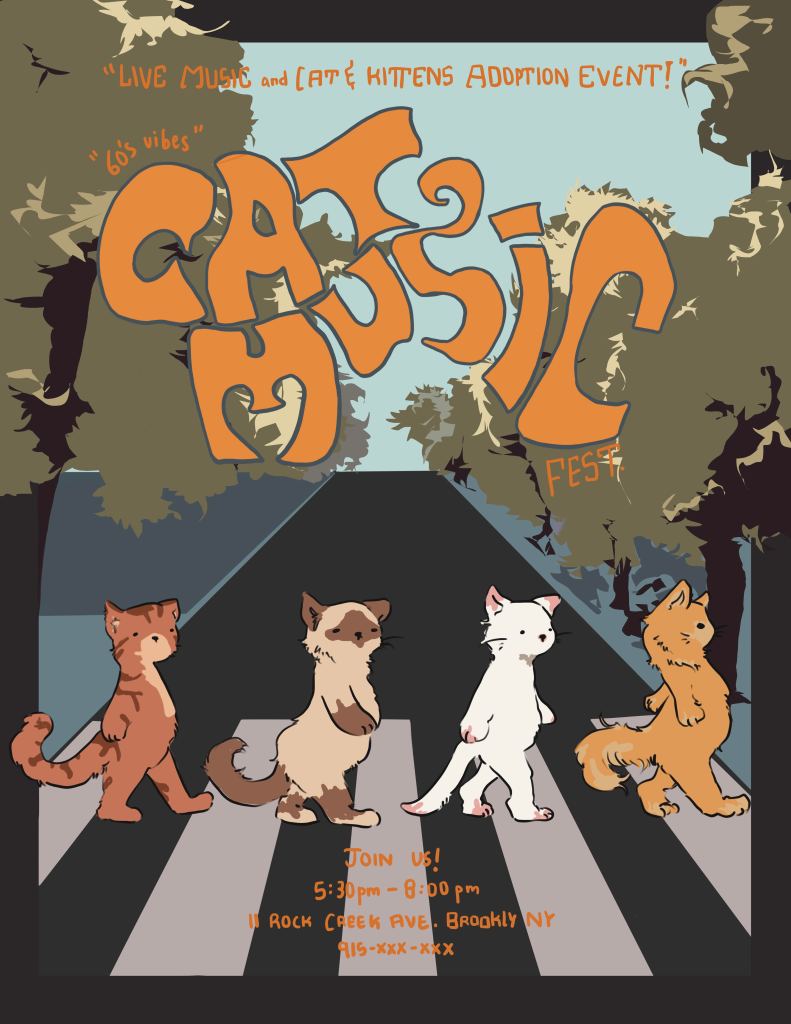
What makes an attractive illustration?
Undoubtedly, everyone would want to know the secret recipe for making the perfect, most eye-catching, attractive illustration. Well, in this blog, I will tell exactly— not that. Since I don’t know either. However, I will talk about a few things that can take your already awesome art a step higher by adding to your illustration.
I was inspired to write on this topic after our lecture in illustration class with Steven Brower. We had a project given to catch the attention of a New Yorker in the street. To make street handouts that would be taken and not ignored by people who pretend to be busy, avoiding the person handing them out.
Overall, This project really put our thinking to the test, whether we can think of an attractive handout in a short time and be creative with it. My head was empty till the last moment. I only knew I wanted to do something with the idea of cats cause who’s not gonna love cats? (If you say you don’t, then you should kindly recheck your opinions. 🙂
When My boyfriend, a New Yorker, suggested something minimalistic and related to beetles, the idea struck me immediately!
Our critique was quite different from the usual ones, and I must say it was fun and approached the artwork differently. We each walked past the artist handing out the street handout and then had to explain why or why not we took it.
Format
Everyone had great ideas, and we could all appreciate each other’s creativity. I especially loved the idea some had of having the handout to be a business card size. This leads to the topic of format.
The word is self-explainable; most art majors/ interested readers are likely familiar with it(including the rest of the following art terms). I realized afterward that my handout size might have been too big, which could easily be why a person waking down the street would turn it down. The idea of handling something smaller looks pretty reasonable for a scenario like that. It could easily be tucked away in a wallet or pocket. For many of my classmates, their reason for taking the business cards was the format of it.
attraction/ easy to catch attention
Well, to first even have the handout actually make a person stop and look, it had to be attractive. Many factors come into play to make art eye-catching, especially knowing the basic principles of design and how to use it to your advantage.
When they walk into a bookstore, many people are often led to the book with the most attractive cover. One that can’t help but be noticed and take a closer look upon. This proves how important it is for an art to be eye-catching.
To achieve this, there are a few things to keep in mind.
Vibrant, bold color choices
Our eyes are naturally drawn to bold colors, which explains why many even stated that they took the handout due to the color choices. This is also why logos are usually bold colors.
If you are more of a minimalist and like toned-down colors, then don’t worry. You don’t have to try to adapt saturated colors just for that reason. You can still add a minimum amount of vibrant color in a way that will look purposeful. Adding a string of brilliant red across the canvas will not only lead the viewer’s eyes to the places you want but also the contrast of toned-down colors to that bright red will easily make it one that everyone will be drawn to.
I often use this technique in my works since I get intimidated by intense color palettes, so I try to stay with less saturated colors but add a dominating color. This is an easy way to add contrast to my works
use of contrast
Contrast doesn’t just have to be with colors, but so many other things like the line weight, light/darkness, or even the scale. If there is a sea full of coffee beans, one can add a drop of bright candy to make a noticeable color contrast and the characteristics of each subject. The difference between bitterness and sweetness. Contrast can be easily achieved; I’m sure I don’t have to explain much about it.
One art I remember from the critique had a silhouette of a runner. The negative space surrounding the runner quickly drew my eye to the subject in the middle.
There are many more ways an art can be more eye-catching. As I mentioned before, I reference pop culture to evoke a feeling of familiarity within the passer. This is another way of finding your audience and getting them to relate to your work.
I think, above all, presentation really matters. This sums up everything I talked about and even more that I missed (I only wrote the few things discussed in class since this blog would get too long if i started summarizing everything). When your piece looks put together and well planned, people can notice the professionalism and value the art piece more. Using all these techniques to your liking enhances the chances of your art piece being noted by more. I’m sure many of these have been discussed in the class, but I hope at least a part of it was helpful to you!
Thank you for reading!
/ᐠ ̥ ̮ ̥ ᐟ\ฅ
