Intro
In case you missed my last post, I’m starting a mini series of small design-related projects to keep my creative juices flowing this summer. In my last post, I wrote about bullet journaling. This week, though, I decided to create some covers for some of my Spotify playlists. Right now, I just have placeholder photos I found on Pinterest, but I’ve wanted to personalize these covers for so long. I have over 60 different playlists depending on my mood or the artist I want to listen to, but today I’ll pick out three playlists to redesign the covers for.
About the Playlists
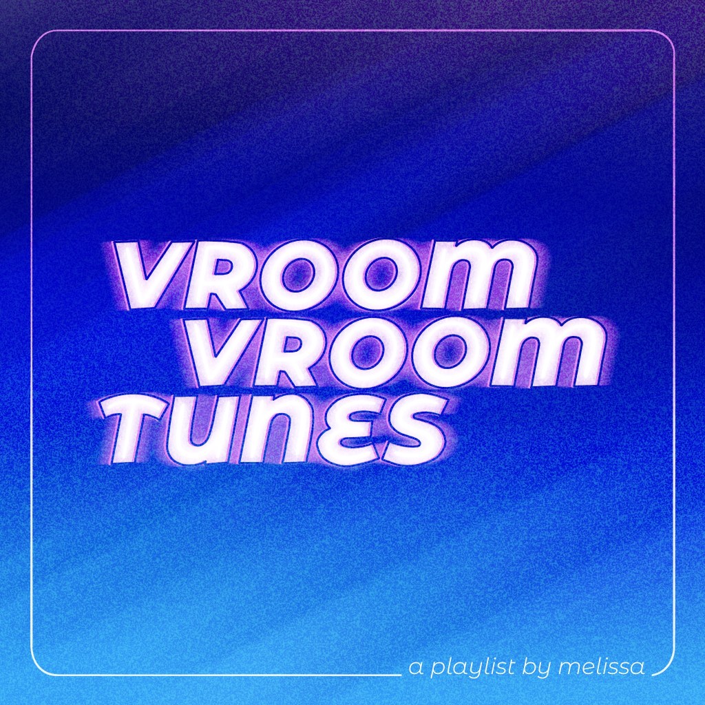
My first playlist, which is one of my go-to’s, is called “vroom vroom tunes.” In this playlist, you can find a bunch of my personal favorites, as well as other songs to fit any mood, perfect for singing (or screaming) along in the car. This playlist is over 24 hours long (and counting!), so I love listening to it whether I’m going on a long car ride or just driving to work.
My second playlist, “(home)sick mix,” is pretty self-explanatory. It’s a bit shorter, but it has songs that I’ll play that remind me of home when I’m at school and I miss it. A decent amount of these songs are kind of sad, but they’re so good when they’re all together in one place.
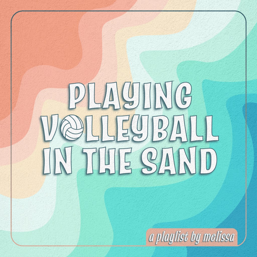
My third playlist is called “playing volleyball in the sand.” Again, pretty self-explanatory, but I’ll listen to this when I’m working out or playing volleyball. It has some of my favorite songs, along with other ones that get me motivated to play or work out. The songs are mostly fast-paced and upbeat to get me going during the day. My original playlist cover was a screenshot of that volleyball scene from the original “Top Gun” movie, but I decided to part with it and be more creative with a cover of my own. I also may or may not have looked up “songs about winning” to put in this playlist too…
The Process and Final Products
I decided to experiment with three different programs for each of the playlist covers, each relying heavily on typography and effects. I used the Procreate app on my iPad for “vroom vroom tunes,” Adobe Photoshop for “(home)sick mix,” and Adobe Illustrator for “playing volleyball in the sand.” Although there are some major differences between the programs, I wanted to create a consistent style for each cover, using similar blend modes, opacity settings, grain effects, and the same border and tagline. But, some design differences between these are the motion blur, the collage/blurry effect, and the flat color design.


As for the rest of my playlists, I think I’ll keep experimenting with these three programs to maintain this style for my other covers. I think Adobe Photoshop was the most fun for playing with effects and overlays, but Procreate was the most fun as far as creating hand-drawn typography. Hopefully, I’ll finish the other playlist covers when I get some more free time… this little project has definitely piqued my interest in album cover design!