Faculty Guest Blogger: Steven Brower
Steven Brower: One of the great things about the low residency “Get Your Masters with the Masters” MFA for designers and illustrators at Marywood University is the advent of the unexpected, not only among students but faculty as well. Case in point: there have been three typefaces, now commercially available, that have grown out of the program. One such example is “Lustig Elements”, created by MFA faculty Craig Welsh and the legendary designer Elaine Lustig Cohen.
I teach The History of Graphic Design at both the grad and undergrad level at Marywood. One of the major figures I lecture on extensively is mid-century designer Alvin Lustig. An example of his that I show is a typeface he designed in 1939, entitled “Euclid,” no doubt due to its modular, geometric mathematical components. All that existed of the face, however, was the name itself and the words “a new type”.
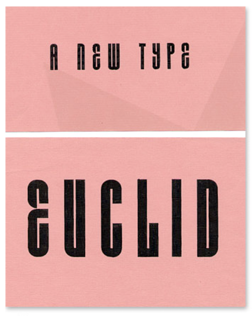
Euclid – A New Type
In 2008 Craig Welsh, of Go Welsh Design in Lancaster, PA, then an MFA student about to graduate, was inspired to contact Elaine Lustig Cohen, Alvin’s widow, and suggest collaborating on a comprehensive typeface based on the few existing characters of Euclid. The two of them teamed up, with the end result, “Lustig Elements”, a complete typeface available in both wood type (from Hamilton Wood Type in Two Rivers, Wisconsin) and digital (from p22.com). Craig has been teaching in the MFA since 2012 and when the wood version was finished he brought the face to Marywood for its inaugural printing during the summer program.
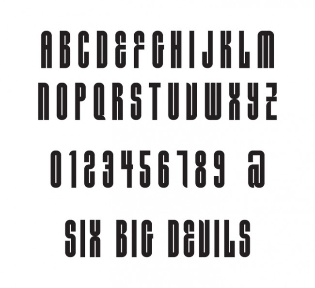
Lustig Elements
Another such instance is the face “Bouncing Checks Layered”, created by eminent designer Seymour Chwast of Push Pin Studios fame, and renown type designer Ray Cruz. Independently they have each designed scores of typefaces and while teaching in the program together they decided to collaborate. The result? A whimsical display typeface created with 4 font layers that you can customize with your own colors. It includes as part of the font forty humorous illustrations by Seymour.
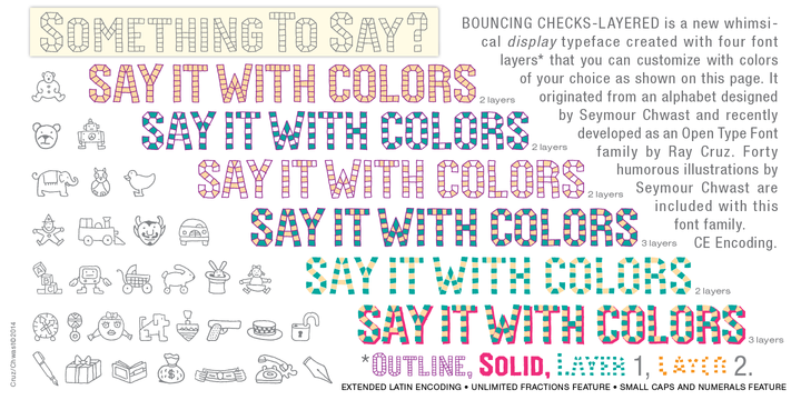
Bouncing Checks Typeface

Bouncing Checks Typeface
One of the unexpected results of their collaboration on my part: type envy. Unlike them, while I have dabbled in type design, I had never had a typeface produced. I approached Ray to see if he wanted to collaborate on one with me and was thrilled when he said yes.
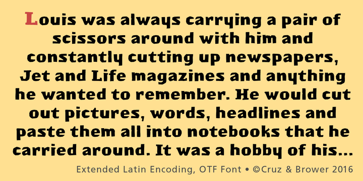
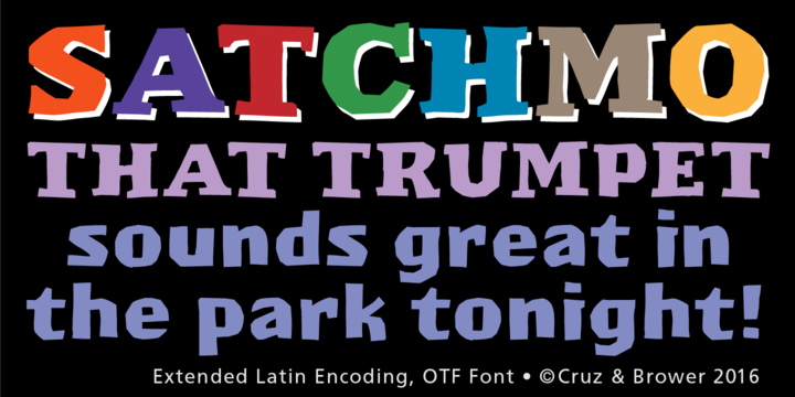
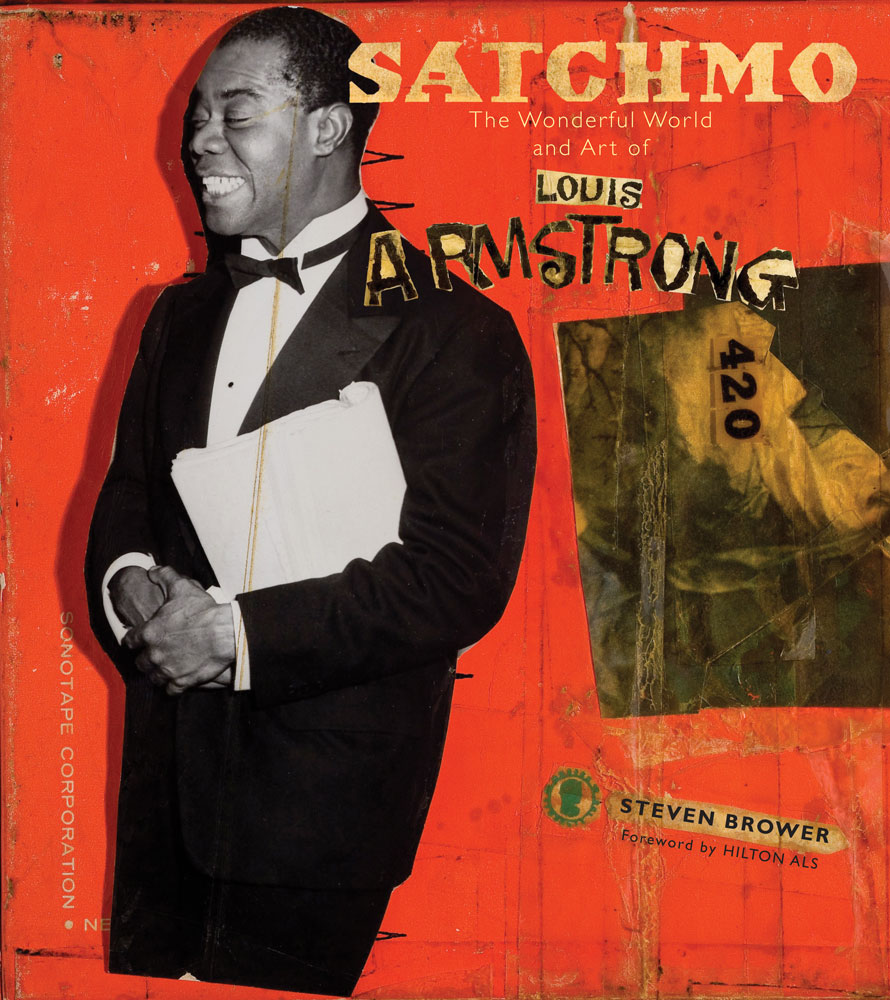 The face was one that I called “Satchmo”, so named for the subject of a book I had written and designed in 2009, on jazz great Louis Armstrong. I originally created the face on commission for a CD cover for the band Fishbone in the mid-90s but it was never used. When I was designing the book years later I realized it was the perfect font for the subject and expanded it, to utilize for the title and chapter openers. The type was completely cut out of black paper with an Xacto knife. When Ray told me to create a digital font I would need to create all the upper and lower case characters, punctuation and glyphs, I panicked. Could I still cut type out of paper after so many years? It wasn’t until Seymour said to me “just draw them” that I realized this was in the realm of possibility. Thanks to that advice and Ray’s amazing patience, the font was completed, maintaining its unique hand-cut quality. Ray then did all the heavy lifting, creating a complete Open Type font. Both “Bouncing Checks Layered” and “Satchmo” are available from myfonts.com.
Satchmo Typeface by Cruz & Brower 2016
Satchmo Typeface by Cruz & Brower 2016
I have decided if I design another typeface with Ray, we should call it “Marywood”.