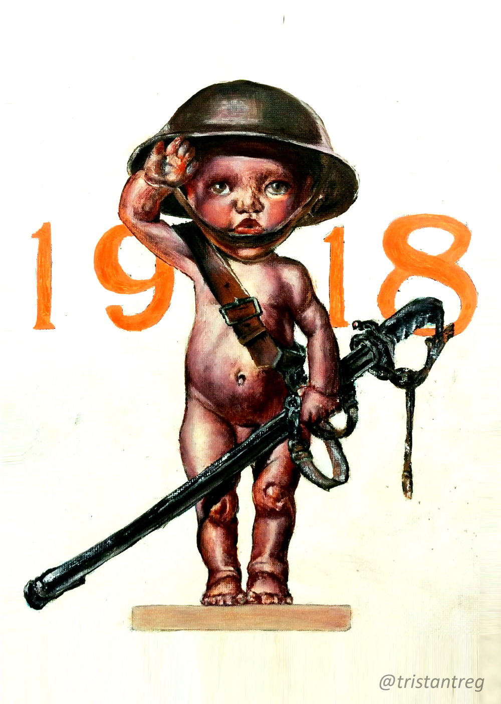
Welcome to another segment of, The Work In Progress. Inspired by J.C. Leyendecker, I work on my study titled, “1918 Baby.”
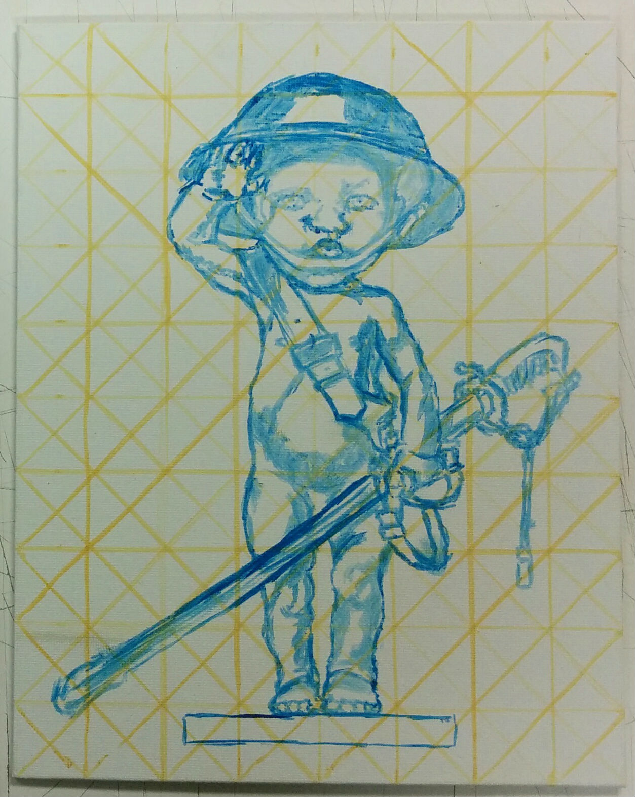
By learning about different techniques on how to accurately lay down an object on canvas, I get to experiment with what approach works best for me. Since I am studying Leyendecker’s technique, I used multiple light lines an inch apart with diagonals going through them (something I was dying to learn since I love technical drawing). Now I could very accurately draw the baby and objects without hesitation. When painting I have to think about the colors, even when laying down the outlines. The yellow lines would blend in with the yellow background, while the blue lines would give off a contrast to the oranges that I would use as highlights.
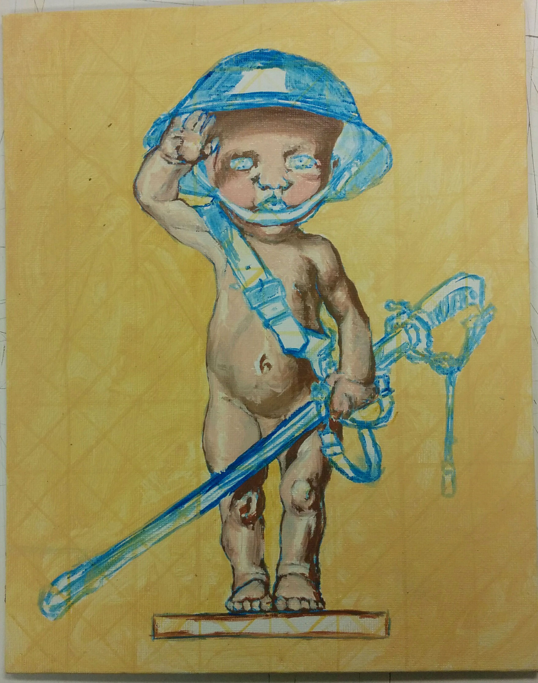
With any paintings I create, I have the average color or base color. This color added with black and white (with a few additional color tweaks) gives me my shadows and highlights. Just as a layout and toner, these colors help guide me to formulate what form or color needs to go where. It also gives a nice blend towards, the soon to be, overlapping color.
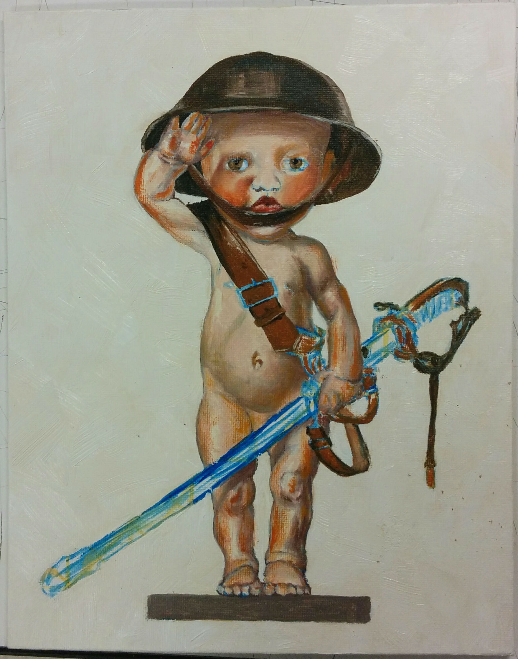
Much like in the background, I wanted to have a layer over it which gives off larger strokes. To do this I waited for the original layer of paint to dry, then I used large heavy strokes of white paint that you would see in pieces such as Van Gogh’s. Furthermore, I added base colors to other objects so that I could accurately compare the value and general color of the piece as a whole. To make the piece pop a bit more, I started to add in orange highlights to contrast with the blue outline which I originally talked about. This portion of the painting sequence was the weirdest part to say the least. My younger self would definitely stop painting at this point by just looking at the state of the bland figure.
I pressed on though by looking for corrections that could be made. Now that I’m educated on why I feel so disgusted by my piece, I can pinpoint alternatives to help make it more appealing. So, I started with the head. It needed darker shadows, eyelashes, and touches of my style which include using the palette knife. This added a “war torn” element to the character which is exactly what I needed to give more emotion to the piece. Using a deep dark red gives a musty, dirty, blood-like entity to the figure, especially with the theme of war.

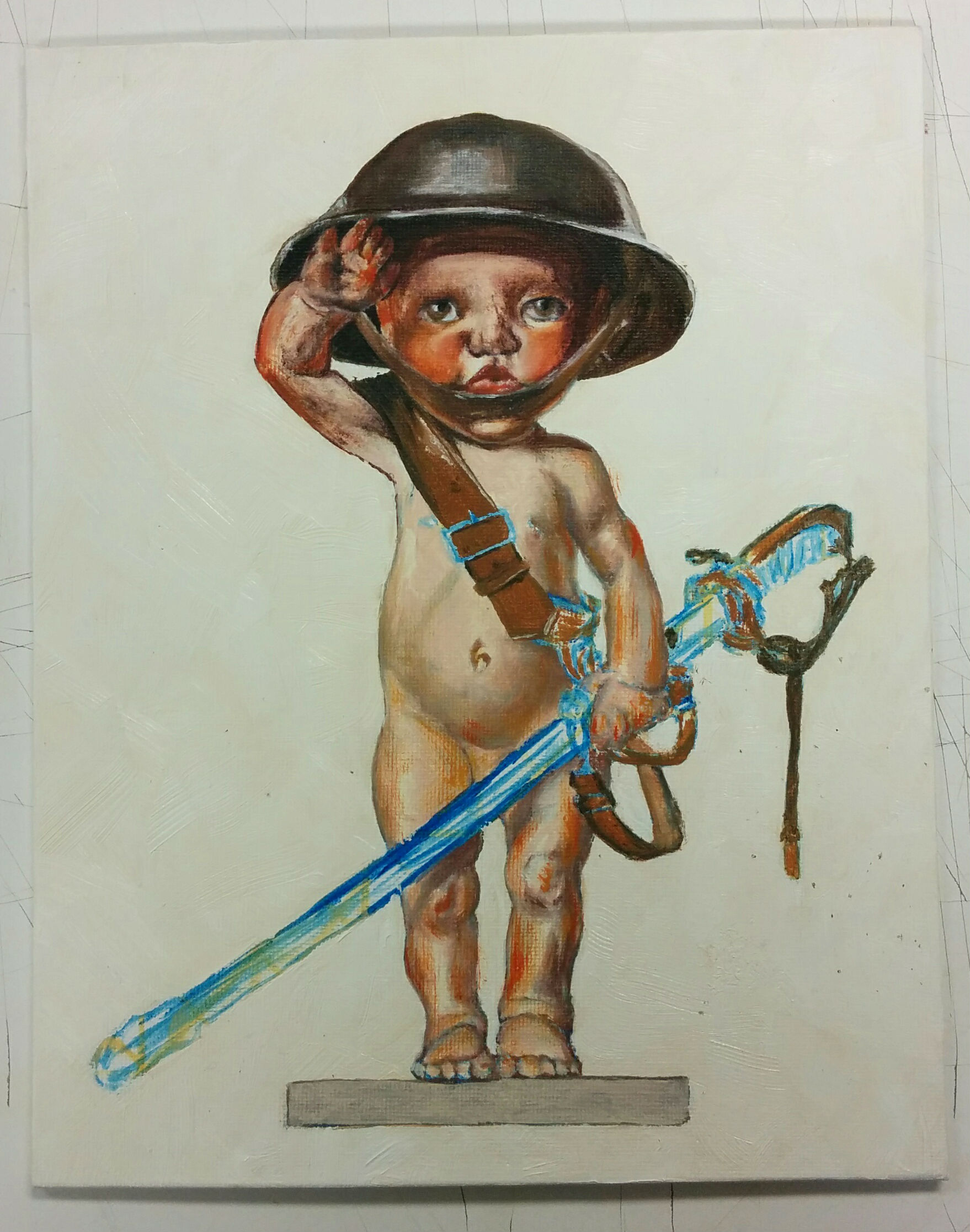
This idea of a war-torn baby appealed more and more to me. The bright orange highlights would give off a sheen which would be covered by the musty purple and dark red. This incorporates with my style in that I think more about the emotions of the piece alongside the composition. I think about this more because I believe that’s what art truly is about. If it can’t release an emotional response, then it may not be considered art at all. That’s why people have different feelings towards different pieces. Whether it be an emotional response from childhood, or subliminally you feel compassion, art is mainly about the emotion. The darker feel of the baby with hints of light along with a background of white and bright orange would have a nice pop to the end product.


As I wrap up, I start to look at the piece from afar. I enjoy dark shadows, which I can see more of in the sword, strap/harness, helmet, and general contours. “1918” also seemed a bit weak, so I went over it with a deeper orange. I made sure that the lettering was incorporated within the piece (not only as a background), so I lightly added more orange highlights to the objects. As you can see with the comparisons above, even the most subtle changes can give off a bigger impact.
I have learned a lot from many artists over the years, but as I finish this study I remind myself of my own style and what I go through to give off my version of an emotional response. By experimenting with different techniques and forms, I get to mold myself more and more into the professional artist I’ve become.
Please leave a comment below if you have any critiques or comments, or simply just LIKE and SHARE!
For more, visit Tristan’s Website