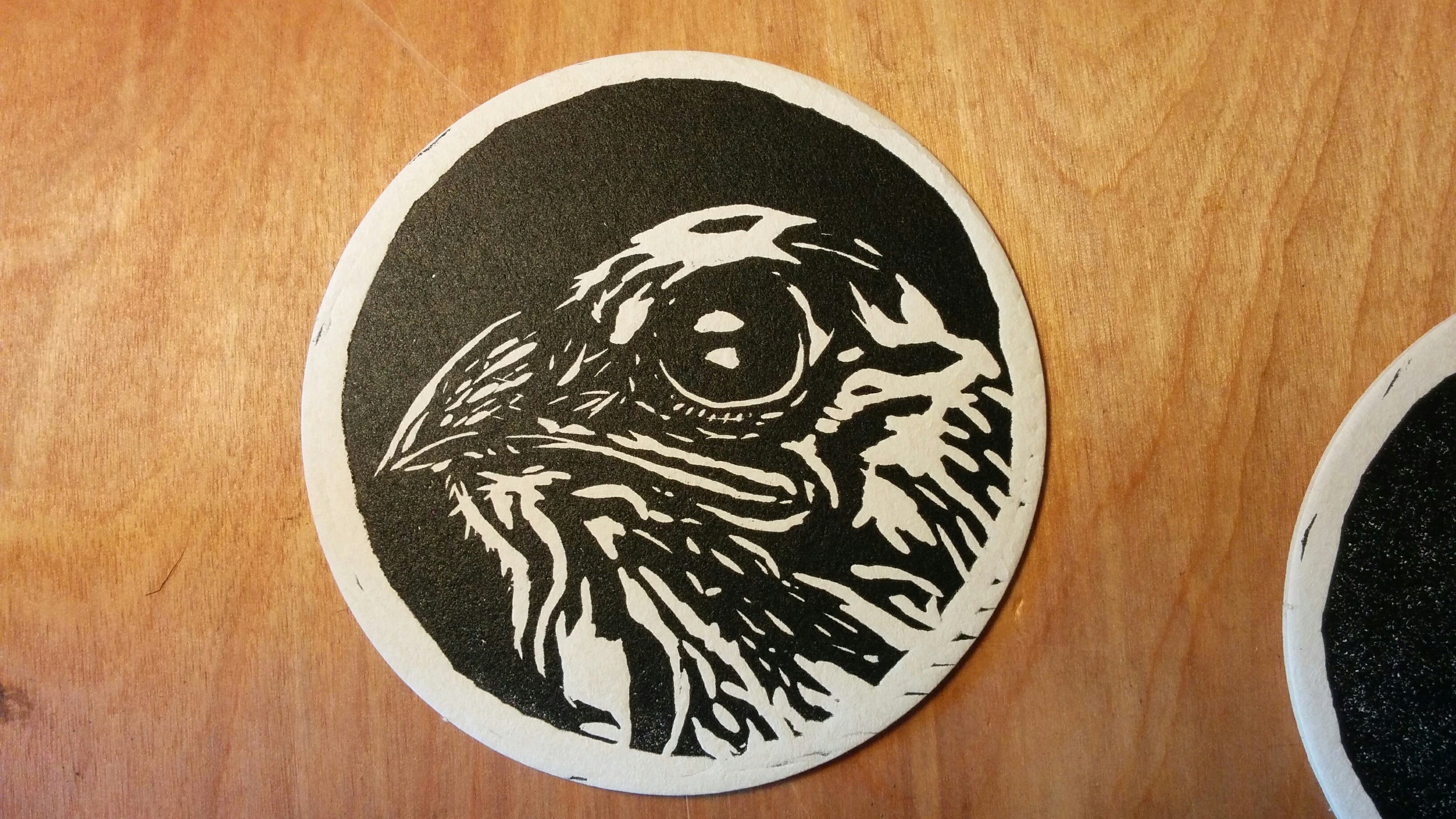
Welcome to another segment of, The Work In Progress. For a vending position, I decided to create a “Baby Bird Print” which would be used to create coasters and buttons.
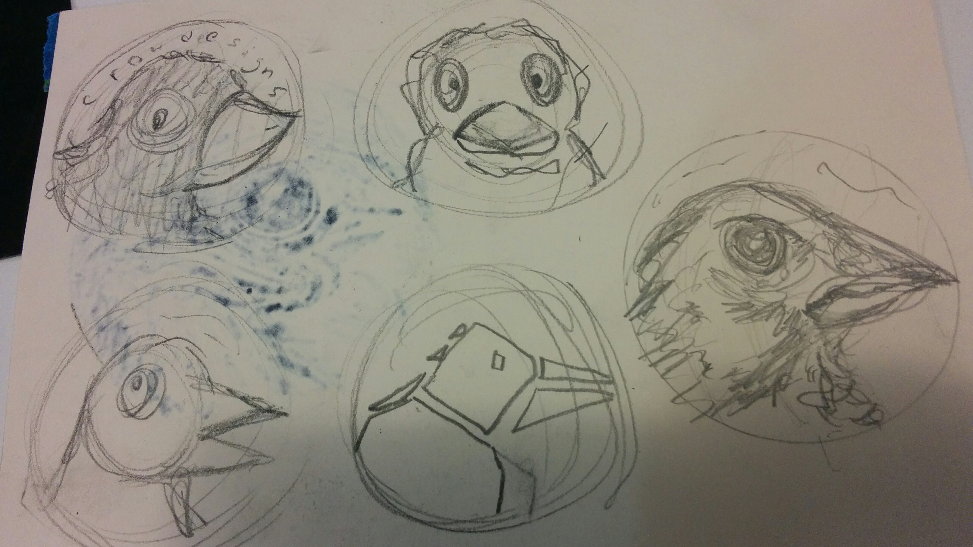
Typically I have an image in my head of what I would like my design to look like. Drawing baby birds was never my forte, so I had to do some research. After a while, I started sketching different styles and seeing which of them would look best on merchandise. During that time I was partnered with Crow Designs, so I experimented with placing their brand name along the circumference of the design. Not only would it be very difficult to either cut the letters out or align the curved type well enough, but it didn’t seem necessary for the overall design. The detail that I wanted to put into the bird was enough in itself.
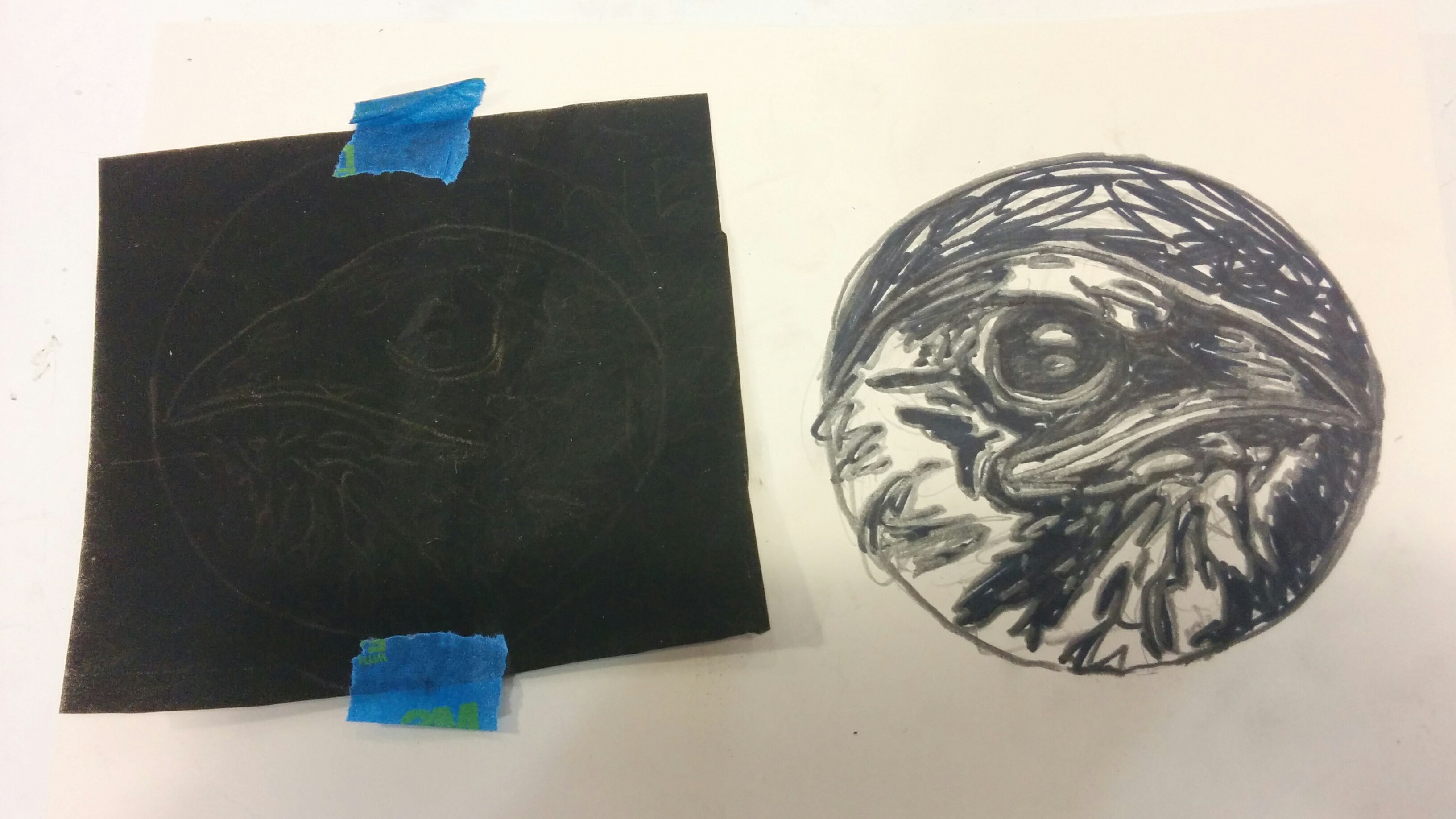
After choosing my design, I sketched it out once more to be certain what the bird would look like, and to draw in the areas which I would cut away (the white parts). To transfer my design onto the lino, I used a carbon print to trace the original onto the block. This leaves a noticeable blue line that I can cut along.
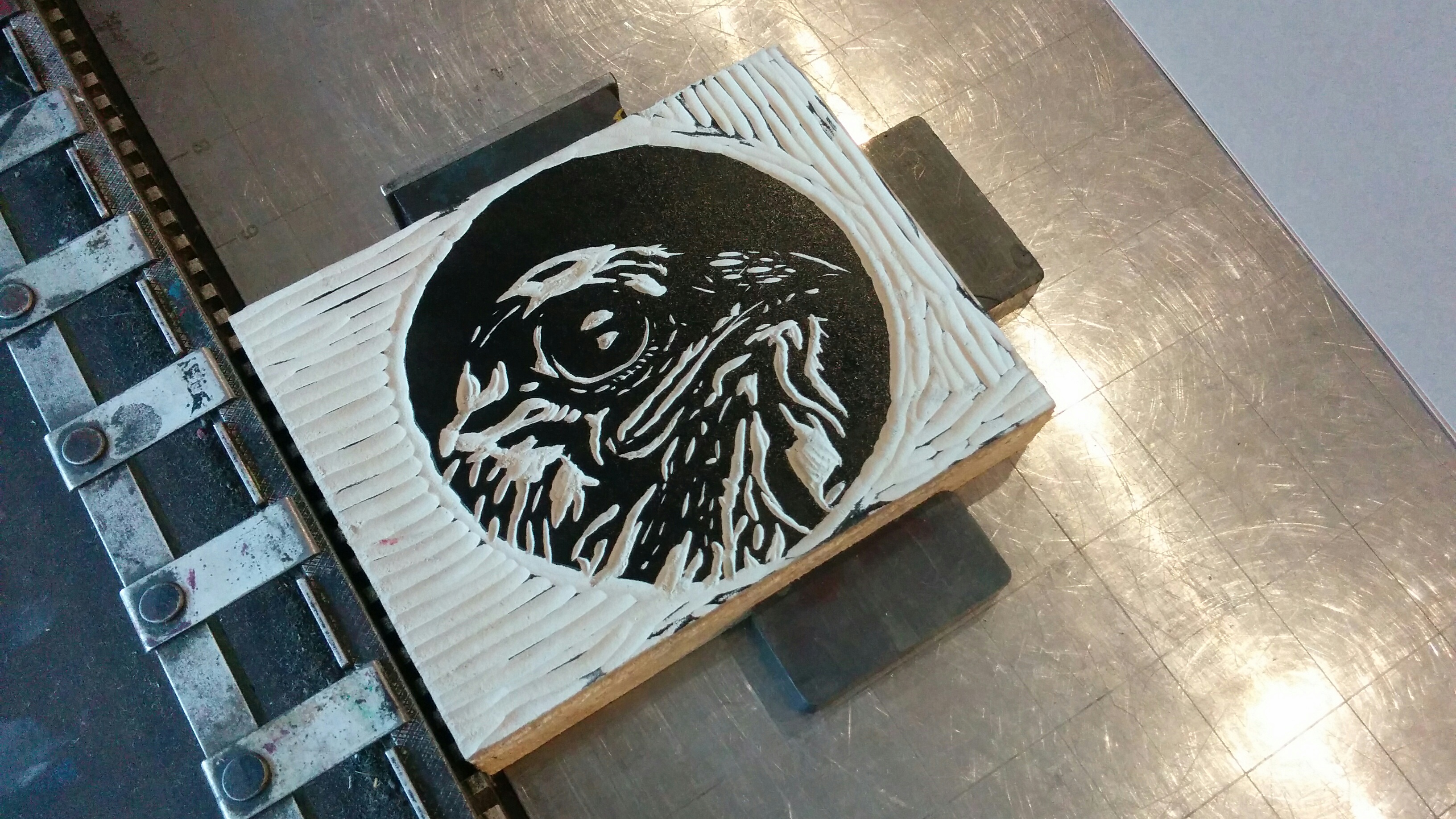
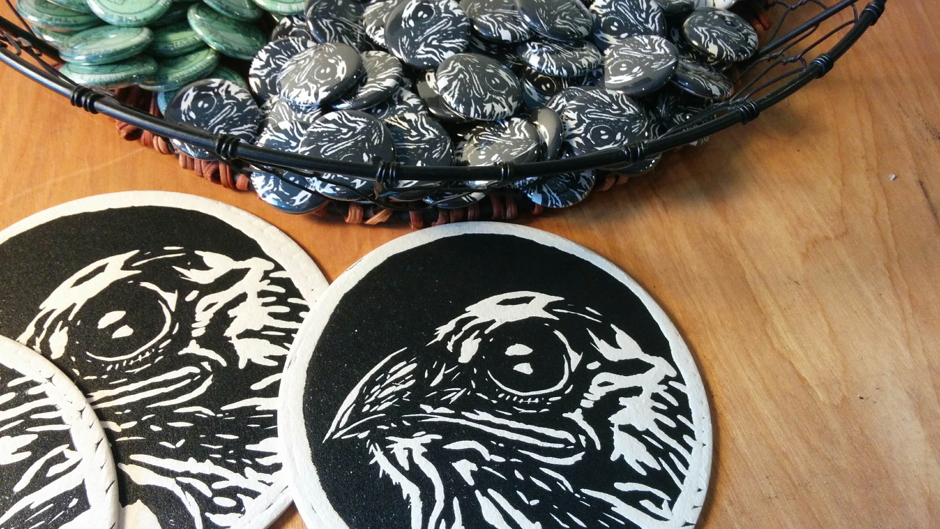
After cutting the lino, I got to print my design. Since I was still in a type workshop, everything had to be type high, which is the international height that the type or blocks have to be from the bottom to the top, or foot to the face (0.918 inches). An even coat of ink was rolled onto the lino, to which I could endlessly print my design. After making sure that the block was steady (by putting magnets around it), I rolled the press over the coaster to give me a solid black print.
The overall design was interesting, especially in contrast to the less detailed merchandise that would be sold at the vending position. It would give more variety to the customers depending on their tastes. I didn’t stop at making coasters though. I created buttons of my design. Only after a short amount of time working, I soon realized that people love buttons.
In the end, this process opened my eyes more into the business side of designing, as well as towards a sub-section of printmaking through a typographers mind. With the limited palette that typography holds, it was nice that I found a way to express my illustrative style through printmaking.
Please leave a comment below if you have any critiques or comments, or simply just LIKE and SHARE!