Welcome to another segment of, The Work In Progress. With several techniques being used on my newest collaged matrix, I decided to incorporate a mix of different styles in my, “Color Collagraph.”
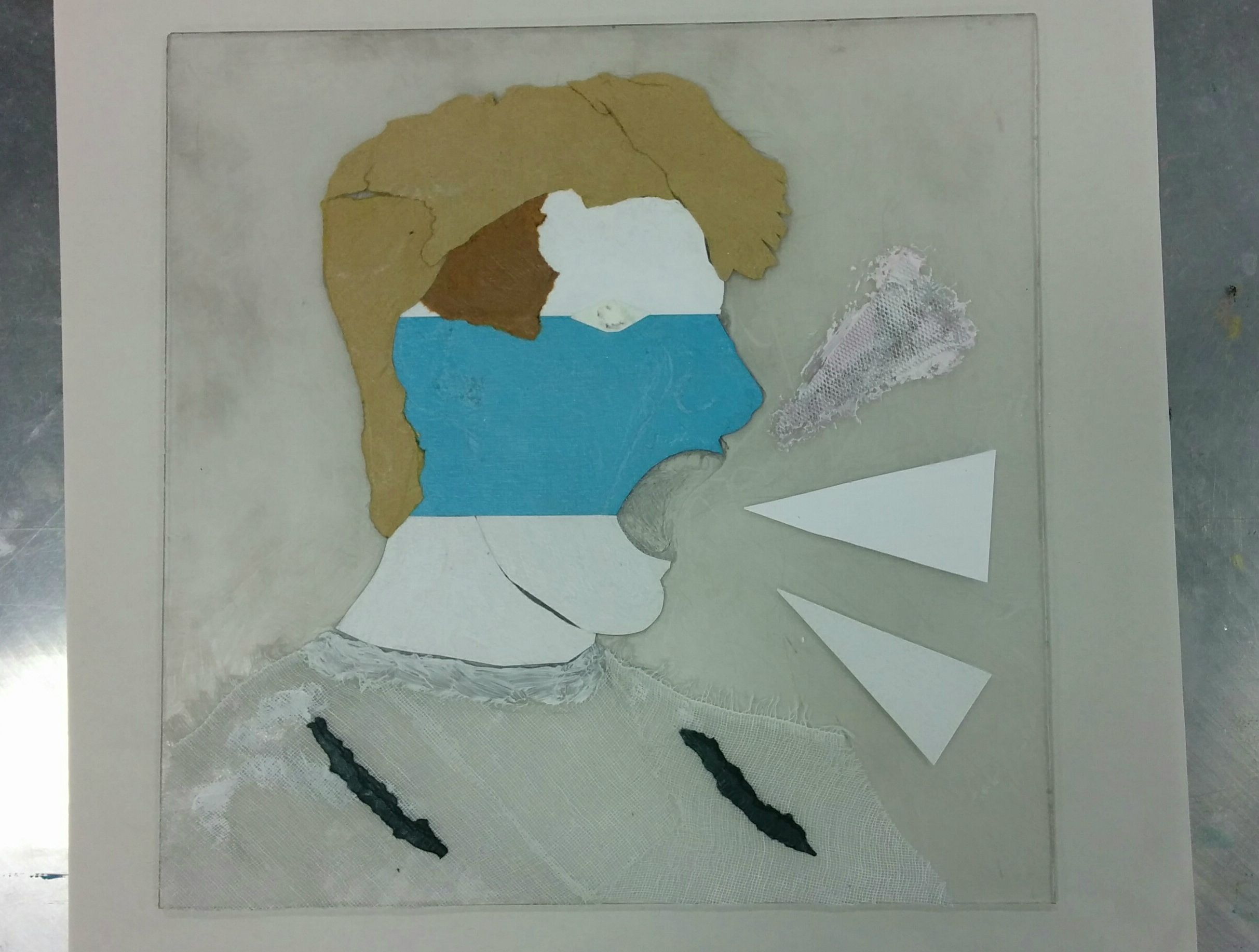
As I discussed before in my relief collagraph article, the purpose of this project was to experiment with my strengths and weaknesses in the abstract realm. I’m not much of a surrealist, constructivist, or cubist, but being able to work around that was just what I was trying to achieve. Above, you can see my finished matrix with a variety of materials pasted into it, including tarlatan, arches paper, construction paper, cardboard, Matt board, sandpaper, and modeling paste. I used different textures to show contrast in parts of the figure. You can mainly see this in the shirt, face, and hair. For the face, it was divided into three sections with three different materials: arches paper, construction paper, and Matt board. All of these papers have a similar touch, but are slightly different, giving the subconscious feeling that I wanted to enunciate. While the eye is the main focal point, I needed direction through the composition, so I added a rectangular shape parallel to the eye. Other parts that help support the movement of the composition include the black construction paper on the shirt, the three triangle’s positions, and the cheekbone’s distinct line.
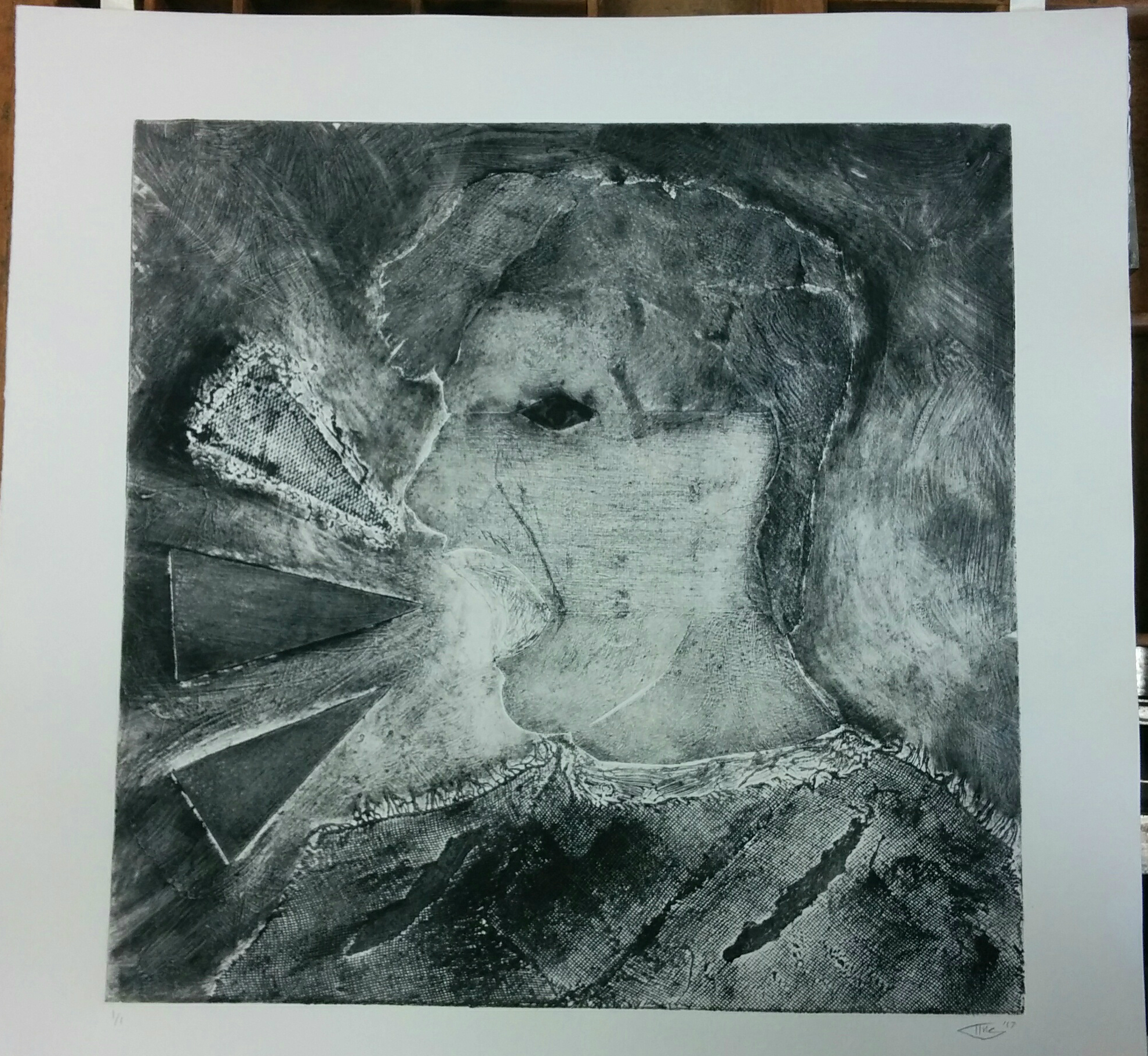
In the image above, you can see what the matrix would look like when inked in full intaglio. I needed to use its flaws and advantages to help my case in completing a final piece. While I don’t like this proof completely, it has its high points. Some of the parts that I’ll use in my final proof include the three triangles and their values surrounding them, the slight hint of the drypoint in the mouth, the white areas around the mouth, parts of the shirt, and the eye if it had less ink within it.
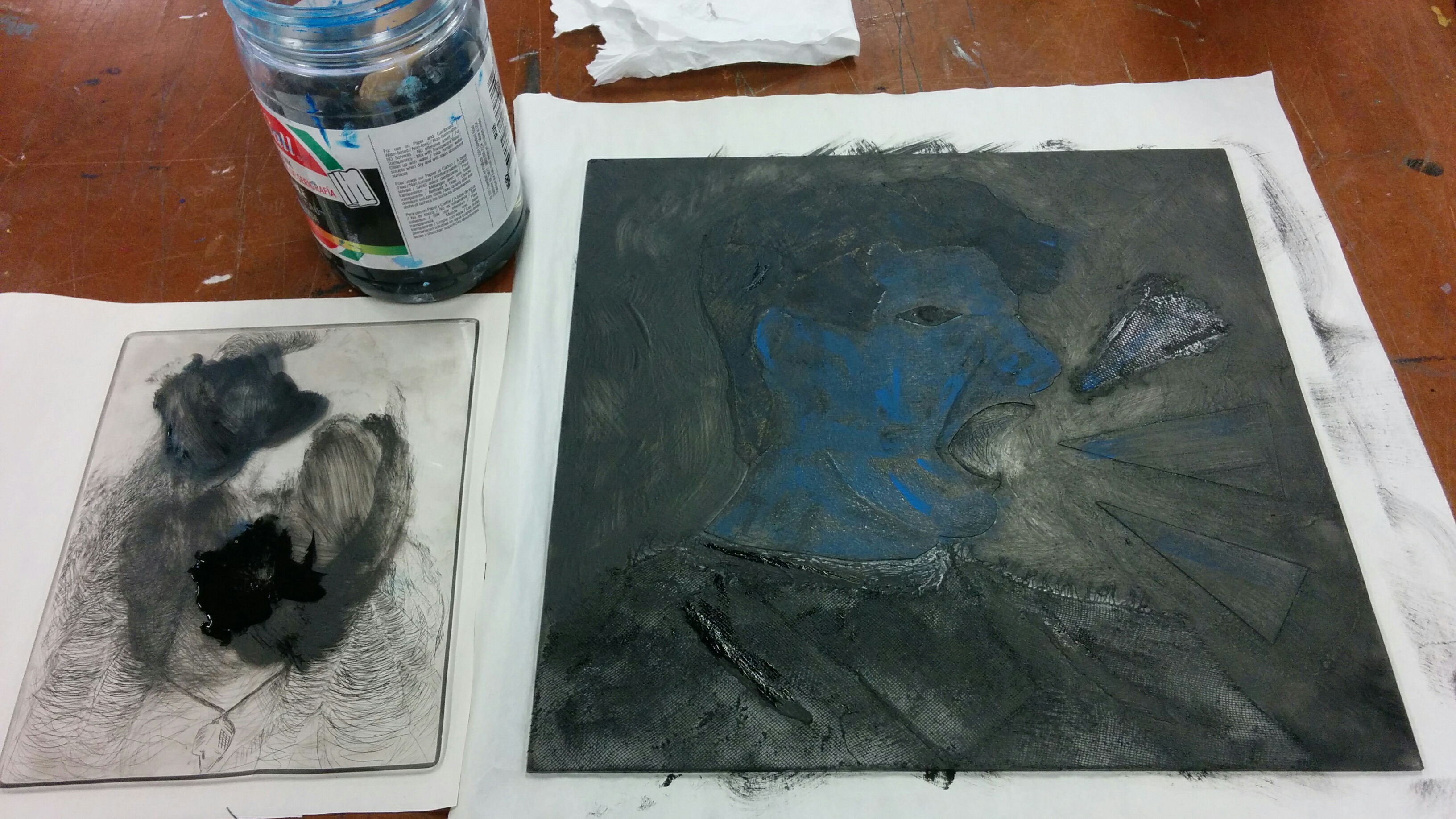
Based off of my original relief and intaglio print, I had to figure out what certain parts of the collagraph needed to be inked. This also implies what techniques needed to be used. While the relief process wasn’t bad at all, there were some parts that failed to show its full potential (for example, the drypoint in the mouth, and the depth in the hair). The relief print gave great textures in the hair and the background, but this time I would be more loose with the brayer when inking.
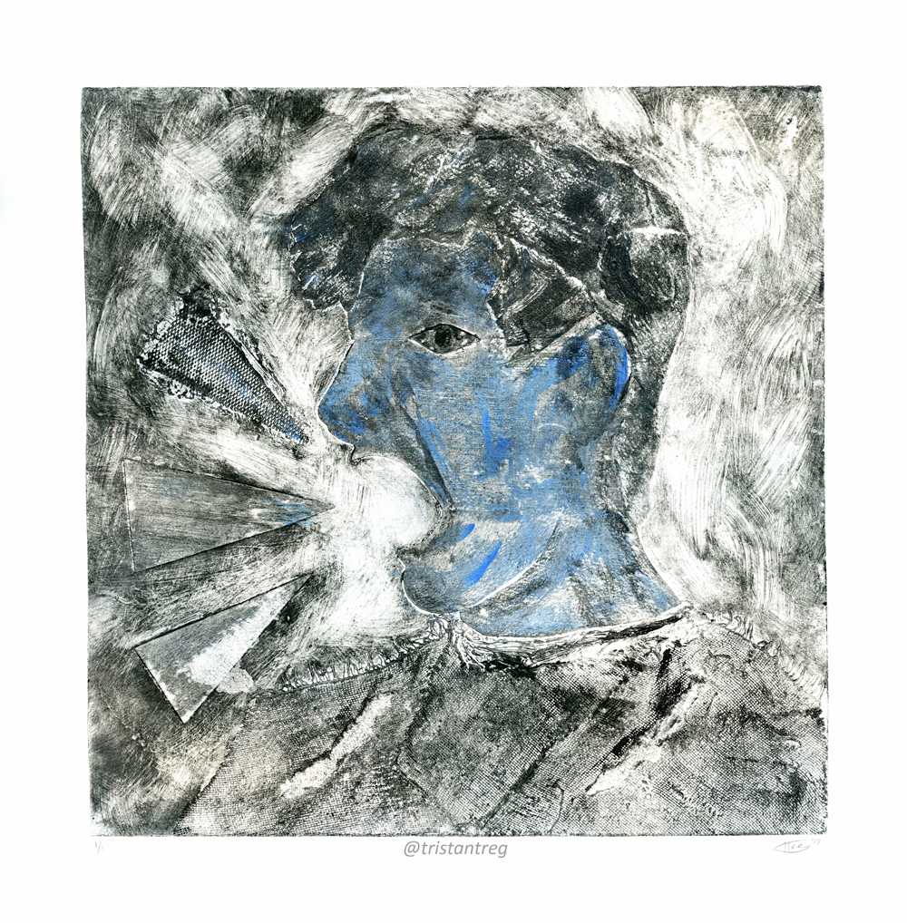
The final colored proof came out great. While some parts could have been darker, I’m impressed that my expressionistic style would be able to make an abstract piece that actually appeals to me. The hues of blue are vivid and subtle, which adds to the piece’s ambiguity and interest. There’s a lot movement, which can be related back to my typical style, as well as dimension. The right amount of white space gives form to the figure, and the textures speak numbers to the viewer to the extent that it could be analyzed even further on.
In the past, I have always disliked my own abstract work, but for once I can cross off that stereotype. While this was a great experience to go through, I will have to wait and see when I can do another collagraph like this again.
Please leave a comment below if you have any critiques or comments, or simply just LIKE and SHARE!