Welcome to another segment of, The Work In Progress. My love for gaming, education, and art led me to have the desire to create an infographic based on “The Gaming Industry.”
After sketching several ideas for the layout of my infographic, I decided to choose one which would resemble stop lights: red, yellow, and green. From my idea, I would have three characters merge together, each having their unique color. Before all the excitement of drawing out the characters came the tedious part of the job; I had to collect all the data which I was going to use in my infographic. It needed to be filling enough to actually give its purpose, but not too overbearing where the illustrations seem meaningless. I wrote down the sections which I was going to present: strategy, FPS, and adventure.
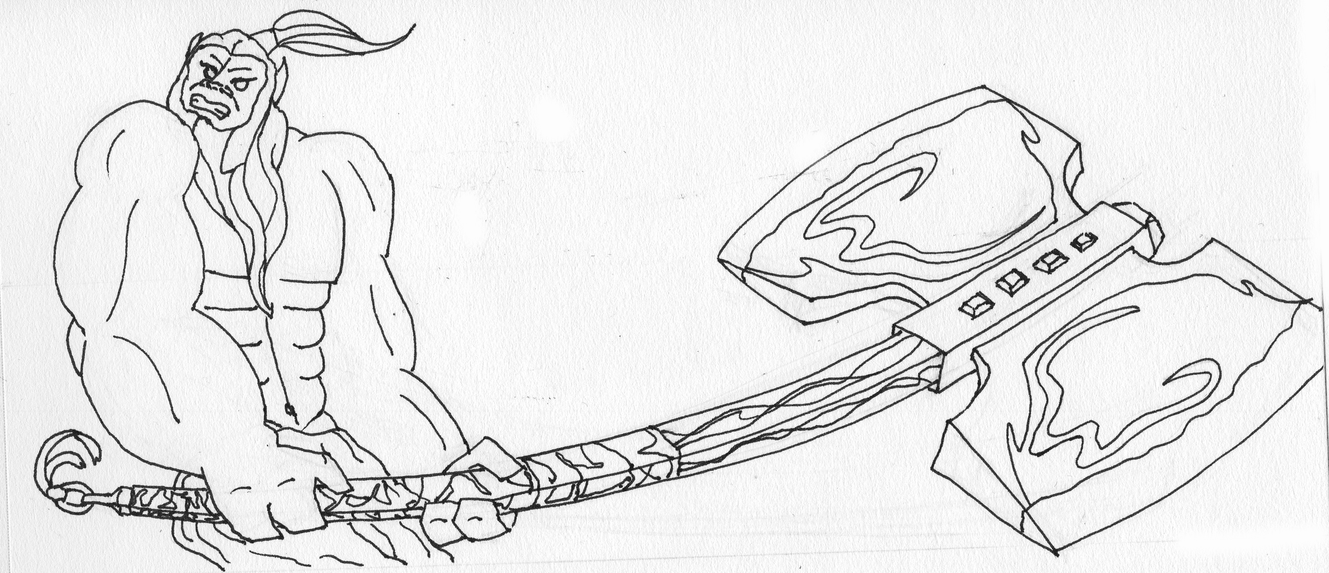
For strategy, I went with Axe from Dota 2. His intense, red color along with his large axe would fit well for the beginning of the infographic. The detail would also draw in the audience in comparison to the rest of the background. The movement in the hair, handle, axe, and body would be a great start to the infographic.
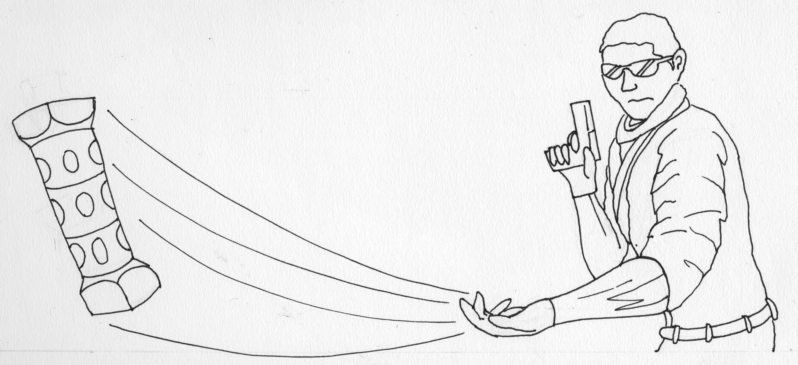
For FPS (First Person Shooter), I had the decision between the terrorists or the counter-terrorists. The color I needed to fit in with the theme would be yellow, so I chose the terrorists, in contrast to the counter-terrorists which would have been blue. To provide flow, I added the flashbang which would also merge the other illustrations.
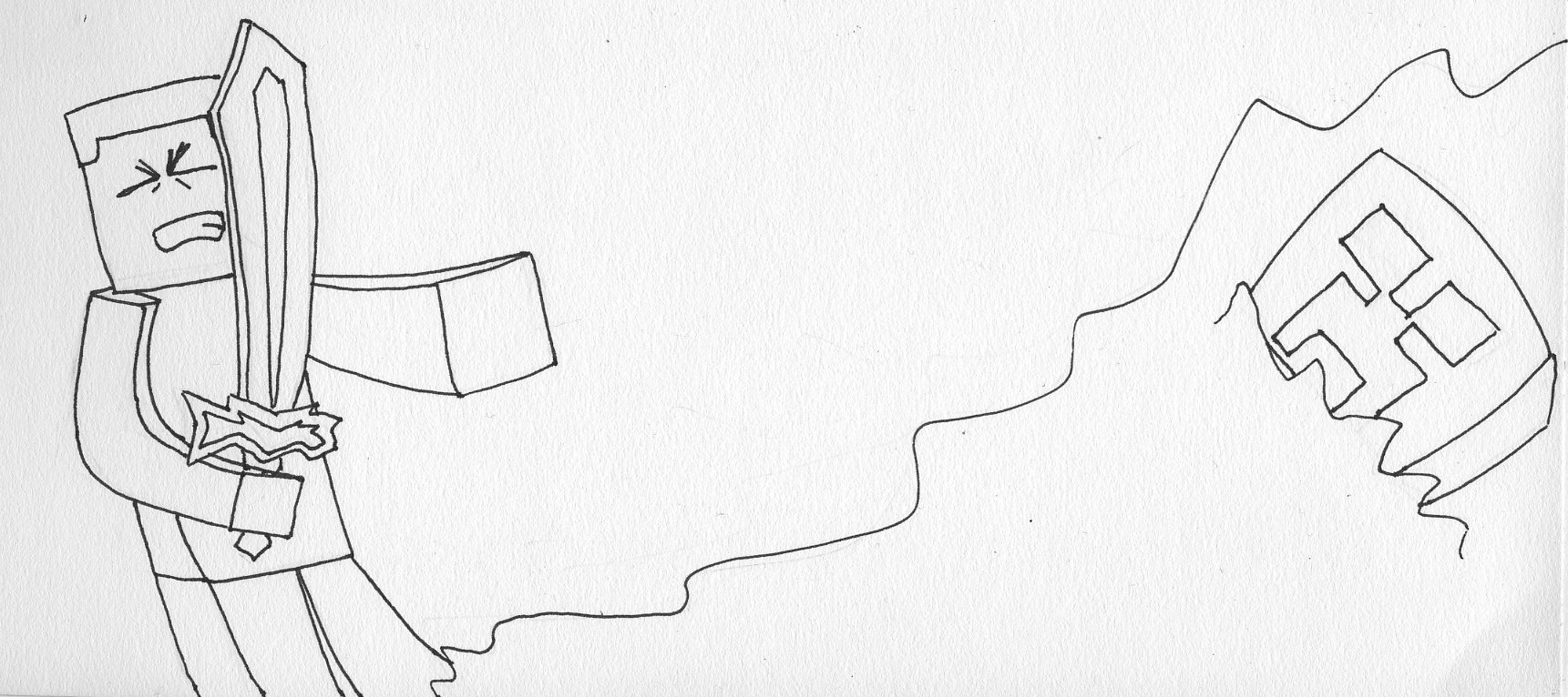
While the other two seemed to only fit with a certain type of audience, I decided to add a game for all age groups: Minecraft. This adventurous game is known for its famous green monster, the creeper, which explodes within its proximity. While my original idea was to have the sword be the object to merge the illustrations together, I decided that a red and yellow explosion would unify the top two illustrations better, and provide more excitement to the audience as they view the piece as a whole.
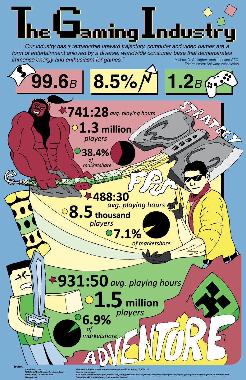
As mentioned before, each section has their own color. Subconsciously, it seems appealing because stop lights are seen so often that the color combination automatically works well together. After scanning the illustrations in and digitally coloring them, I placed them so that each merges with the other in some way. Axe’s axe merges with the terrorists’ head, the flashbang merges with the tip of the sword, and the explosion hides the bottom of the terrorist. Angles also work in my favor to make each section have roughly the same amount of surface area to place the data in. Incorporating the titles was important not only for recognition, but for the amount of white space too. Even with the little icons at the top, it adds a burst of life into the piece which shouldn’t be overbearing. The action given by this infographic leaves a spark of interest to the audience with straight-to-the-point data offering a easily readable chronology.
Please leave a comment below if you have any critiques or comments, or simply just LIKE and SHARE!