Welcome to another segment of, The Work In Progress. As a continuation to Part 1, I will discuss the process of my second edition to, “Hana.”
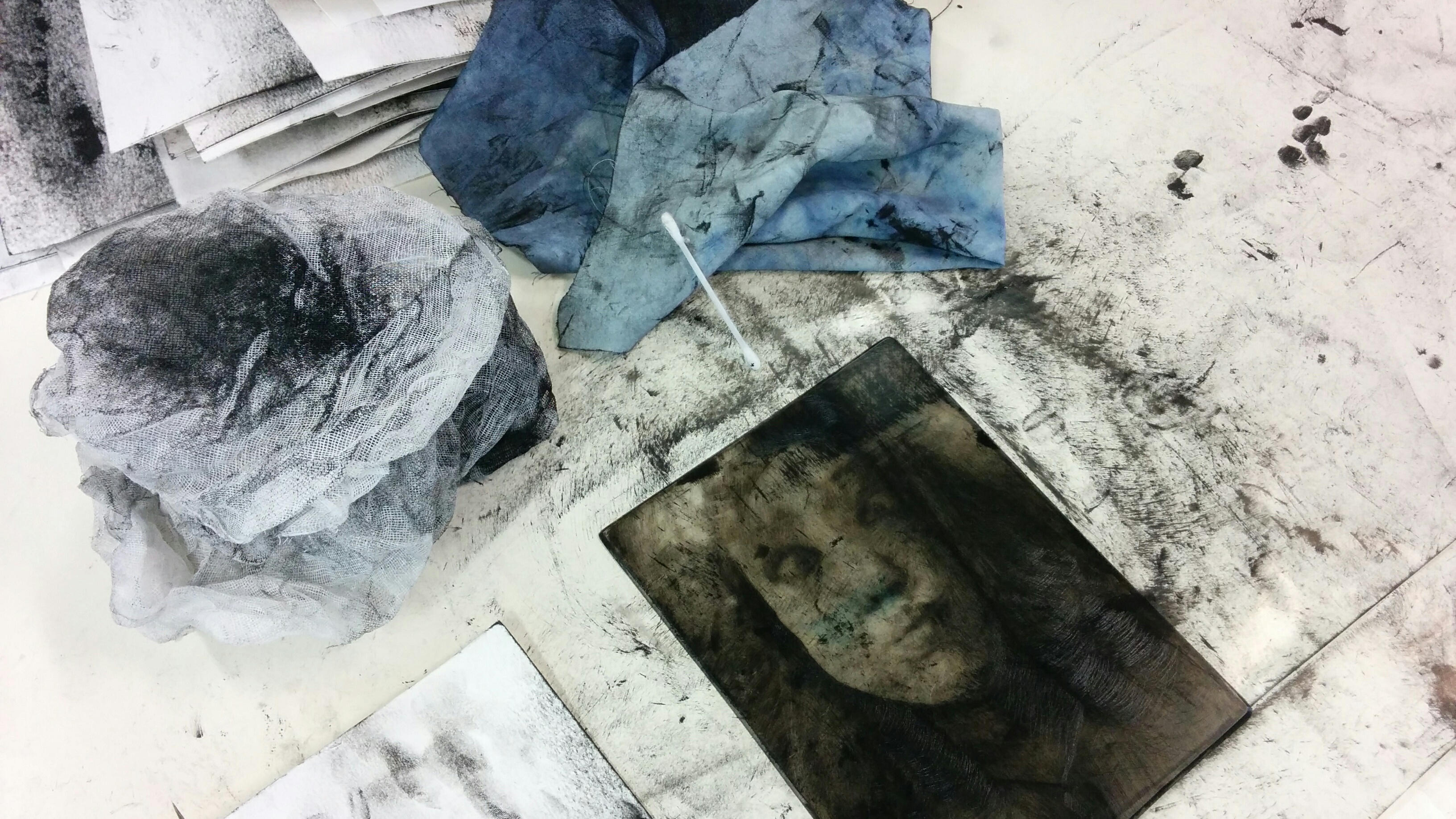
The difference between the first edition and this edition has to do with the tone of the overall plate. With the subject being a girl with a bubbly and sociable attitude, I figured that one proof should be a bit grittier and muffled to add a new flare and depth to the piece. The picture above shows the materials I used to achieve this effect. From left to right you can see tarlatan, a microfiber cloth, and a simple cotton swab. Once you add a layer of ink to the plate, it’s best to use the tarlatan first. This starch induced cheesecloth will be one of the big factors to removing excess ink. The visible black lines are the burr marks where I used the diamond point scribe. At this point, I needed to be careful how much ink I wanted to take off. I then used the cloth to bring out more ink along the highlights of the face and neck. It’s also used to clean up the beveling and back of the plate. The cotton swab would be used to clean finer details like the necklace and the eyes. I then blended the piece together by very lightly using the tarlatan in round motions to create an interesting effect.
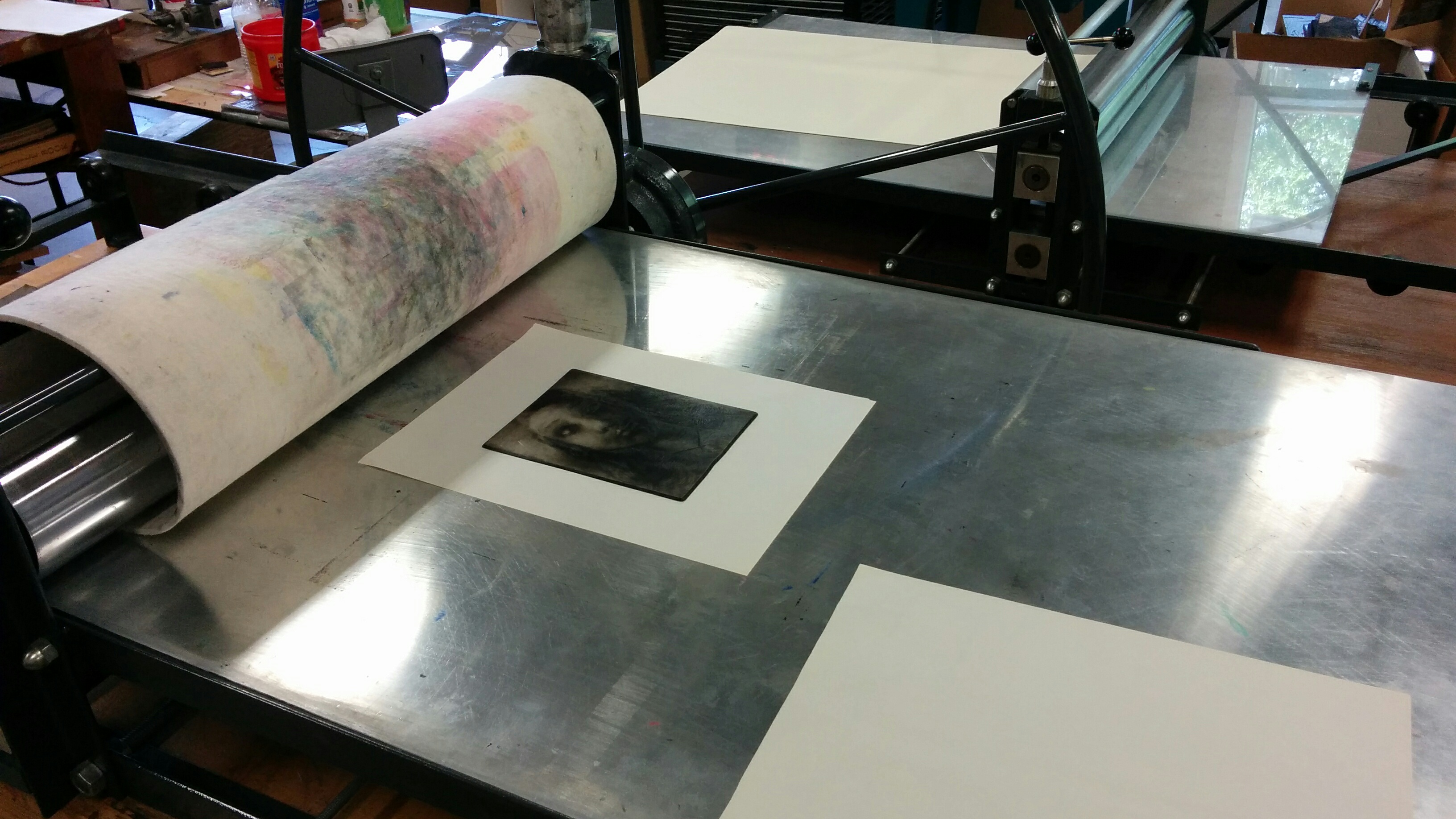
The printing setup can be seen above with the press, the mat, and the plate with soon to be dampened paper on top. The sheet below the plate helps with precision when placing the same size damp paper over it, while the sheet above all of those layers will keep any excess ink from soaking through onto the mat (which as you can see, isn’t always followed).

The problem with drypoint when making more than one proof is that it can be difficult to receive accurate images. An example can be seen between my first proof and my second proof. While they look similar, the first proof has less ink on its surface than the other; therefore, it cannot be labeled within the same edition. I was looking more towards the second proof, so I kept trying to replicate the same process about three more times.

The final proof came out just as I envisioned it to be. The eyes pop out more, along with the sub-focal point of the necklace. The face has a bit more volume to it and the tone fits well with the subject’s character.
Overall, the drypoint method is one of my favorites and I will definitely not leave it behind. Its personalized pen and pencil feel gives the printing process an expansive element towards the limitless opportunities it holds. While the plexiglass wears down, my love for engraving will not.
Please leave a comment below if you have any critiques or comments, or simply just LIKE and SHARE!