Welcome to another segment of, The Work In Progress. Expressing my art through painting has been a heartfelt experience, but printing them through a press gave me a breath of fresh air as I will discuss along with my “Monotype.”


Based on my sketch that I drew with pen and pencil, I used a plexiglass plate to paint over my design; this way I’m able to have the form of my sketch without having to redraw the same image. I love chiaroscuro, so I knew that working with black and white through my style became a matter of implementing intense highlights and shadows. Above, you can see my work in progress as I expressively paint my design on glass. Having the background be black for a simplistic figure seemed to be the best option as most Baroque artists demonstrate. It gives the clear message that the emotion from the focal point conveys the basis of its meaning. Also, the black background gives the dark atmosphere of the figure screaming a heightened expression towards the audience. Throughout the process of painting, I used both a wet and a dry brush. The wet brush gives a loose texture which can contrast with the dry brush. One gives a watercolor feeling of transparency and softness, while the other presents the rough texture that the figure can convey, giving a clear and precise angle towards certain segments. The wet brush was used in parts like the cheeks, the neck, and the shirt, while the dry brush is predominately used in the hair, the eyes, and the nose.
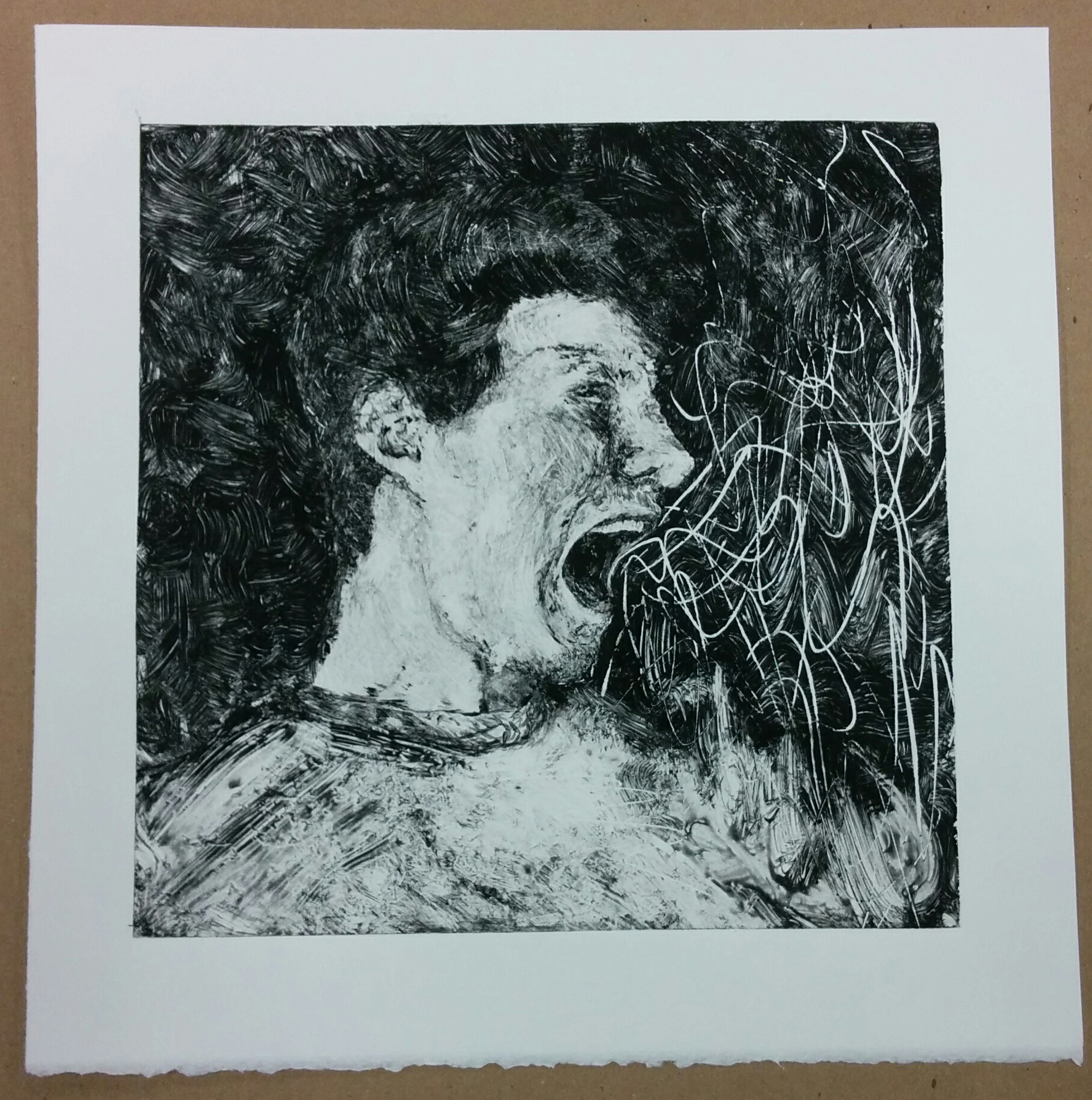
In contrast to my main proof, the one above has a few problems. As I realized afterwards, the composition was too open with parts like my shirt and the background being too dominant. If I wanted the face to be the focal point, I would have to either darken the whole plate, or crop the image down. While I did decide to crop the image down, I also worked on the values. Everything needed to be darkened, although the problem may also have stemmed from the fact that my paper wasn’t damp enough to pick up the dried paint when pressed. This would explain a lot, such as how my textures weren’t picked up from the face. Unlike other prints, monotypes and monoprints are unique in that they can’t be exactly duplicated. The paint will always have different textures, values, and movements depending on the stroke of the brush. I would have to repaint everything which I did after learning the corrections that needed to be made, including removing the squiggly lines in the background.
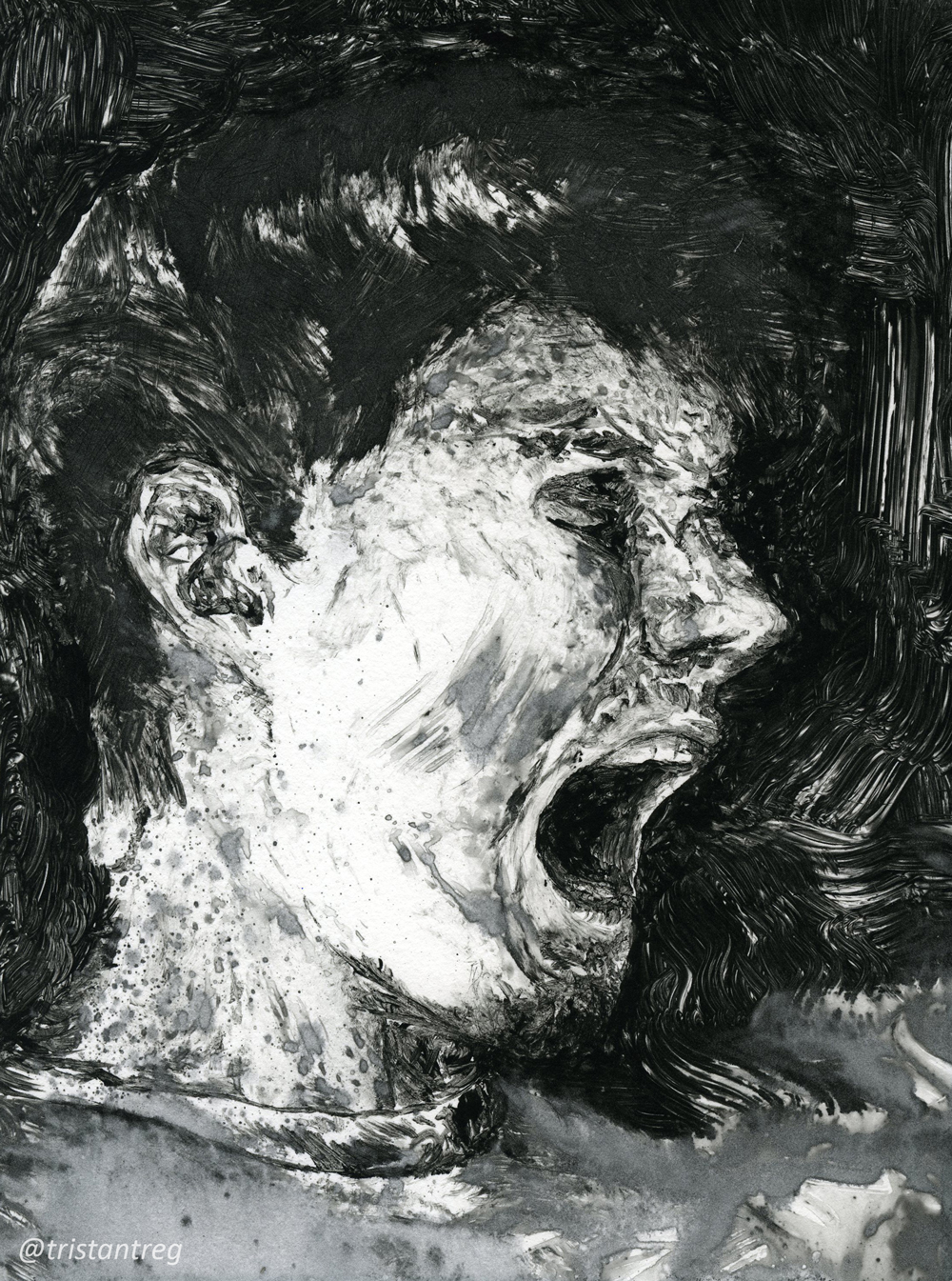
My final bleed proof had all the changes that I wanted and more. The wet brush worked well in the parts of the face that needed to be, including the dry brush which added nice waves to the background for movement, especially near the mouth. The shirt was tough because it needed to be visible, but not dominating. Much like in my monoprint, the shirt blended in with the background to give it form, but it never took away from the focal point. For this instance, having the shirt be pure black would be hard for two reasons: one being that this monotype has visible textures in the background which can be annoying to mix in with the plain shirt, and the other being that the background is black, so it could easily take away from the composition. Using the wet brush conquered both of these obstacles, in that it gives a change in texture, and it has a difference in value.
This single edition gave me the experience to work with paint to a different degree. The prints give a crisper image along a smooth surface, unlike painting oil on canvas. The use of both wet and dry paint gives a unique impression only found through the intriguing process of the monotype technique.
Please leave a comment below if you have any critiques or comments, or simply just LIKE and SHARE!