Welcome to another segment of, The Work In Progress. Today I will discuss the process which I took to create the sweet and savory combo, “Peppermint and Potatoes.”
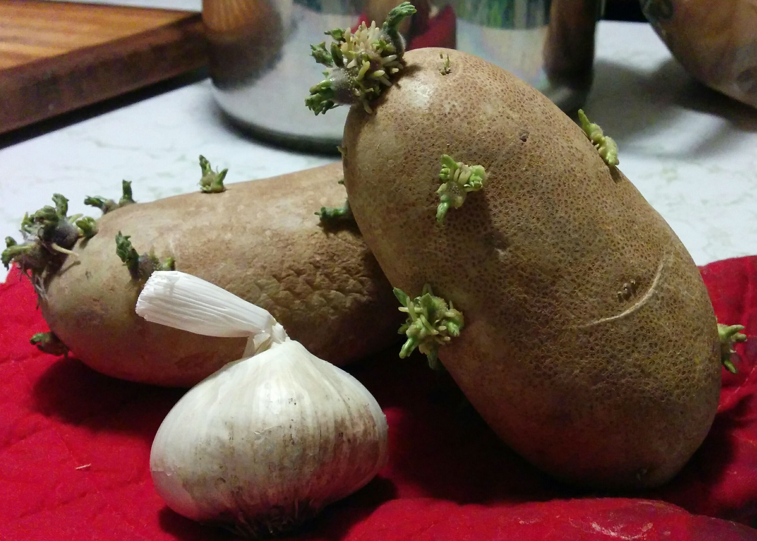
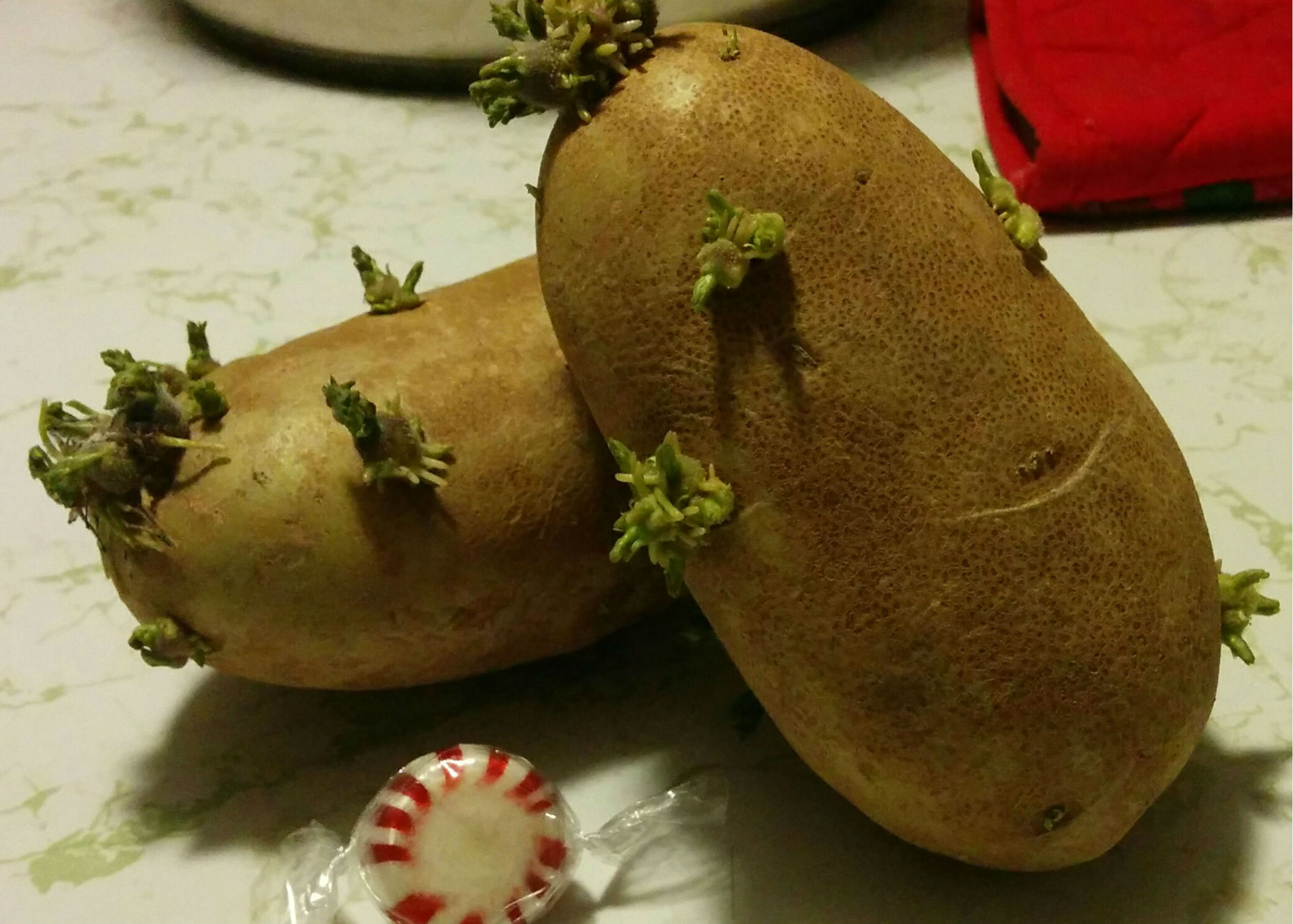
Choosing the objects I wish to paint can be very simple or very hard. For me it depends on what is interesting around me. For example, the potatoes above have been sitting in the sun for about 2-3 weeks and have started to grow sprouts. Abnormal to the common urbanized civilian, these became quite an attraction for me to study. Having another interesting companion next to the potatoes would work great here. Much like taking a photograph, you have to have an “eye” for things. This includes, but isn’t limited to, the composition, color, movement, and balance. I thought that having a red hue to compliment the green and yellow potatoes would work perfectly. The first picture above gives a resting point with the garlic from the red background and textured potatoes. The second picture not only has a nice red hue to stand out from the green, but also it subconsciously provides the sweet and savory contrasts of the peppermint and potatoes. While both would work well as their own paintings, the second one gives a different emotion which I wanted to work with.
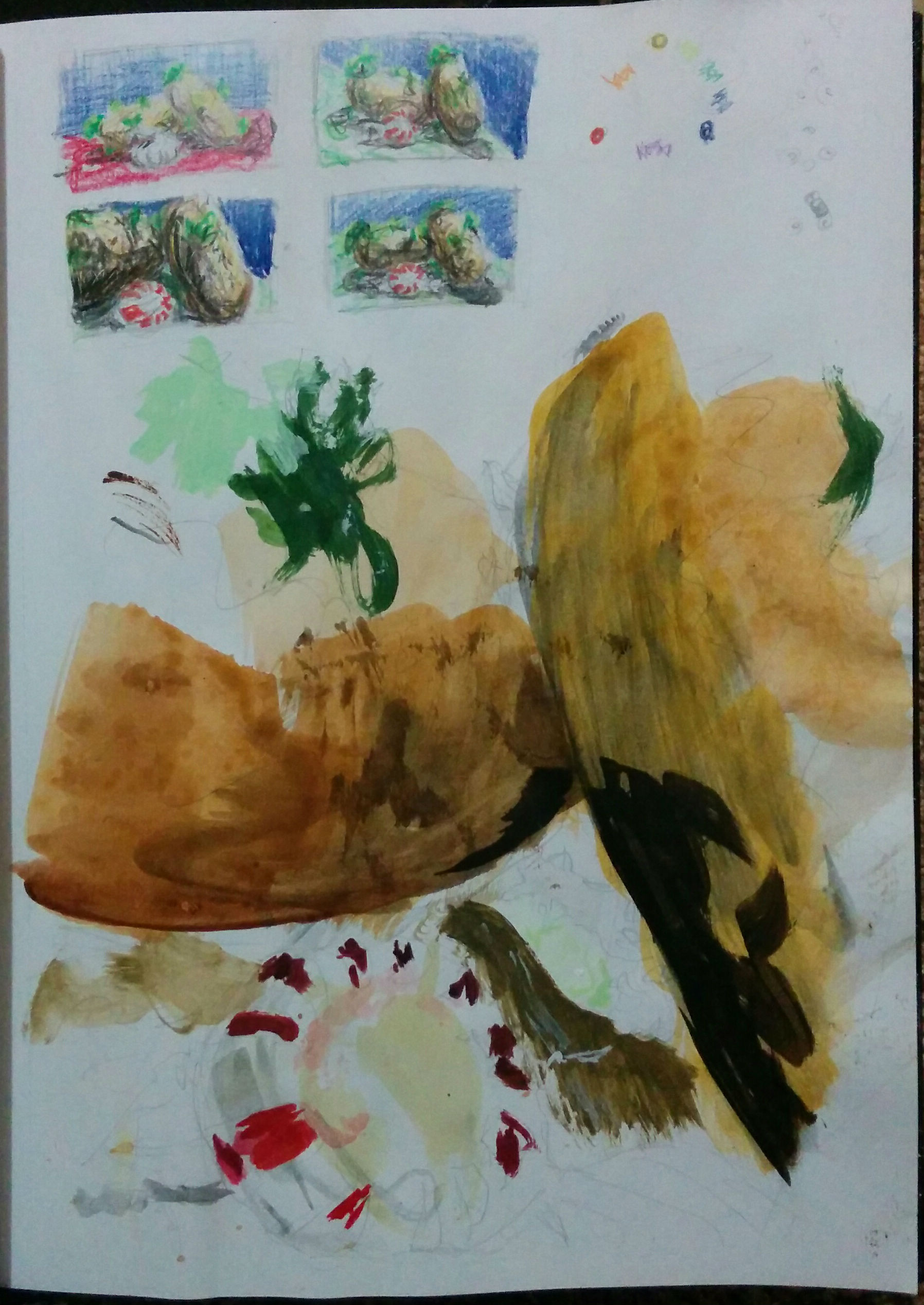
Above, you can see the variety of sketches I made to make sure that my choice became the best option. I tested out different color harmonies such as complimentary, analogous, and triadic. Once I made my decision, I went to work. I tested out different values and color hues in my sketchbook making sure that the tints and highlights were what I wanted. Not only that, but I tested out how different colors would react when painted next to each other. The values of the potatoes when they touch would be one of the big tests. I had to make sure that they didn’t blend together, but rather that they each have a unique personality.
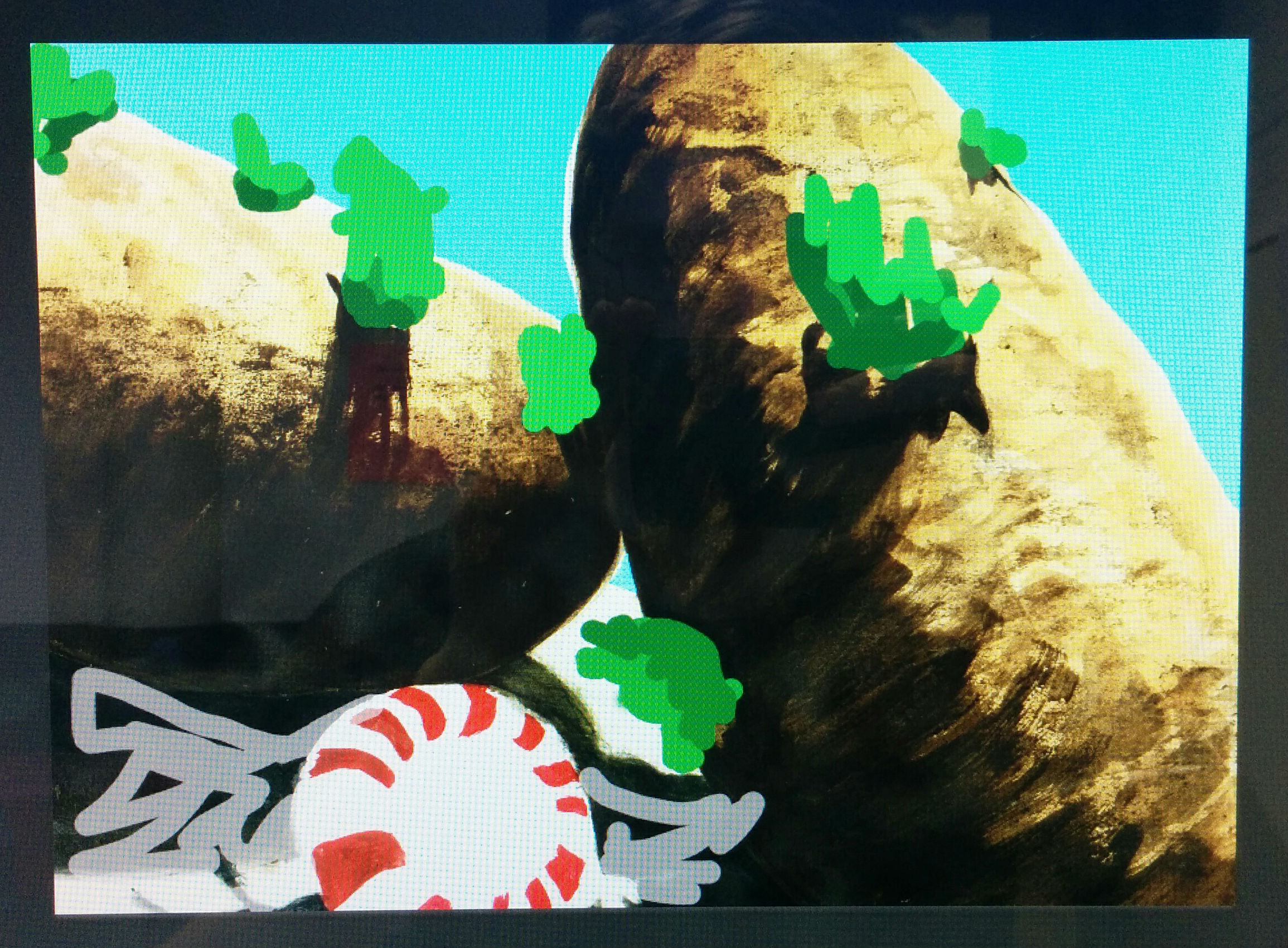
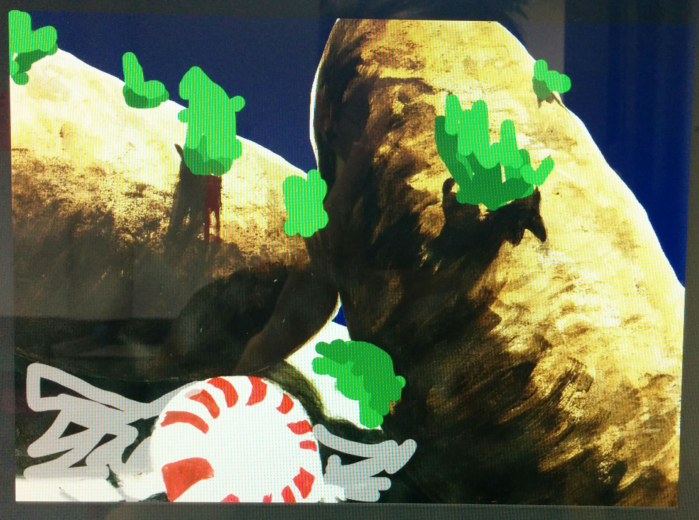
Along the way I didn’t quite know which background colors would fit in the best. While I knew that I wanted a blue hue, I couldn’t figure out whether it should be darker or lighter. I went into a photo editing program and roughly drew in the colors so that I could compare the changing background color with the surroundings. The darker blue wasn’t horrible, but the light blue caught my attention more. It seemed to have a “popping” personality which fit in with the surreal sprouts on the potatoes, and the portal-like peppermint which led your eye around along the highlights of the potatoes.
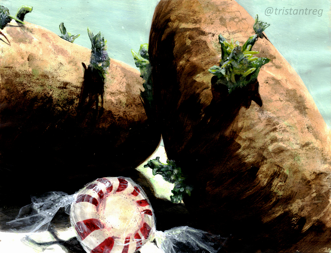
The musty greenish-blue became the final background color so that the objects would become the brightest points, and thus the main points of attraction. Notably, the peppermint by itself would be perfect. It has its own revolving motion, and the plastic wrap gives nice diagonals to add drama, balance, and a recurring movement.
This project definitely reminded me of the good old days of drawing foods such as “Apples and Bananas.” It was nice to revisit this scene and I’ll probably continue on this path of painting closeups of food.
Please leave a comment below if you have any critiques or comments, or simply just LIKE and SHARE!
Very interesting seeing the art in progress 🙂
It’s one of my favorite things to show and discuss in art. Thank you for your comment!