Welcome to another segment of, The Work In Progress. Showcasing my abstract work can be tough seeing that I’m not into its ingenuity, but within the printmaking field I feel more comfortable featuring my “Relief Collagraph.”
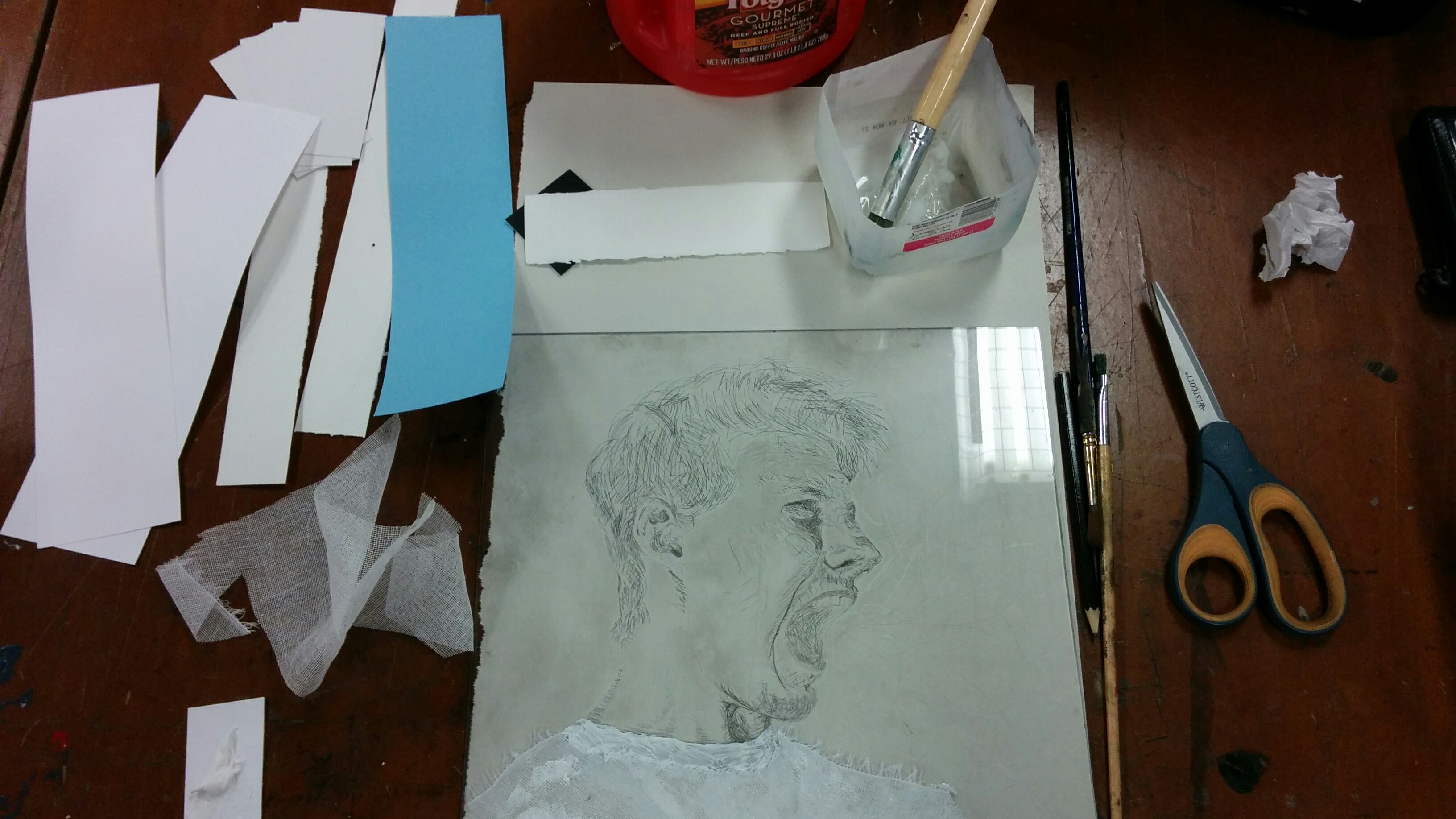
To have some sort of interest to my collagraph projects, I wanted to work around a design or image that wasn’t abstract. For this piece, I decided to use the backside of my plexiglass that was used for my monoprint and monotype; that way, my loose collage scraps can be used to create a new image from the previous drypoint matrix. I decided to create something abstract and more surreal to fit in with the natural collage style, and to have something that contrasts the “pen and paper” design of the original drypoint. For the picture above you can see some of the materials I used to paste onto my plate, some of which include tarlatan, arches paper, construction paper, cardboard, Matt board, sandpaper, and modeling paste.
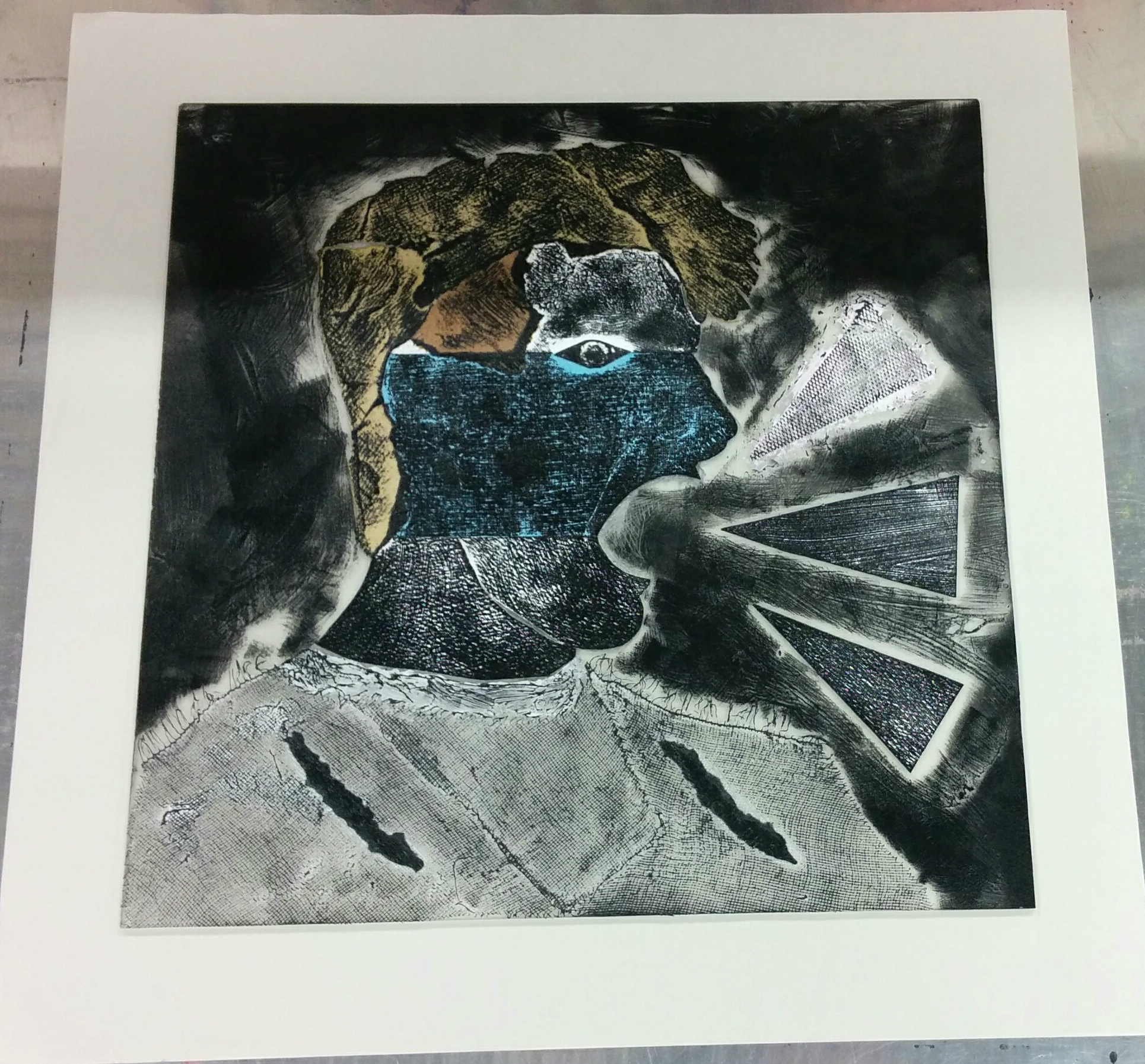
The design I went for included a mixture of different movements including Cubism, Russian Constructivism, and Surrealism. I used a water base sealer to glue down my design and to create nice textures and effects along the composition. By using a brush, I simply glued the shape onto the plate, and added a second layer of glue to make sure no water or ink soaked into the materials. If I didn’t add another layer then that could cause shifts in the collagraph, and make the paper stick to the plate. I also engraved the inner mouth area to provide a nice contrast to the surrounding rigid shapes. For the picture above, you can see the ink that was put onto my matrix in relief, including the background layer to add texture and depth.
My first proof shows what needed to be changed. The pressure I put onto the brayer when I inked up the plate proved to be too hard. Not only do the textures not shine through, but the image itself is too dark. There are some elements that would benefit from a lighter pressure, especially the eye; that’s one of the main focal points in the piece that needs to have more white contours around it. While I did experiment wiping ink away from the mouth, it seemed more of an Intaglio feel, so I strayed away from that for now. The movement of the brayer seemed enough, especially with the rigidity of the composition. What I would now do is have less pressure on the brayer, and move it accordingly along the shapes instead of the classic vertical inking.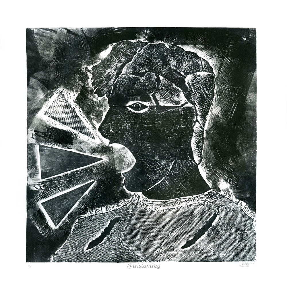
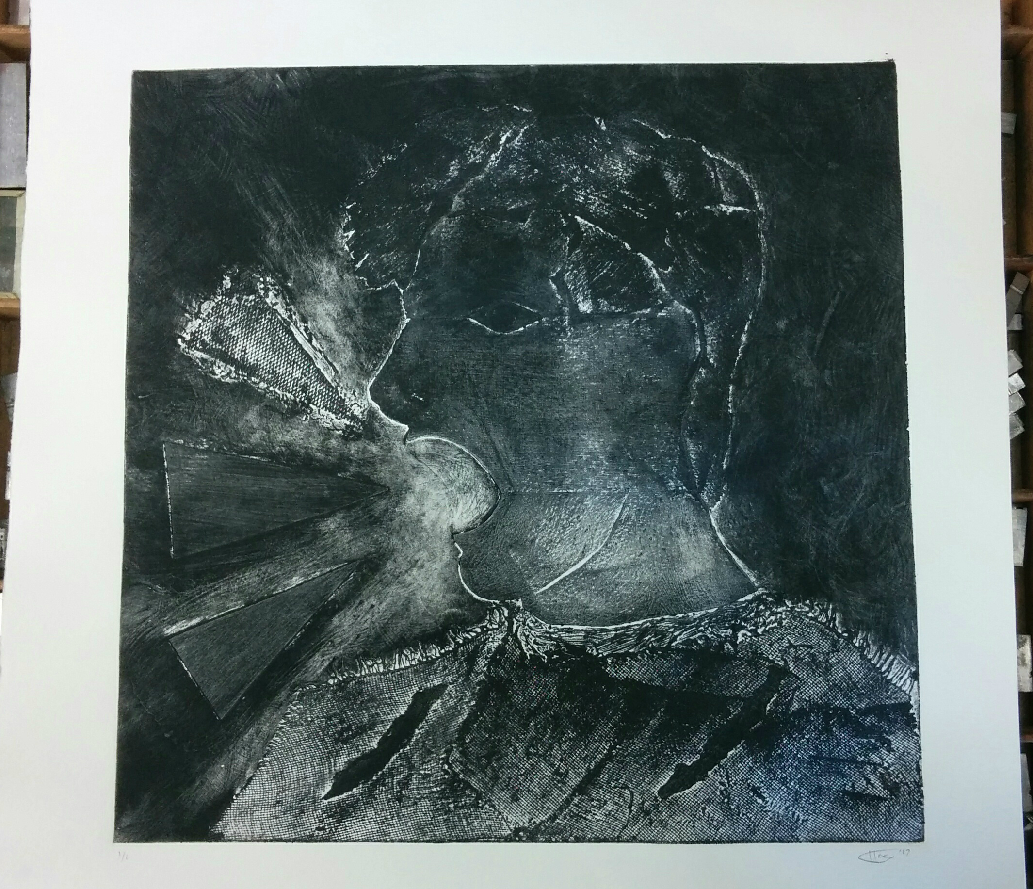
The final presentation looks even more interesting than what I envisioned it to be. The textures and movement become the key elements in this edition. The variety of shapes and materials that I used separated some sections from others, and gave a change in texture. The background was also a key element, because I knew that the figure would not work without a stable foundation. The brush strokes of the dried glue really helped emphasize the nature of the piece. Adding blue paint through the Intaglio process would be a new and intriguing edition to my collagraph collection.
While the figure as a whole appears two-dimensional, it presents a deafening quality along with its bizarre features. It’s one of my few abstract pieces that I would relish to show. The meaning behind it poses more questions as to its purpose, but that’s only part of the beauty.
Please leave a comment below if you have any critiques or comments, or simply just LIKE and SHARE!