I understand that every typeface has a special job, a project they’re probably perfect for, however, there are some typefaces that keep me up at night knowing that they are taking up space in my font library never to be used. Some typefaces should have never existed and some just need to retire having done their time in this digital design world and they need to hang up the keyboard for good.
Before I jump right into ripping fonts apart, I want to preface this blog with a short 3 minute clip about typefaces if they were people at a font conference because if I had to watch it you do too.
As a designer, fonts and typefaces can make or break your work. Fonts have personalities just like your graphics and arts do and you have to make sure they get along, it’s just that sometimes the font has a crappy personality.
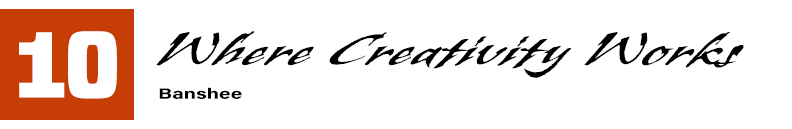
First one up at number ten is Banshee, I can only imagine his persona at the font conference screaming and yelling and running around like a chicken without a head. I just don’t understand if its a serif font, sans serif or if its cursive but they’re all individual letters? SO confusing. It’s just very chaotic and I need Banshee to make up their mind. I personally would never use this font because of it’s indecisiveness and Banshee trying to be a little bit of everything. Another thing throwing me off about this font is that the resting line for each letter is different, the ‘t’ hangs way lower which would be fine it that was the only letter that did that or if it was complimented but the ‘a’ and ‘i” are also different from the ‘e’ and the ‘k.’ It’s really triggering my OCD, over all bad font but could have some use during the halloween season due to its sporadic energy.

Rolling in number nine is Comic Sans. I don’t hate them but I am definitely never ever, ever, EVER using this font in anything. This is one of those fonts I said needs to be put in a little old typeface nursing home next to Arial, Arial Black and Impact. Arial Narrow is okay, not in the top ten but probably in the top twenty five. Comic Sans reminds me of elementary school when my teachers would first make power points on the projector having little to no knowledge about Microsoft programs. While it served a purpose then, it’s definitely outdated now and I don’t see much hope for a revival in the near future. Like I said, I don’t hate Comic Sans but I’d judge you a little bit if I ever saw you using it.

Verdana, oh Verdana. Theres so many fonts that look like this, however Verdana is probably the worst one of the simple yet rounded typefaces. I’m sorry but if I had to choose between Verdana and Acumin, I would be sending Verdana home no doubt about it. Theres just something off-putting about Verdana, like counterfeit or imposter like. I just don’t trust a Verdana font.

Enough said, plus this font family takes up so much room in my library.

This font, Andale Mono, is comparable to Verdana in the sense that theres a few fonts that look like this except Andale Mono does it the worst. Once again its off putting but this time it’s because of the spacing of the letters. They’re so awkwardly far apart that it’s hard for me to put it together and read it as one word. Like, why would I use Andale Mono when American Typewriter sits right next to it? I also don’t know if it’s trying to be Typewriter or if it’s trying to be edgy and tech with its squared off corners. Overall, I think this typeface is obnoxious in the most submissive way and I don’t like it.

Coming in at number five is Apple Chancery. If I had to personify him at the font conference he’s a prince like character except he has unintelligent ideas and narcissistic tendencies. I’d say he fakes his British accent and he’s actually a guy from Southern California that didn’t fit in with the lifestyle. This font tries to be elegant and delicate but falls short of this by having all of their letter characteristics pointing in different directions. Why is the front of the ‘w’ and the ‘y’ curving left, yet the ‘h’ and the ‘k’ are curving right? Absurdity.

It must be fonts called Apple that just lack personality.

For being the first font in most of our libraries, it does not live up to it’s real estate in my font library. I would probably use this font if I were working in a law firm and I wanted to “spice” up my professional corporate letterhead. Maybe get a little crazy and put it on my business card too. Overall, Academy Engraved needs to step it up.

Remember when I said there’s fonts that shouldn’t exist? This is one of them and then someone just had to go and give it to the cover of Avatar as if Papyrus was deserving and cut out for that job. It gave Papyrus an ego boost and a renewed contract in font libraries everywhere and if it didn’t get it’s lucky break I think it would have been gone a long time ago (like it should have).

This might be a hot take but I hate Times New Roman. I think it is given too much credit as a default for all of my essays and papers. Maybe it’s because I am an art major but I think we should be able to use font based off the topic that you’re writing about and if not that, there are a ton of other fonts that are more readable than the tiny, serif Times New Roman. Maybe I’m just traumatized by MLA format but I think Times New Roman is the most overrated font out there.
As I take a type class this semester, I couldn’t let this sit any longer and I needed to voice my opinions about some of these typefaces. Now since it’s off my chest, maybe I’ll write about my favorite ones next time.