Like any other artist, professional photographers need a way to showcase their work. Websites are a common format used today and are quite effective with helping the artist branch out to new clients. Just like any portfolio, the website should be as compelling as the work. Below, I’ve included my current top 5 favorite websites (in no particular order) done by professional photographers and a short description of each.
1. Jim Richardson
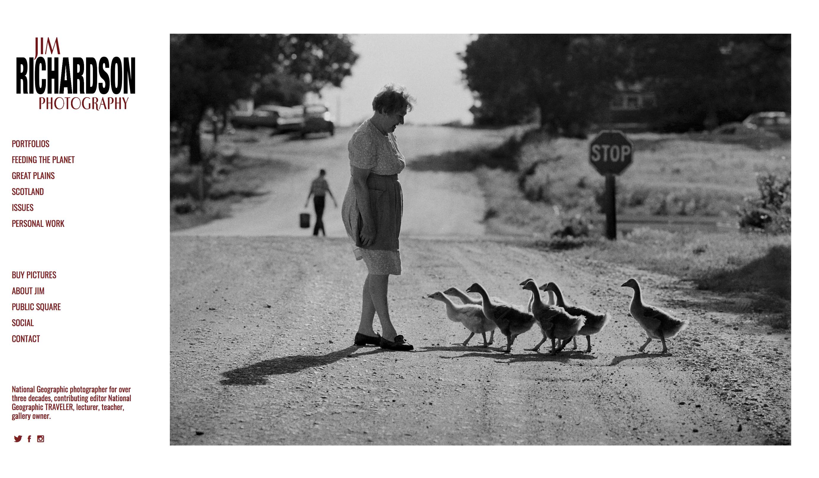
Starting with a single photograph on the main page, the viewer can scroll through the sidebar navigation and choose different projects for viewing which expands into a grid layout. The website is minimal, allowing for a very clean and professional look. With this simple layout, I believe the viewer is able to appreciate the work without being too distracted by the website. With its easy navigation, there is no questioning on where or what you might find. Coupled with the amazing work, I think the website proves to be very successful.
2. Joseph Lawrence
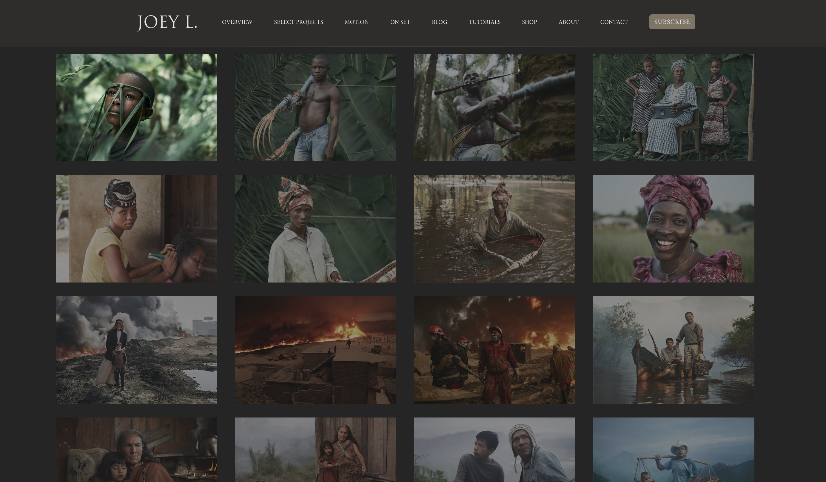 With a similar grid layout as Richardson’s site, the photographs are dimmed and a mouse-over effect is applied. This allows for the image the viewer is interested in to stand out when the mouse hovers over it. With the neutral background and top navigation bar, viewers can easily browse the projects. Despite its simplicity, I believe it to be a beautifully done and a strong website.
3. Jeremy Cowart
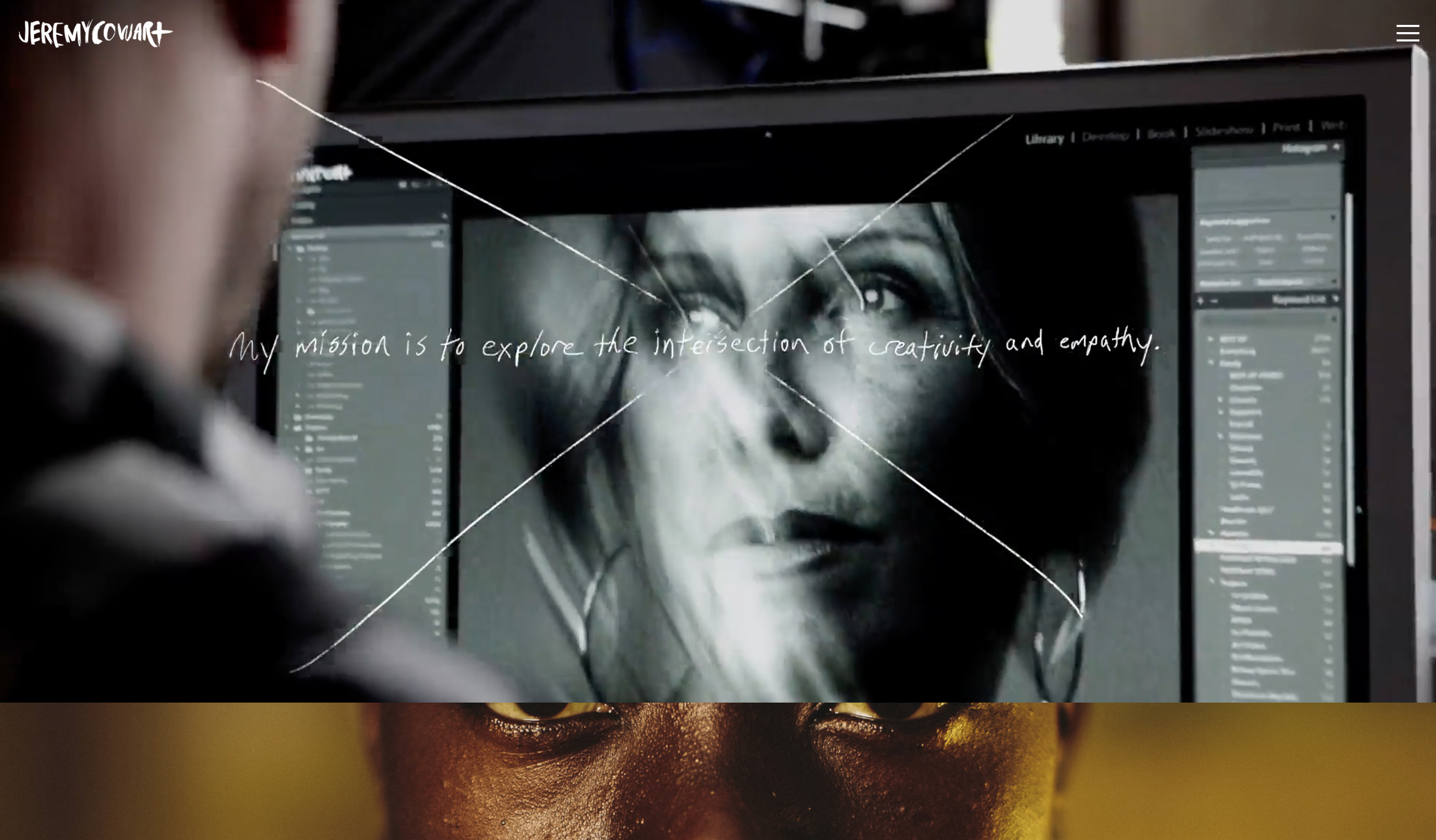 Setup as a horizontal, one-column layout, Cowart’s site allows the viewer to focus on one aspect at a time as they scroll down. The navigation is tucked away but easily accessible allowing for one less distraction from the work. I think what draws me in most about this website is the main page. Because of its setup, I find it interesting to explore. It also includes a video within the header of Cowart working, which gives the site a kind of ‘behind the scenes’ feel to it.
4. Adam Pretty
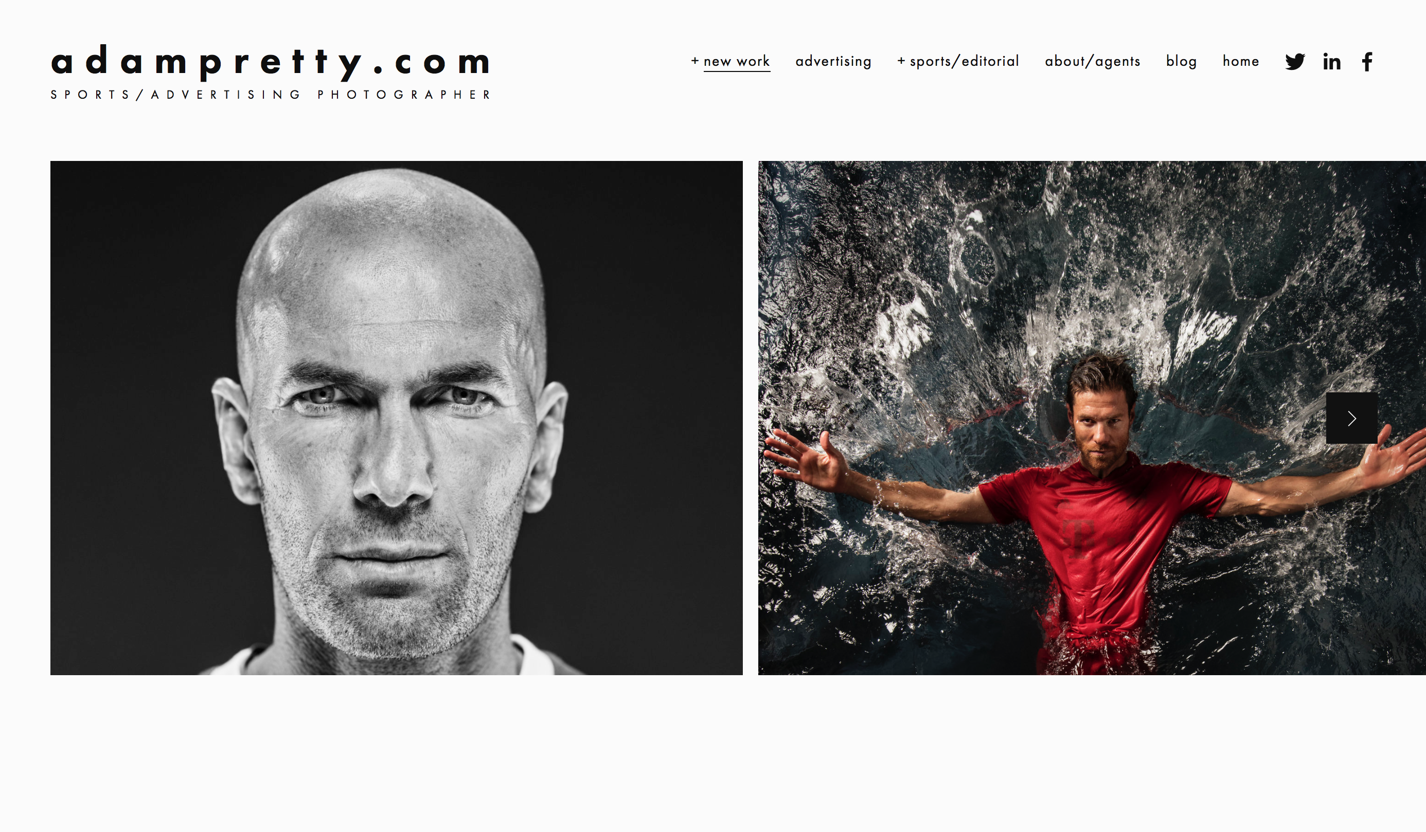 Taking a different approach in comparison to the others, Adam Pretty has his main page setup with little content and a focus on a few of his images which appear in a loop. When entering the main part of the site, the navigation bar at the top allows for clear and easy access. What I like best about this sight is with its full screen views of the photographs, it allows for viewers to focus exclusively on the work.
5. Davina and Daniel
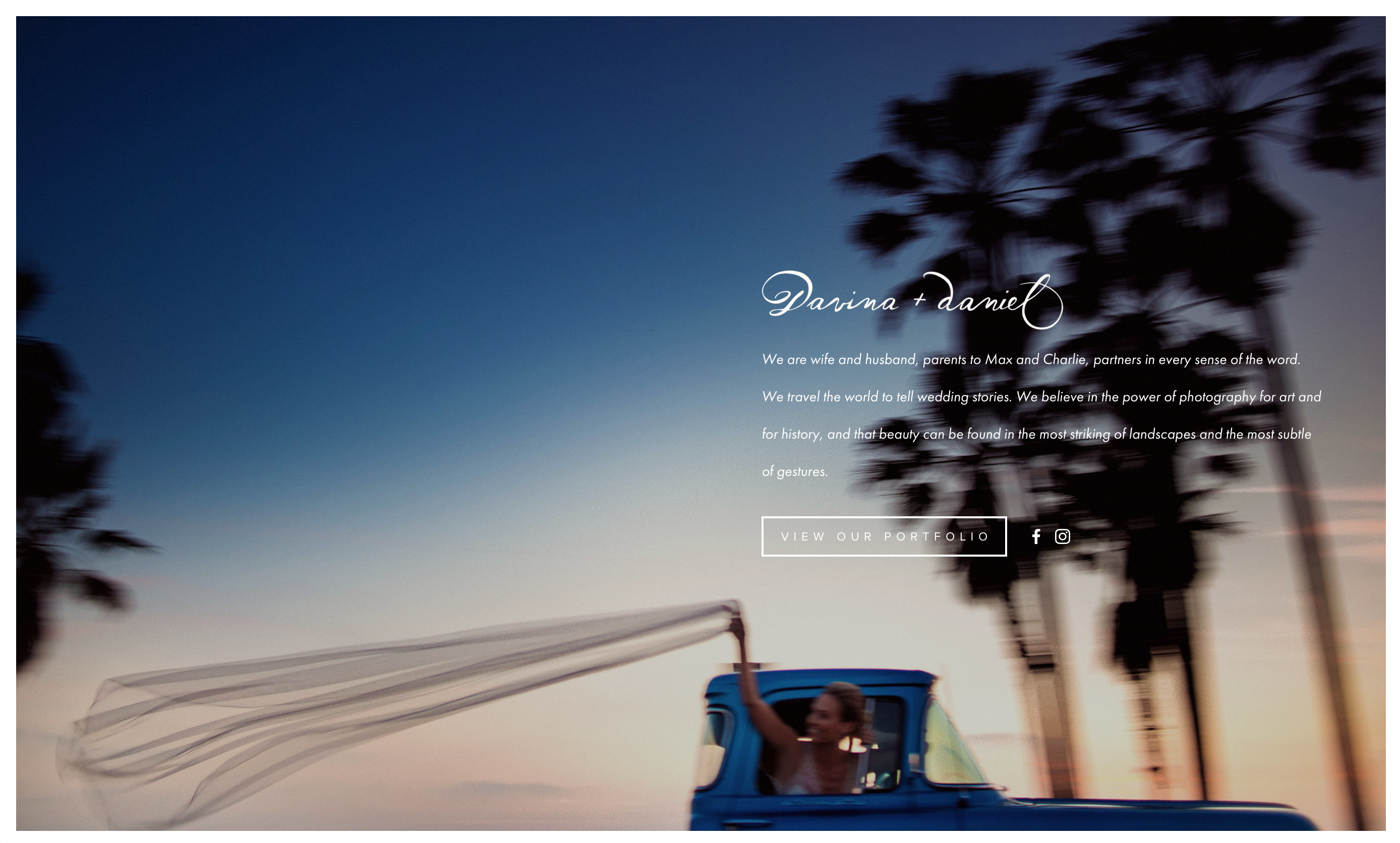 Similar to Pretty, Davina and Daniel start their main page with a full screen loop of a small selection of photos from their portfolio. The main page also has limited information with a single button to enter their main site. After entering the main site, navigation remains simple, with a navigation bar up top and a sort of scroll-through slideshow of their work. The site is straightforward and uncomplicated, and the style fits well with their work, which I love.
Featured Image: http://www.adampretty.com