That’s complementary colors of course. Who doesn’t love a complement? In today’s society a lot of people don’t take compliments well, but I’m glad that’s not what it’s like in the world of colors. Complementary colors will forever complement each other (don’t quote me on that). I think of working with a pair of complementary colors the same way as working with black and white. They have this magic to them when they’re put in a piece together. They bring out the best and worst of each other, which I think is awesome and so real in and of itself. Painting with complementary colors, and those 2 colors only, can be fun and yet frustrating. It’s almost like a challenge since you have an idea of what things in the artwork to make which color, but it can be hard to execute because if the 2 colors mix you get a mucky color that you most likely don’t want in your piece. It’s a stimulating challenge in my eyes.
Green and red, the Christmas pair, which is truly all I saw in them until I saw The Swing by Jean-Honoré Fragonard, a rococo period painting. I realized there’s more to them than what lays on the surface if done right. The painting uses pink with different shades of green and even some blue-green in the background (maybe this is where the 4th grade trend of neon pink and green nail polish came from). Using different values of the colors adds more dimensions and using their related secondary colors just adds a whole new playing field to the complements. I did a painting, pictured below, in Painting II class and I call it Electric Woman because of the way the orange-red figure is almost blinding compared to the rest of the painting. I was going for the secondary complements of orange-red and blue-green, which added more personality to the painting than just simple red and green together. Something else interesting to think about with this pair is that the green leaves of trees in the spring turn to various shades of red in the fall which doesn’t make sense if you think about it because they’re not related on the color wheel, so how does one simply become the other? Or maybe since a green leaf is so alive and a red leaf is fallen and dead it makes perfect sense considering they’re opposites, complements of one another.
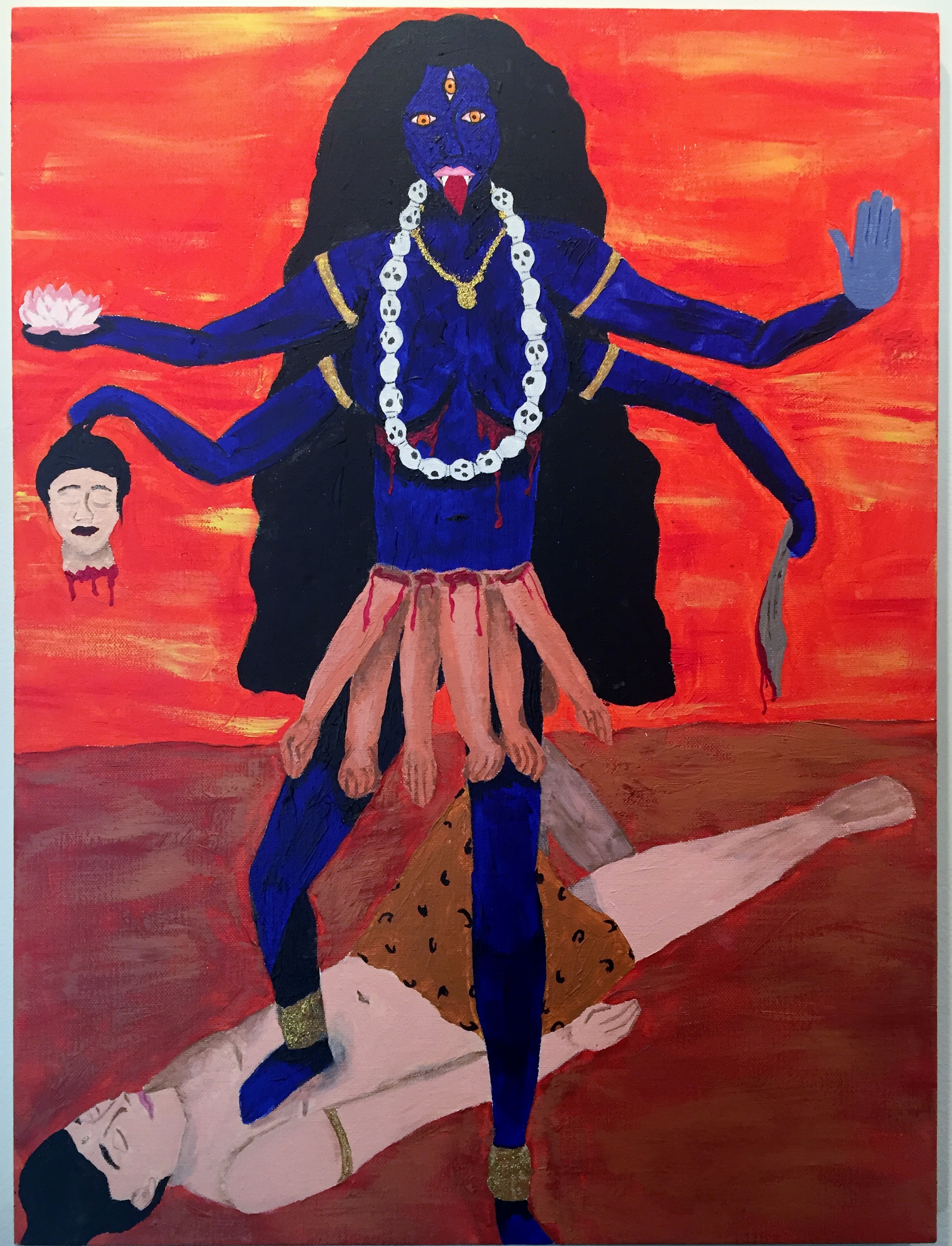
Then there’s blue and orange, which I personally find the most awkward of the complements. That’s not to say I don’t enjoy them because, like I stated before, there’s magic when complements are used together; I just find that they’re the hardest to use together. For these, too, I use secondary complements sometimes instead. As I said earlier, I find the blue makes the orange look electric, like it did in my painting Electric Woman, giving the figure this strong presence in the piece, especially since blue naturally fades to the back in art. I did a painting titled Kali, which, you guessed it, is of the Hindu goddess Kali who is always portrayed as being blue. I decided I wanted to make her really stand out by making the background orange. This was strange because normally blue is in the background rather than foreground. It’s funny to me because she somehow still has this electric feeling to her; the blue reminds me of one of those lit up OPEN signs in business windows. The blue is just as electric as the orange when worked well together.
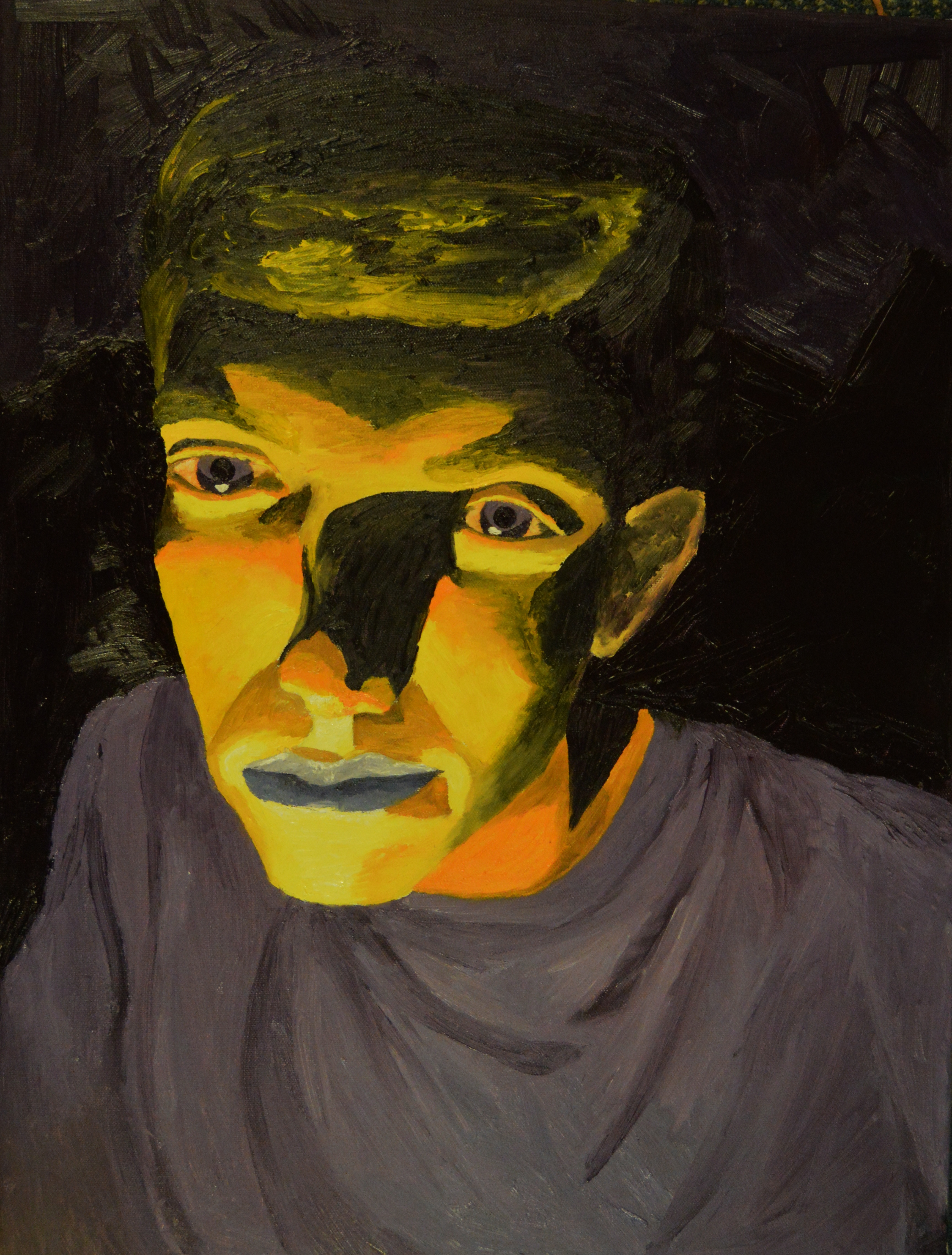
I’ve saved the best for last. My favorite complementary colors to work with are yellow and violet (purple). They have the greatest contrast of hue, yellow: violet is 1/4: 3/4, which I’m fascinated by. For my painting titled Lit, my friends and I were outside at night and there was a light that was hitting my friend Ryan’s face perfectly; it reminded me of chiaroscuro (one of my favorite art techniques) but in real life. Therefore, I took a picture of him and later decided to paint it. Of course I put my own spin on it; I used yellow as my bright, highlight color and purple as my shade, darkness color (for the most part). I always found it more interesting to make a figure a different color than they truly are; it gives them character in a sense. For yellow and violet I never feel the need to use their secondary color complements over them alone as I do with the other primary complementary colors. Maybe that’s why they’re my favorite.
In a fire the flame originally looks yellow or yellow-orange, but if one looks closer throughout the flame there is violet or blue-violet, I again am intrigued just as I am with the red and green leaves situation. It’s so amazing that these complements show up naturally within the earth. Now, I don’t know if that means anything, but I think it’s pretty cool.