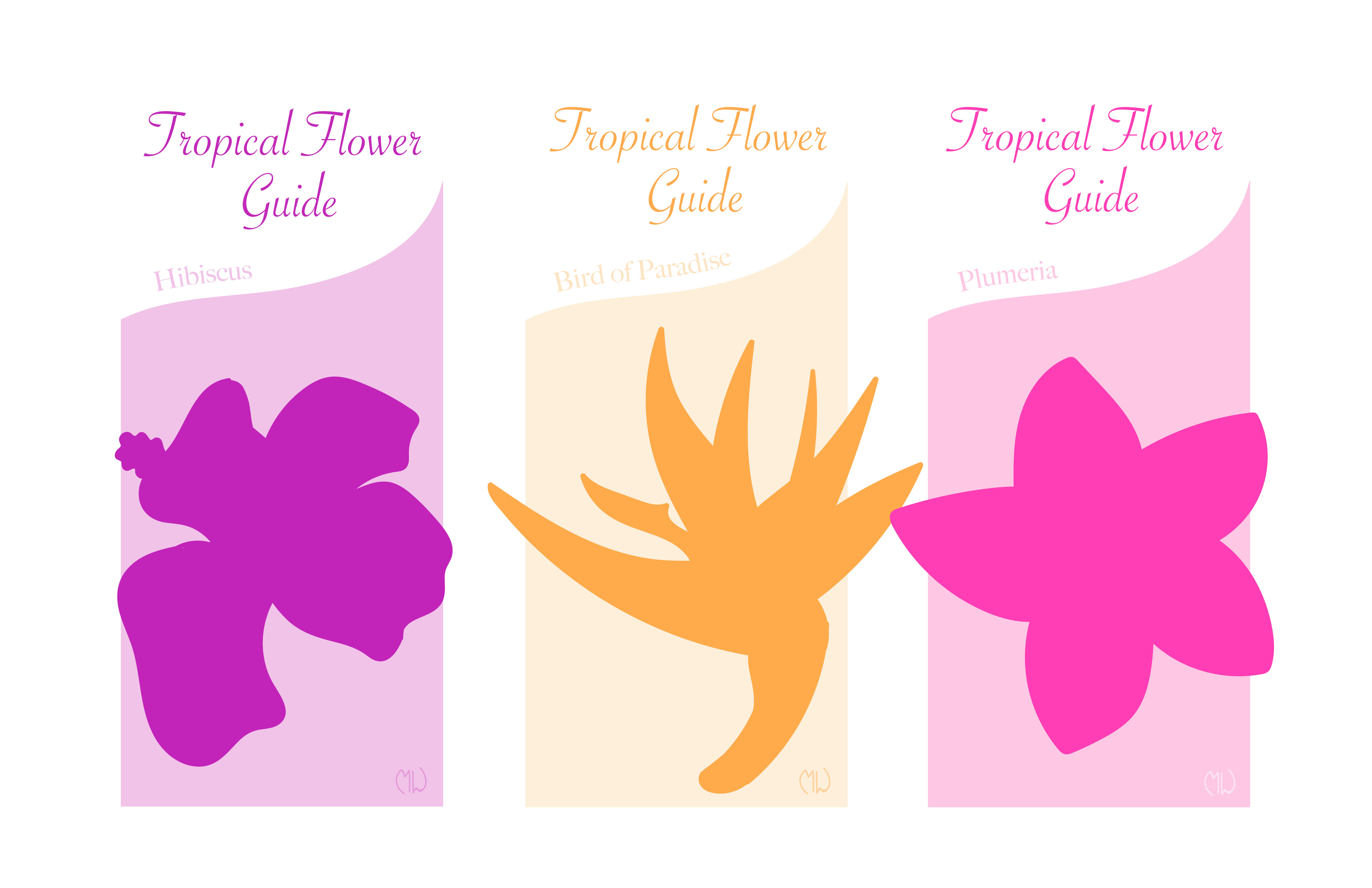
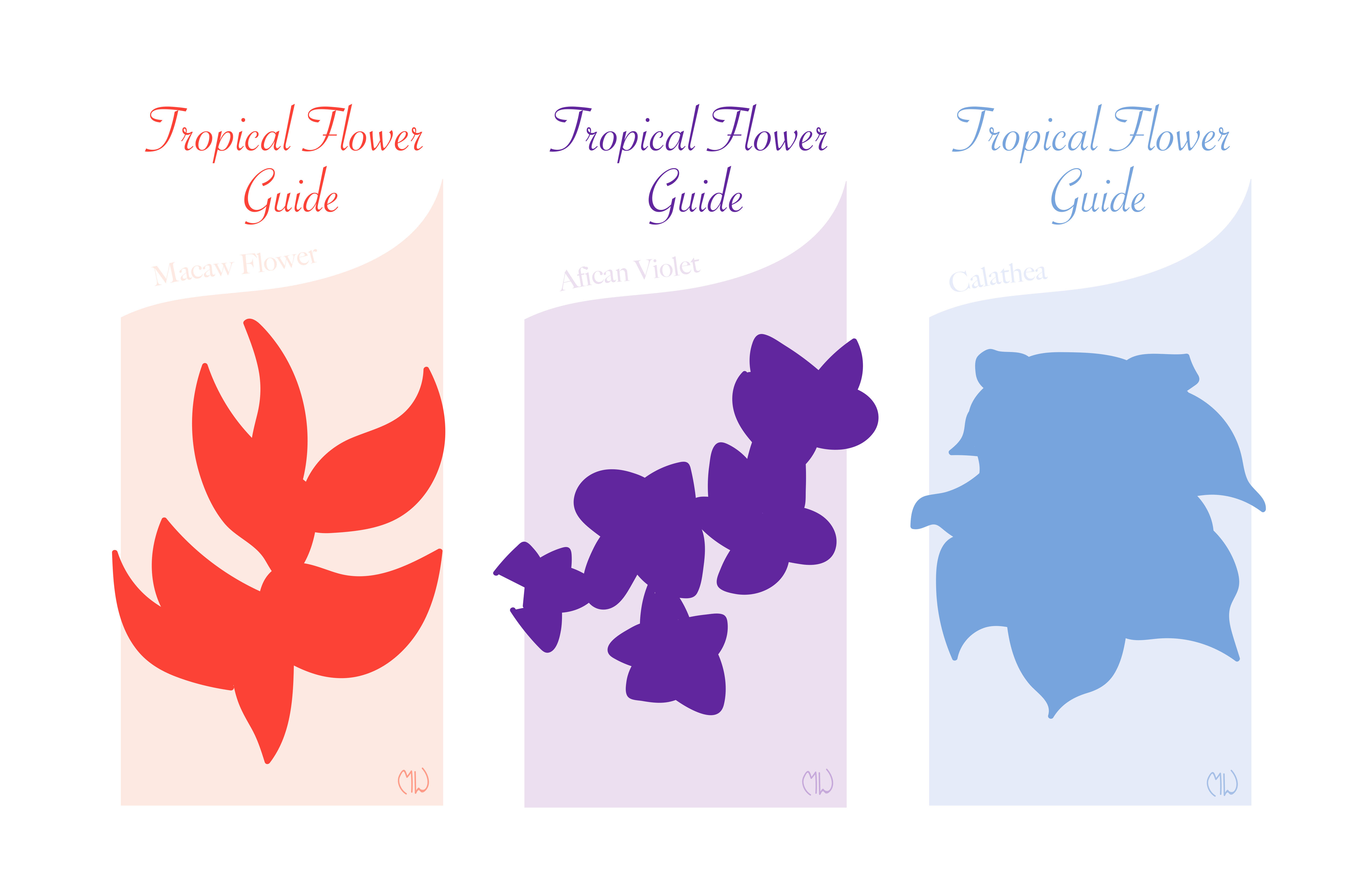
This time around for my Intro to Graphic Design class, we were given the task to make brochures for household how-to’s, financial how-to’s, and more. We had to keep in mind the typography and the design, and make sure that they worked well together. This project was building off of previous projects where we only designed text or imagery, while this one combined the two. We were also limited a monochrome color palette and black. To begin, our professor showed us example brochures from simple to complex to help us come up with our own ideas.
For my own project I created a list of many possible themes and ultimately went with “Tropical Flower Guide.” Next I picked out a color palette for the entire brochure set while trying to match the color of the flowers. Then I began making rough drafts of different tropical flowers while using the monochrome color scheme. After a few revisions I created my final piece. I tried to change the weight of the background and make the artwork be the main focus. I also tried to make the type more prominent because it was also part of the main focus. Both of these parts needed to be balanced with each other. Finally I changed the last pink flower and I tried to make it so that it could stand out if it were by itself, also changing the rest to make them all consistently designed. Overall this was a tough project but it taught a lot about balance, unity and harmony, and how to combine the use of type and imagery.