I am starting to think in a new way about how I want my colors to relate to one another in my paintings. Reducing the contrast between values and focusing more on the contrast between the color seems to interest me more right now then ever. In this painting specifically I am using less paint and allowing the transparent layers to become important. I want the mass area of red to have interesting qualities peaking through so that the more dominate shapes are not the only thing that will hold the viewers attention. I also appreciate the combination of the straighter edges with the organic shapes and figuring out how to balance them.
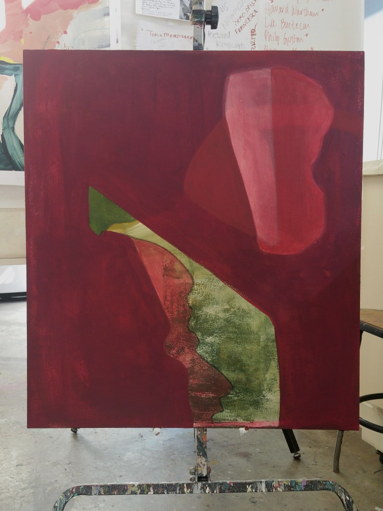
Acrylic on canvas. 36×32.