A few weeks ago I was discussing this idea of Color Therapy and how sometimes if you go out of your comfort zone you can discover strengths you have never known about yourself. I think sometimes we get too comfortable in things that we know and forget that if we branch out our world can get just a little bigger.
Over the past few weeks I’ve been working on a piece that incorporates certain colors that in particular invoke some anxieties for me: Light blue and red. The base of this piece was light 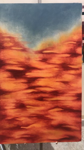 orange. As I started building up different tones of orange, I decided to add red tones to change things up. Red is a color I highly dislike and can’t even stand to look at it. However, testing art that evokes an emotional response is kind of the basis of art therapy in my opinion. To release emotions unknown to the client or the bring to the surface emotions that the client must confront in due time. I did this on my own with a new, uncomfortable color palette.
I began layering up these orange and red tones until I decided to add light blue for a complimentary contrast within the piece. The piece was more of a journey or a healing process for myself, rather than a piece of work to look pretty in a gallery space. I started 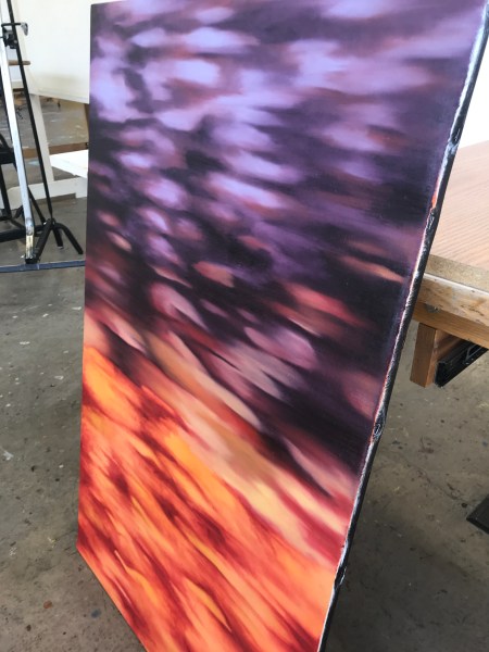 adding other tones and colors to the piece, but I am currently at a standstill. My process feels over, and I may start over again, going through a new artistic journey to finish out my semester process.
Within art therapy, I personally believe that so many things must be taken into account but sometimes it can be as simple as a longitudinal therapy session, where the client can work on one painting as a symbol of a journey or emotional conflict. 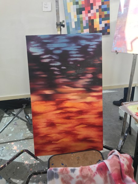
Love it. Reminds me of what the surface of another planet may look like. Nice work. 🙂
Thank you! I feel as though color and exploration can defy so many odds in the realm of therapeutic processing!! Thanks for reading!!