It was a morning commute on the LIRR as I scrolled through Instagram when I found it, the brief. If you’re up to date on my blogs, you’ll know I was establishing my art account and spending a lot of scroll time finding inspiration and watching reel tutorials. However, the quiet Wednesday morning feed produced my very first brief. I don’t know why I was surprised because I could have imagined accounts like this: ones that post prompts for you to design!
Briefs are a great way to stay creatively active during summer months and breaks, as well as keep your skills in the computer nice and sharp. They’re super easy and are social media based so you get to work on presentation and display of your work which has been super fun, helpful and beneficial for my designers skillset.
A Brief on Briefs.
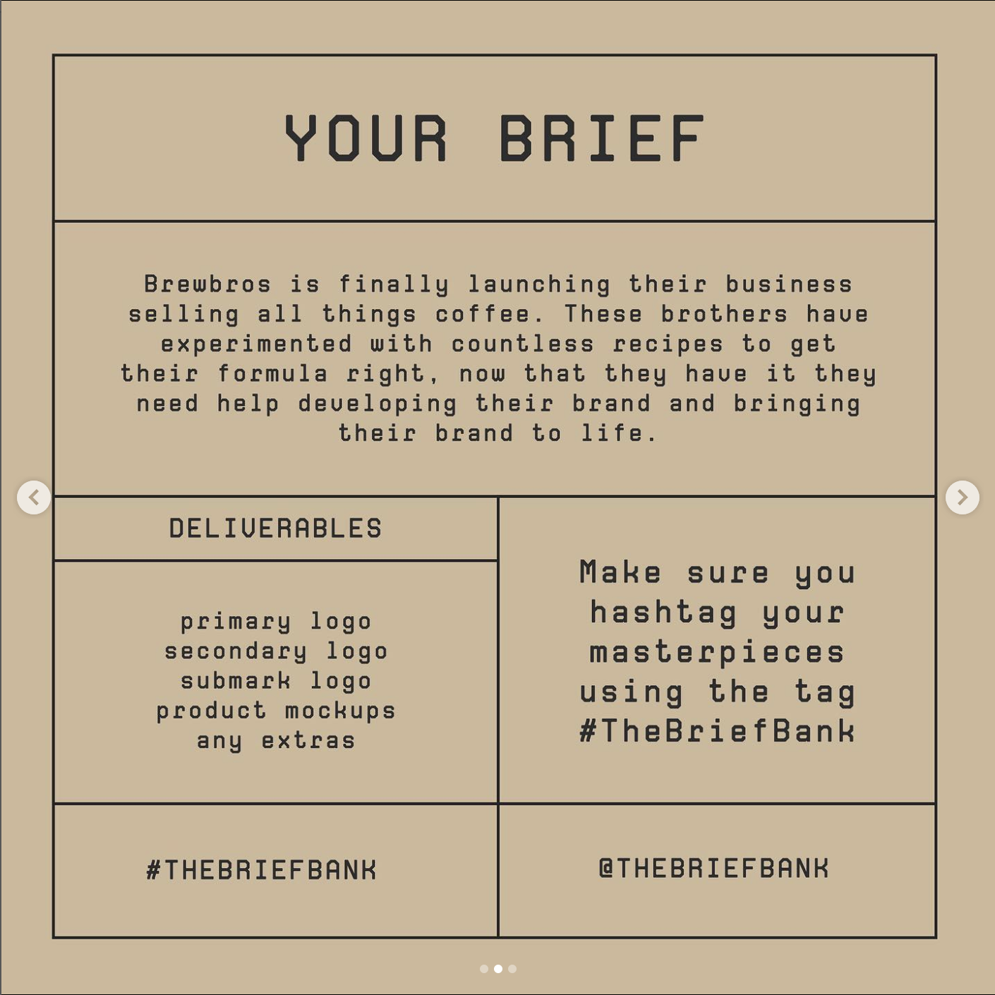
A regular brief is a design prompt that provides hypothetical companies and start ups for you to create logos, branding and designs for. There are numerous accounts that are specific for posting weekly or bi-weekly briefs that designers and artists around the world can participate in. A brief will provide a small description of said company and the design requirements such as primary and secondary logos, watermarks and packaging designs. Some briefs will give you a recommended color palette, although you have full creative freedom to choose and design what you want!
Although many briefs will give you a week or two to complete your designs, that is for the challenge aspect of the brief where they will pick winners based on the strongest design and presentations. You are still welcome to use the brief after the deadline which I find myself doing more weeks than not.
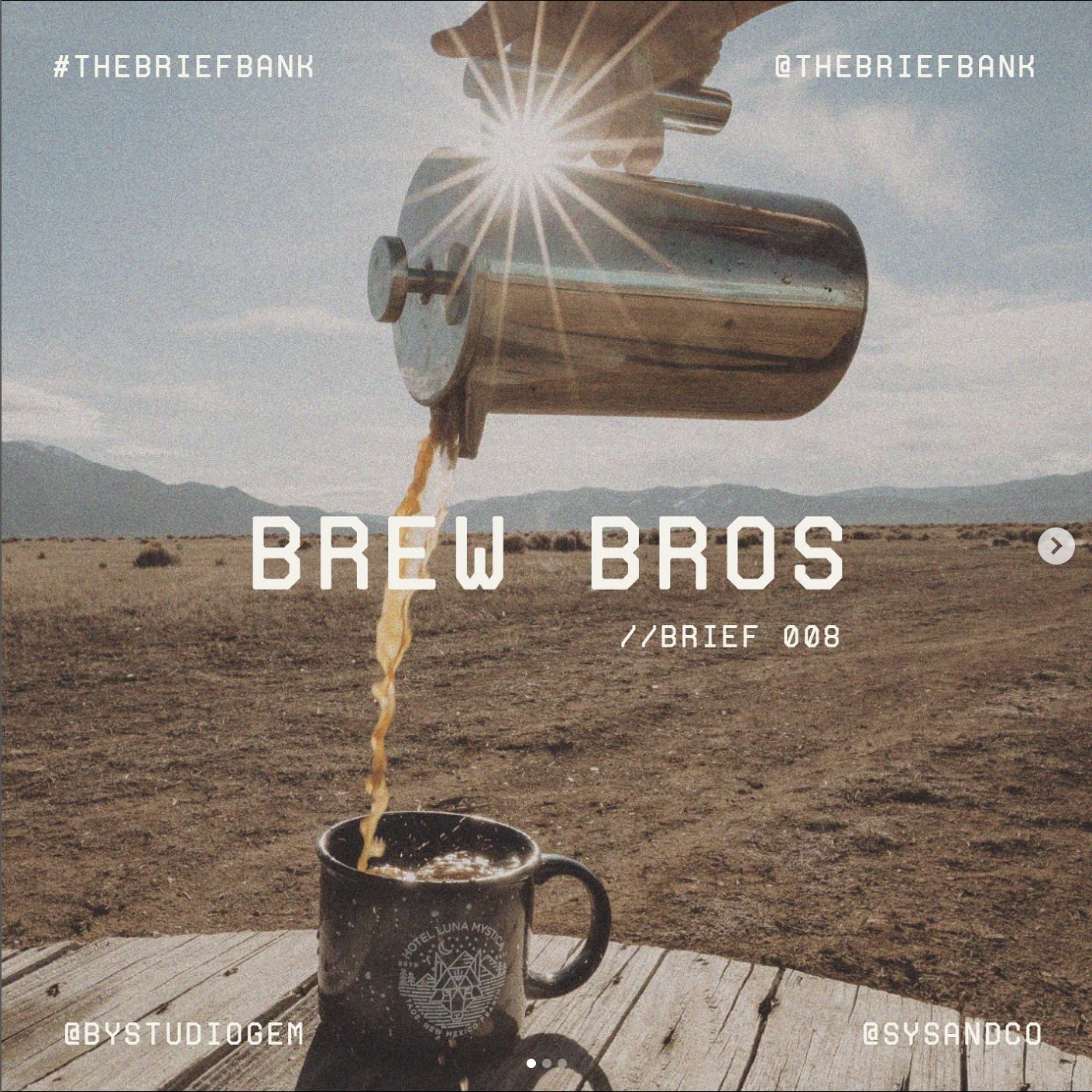
My favorite brief I’ve done so far (I’ve only done two) has been the Brew Bros. Posted by @thebriefbank on Instagram, they prompted a coffee company started by two brothers and wanted logos and some coffee cup styles. I was immediately inspired by a masculine take of a coffee shop and had a baseball inspired vision for it, since the name of the company reminded me of sports. I got working on some sketches and ideas for logos, patterns, products and layouts.
As I aspire to become more fluent with Adobe Illustrator, I made the logo there and then exported it to Photoshop where I edited it into a layout and graphics. I also used Adobe Dimension to make coffee cup graphics which I was really proud of myself for.
Overall, my goals were to use a bold color palette, with an athletic yet welcoming feel and to improve my skills in certain adobe products. Along with presenting my designs and layouts on Instagram, I really enjoy interacting with other designers and seeing how their final visions turned out. It’s truly amazing to see one hypothetical company carry so many aesthetics and potential.