Now that the spring semester is over and the 2015-2016 school year is over I can’t help but look back on all that I accomplished! It was a tough year overall, but it’s true that hard work pays off and I’m really proud of some of the work I came up with. During foundation year I was just learning the basics and didn’t really have a feel for illustration, so during my sophomore year this year it was really nice to finally take some illustration classes.
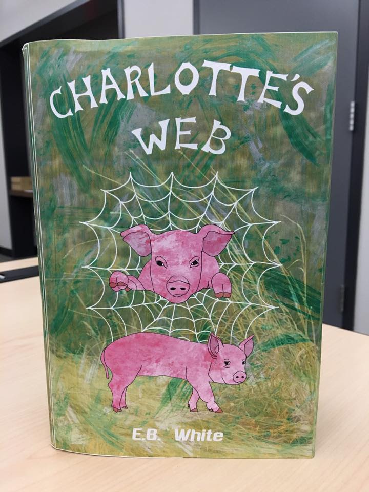
I had a lot of success in my Digital Illustration class and some of my favorite pieces from this year are definitely from that class. But my all time favorite would have to be a project where we picked a classic piece of literature and redid the book cover dust jacket. Since I loved this project so much I figured now would be a great time to share my experiences with it. For the dust jacket project I had to pick a specific art movement and incorporate that style into the design. I had so many ideas for this project, but I narrowed it down to classic children’s novels and ended up choosing Charlotte’s Web to recreate. As a kid I loved both the book and movie and I even watched the movie again before I started my project to get some inspiration. The art movement I chose to incorporate into the project was fauvism. Fauvism was an art movement that involved paintings consisting of bright colors, a flatter composition, and different brush strokes, and I thought it would be fun to play with that idea.
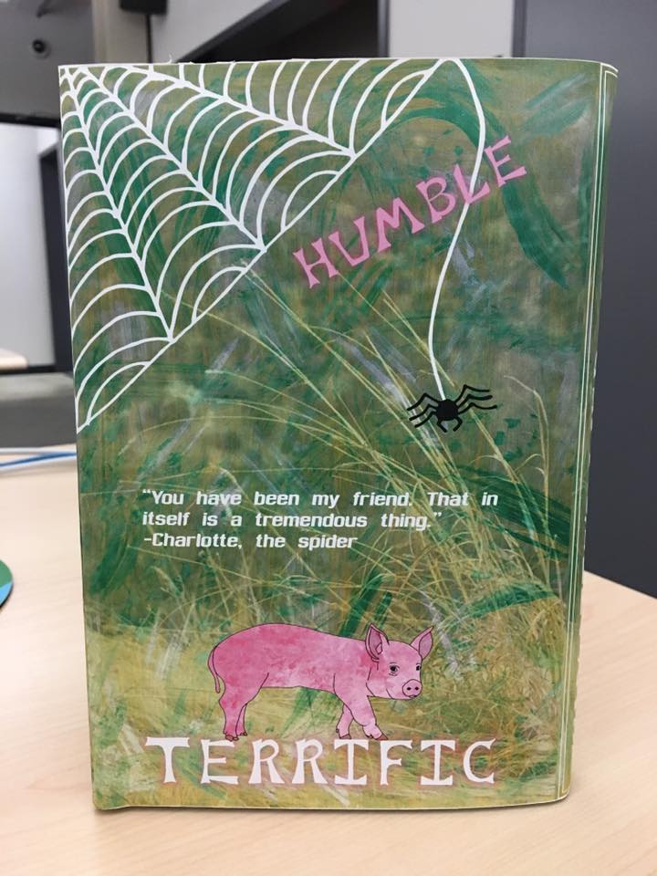
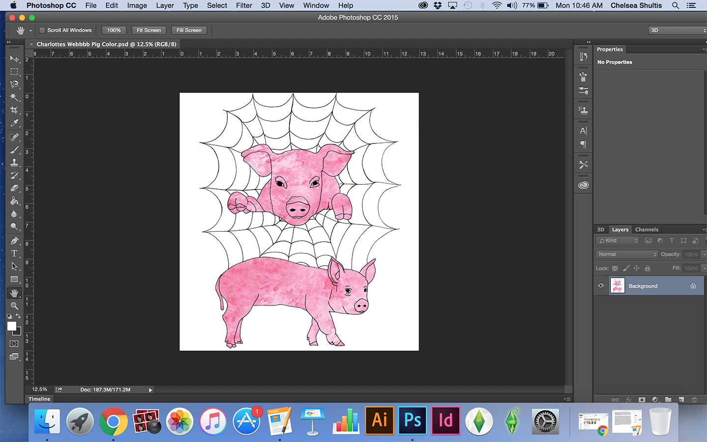
For this project I incorporated hand-lettering, photography, and collage with traditional art. I started off the project by coming up my own hand-lettering for the title of the book and various words from Charlotte’s Web like ‘Terrific’ and ‘Humble’. During the time period that fauvism took place, thick blocky letters were common and I replicated that into my hand-lettering. After completing my hand-lettering I traced the title in black marker and scanned it into the computer so I could fix it up. The second step I took was to draw out some pigs for the cover and it definitely wouldn’t be Charlotte’s Web without a pig so I drew out the pigs using pencil on bristol. I wanted my design to be interesting so I drew out a pig in the center of the page and then a spider web around the pig to make it look like he was hanging out of the web or about to jump out. Then I drew another pig underneath, and once I was done I scanned my line drawings into the computer and fixed any impurities in Photoshop.
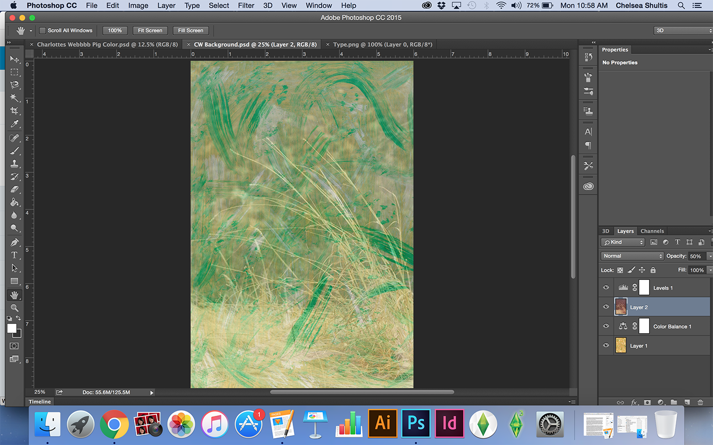
To color in the pigs I took a traditional approach with painting. I took acrylic paint and mixed different reds and pinks. Then I dabbed and swiped the different colors onto paper to create a different texture. I used the same approach to create possible backgrounds as well. Once I was done creating different textures I scanned those into the computer and cleaned them up in Photoshop as well. The next step I took was to combine my line work and paintings together in Photoshop. I did this by deleting all the white space from my line work. Then I placed the textured painting behind my line work to look like the pigs were colored in. Then I had to do a lot of erasing so only the pigs were filled in with the bright pink color. After a lot of playing around in Photoshop it was time to work on the background. For this I combined photography with another textured painting I created. In Photoshop I placed the painting on the bottom most layer and then I placed the photograph on top. The photograph I chose was of a hay pile and a grassy area. To get a collage-like effect I changed the opacity of the photograph to get the paint strokes from the background layer to show through. I also adjusted the levels and the color balance until I was happy with the overall background image.
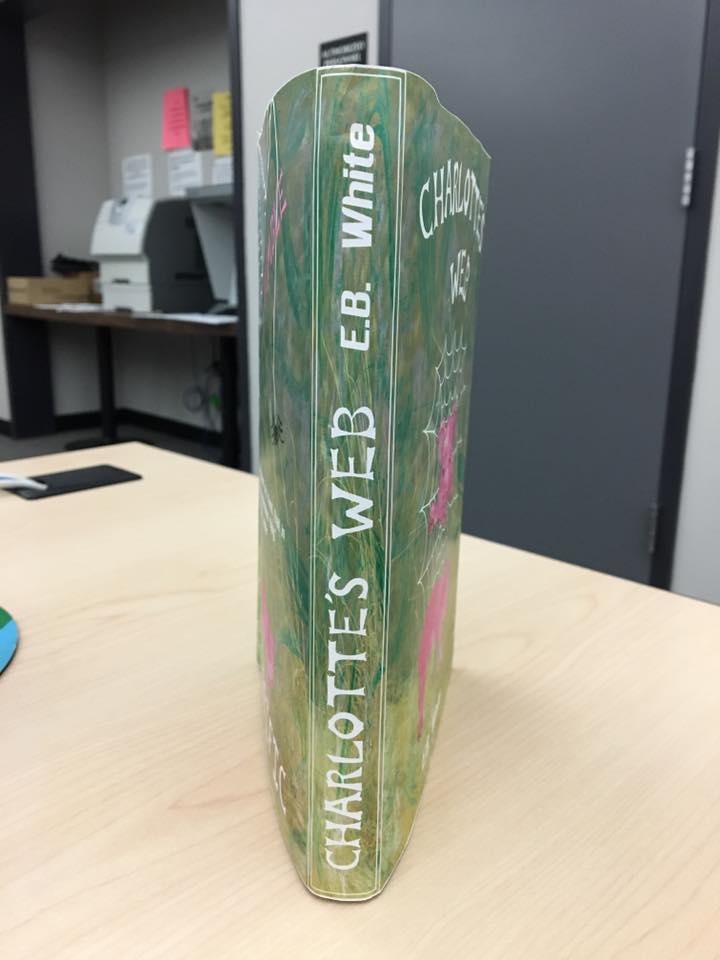
Once I was done with each individual piece of my design it was finally time to start putting the book cover together in InDesign and add some finishing touches. I made a majority of the text white so it would really stand out against the bright green background. I also placed a pink glow around some of the words which added a nice touch. Overall, I am very happy and proud of what I came up with for this project and I think it represents fauvism in a new way. The color palette I used was simple and mainly just pinks and greens whereas in the past fauvist paintings used many highly saturated colors. Nonetheless, I still think my project captures fauvism well. Another thing I enjoyed about this project was that it allowed me to learn about and try a new art movement style that I was not very familiar with. In general it was a great learning experience and I definitely plan on trying some of these same techniques in the future again. After all, it is summer now and I will have a lot of time to experiment. Here is the final dust jacket and what it looks like on an actual book.