Hey everyone! So coinciding with the beginning of my Spring semester, I will be focuses my posts on schoolwork and just more design rather than fine arts as a whole.
The Beginning of the semester usually starts off with great enthusiasm but poor executions just due to being slightly rusty because I don’t focus on Illustrator or Photoshop as much as my pen or brush. This semester is starting off well though with 2 projects already on my lap.
Project 1: Ligatures
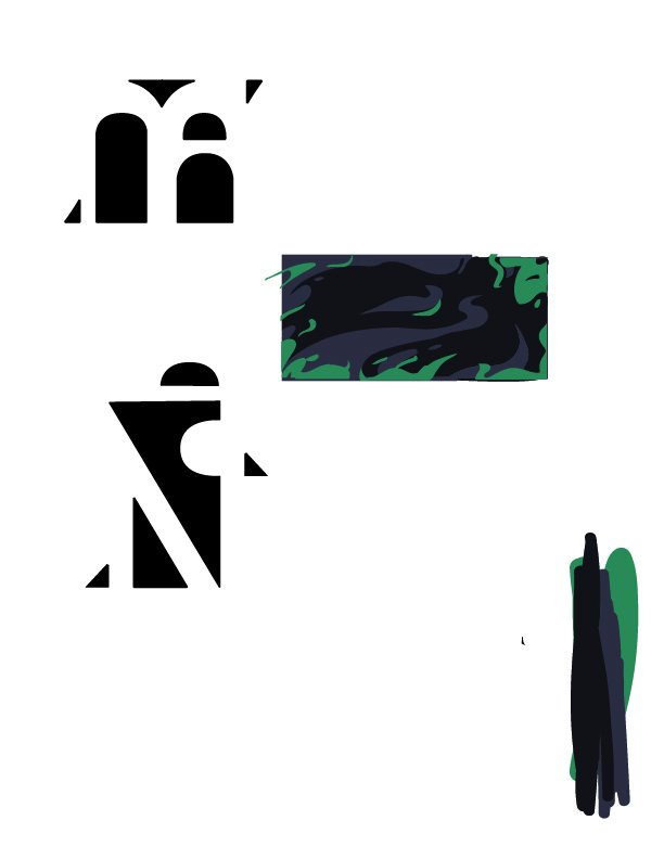
My afternoon class is starting which is Joey Zarcone’s “Intro to Graphic Design” is a ligature of our own initials. We have to keep in mind about how it may be used in various mediums such as it’s consistency with or without color and how it would be presented on a product, our example being a business card.

This process typically produces a lot of scraped ideas as you can tell. The only ones I decided to continue with on the computer were circled out of 30 thumbnails I had done. The next picture is where I am at currently with the project with 2 finished logos to compare and a rough sketch of a business card.

Project 2: Bucket List
This next one is for Sue Jenkins‘ “Graphic Arts II” class. Scrolling through Pinterest or Instagram, it’s pretty common to see people specializing in typography to create inspiring posters or personal bucket lists to show off their compositional competence. That’s how I am viewing this project, while still trying to develop something unique.

What I thought would differentiate this poster from any other is using the center of the composition for the title with the actual list sort of emanating from it.

This is where I currently am with it. I have some difficulty at the moment trying to get a feel of what the technique should be for this. I wanted this to at least appear handwritten in a sort of innocent or amateur way so I simplified some illustrations. What I really want to achieve however, is a charcoal or ink sort of texture in the background that affect any legibility.
Sketch of the Week

Hope you all enjoyed!