Hi Everyone! This week has been a little crazy when it comes to my workload. Today I’m going to be showing a small bite size piece of my portfolio which I’ve been dedicating my time to during the past week or two. This year’s projects have really improved my understanding of Design, Adobe products, and how to stay consistent when it comes to craftsmanship. This can be explained better in my last post regarding the infographic recipe. That project is where I feel I should be at currently as a Graphic Designer, and so the work I had done earlier in the year should be looked back on now with fresh and more experienced eyes. Today I will be showcasing my movie title design project.

This was assigned to me in last semester’s Intro to Typography class with Professor Christine Medley. The goal was to simply create a title with an accompany animation. This was suppose to help me get accustomed to AfterEffects on a basic level and even more important, think about how I can express a concept or emotion like a Movie with Typography. For this project I got to pick “Little Shop of Horrors” as I found it to have lots of potential for improvement compared to it’s revised design in the 80’s motion picture.
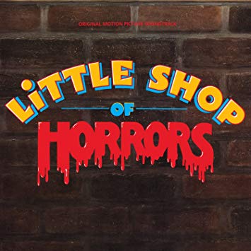
This design I came up with however just seemed flawed. Firstly, the animation was rather rushed and done through Animate by the approval of my professor. The spacing in general is wonky and just felt too stiff and amateurish. And most important my concept was lacking, I thought more about the environment rather than the emotions or characteristics of the movie. I tried to make it seem like a vintage sign being eroded by foliage as reflected in the film, but that isn’t necessarily what it is about, is it?

Revisiting this design meant changing how I want to interpret the story. In essence, “Little Shop of Horrors” is comedic and scary in a more slapstick kind of way, and done through the lens of 60’s Soul music just as the musical. So while trying to still focus on the contrast between “Little Shop” and “Horrors”, I tried capturing the essence of the movie through sharp and organic shapes like a more 60’s design style. Hopefully this will go well with my professor in the portfolio review in two weeks as I feel it has improved significantly and hopefully I can get the time in to work on a new animation now that I am comfortable with AfterEffects.
Hope you all enjoyed!