I’ve been doing a remote internship for the Scranton Fringe Festival as a Graphic Design Intern over the summer of 2023, and I figured a blog post about some of the things I’ve been working on would be a great way to further connect the art communities of Marywood and Scranton!
This past spring, the Scranton Fringe Festival website was custom designed by undergraduate Graphic Design majors at Marywood University as a service learning project in Art 441I: Interactive Design II taught by Sue Jenkins, Associate Professor of Art.
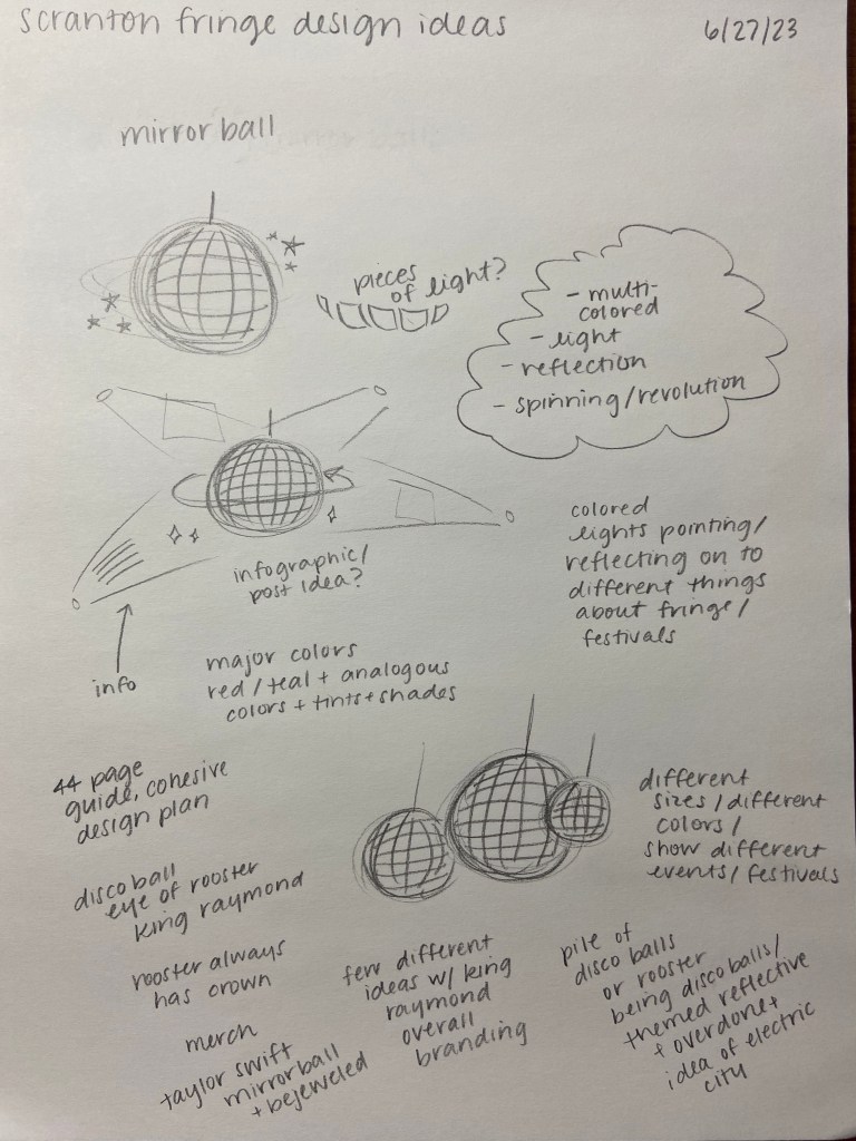
During my internship, I was tasked with making graphics and laying out a 20+ page guide for The Scranton Fringe Festival’s main festival, somewhat based on the look of the new website. The festival is happening September 28-October 7, 2023 right here in Scranton! After discussing details for this project in particular over the phone and by email, I got to work on thumbnail sketches. I often take notes when doing sketches as well, whether those are my own thoughts or ideas, or ones I took from a conversation. Although these aren’t the neatest sketches, they’re just supposed to be a starting point in getting all of my ideas down on paper to be developed later on.
The overall mirrorball theme is something I’m really excited about, especially because there are so many connections to reflection, the arts community, and light throughout the entire Scranton Fringe Festival brand.
After brainstorming on paper, I opened the Procreate app on my iPad and began refining some ideas that I’d drawn out, as well as developing some new sketches based on my notes. This step is important in providing a better visual, especially through using color, which is very crucial for these concepts.
The overall mirrorball theme is something I’m really excited about, especially because there are so many connections to reflection, the arts community, and light throughout the entire Scranton Fringe Festival brand. I first thought of the mirrorball idea as an overall theme concept when scrolling through their website, being the first banner image is a mirrorball. I thought this could be expanded upon, especially since the idea behind the festival is to reflect the art of performance back to the community so everyone can come and appreciate it. The colors, again, were a crucial point in developing the thumbnail sketches, especially because mirrorballs create so many different colors when light hits them. In order to keep a color palette though, I took some inspiration from the red and black colors of the brand, as well as the teal accent from the website. Some other analogous colors to those included pink, blue, and purple. I also played around with some different brushes like a lens flare and lightpen to create shiny surfaces and circular design elements. Another important part I was asked to highlight was King Raymond, their “chicken/human hybrid” mascot. In creating a main guide for the main festival, we wanted him to match the theme too! We tossed around some ideas, about making his eye have a mirrorball in it, for example.
Here are some updated progress photos! I am still working in Adobe InDesign to create a layout that is both clean and cohesive, but still connects back to the vibrant theme. I definitely recommend visiting the Scranton Fringe Festival website and getting involved, especially because some very talented Marywood graphic design students designed it! They are a great nonprofit to support, making art accessible in the surrounding community through a variety of events and performances!

