I focused more on capturing the figure with little outlining this week. I aspire to illustrate extreme contrast between the highlights and shadows. I am satisfied with the use of this technique, but my figures still need work. Also attempting to add color into my work, I utilized the thin-point sharpies. This created simple, yet eye-catching illustrations. I also went back to a bit of crayon work as well.
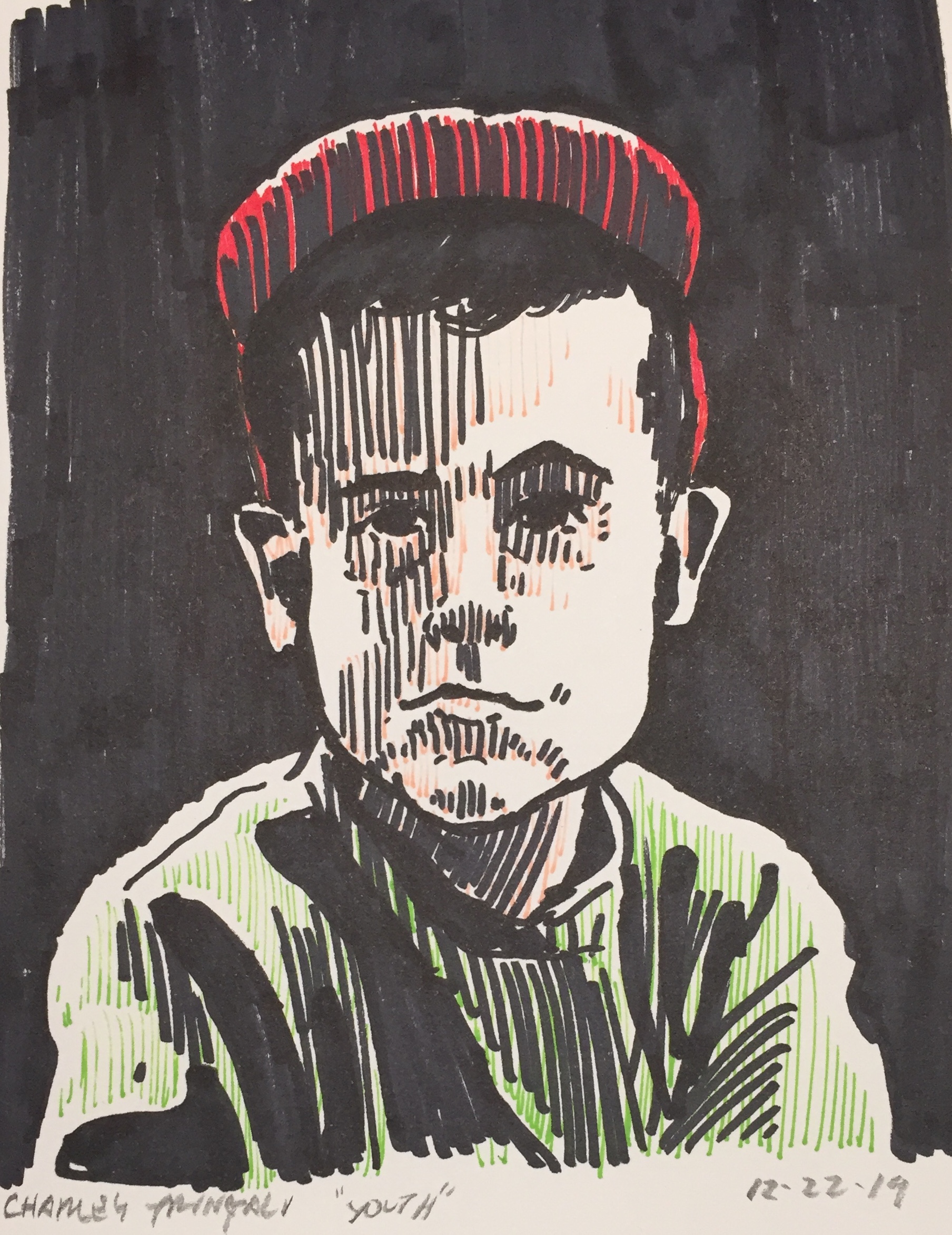
“YOUTH” – This drawing was done from a photograph of myself when I was a child. I failed to capture the likeness, especially the age. I almost look older than the age I was in the photograph… the chin should be higher and cheeks wider. Other than sharpie work, discovered placing lines with the thinner sharpies over top. Using the color to accentuate the shadows and middle values, the whites (highlights) pop even more. The colors are much more saturated than I would like, but it glows more than it would have than with realistic ones.
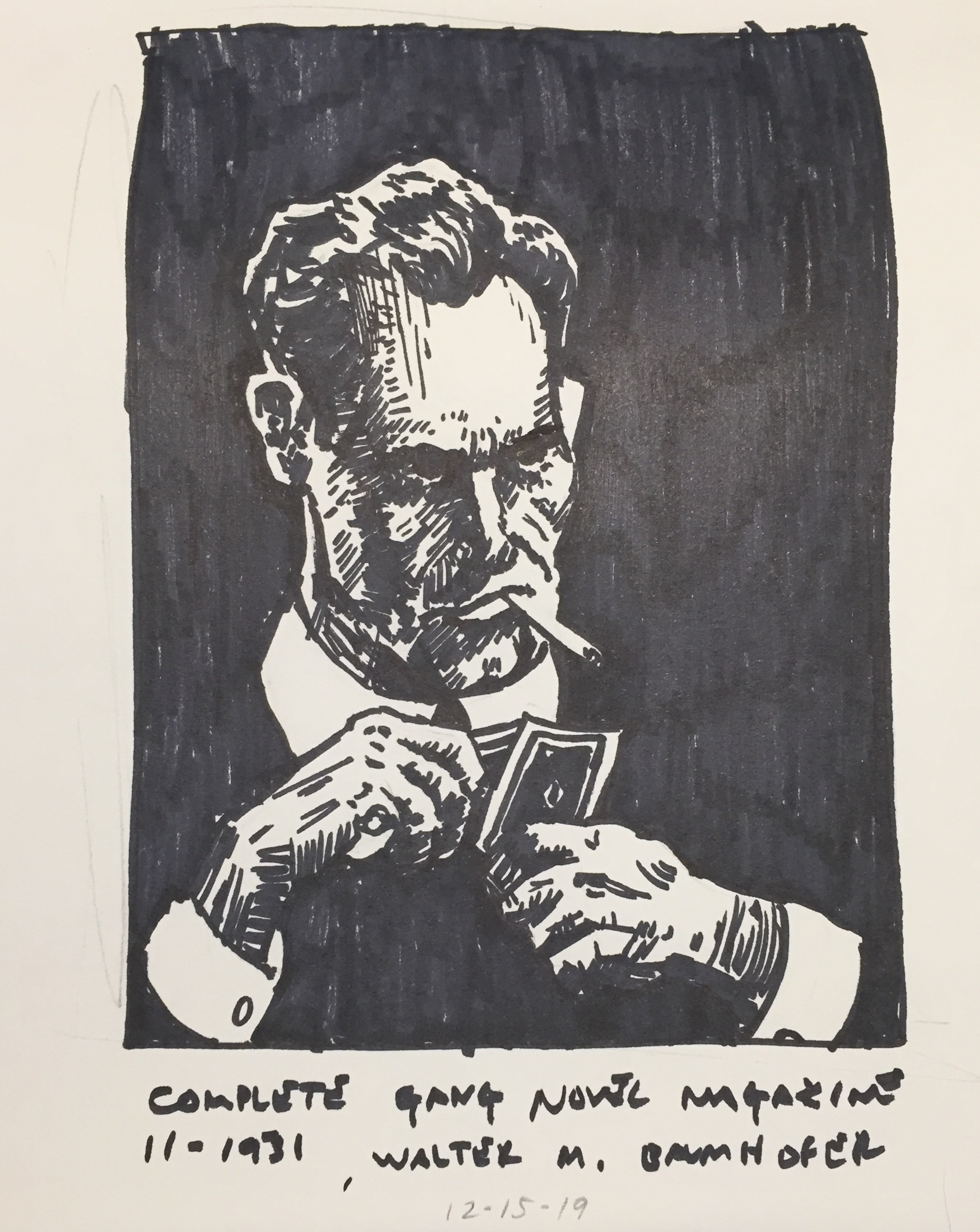
Looking through a book compiled with pulp art and artists, I stumbled upon Walter M. Baumhofer. I liked his style of illustrating on his covers. Looking deeper into his work, I found that he completed many finished paintings/illustrations. This drawing was done from “Complete Gang Novel Magazine” 11-1931. The way that the head and hands are detailed and his body is part of the background is what drew me to his work in the first place. With the sharpie, I used very rushed strokes instead of taking my time too.
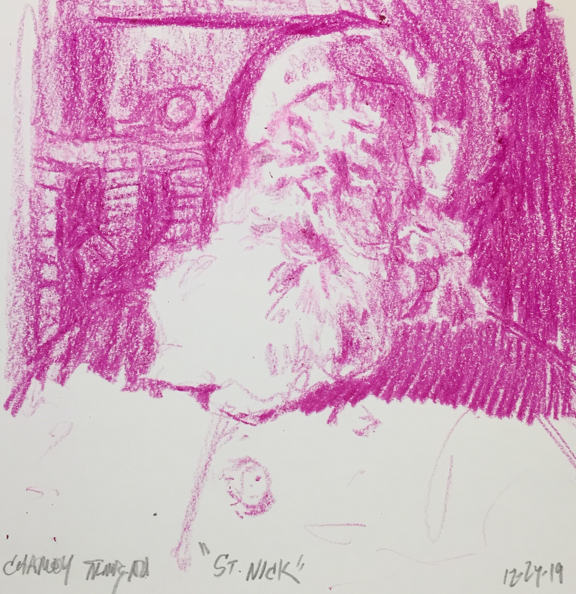
Back to crayon work. This is a week late, but I drew Santa Claus in celebration of Christmas. I zoned in on the shadows to really make the white/highlights glow. I believe I executed this successfully here.
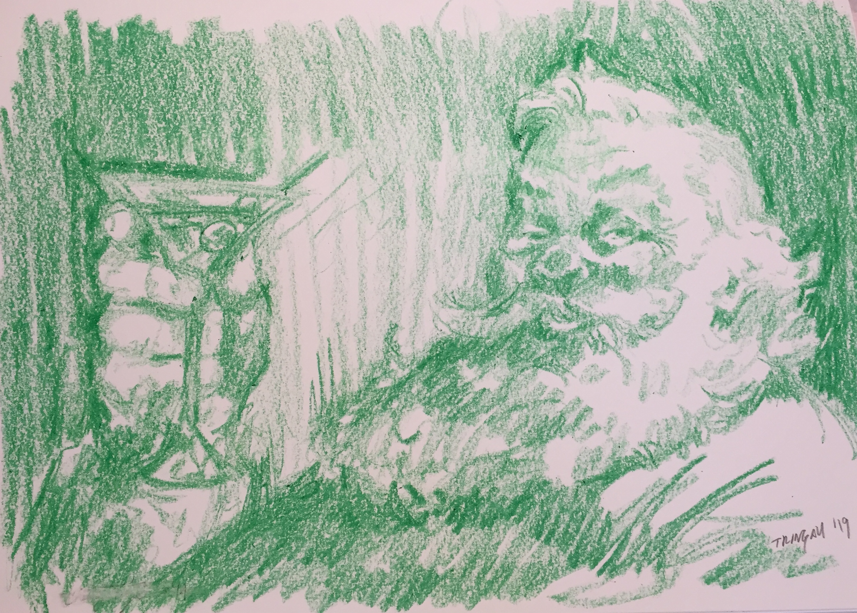
Another Santa Claus. I used the Coca-Cola Santa as reference. Using green to contrast the red from the previous for the Christmas season it gave it a cool look. I drew him with a Martini relaxing after a hard nights work. I don’t think the lighting is very believable, but I think it came out well