Hey all!
This week in my adventures in Illustration class we have been working on movie posters! Luckily enough, on our list of movie posters were a couple of scary movies, perfect for the season!
They were all black and white films, so they were all older. On the list was Psycho, and me being a horror movie fan that had somehow always avoided watching this movie (completely not on purpose btw), I was pumped to watch it.
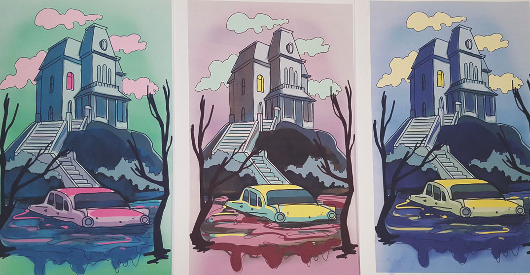
The movie, I must say, was fantastic. Norman Bates had become one of my favorite all time villains. In any case, I wanted to capture the simplicity of the horror, while still using colors to create an atmosphere. Using the house as a classic symbol that most people would be able to recognize from the movie, I moved some of the scenery around, using artistic license to put the car from the swamp in front of the home where Norman lives with his mother. I have 3 different colors in these sketches, as I am still playing around with the idea of the colors to give a kind of eerie feeling.
I wanted to also use creepy trees to frame the picture, using them to almost isolate the middle ground. I think I will extend the trees even, to create a creepier effect.

These aren’t the finals yet, but I like the eeriness of the green one, while the blue and yellow colors work really well.
Anyway, thanks a lot guys and I will see ya later with an update on the finished piece! Have you ever made any movie posters? Let me know in the comments! Thanks!
I vote for the green one!