There’s the famous quote, “don’t judge a book by its cover,” and while I agree with that I also think the cover plays a significant role in a books success. The cover of a book, or even just simply the spin of a book, is what catches ones eye in the book store. The illustrations on book covers make someone want to turn the book over and see what it’s about or open it and just dive right in.
 In high school John Green was my favorite author (he might still be but he has some competition). I still follow him on social media he recently released a photo of his new book’s cover, Turtles All the Way Down. Now honestly I had completely forgotten he was even writing another book but I got so excited when I saw the post and he wrote a lovely little caption mentioning the illustrator, Rodrigo Corral, who created the cover of the new book and of his past book, The Fault in Our Stars. In that moment I realized how underrated book covers are, not just the artworks but the artists who create them. I just started reading a new book on Monday, The Infinite Moment of Us by Lauren Myracle, who’s written a different book with John Green and another author. In this book there is a myth of a grandma and her grandson (this is not a spoiler all this happens within the first chapter). Myracle wrote, “An old woman told her grandson that the world rested on the back of a giant turtle. ‘It does? Well what does the turtle rest on?’ the grandson asked… The old woman laughed and said, ‘That’s the best part. It’s turtles all the way down!'” The title of John Green’s new book made absolutely no sense to me but now I have some better insight and simply wanted to share it with others.
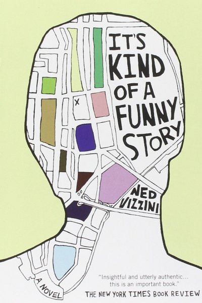
My favorite book from high school was It’s Kind of a Funny Story by Ned Vizzini. This book is amazing, not because there’s some amazing new universe in it or anything like that, it’s just a simple real story of a teenage boy. Towards the end of the novel the main character, Craig, starts creating these map drawings but they’re not of cities there of a person, how their mind is mapped out. This little detail made the cover so much more intriguing. The cover gives you a visual of what the maps look like. (Come to think of it, Craig was using art at therapy while in the hospital, he just didn’t word it that way. Maybe subconsciously this had an influence on me wanting to be an art therapist; this book showed me a success story with art playing a role.)
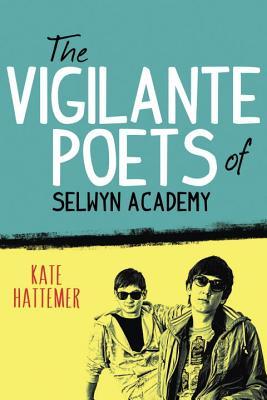 Now considering I’m a book junkie, I obviously didn’t just have one favorite book in high school my other favorite was The Vigilante Poets of Selwyn Academy by Kate Hattemer, which I discovered my senior year. The cover of this book caught my eye in a bookstore, as well as the word vigilante used in the title. The cover is bright yet simple. My favorite thing about it though, is the edited, drawing-like images of the 4 characters, 2 on the front and 2 on the back. Honestly the characters just looked so cool that I knew I wanted to read the book, which was such a good decision. The book surprised me and I loved it. None of my friends had read it and I had never heard of it so if it weren’t for the cover catching my eye I may have never read it and that would have been a tragedy within itself.
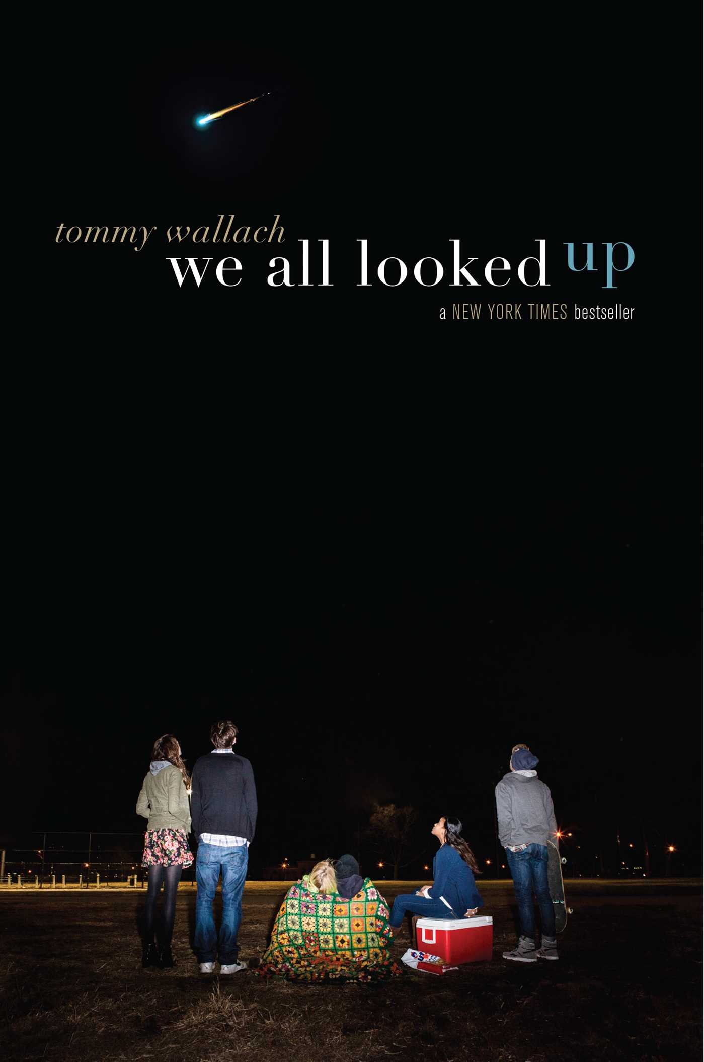
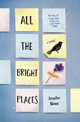
Last summer I read 2 books back to back that I bought together at a book store; both of which caught my eye there. The books were We All Looked Up by Tommy Wallach and All the Bright Places by Jennifer Niven there covers are completely different. We All Looked Up‘s cover is a photograph of friends sitting under a shooting star; it looks like it could be a old photograph of any group of friend that one could find in an old photo album. The only thing that set it apart from any every day photo was how prominent the shooting star looks in the sky. The cover just made you want to be a part of that friends group. On the other end of the spectrum All the Bright Places has a cover that is a simple lay out that looks like post-it notes with a doodle-like drawing on one and a flower taped to another. It almost looks like a collage one would make for fun one day. The doodle is a bird specifically a finch and the taped flower is specifically a violet. Once you start reading the book you realize the characters names are Theodore Finch and Violet Markey which makes the cover clever in my opinion.
Another book I read more recently is The Museum of Intangible Things by Wendy Wunder. This book is one that has 2 covers, an original and a new one. I have the original and love it because the cover looks like it could be a sketch taken out of someones personal art journal. It’s simply a car viewed from above with 2 girls getting out of it and the title is written on top in cursive that looks hand written rather than typed. I’m a person that always likes the original cover because I feel like they’re more authentic in some way but for this book I don’t mind the new cover. It is a photograph looking cover with a hand lettering design on top of it. What’s funny is, I was in a bookstore a while ago and I saw this cover and immediately picked up the book because it just looked cool and then once I did I realized it was a book I had already read. I think it’s very cool how both style of the covers made me want to read the book.


A book that’s cover wasn’t the reason i picked it up is called, My True Love Gave to Me,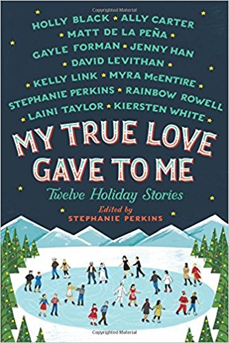 which is a book of 12 Christmas short stories written by 12 amazing authors. I found this book when looking up an author and realizing he wrote one of the short stories and then when reading about this book i recognized multiple authors names and just knew I had to read it. The cover is just of 12 couple ice skating but as I read the stories I realized each of those couples resembled the couples of the short stories. I turned the cover into a little game where after I read one of the short stories I would try to figure out which couple on the cover was the one from the story; some were clearly easier than others. After I read them all I finally figured out each couple on the cover and that just added to the quality of the book.
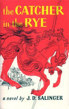 I just finished reading, Catcher in the Rye by J.D Salinger, now I know I’m a little late to this book since most people read it in high school but for some reason that was not a book I was assigned to read. My friend actually just gave it to me for my birthday this year and so I gave it a go. After reading only 50 pages of the book, I found myself constantly looking at the cover before even opening the book to read because i felt like there were hidden meanings in it or something so I did what anyone would have done and googled, “catcher in the rye illustration” which then when reading almost ruined the book for me because it started to explain things about the book that I had not gotten to yet. Luckily I stopped reading before the explanation of the carousel horse or else there would’ve been no reason for me to finish the book. All in all though i think this book is a perfect example of how a book cover adds to a book and the whole experience of reading one.
I find the covers of a book to be a glimpse into what the author was envisioning. Even if the author wasn’t involved in the illustration I still think of it as an insight, a little secret maybe, to be let in on if you pay attention enough to it. I also feel that although you maybe pick up and start a book due to the cover, the cover isn’t truly meaningful until you finish a book.