Welcome to another segment of, The Work In Progress. Today I will discuss my design process for a personal project creating a cover for JME’s album, “Man Don’t Care.”
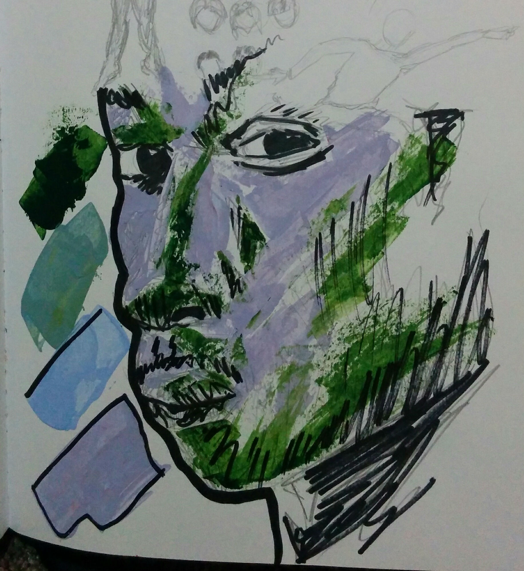
I typically start with the form and color when creating a new project. By creating a sketch I know about the general idea of the finished product. Not only that, but it also gives me confidence to continue on. It shows that I can use my style to create what I intended to in my head before actually drawing on the art board. From the image above you can see my experimentation with color. Knowing JME’s personality and his music style is important to choose the right color. His music is hard, but not extreme as some other raps may be. He went to university, is conscious about the world’s problems, and has great humor, so to me the perfect colors for this album would be black, blue, and green with a “grimey” style. He needs to stand out from the rest, so instead of the normal dark covers it will be bright with light blue, neon green, and white.
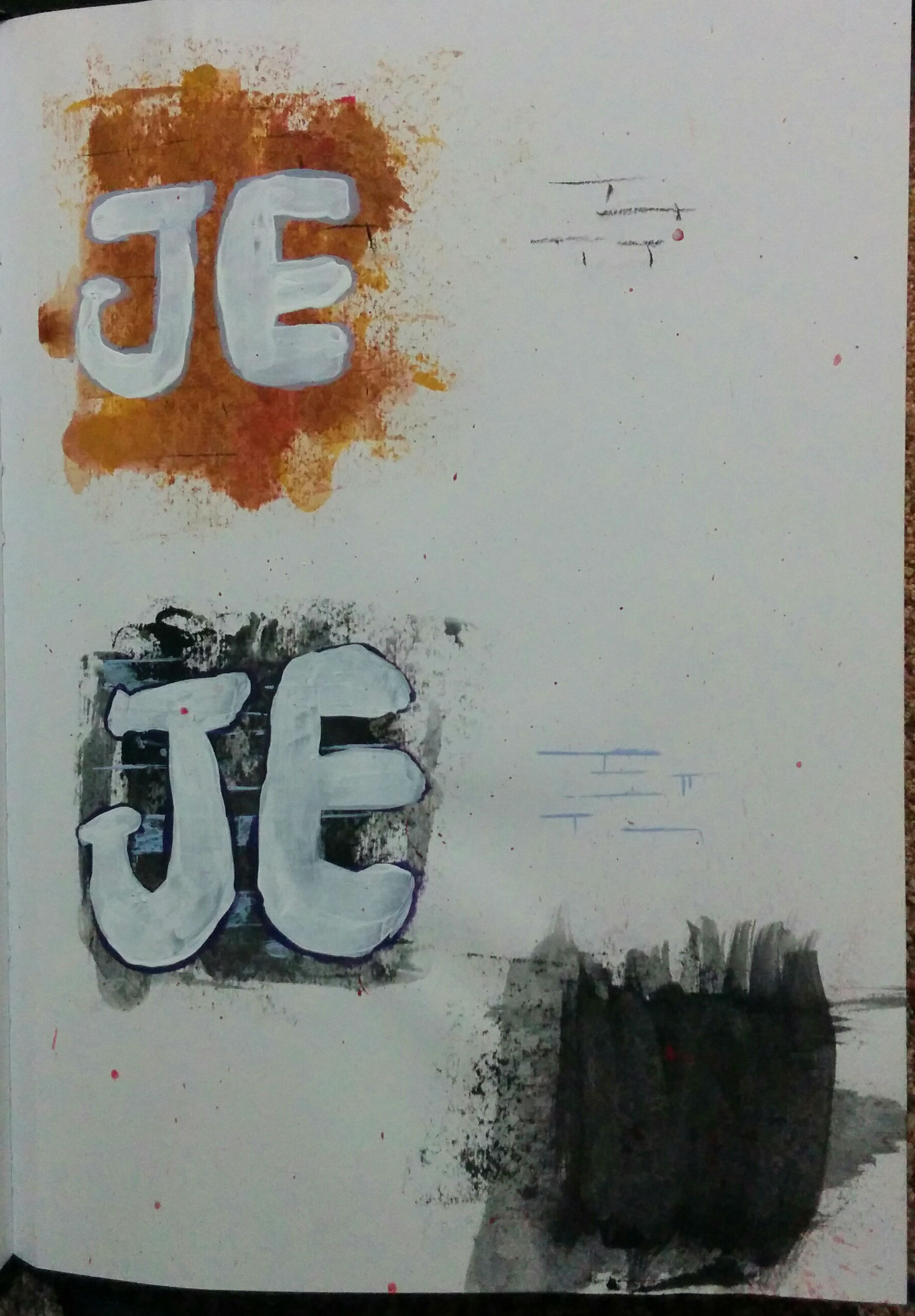
Now that I have the colors for JME, I needed to work on the background. To show that he still originated from the streets, I decided to have a brick wall texture. I narrowed the colors down to light brown with a red hue, or black with a baby blue hue. His name also needed work. I tested to see how it would look on the background I created. Between the two, the black wall definitely works better.
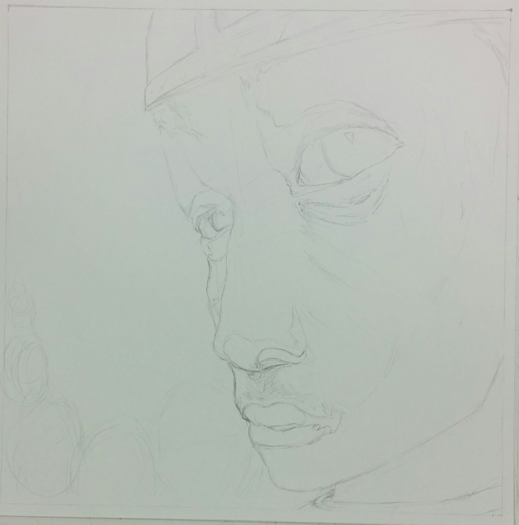
When I finally moved over to the art board, I started with the outline. I enjoy foreshortening and this album had all the signs telling me to actually use it. I find it humorous and strengthening at the same time, which is what JME’s personality seems to be. From the outline you can see the movement towards the left from his hat, his eyes (one of the main focuses on a person), and chin. The left side would have the album name and the artist’s name so I left in the right amount of space just for it.
Sometimes when you start adding in details you realize what else could change. The mouth and forehead needed a bit of tweaking which I easily fixed. Much like in “Mary and Son,” I painted on a back layer of color to lessen the chance of a bright white shining through, and also to set a gradient and medium value. I start with the darkest colors first which include shadows. Using a permanent marker on the face instead of paint is better here because it has a finer tip for the details shown. I finished the background layer during this stage because objects and words could always go over it. None of the colors or shapes from the background should be shown above a different layer. In the end it was easier for me to finish it now.
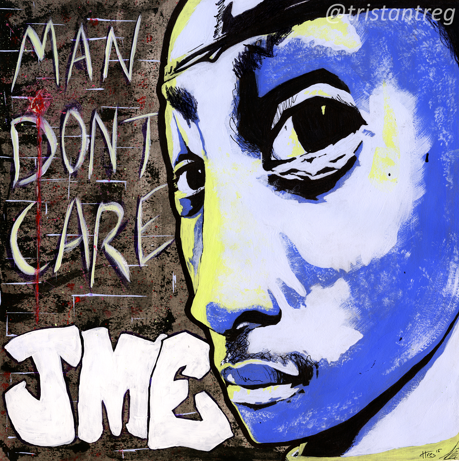
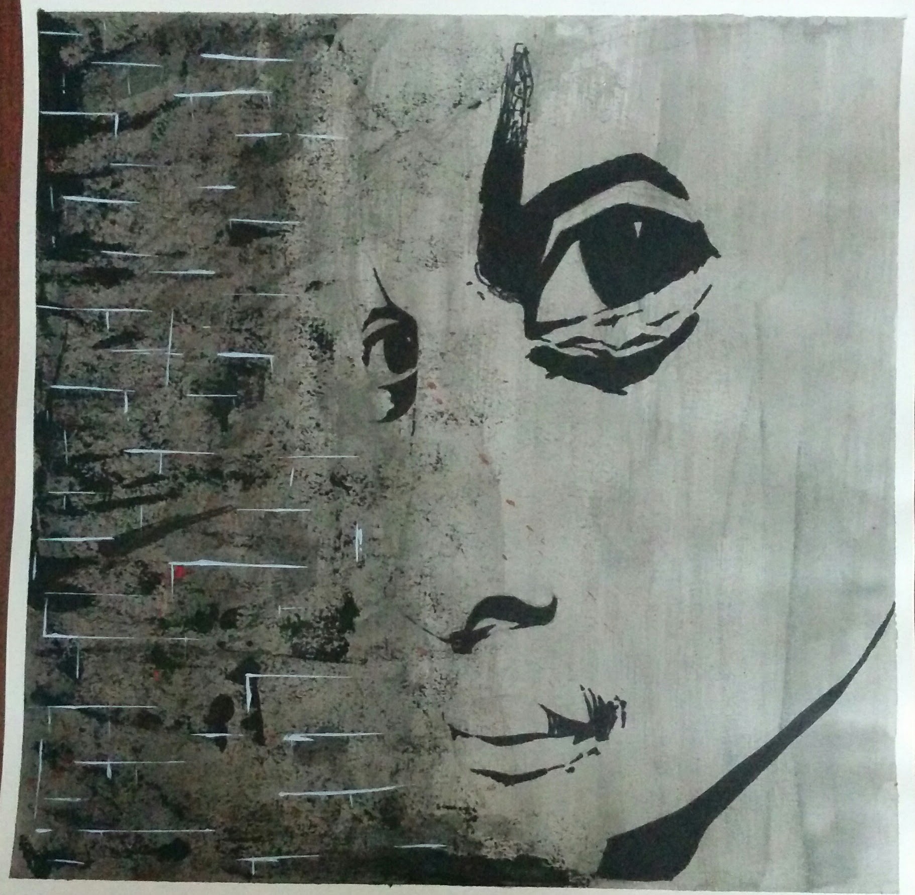
Adding in the colors and lettering became smooth sailing because of the experimentation and sketches I worked on before. I knew what colors I wanted for which values on the face, and I knew what color and design I wanted for the lettering (including the spacing). I will admit though, sometimes I won’t sketch out my projects and it still turns out strong. For me there are exceptions to this, but it all depends on multiple factors including my confidence. Without confidence, I typically would experiment with my style by sketching and designing.
Nonetheless, with my love for several grime songs, I enjoyed creating this album cover. The style, movement, design, and type gives off a perfect theme to JME’s song, Man Don’t Care. I guess learning about Kandinsky was beneficial after all. Who would have thought that teachings from my first year of university would have an impact on me today?
Please leave a comment below if you have any critiques or comments, or simply just LIKE and SHARE!