Welcome to another segment of, The Work In Progress. Movie posters have been a craze for many Illustrators in the past and it was time I took my hand at designing James Joyce’s, “The Dead.”
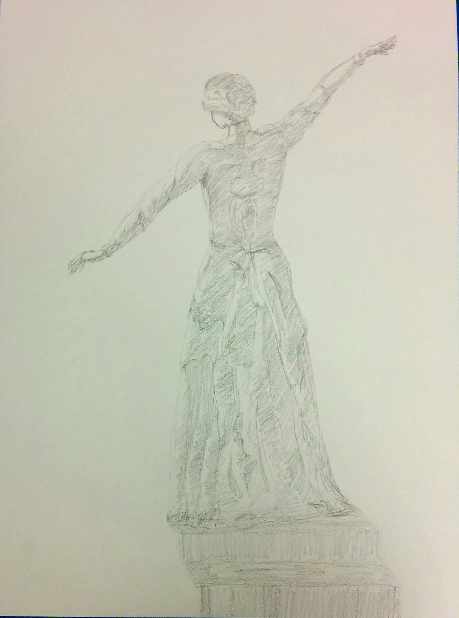
This project became one of those instances where I did not rely on my sketchbook. Although I did sketch out a few poses, I never looked back on them. I enjoyed the book and movie so much that I knew what exact emotions came out of them. I needed a certain medium to work with and the water/ink technique fit in well with the atmosphere which Joyce creates. Among my travels in Europe, I was given a video for inspiration while helping raise money for kids in Nepal. Although the video’s message is about the impact of dirty water on a society, the art style really spoke to me, and thus it became one of my favorite mediums to work with. Knowing how ink flows through water, I decided to have movement in the figure from top to bottom in diagonals. Even in the vertical dress, I added in designs which incorporate diagonals and space. This outline also shows how Figure Drawing class helped me improve on drawing figures without a model.
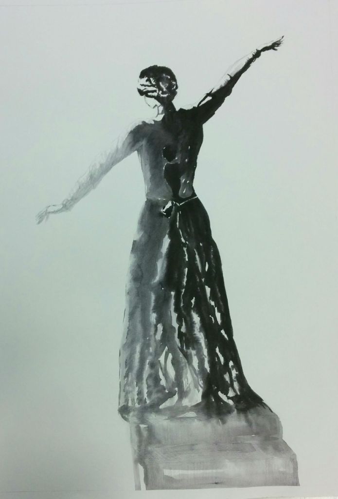
Once I laid out the first layer of ink, I had to see which parts needed more value, including figuring out the form in space. Immediately I noticed that several places needed to be darker. Although parts of the body would benefit with a light tone, I had to think about the global light source and the emotional connection. Hence, I decided to have the finger tips lighter while the rest of the body adjusted with the global light. The stair case was not stable either, and the composition is not balanced assuming that heavy type would lay in the top left portion of the poster. One of the current solutions to figuring out how to correct a design is through a photo editing program.
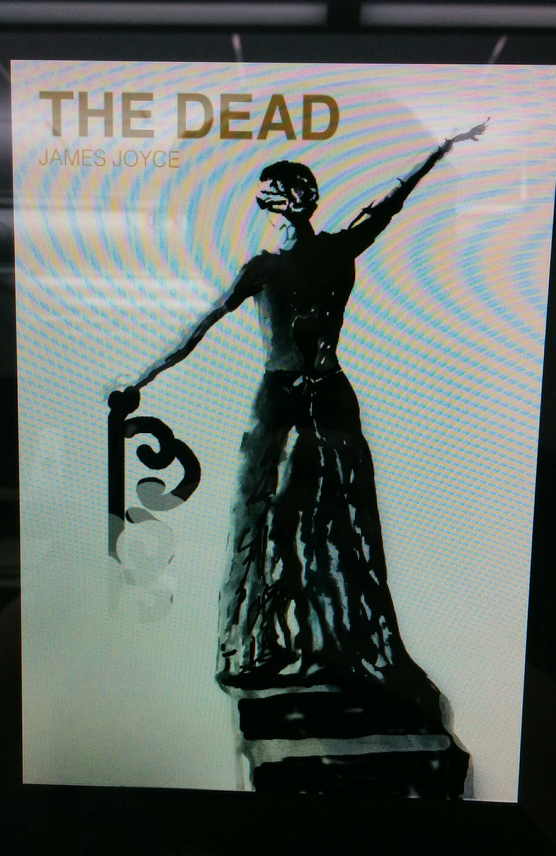
By using a photo editing program I can experiment with different colors, different objects, different values… the possibilities are endless. It will lead to a more successful piece once you can see your improvements instead of imagining them. I thought of adding darker values on the body and staircase, a newel to create more balance, and a general idea of the placement, color, and type face for the text.
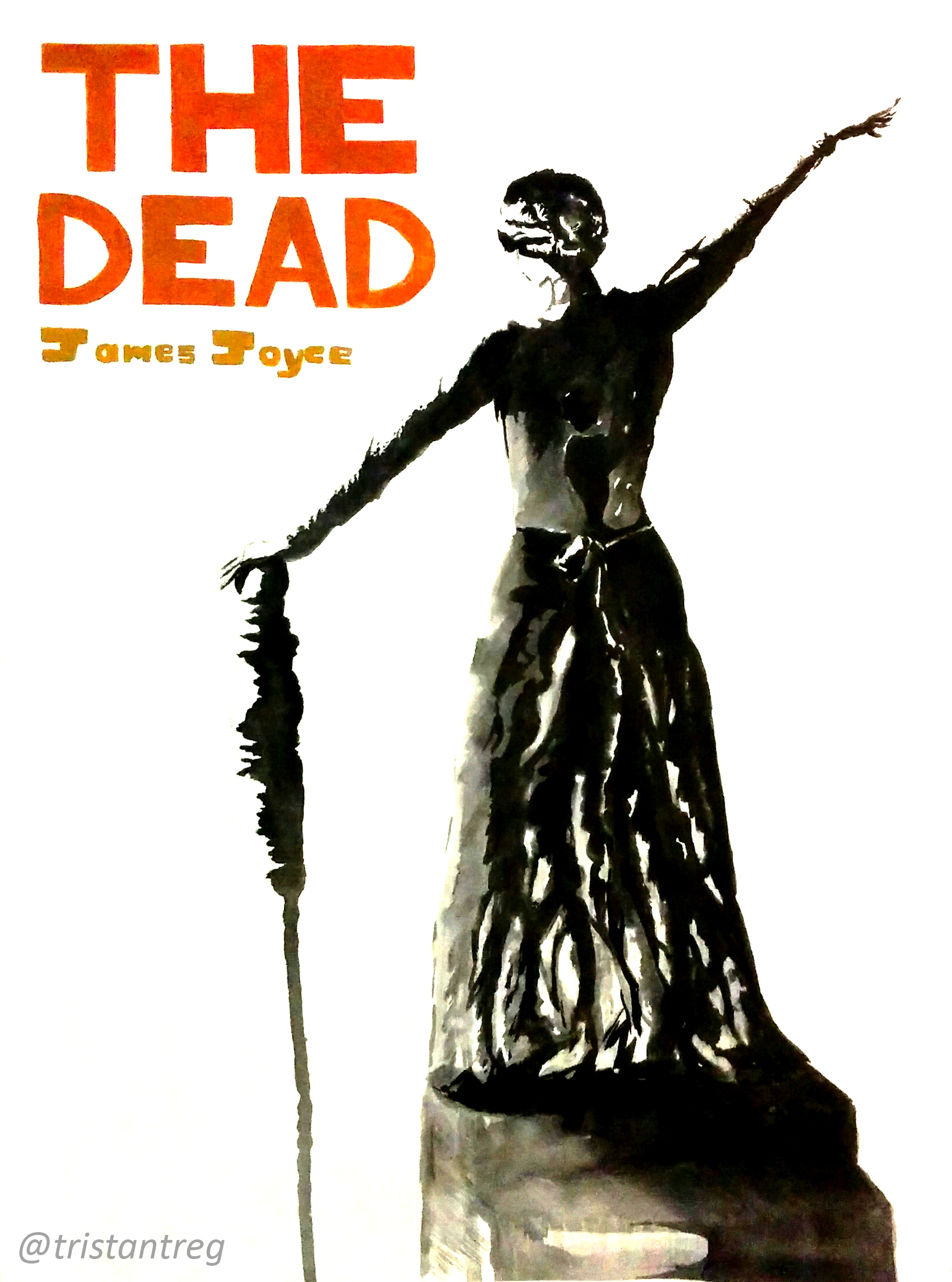
Along the way I knew that the staircase was not a main part of the piece, so less detail and value were added than intended, and the text fit in better going vertically rather than horizontally. Also, the newel shouldn’t be detracting the action of the figure, so I removed the fancier design from the pillar and left it with a basic design.
All in all I enjoyed going through the creative steps to finish this piece. I love using ink and watercolor, but combined it’s ecstasy. Having a poster in my room of one of my favorite books and movies is always a great sight, especially a self-made one.
Please leave a comment below if you have any critiques or comments, or simply just LIKE and SHARE!