Hello lovelies, did everyone have a good weekend I know I did. This week in my advanced graphics class we were tasked with designing a logo for this wonderful non profit organization called Unicornucopia. If you want to know more about their non-profit check out their website!
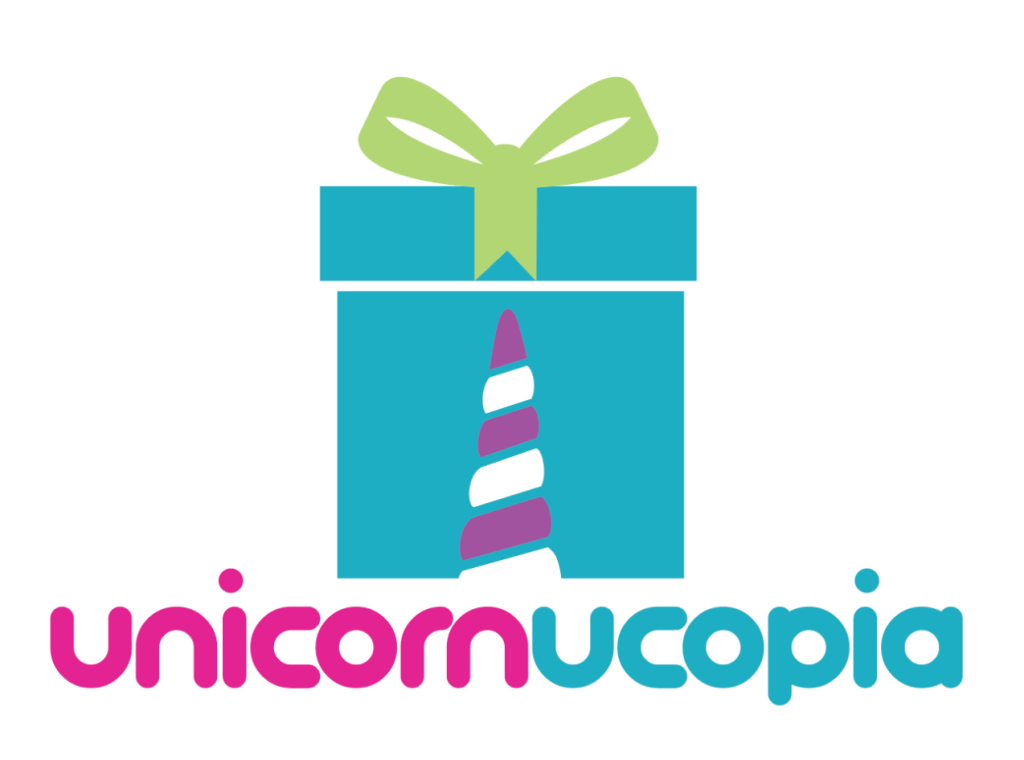
My ideas behind this version of the logo design was since the charity helps supplies presents to children in need, I would incorporate the unicorn horn with a present. I chose the bright color pallet to envoke this feeling of happiness. Although this logo was not chosen, it is still one of the favorite designs I have created.
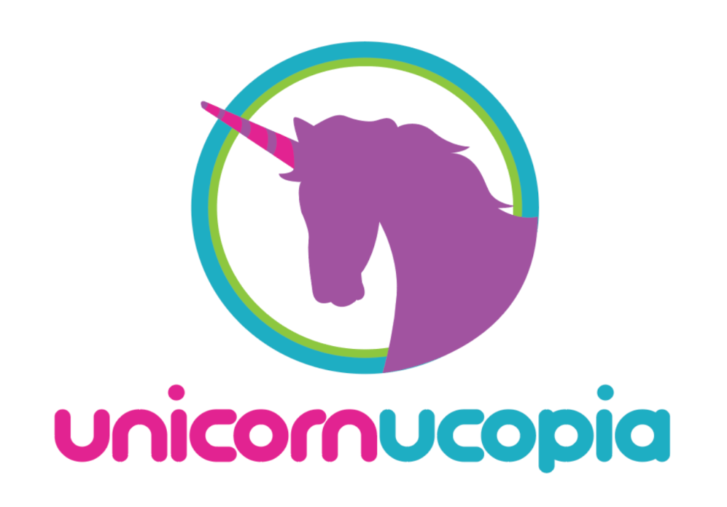
My second idea was a little bit more straightforward that can stand alone as an icon need be. The biggest challenge was trying to create a logo that did not lean to feminine which is incredibly hard considering a unicorn is typically associated with feminine adjectives. I thought brining in the blue and green would balance the pink and purple used.
With a few tweaks, I will be submitting the design once again to see if it is the final option!
Stay tuned to find out if my logo was chosen!