Hi Everyone
So as classes begin again online, I just started getting more projects to work on. One of these is a travel poster for my Intro to Graphic Design class. A simple project where I had to create a mood board on a travel location and develop it into a poster. I chose Malta for the location as it was going to be a unique location to choose. This would make me 1: be creative in order to make a poster that is memorable for my audience instead of using a more popular place like Paris or Rome thats more expected, and 2: Malta has a long an interesting history behind it so I could use historical assets to fulfill that creativity.
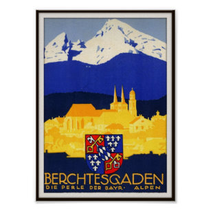
This is my general reference I based this project on. Ludwig Hohlwein’s work is rather simple yet detailed at the same time. This is because of his use of economy. When I mean economy I mean simplicity. Having good economy means using the least amount of shapes or detail to describe what you’re illustrating. Impressionists for example were capable of implying leaves on a tree or hair with a single stroke of the paintbrush rather than the 100s it would take to achieve similar results by the masters.

Notice how a palette as simple as a dark, light, and median, are more than enough to describe the scene with detailed yet limited use of shapes. I used a historical tomb using Arabic as a sort of pattern or texture to the background to integrate some more elements into the composition. Also note I used the shield or coat of arms of Malta as a symbol meant for the viewer to remember much like a logo as Ludwig had used. I’m still not quite satisfied with it yet but all the major decisions have been made already.
Hope you all enjoyed!