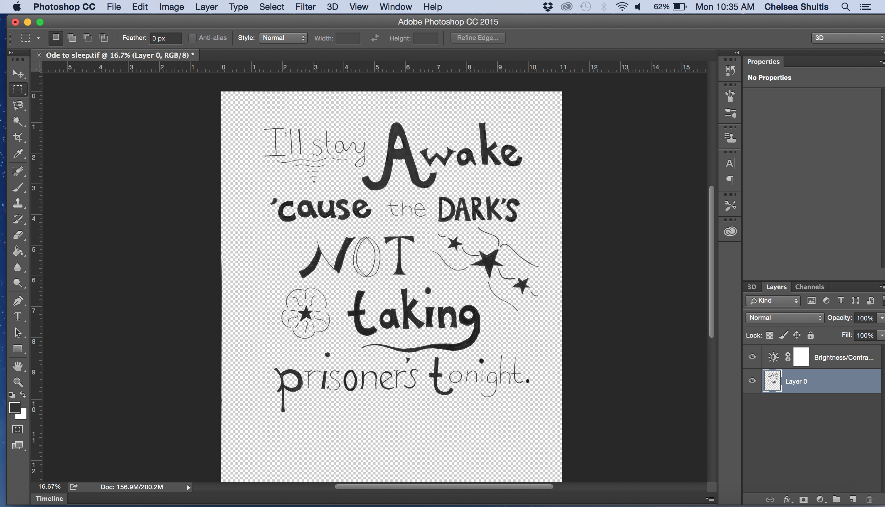
A couple weeks ago I started a hand-lettering project and shared my beginning progress. Since then I accomplished a lot and I think the piece is just about done. The last time I talked about this piece all I had accomplished were a few basic sketches and then my final drawing colored in with black sharpie.
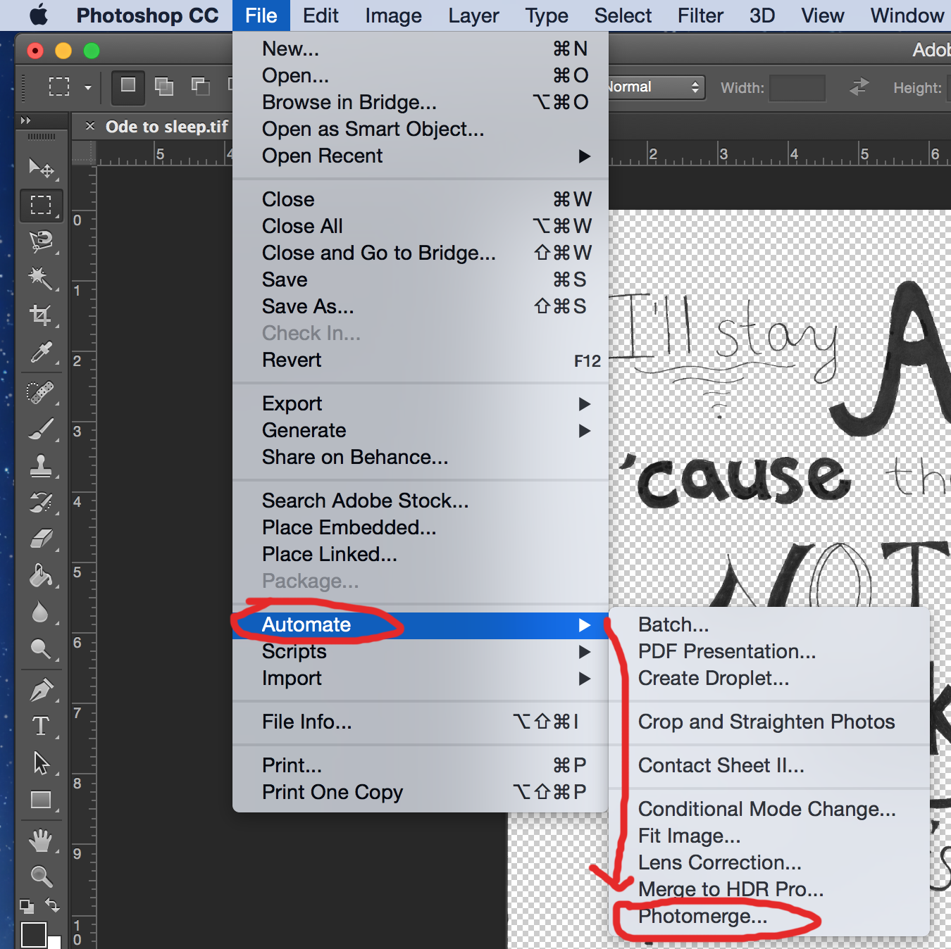
This week I was finally able to scan my final drawing into the computer. My scanner was not big enough to scan my drawing at once so I had to scan it in twice and stitch the images together in Photoshop. There are a couple ways to do this but there is a helpful tool under file and then automate called Photo Merge that will do this for you completely. Since discovering this tool I’ve used it for a lot of projects.
Once I had my hand-lettering stitched back together I cleaned up my design a little bit in Photoshop. I used the brush tool to fill in little areas that I missed with the black marker. I also used the eraser to fix impurities too. Then I adjusted the contrast to make the black letters a darker black and really stand out more. The next step I took was to save my file as a tiff and open it in Adobe Illustrator.
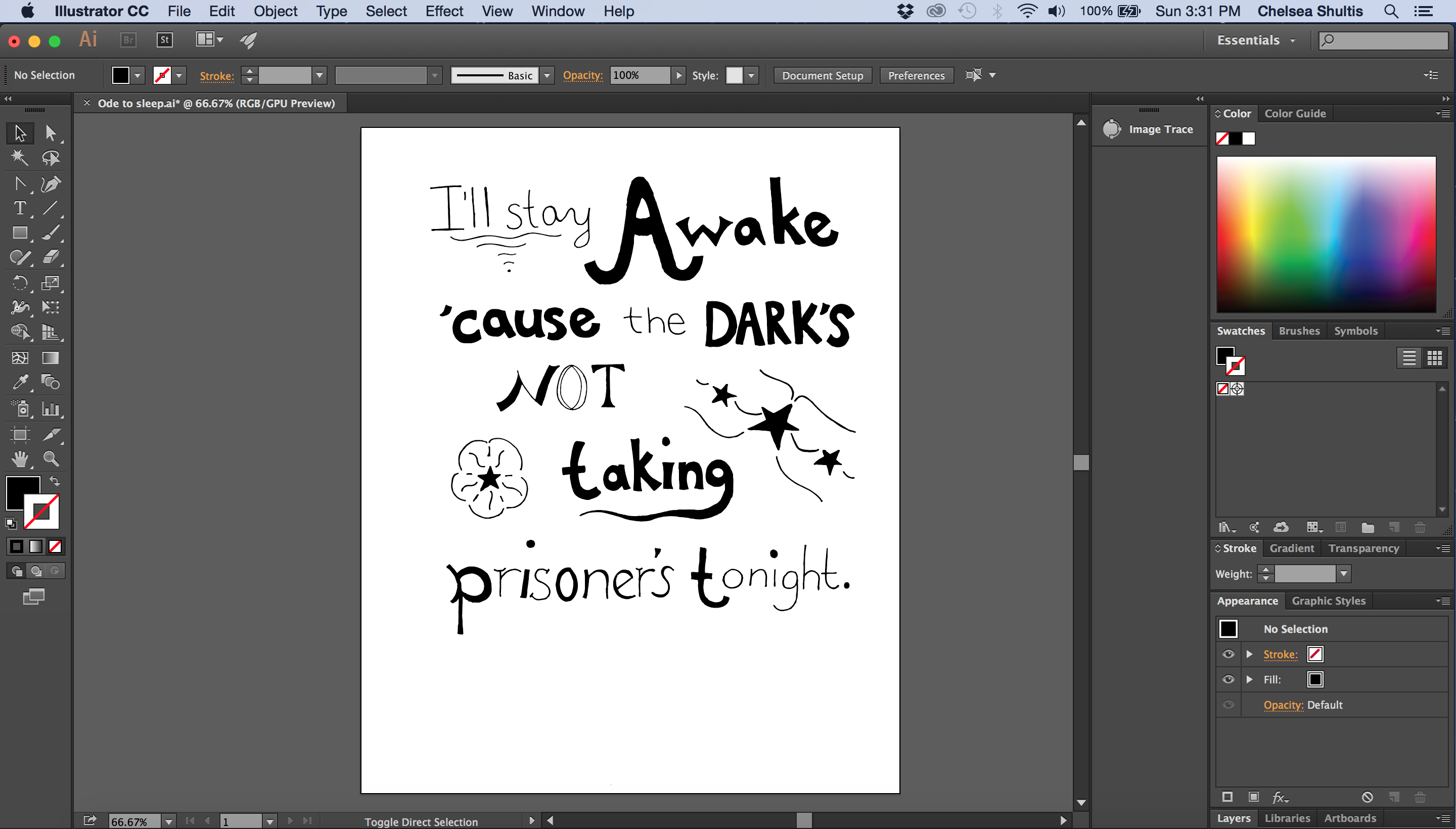
Once my hand-lettering was opened into Illustrator it could be converted into a vector file and I could work with it further there. When you’re working with any hand drawn drawing that is scanned into Illustrator, the first step is to select the entire drawing and use the Image Trace tool. This is found at the top of the page on the tool bar. This tool is actually what converts an image into vector art. Once my hand-lettering was vectorized I was able to adjust the different letters how I wanted to using the pen tool. I also resized the words “not taking” and made them a little smaller.
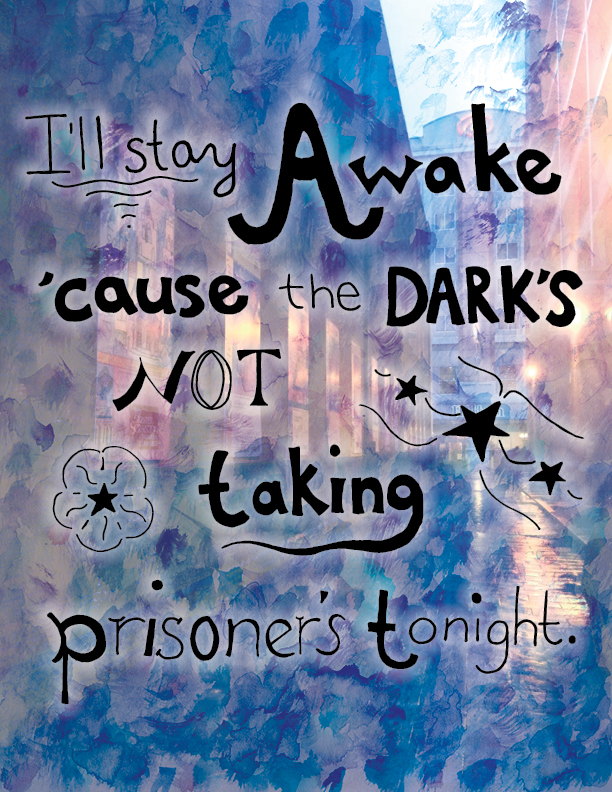
After spending some time adjusting my design I copied and pasted it into InDesign. Then all I had left to do was to figure out what I wanted my background to look like and paste that into InDesign as well. For my background, I ended up using collage. I chose a photograph that I took of a dark alleyway and then a painting of dabs of watercolor. The picture of the dark alleyway contained a lot of reds, purples and oranges along with some black and I placed that image on the bottom. Then I placed the watercolor painting on top and adjusted the opacity and used different effects in InDesign. I settled on the effect called Hard Light and adjusted to the opacity to about 70% so the alleyway would seep through the painting. I think it created a really neat effect and right now I’m really happy with the piece overall.
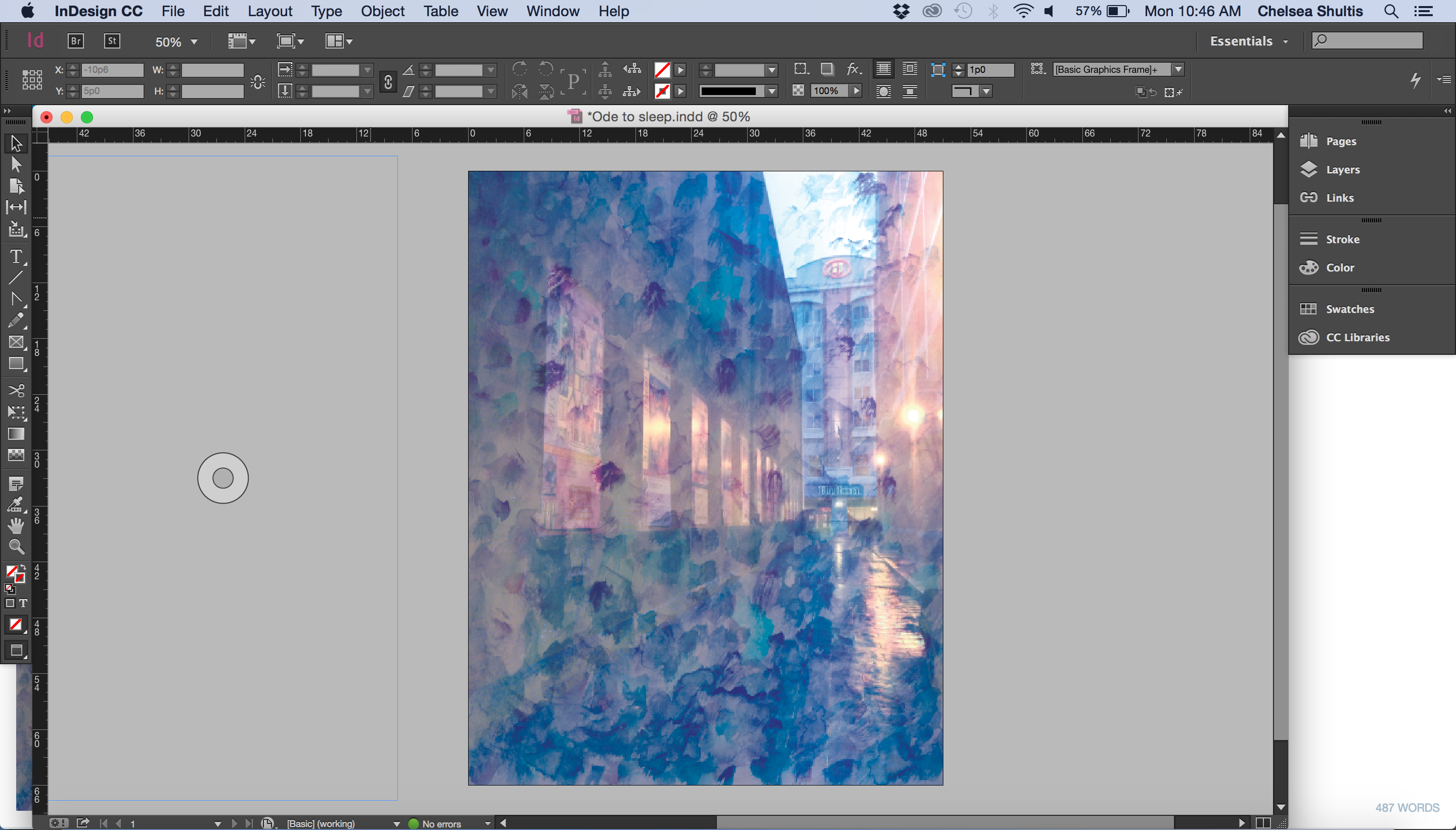
The final piece:
Great job