We all know the saying, “Never judge a book by its cover”. It’s a great saying – it tells us that there’s always more to a person than what you can see. It’s a saying that we’re taught as kids, allowing us to make friendships with people of all backgrounds. I follow this rule of thumb every day… well, except when I’m book shopping.
Don’t get me wrong, it’s not that I wouldn’t read a book that didn’t look nice, but I’m way more likely to pick up a book and read the summary if the cover is appealing. For me, at least, this has a few general rules: no real people (my biggest pet peeve), pretty colors, nice fonts, and simple yet intricate designs. Bonus points if the cover underneath the dust jacket has an imprint on it! So often, the illustrators who design these covers go unnoticed. Today, I’d like to share three books that I picked up because they were pretty, but I bought them because I was intrigued by the story.
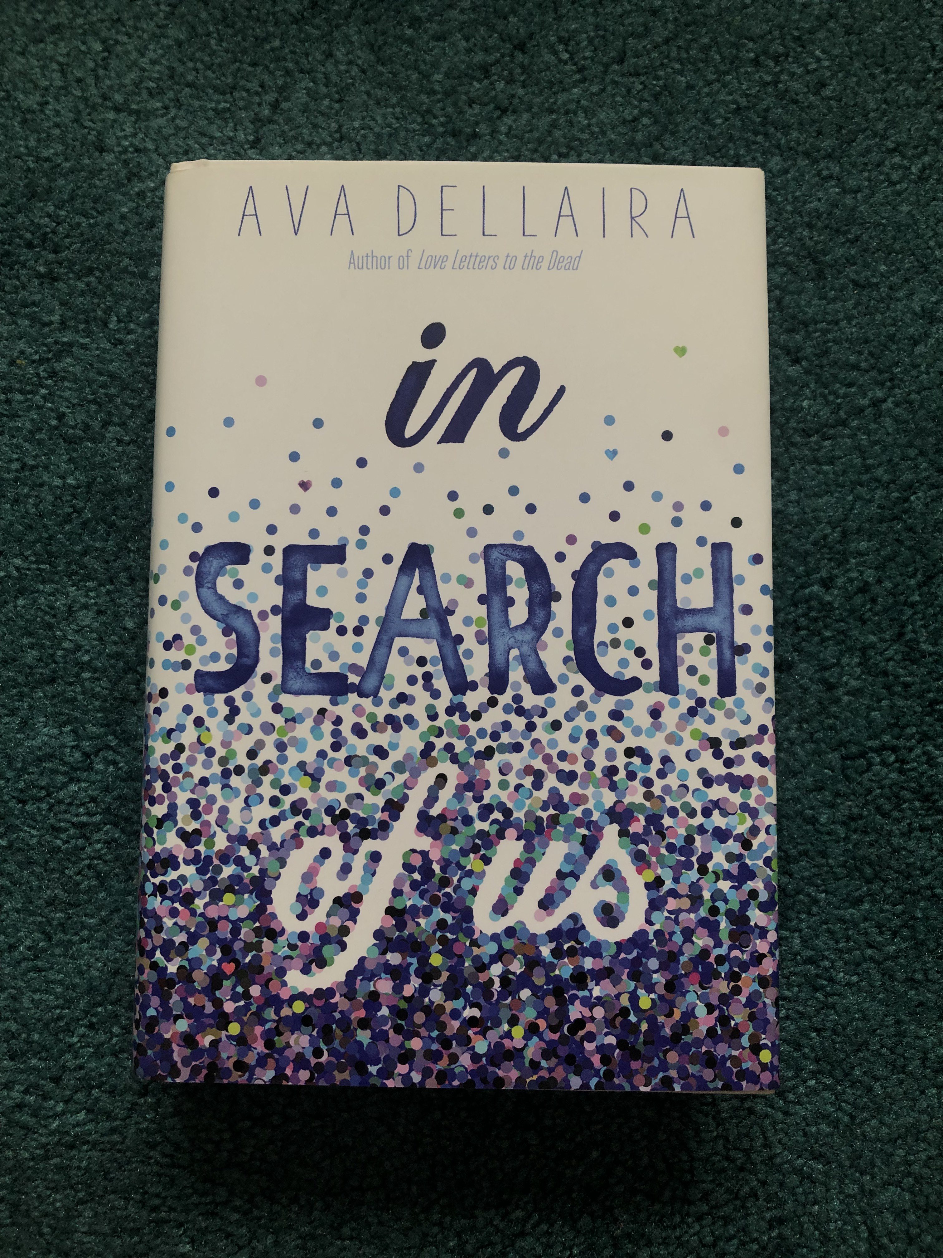
The first book is In Search of Us by Ava Dellaira. The cover was designed by Elizabeth H. Clark. What I love about this cover is all of the small details. What first drew me in was this gradient of blue rising up into the white. The circles all seem blue at first, but if you look closer, you’ll see pinks and greens. This keeps the viewer interested. This gradient continues through the spine and onto the back cover, which I think was a great choice. I think this cover, despite being very simple symbolically, addresses the plot of the story well. The story is told in the alternating perspectives of Marilyn at seventeen and her daughter Angie at seventeen. Marilyn’s story is about wanting to escape the life she is currently living, and Angie’s is about finding the answers about herself, her culture, and the father she never knew. Both girls had a sense of sadness surrounding them, and throughout the book, they find the answers they need and learn important lessons. They slowly come out of the blues of their past into the light of their future. Clark did an amazing job with this cover, finding a way to engage with readers in the simplest but most beautiful of ways. Check out her website for some more books she’s designed!
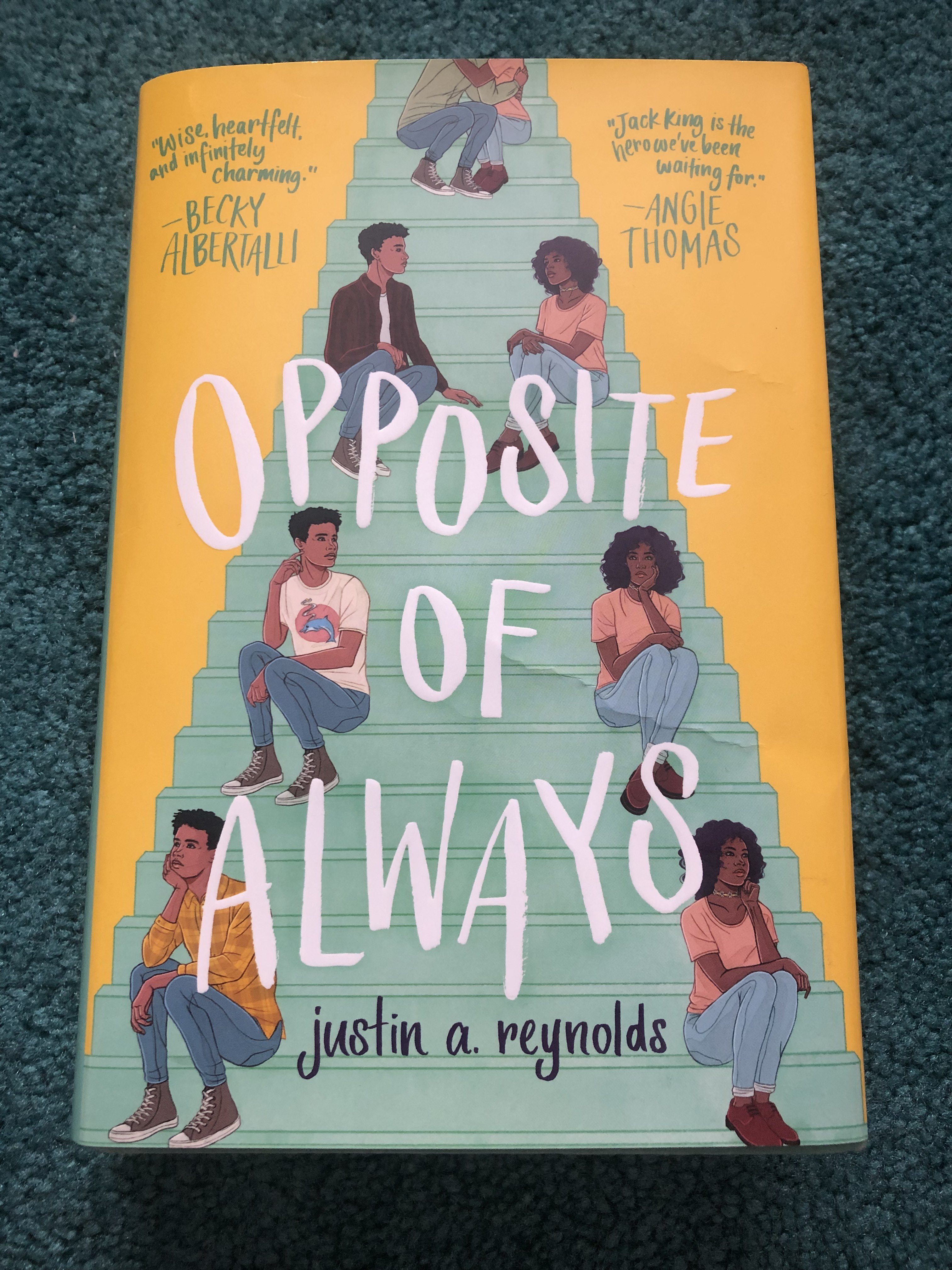
Opposite of Always by Justin A. Reynolds is a book I admittedly bought simply for the color. When you take the dust jacket off, the inside cover is a beautiful light teal, almost mint color that I simply had to have on my bookshelf. It’s a good thing the story was good too! The cover art was done by Stephanie Singleton and designed by Erin Fitzsimmons. What I really love about this cover is that it almost tells the story. The two characters, Jack and Kate, met at a party on a set of stairs outside, and Jack falls for her. Everything goes great for the two of them until Kate dies, and Jack is sent back in time to the night they met to try again and again and again. I love that the stairs are featured on the cover because it feels like you’re supposed to walk up and into the story. I think it’s interesting that the couple is cut off at the top because there clearly should be more. It makes readers wonder what would come next. You also realize that while the stairs get smaller, the figures stay the same size. This seems to be to show that, when everything else in the world is confusing or moving forward, Jack and Kate are still the most important things to each other. I also just noticed that Kate is wearing the same outfit in each image of her, while Jack is wearing different outfits to show that he keeps returning to the same night, which I’m so glad Singleton thought of doing! Be sure to check out both Singleton and Fitzsimmons on their websites linked above – you might even see some familiar books there!
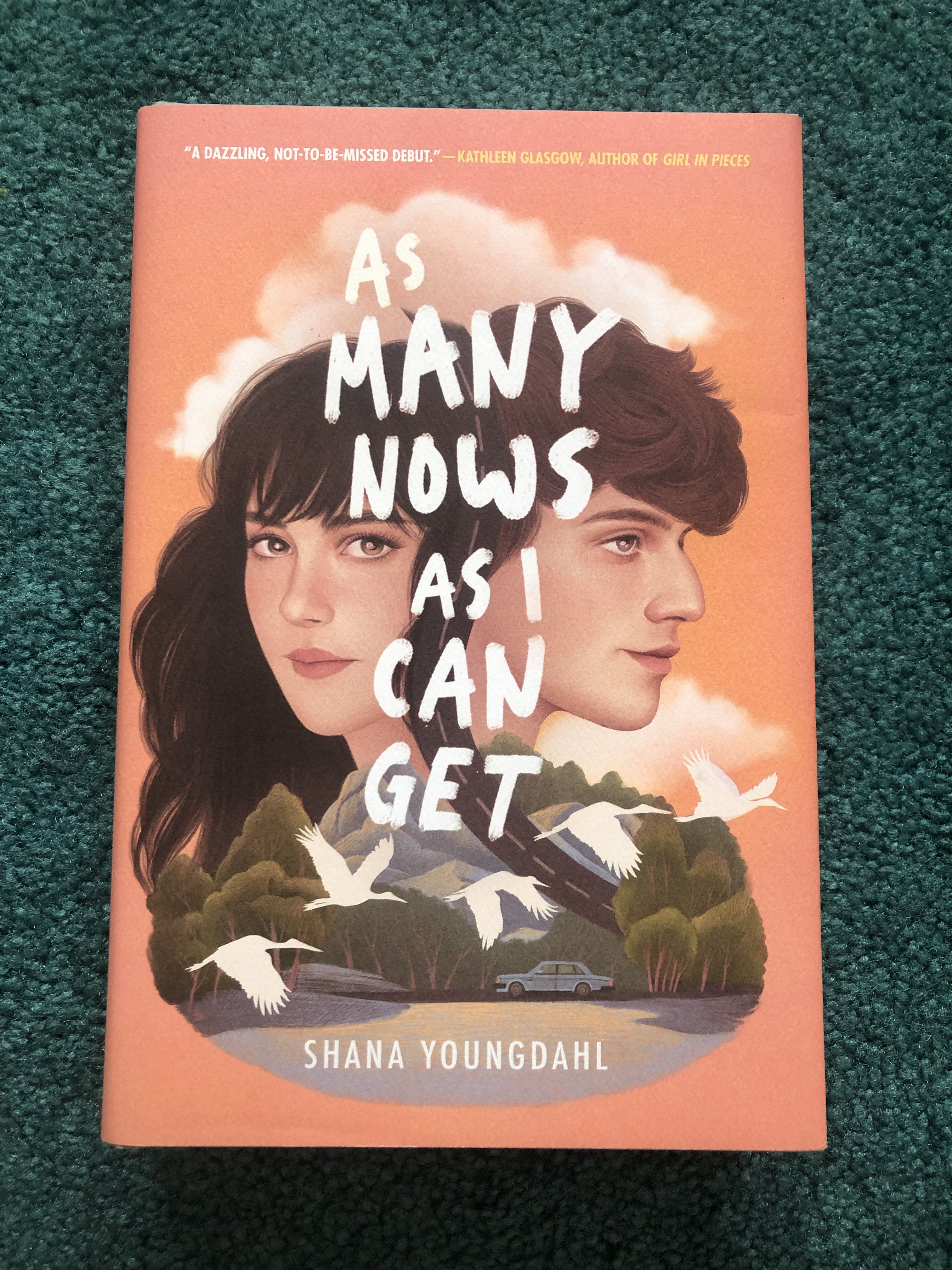
The last book I’d like to share today is As Many Nows As I Can Get by Shana Youngdahl. The cover art was done by Mercedes DeBellard and the jacket was designed by Maggie Edkins. I love everything about this cover. I think having the two characters’ faces connect was a great way to show how they impact each other and using the landscape as their neck and shoulders was a beautiful way to set the scene. I think that’s the best way to describe this cover: it’s just beautiful! The story is told by Scarlett, a college freshman in the car with her roommate. She tells us her story by alternating to the past to show her relationship with the mysterious David and returning to the present to show the effects it had on her current life. I think much of this is stored symbolically on the cover. As I said before, David has a lasting impact on Scarlett, which is why they are shown physically connected. David, however, is looking away from the reader, while Scarlett is making eye contact with us. This tells us that while David plays an important role, this is Scarlett’s story. I also love how the road comes through the mountains and splits them, showing that there will be a divide between the two at some point. It’s interesting that the car is moving towards the left while the birds are moving towards the right, and I think this could indicate that Scarlett is somewhat stuck in the past, although she is trying to move forward. The story is just as beautiful as the cover, and DeBellard and Edkins did a fantastic job capturing that. Make sure to check them both out at the links above!
I tend to read Young Adult novels, so I know these books may not be for everyone, but I really recommend these to anyone who enjoys this genre! I hope to do a second part of this at the end of the summer after I’ve read some of the books I bought throughout the year. I seriously can not leave Barnes and Noble empty-handed. I hope the next time you go book shopping, you’ll stop and consider the cover design: what choices were made and why? It can really give you some great insight into the story ahead of you!
“almost tells the story” pretty well nails it, imho. good movie posters (and come to think of it, good advertising illustrations generally) are the same…
I agree! It’s a great marketing technique, and it’s certainly rooted in traditional art-making. I’m glad you enjoyed!