In continuation of my horror video game project, I’ve been making adjustments and variations to what I already had, as boring as that is. It’s important to me that I know what the finished project might look like—roughly—so I decided to get it over with.
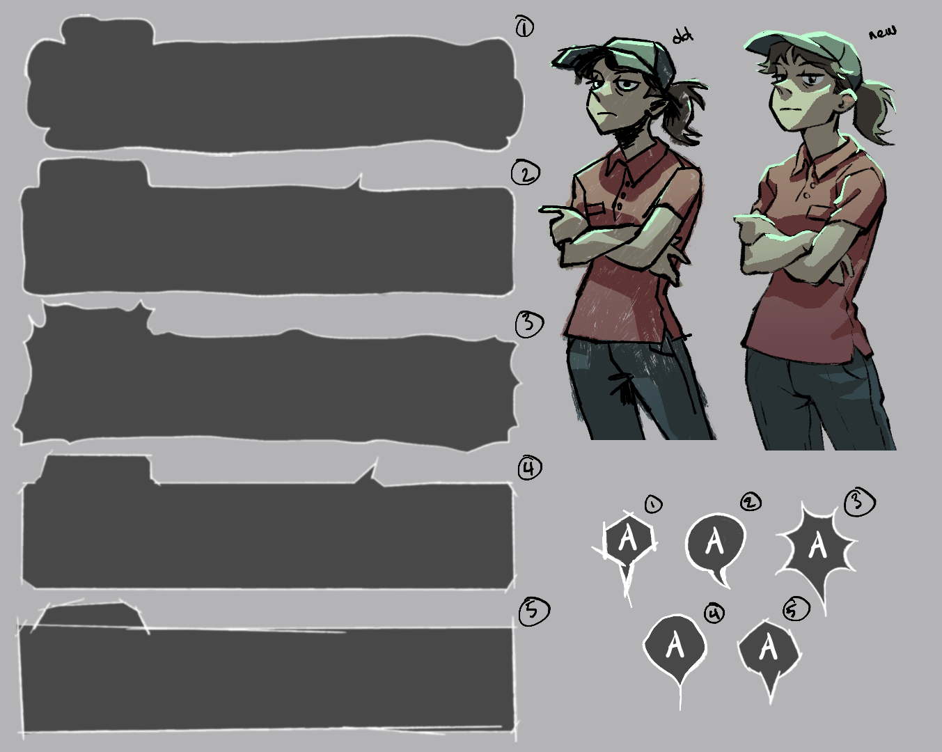
First, I created a few variations of the text box and ‘press A to select’ button. The main issue I have with the original text box and A button (in the image, #5 and #1 respectively) is that they’re super distracting; they bring too much attention to themselves and take away from the more important visuals. I tried to tone them down yet keep the basic style (in the image, #4 for the text box and #5 for the button—I don’t know why I ordered them so chaotically), and I am happier with those watered down versions. I also tried a few different shapes while I was at it. I would love to hear if anyone has a preference between them. Yes, believe it or not, I still don’t know which I’m going with. I’ll probably ask around and then choose the most popular option to avoid any degree of decision-making whatsoever.
I also redrew Patty, with the aim of finalizing this particular pose (the new version is on the right side of the image). The original drawing was really bothering me, although looking at it now it’s got a certain swagger that I don’t think I fully captured the second time around… but I’m not going to draw it again. This is one pose out of 4 or 5 per character, and I also need to draw the sprites, animated movement, etc. I am trying to keep all that in mind so I don’t spend too much time on each item.
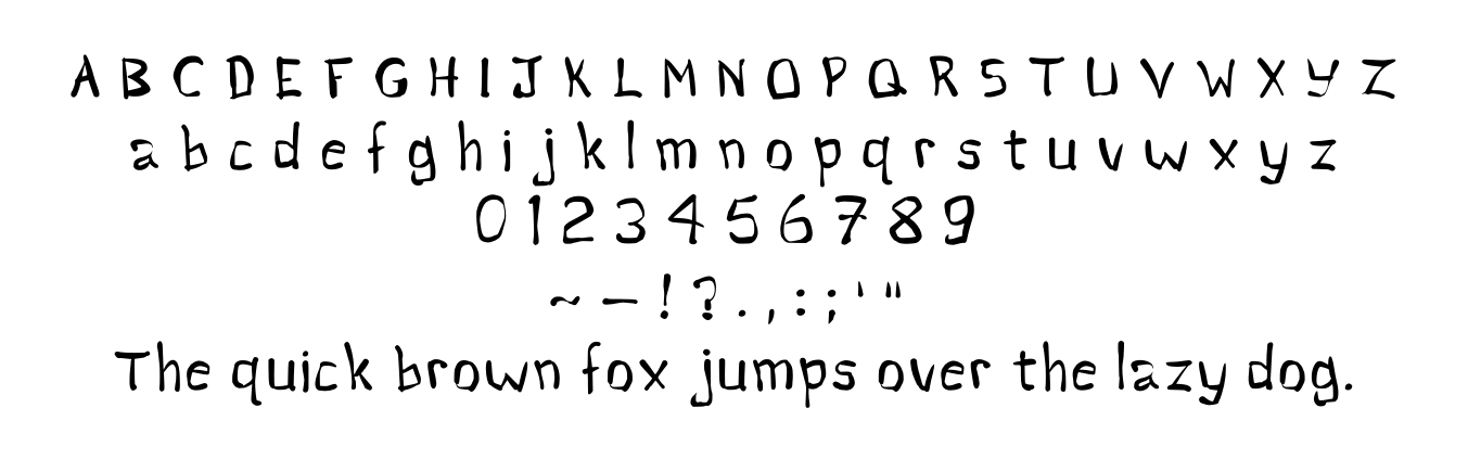
The other task I got out of the way is making a font to use for dialogue, which, as I wrote in my last post, I accomplished through a free website for font creation called Calligraphr. It was surprisingly fun, but I don’t know anything about typography so it may drive some of you crazy just to look at it. One mistake I made is that the uppercase letters are shorter than the tall lowercase letters, so they look a bit strange when they’re beside each other. However, the font is supposed to be kind of ugly so I don’t mind it so much. I may change my mind later, but fixing it would be annoying so I sure hope not.
That’s all I’ve done since my last post, unfortunately. I’m definitely not going to get anywhere near finished by the end of summer, but at least I’ll have made some progress. In the next few weeks, I want to draw another background and a few more poses. I set goals like this often, but they seem to have no effect on my productivity. No one knows if I will actually attempt to do these things, least of all myself.
Thanks for reading!