Since I started writing these blog posts this fall semester, one class I often refer to for inspiration for this writing has been the general illustration class led by Steven Brower. Therefore, it made sense to share the last project from there. This has absolutely been my favorite class of all the ones this semester. Not only was I able to work on projects that I felt very passionate about, but I had a great group of classmates who became wonderful friends; A group that gave helpful critiques and feedback that I can confidently say have improved the quality of my artwork.
Yet again, we were given a project that has me thinking constantly about- excited about all the possibilities. We have to make our theme park and create a map, billboard, tickets, and a 3d model of one of the rides. It is a lot to do, but we were given plenty of time. I wanted to share my process of creating the theme park.
The Bunny Dream

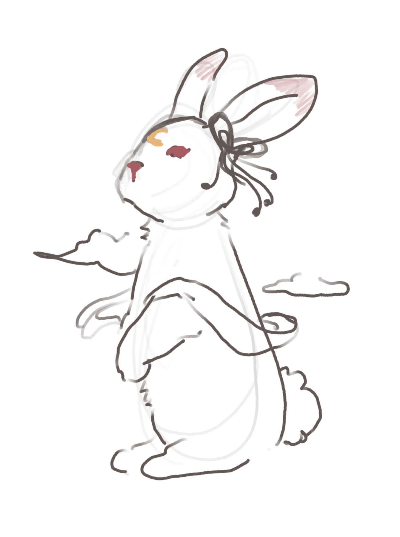
At first, I wasn’t pleased with my idea, but as I continued, it grew on me more, especially when designing the map and all the rides there. The best part was looking at references for bunnies and getting distracted by them. I thought my idea was a bit common with the bunnies as the theme. Therefore, I added the moon, and with that came the idea of inserting the Chinese mythological character Chang E. Then, the inspiration for the building went more towards ancient Chinese architecture. After that, I finally started investing more in this theme.
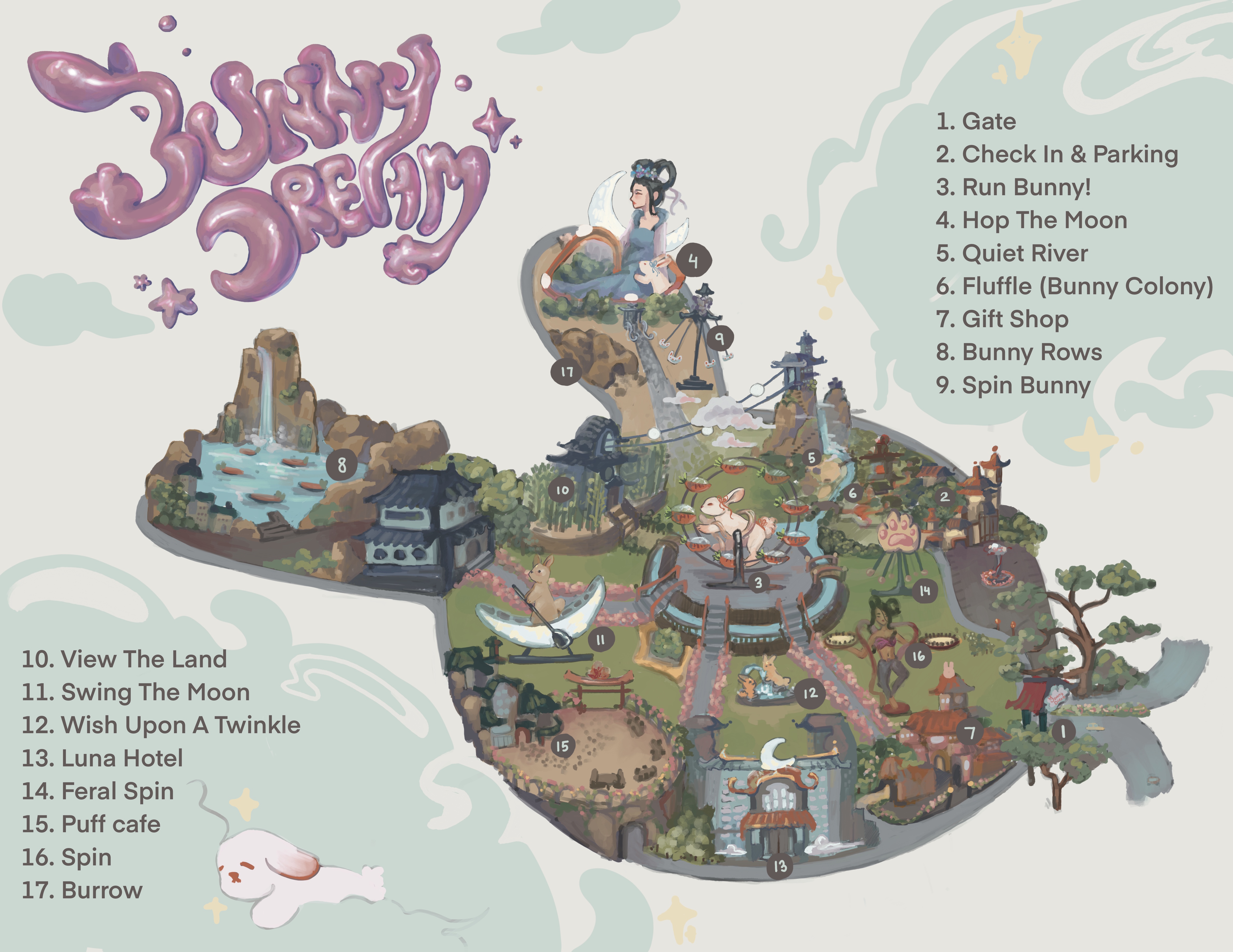
I got pretty carried away with the map’s details, and although I wanted to add more detail to it, I decided it would be best to leave some breathing room for the viewers. To avoid looking cramped, I stayed with a color pallet and added looser brushwork- only adding details where I considered essential places. Surprisingly, I was able to keep a perspective; though I could have put more effort into making it more realistic, I suppose that mistake can pass.

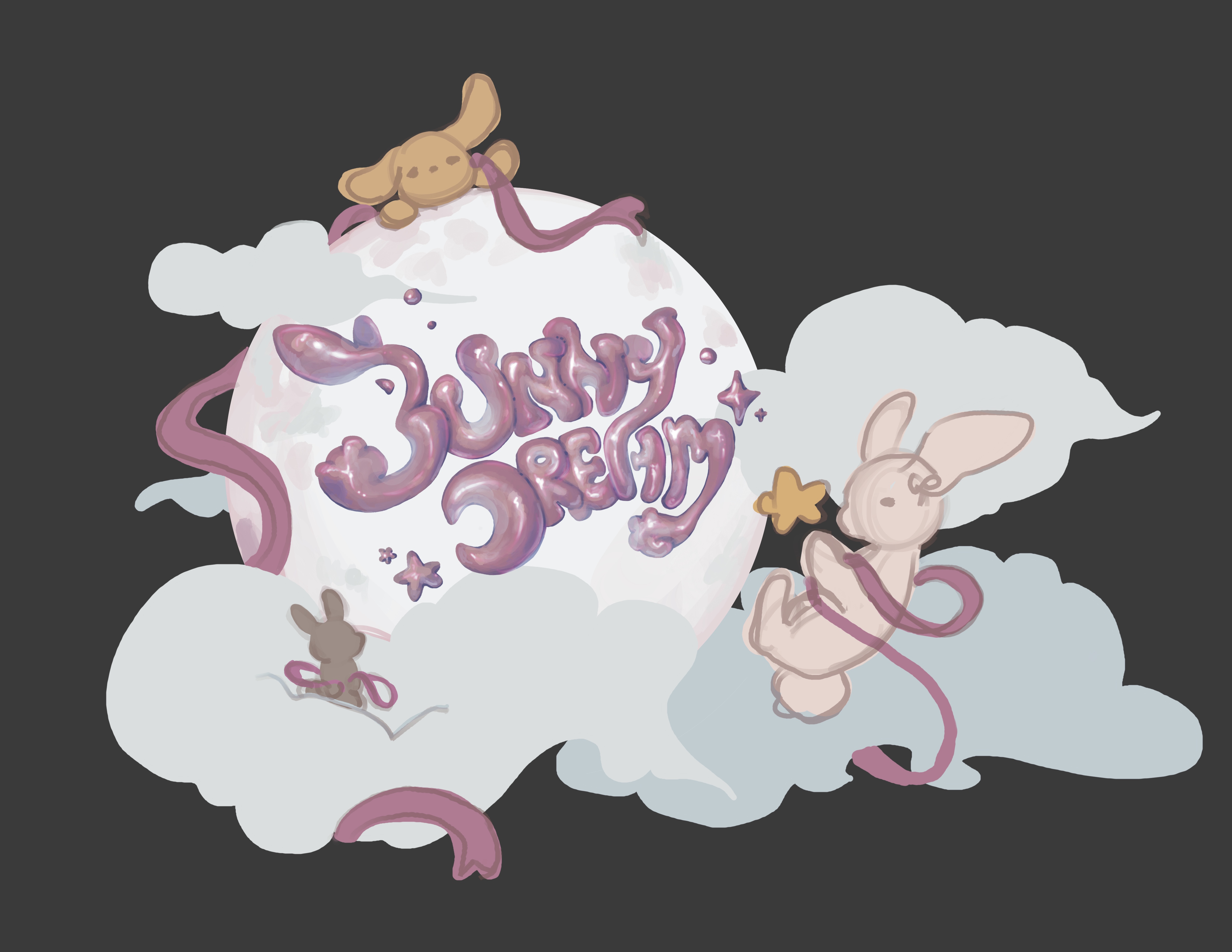
I had a challenging time with the ticket and the billboard. In fact, I had to go through many trials and errors to get to this part. I thought I would do them traditionally, but I finally gave up after doing the type multiple times. Thus, due to the time slipping by and the difficulty of the medium, I went back to working digitally.
It was indeed a better choice for this project since I ended up redoing even the digital one multiple times. Even now, I still have a version I am not yet satisfied with. I hope to get feedback on improving it in the critique this Monday. If any of you guys have some, I would really appreciate it!

Originally, For the billboard, I was planning on doing( again) a traditional approach- like painting each separately and layering them to create a dimensional look. Well (again), I failed and went back (again) to digital. I blamed myself for wasting time for a while, but eventually, I realized that it was nice that I tried and learned. This one is still a work in progress, and I will update it in the next blog, along with the 3d model!
Thank you for reading!
/ᐠ ̥ ̮ ̥ ᐟ\ฅ