A highly detailed, mindfully placed subject, moving the eyes smoothly across the illustration, bringing attention toward the title- is one of the ways I can briefly summarize the beautiful cover designed by Abigail Wilson.

As some may remember, I announced a book cover contest in October to call artists who are also book lovers (Not a requirement) to design a book cover of their choice. Thank you to those who made time to take part in this. After evaluating the excellent entries, we chose the winner…
Abigail Wilson
Abigail is currently a sophomore who is double majoring in Illustration and Art History. I am glad to have been in the same classes with her a few times. Seeing how great she is at noticing art and giving critiques is inspiring. Not only are her works highly skilled, but they also have much more thought behind them. I admire how she clearly illustrates her ideas and vocalizes them in class critiques. Her knowledge of art is easily seen in her cover for The Raven by Edgar Allen Poe.
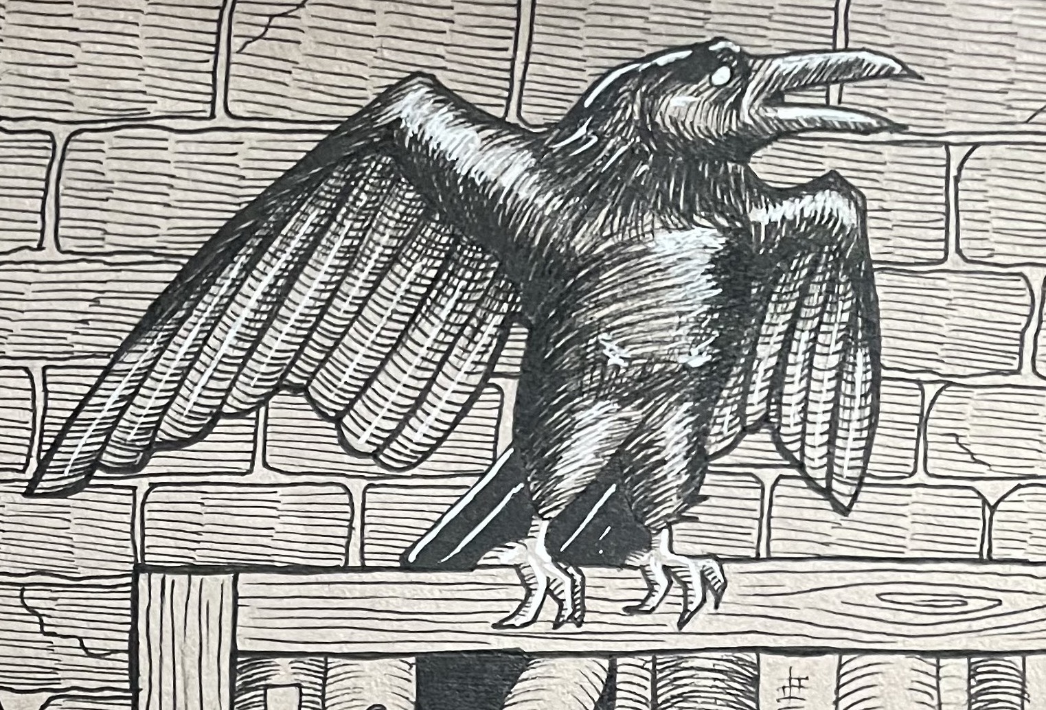
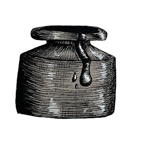
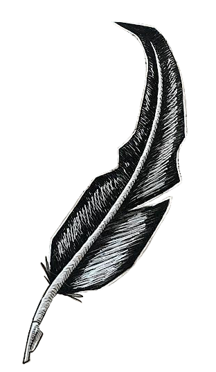
The textures are conveyed through the hatching she uses throughout. She captures the forms through it and illustrates space. Even more, I love the use of negative space at the bottom to bring the gaze down, allowing a moment of rest. I can’t help but look around and take in all the details. It is an excellent composition as it succeeds in keeping one’s attention, making them curious to keep searching and noticing more details.
My words can’t give much justice to her works. Therefore, I asked Abby herself to talk a bit about her work.
1. Which book did you choose to illustrate the cover for?
I chose to illustrate the cover for the poem The Raven by Edgar Allen Poe. This was originally for a project in my illustration class to design a handout that a hardened New Yorker would take on the street. It was a very open-ended project, and the idea for this work popped up in my head, like an advert for a Poe literature society.
2. What was your thought process while drawing?
My thought process while drawing this is that I wanted to work with the directionality in my composition to really lead the eye around. The crow to the quill, the rain and choppy waves that makeup part of the background, even the way some of the books lean in the bookcase. My favorite detail actually came from a happy accident! I couldn’t fit the type in “Nevermore,” so I had the text end at the “m” and lead into the quill with ink splotches proceeding after it. It made me feel far more clever than I am.
Thank you for reading!
/ᐠ ̥ ̮ ̥ ᐟ\ฅ