As part of my independent study (Art 441C) Advanced Digital Imaging, I’ve been working on a series of photo composites. Photo composites, for those of you that don’t know are images created out of elements from multiple images, and can be hyper realistic, fantastical, silly, illustrative, etc. For my series I started with creating a somewhat realistic scene, and then transitioned to creating more abstract ideas and focusing on shapes rather than realism. This is hopefully going to be an ongoing series that I want to expand on and make more cohesive, whether that means splitting it into different series or expanding on only a few of them. Normally sharing in progress work is something that I am too afraid to share, but with a longer project I thought it would be good to talk about my process during to help me navigate where I will be going from here.
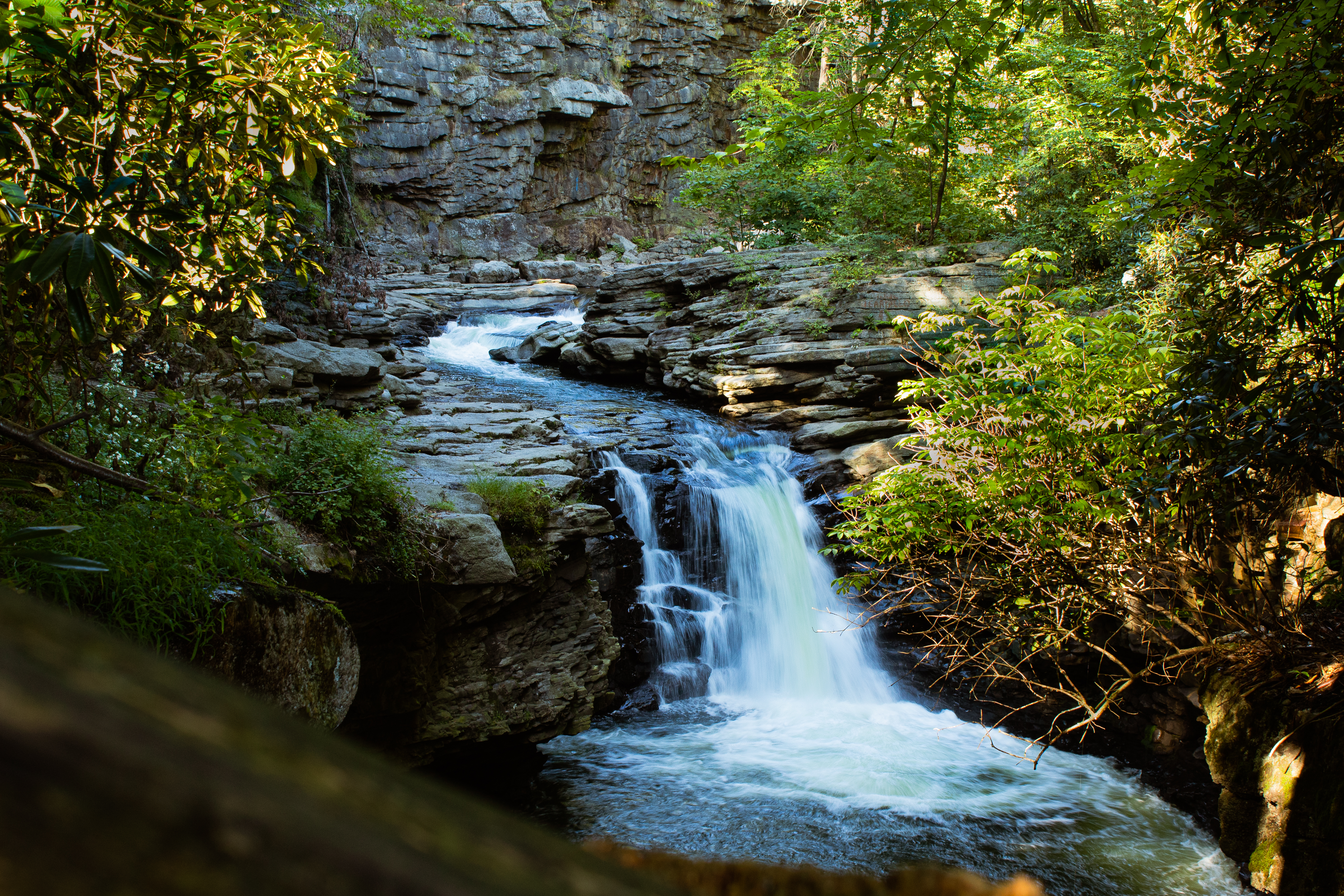
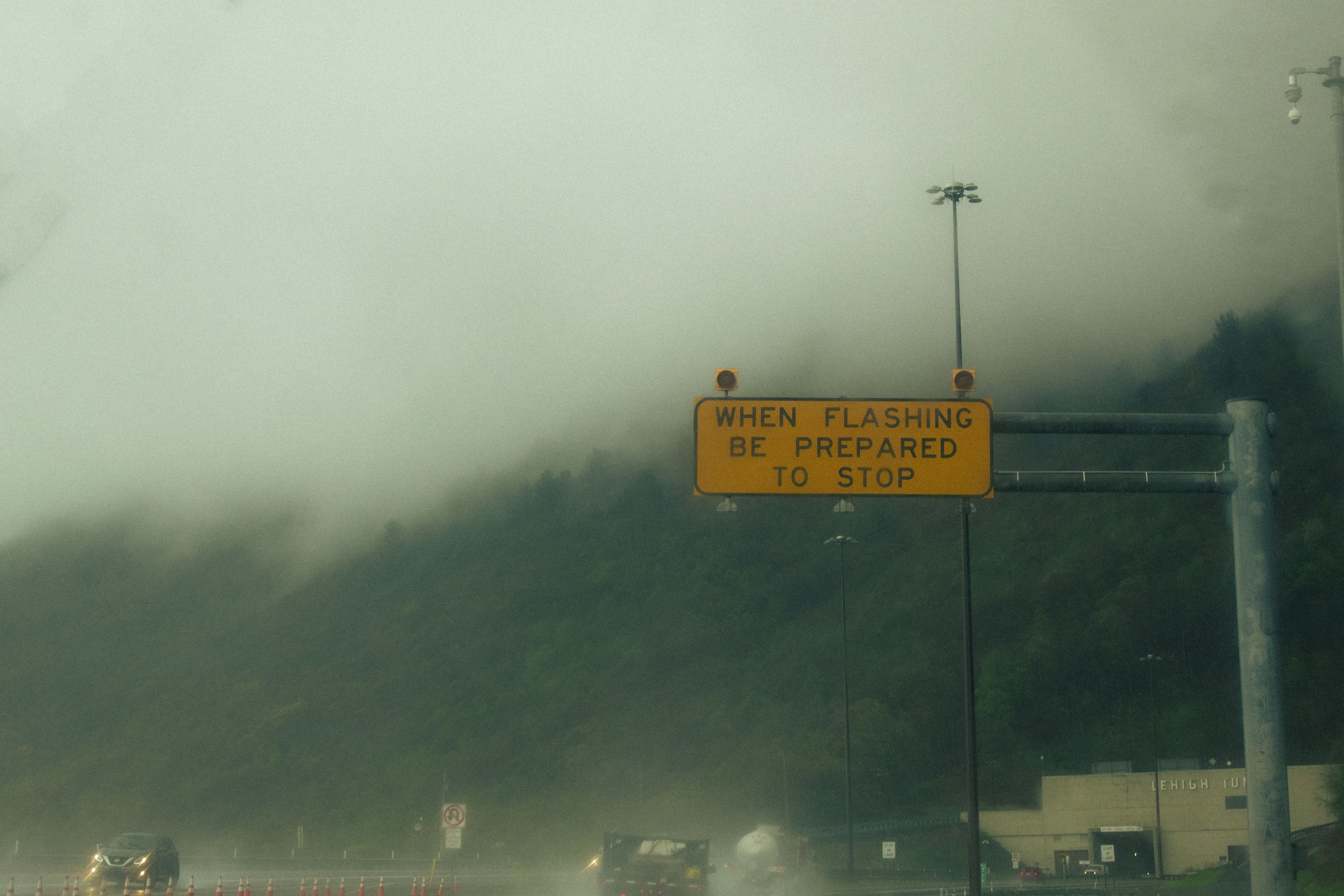
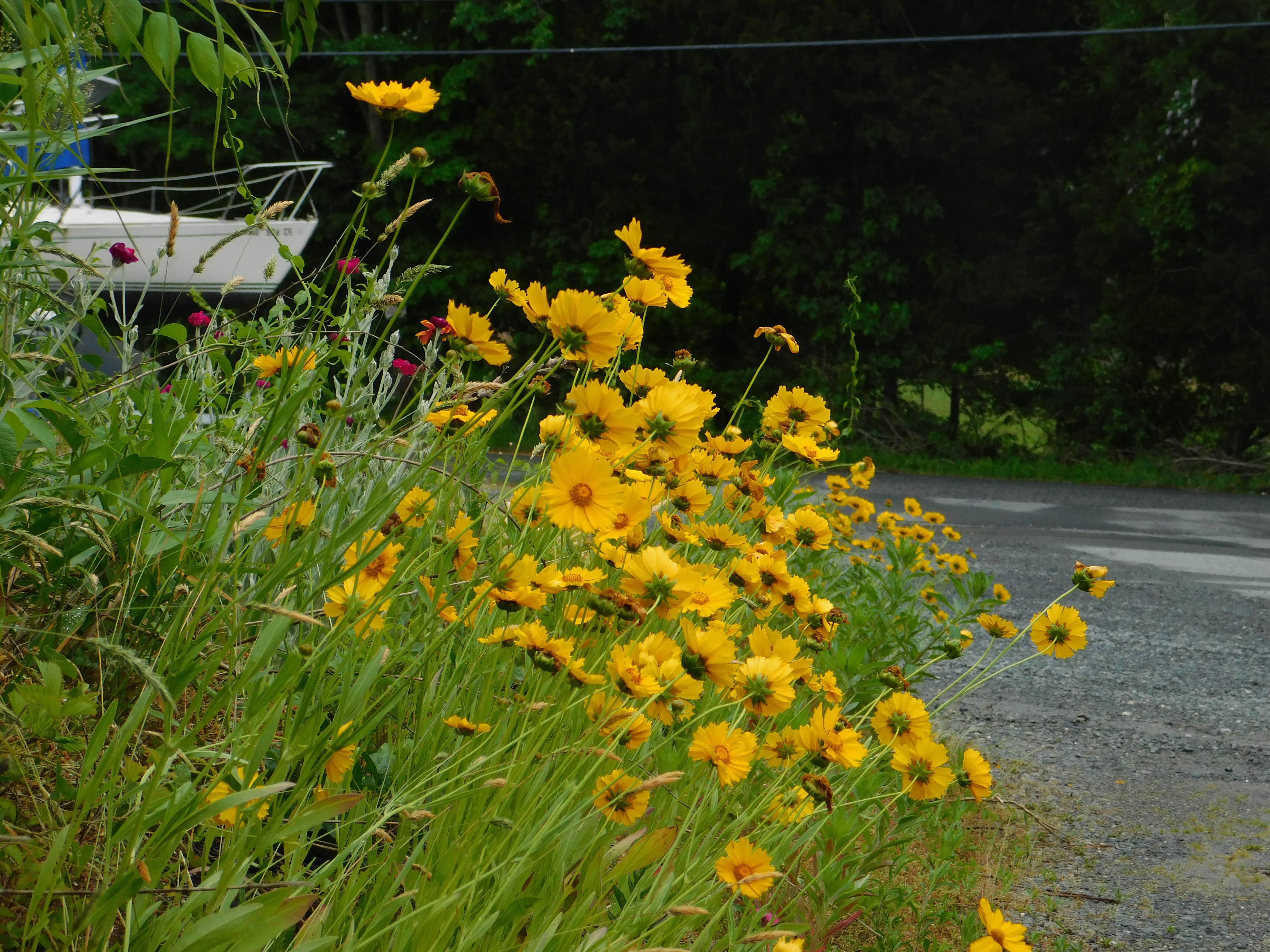
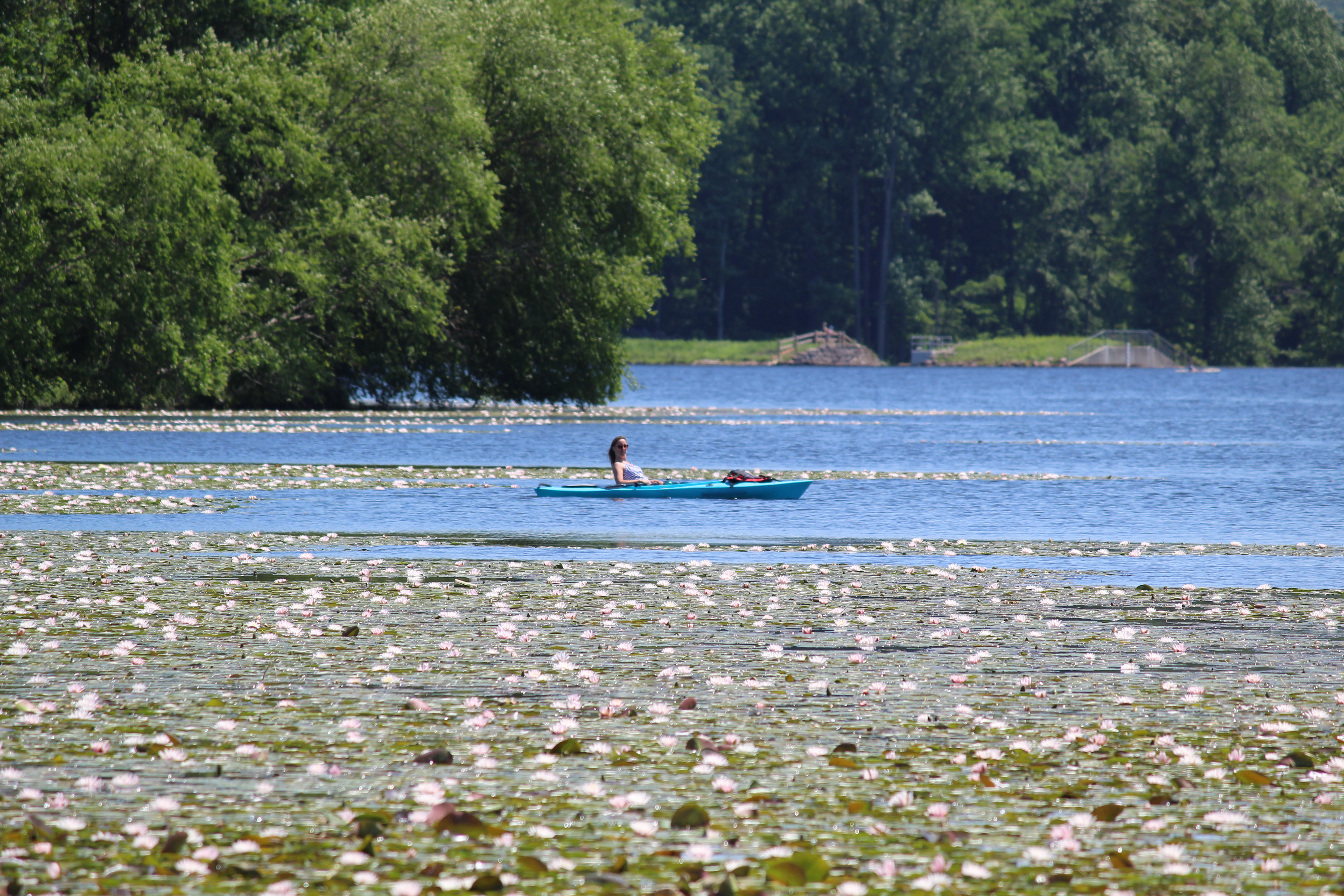
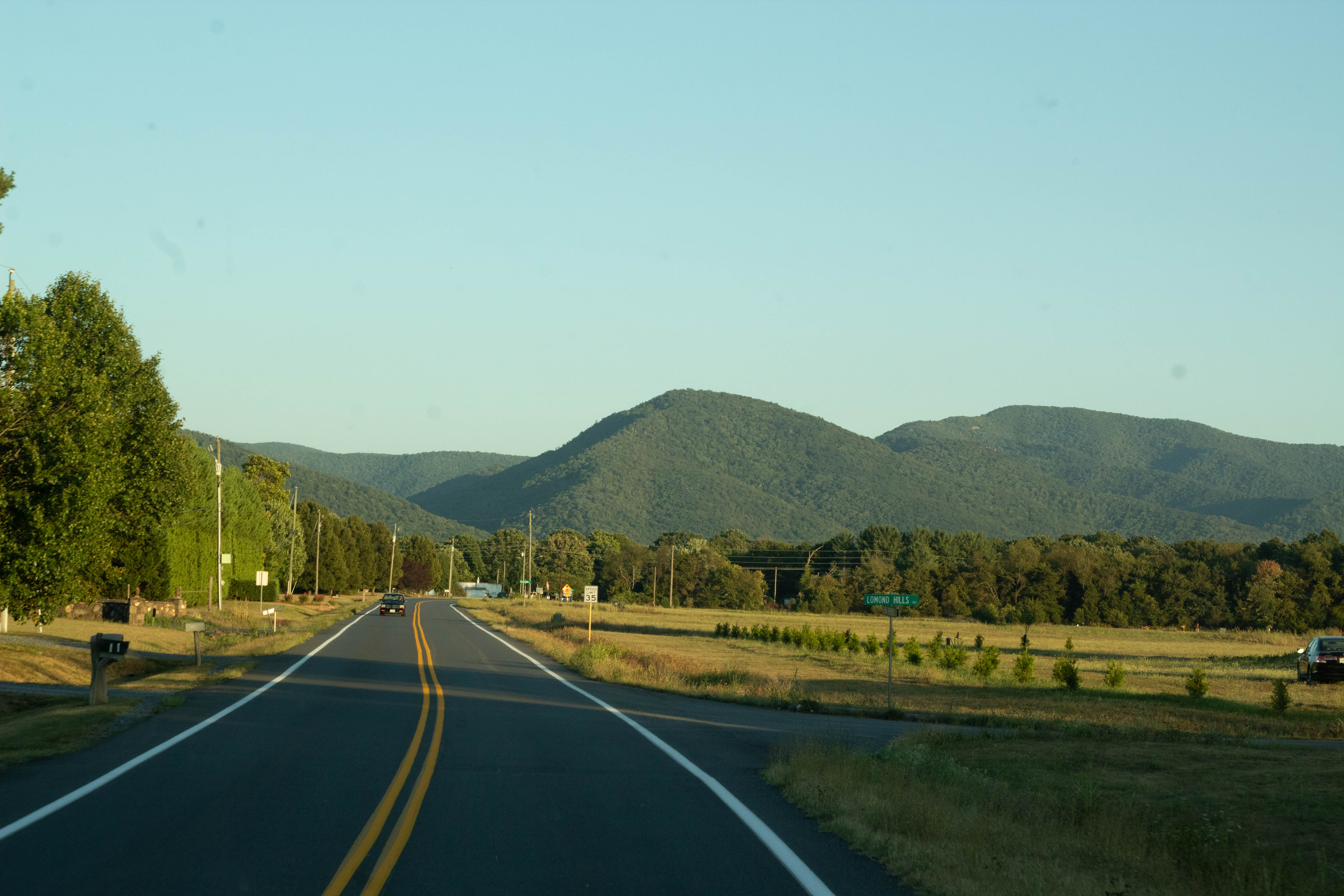
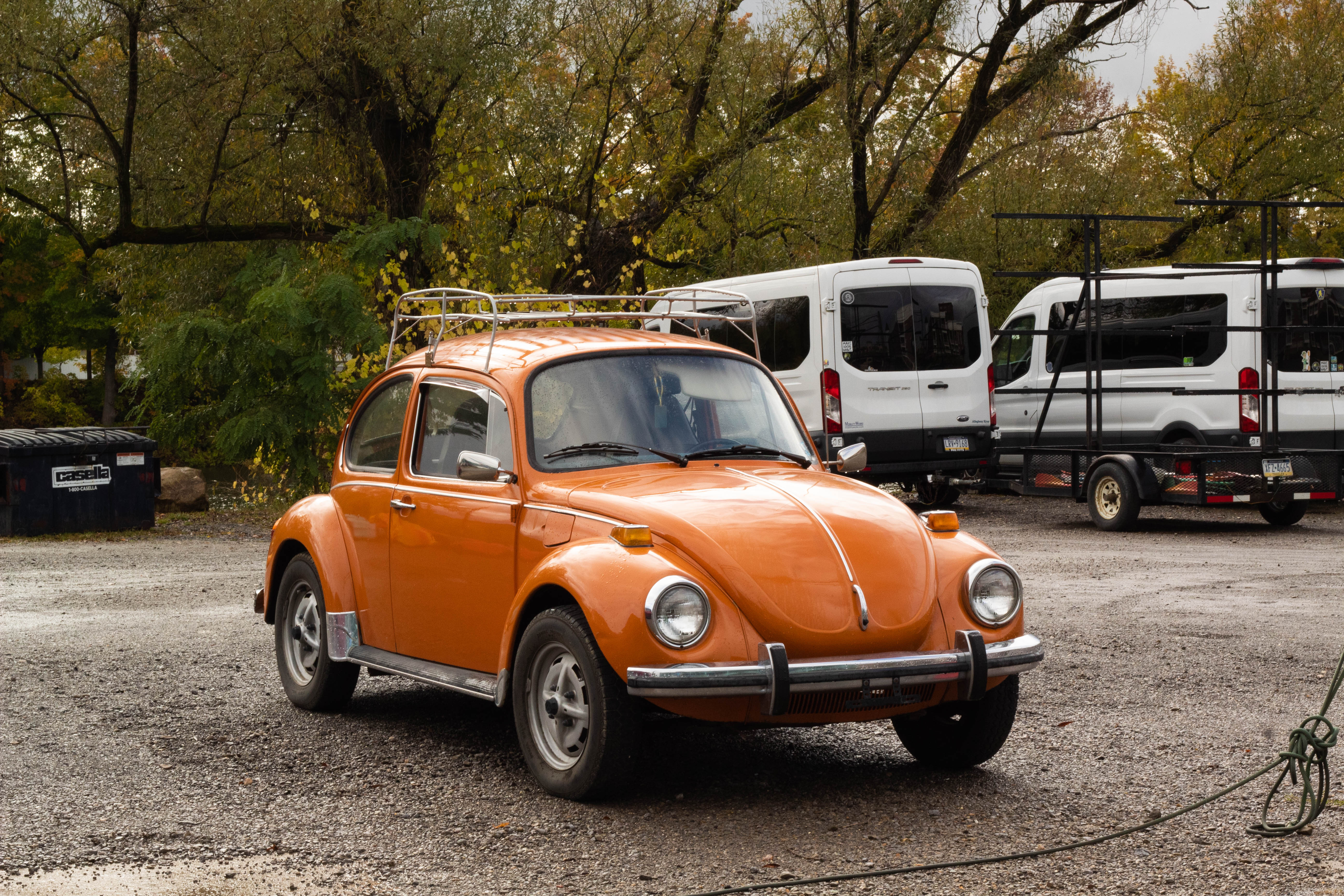
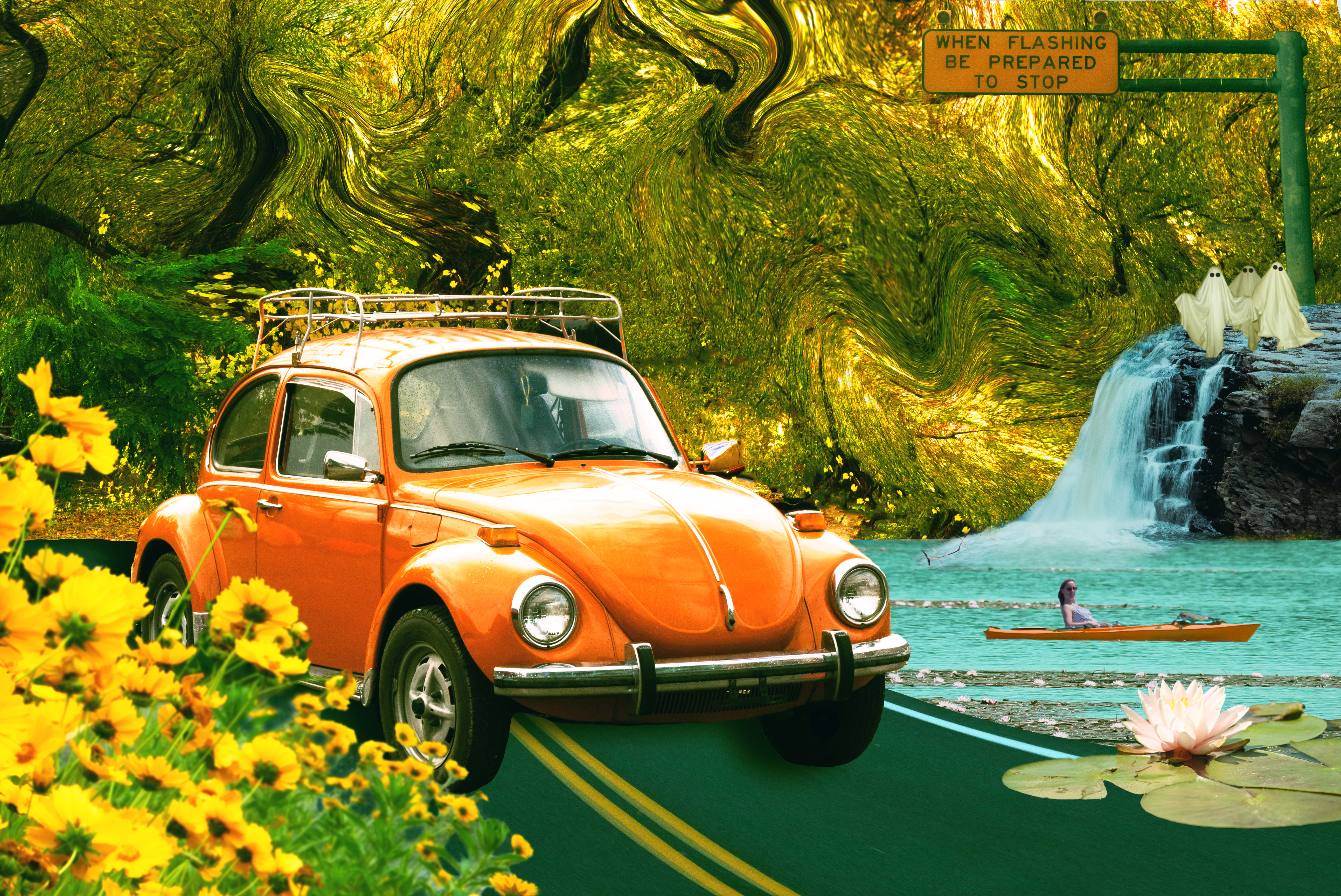
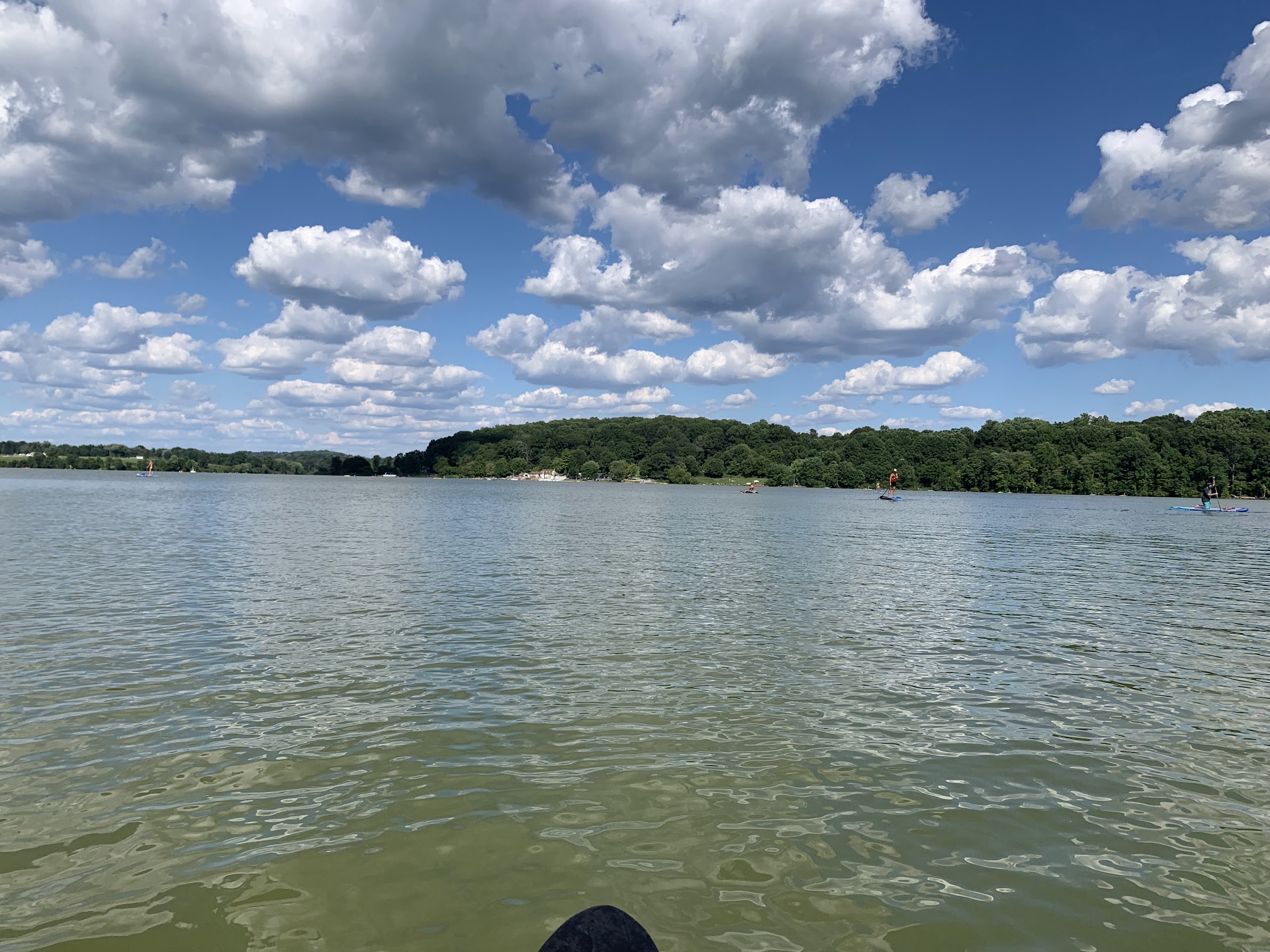
I wanted to challenge myself by using all of my own images and not pull from anywhere else, and this helped as I could manipulate raw files to get color balanced compositions without compromising quality. The orange Volkswagen Bug image was taken on a recent trip to northwestern PA to visit family, and was a fantastic find that I’ll be using for plenty of things in the future I’m sure. The yellow flowers and the photo of the woman kayaking in a lake with waterlilies are some of my earlier work from before college that I found after rooting through probably thousands of images to find the shapes and scenes I wanted to build with. The waterfall was taken at Nay Aug park here in the Scranton-Dunmore area a few months ago, which I highly recommend students check out, especially my fellow photographers! The sign that reads “when flashing be prepared to stop” was taken on my long trip home from school my freshman year and was part of a series that included one of my favorite photos. I wrote about that series and the photo from it that won me a local contest back home in another one of my posts here. The road was grabbed from a personal favorite image of mine that I took while visiting more family in Virginia this summer, featuring the Blue Ridge Mountains in the background, one of my favorite places. The ghosts were taken from the ghost shoot I did for the Marywood Shutterbugs Photography Club.
Using all of these separate images, I slowly built the scene up, starting with establishing the background and the main element, the car. I had a color scheme in mind when starting and either found photos that already fit into it, or in the case of the kayaker, changed the hue via different selection methods. adding the yellow flowers in the bottom left corner helped me add depth and dimension to the photo, and I added a slight blur to the image as well to give the feel of natural depth of field. Adding the waterfall helped add some visual interest to the right side of the composition as well as balance the image. After starting the next image in the series I returned to this image and decided to add a swirling effect to the background trees to have another repeating element between the two. To achieve this effect I went to Filter>Liquify and used a combination of the forward push tool and the twirl tool to achieve the desired effect.
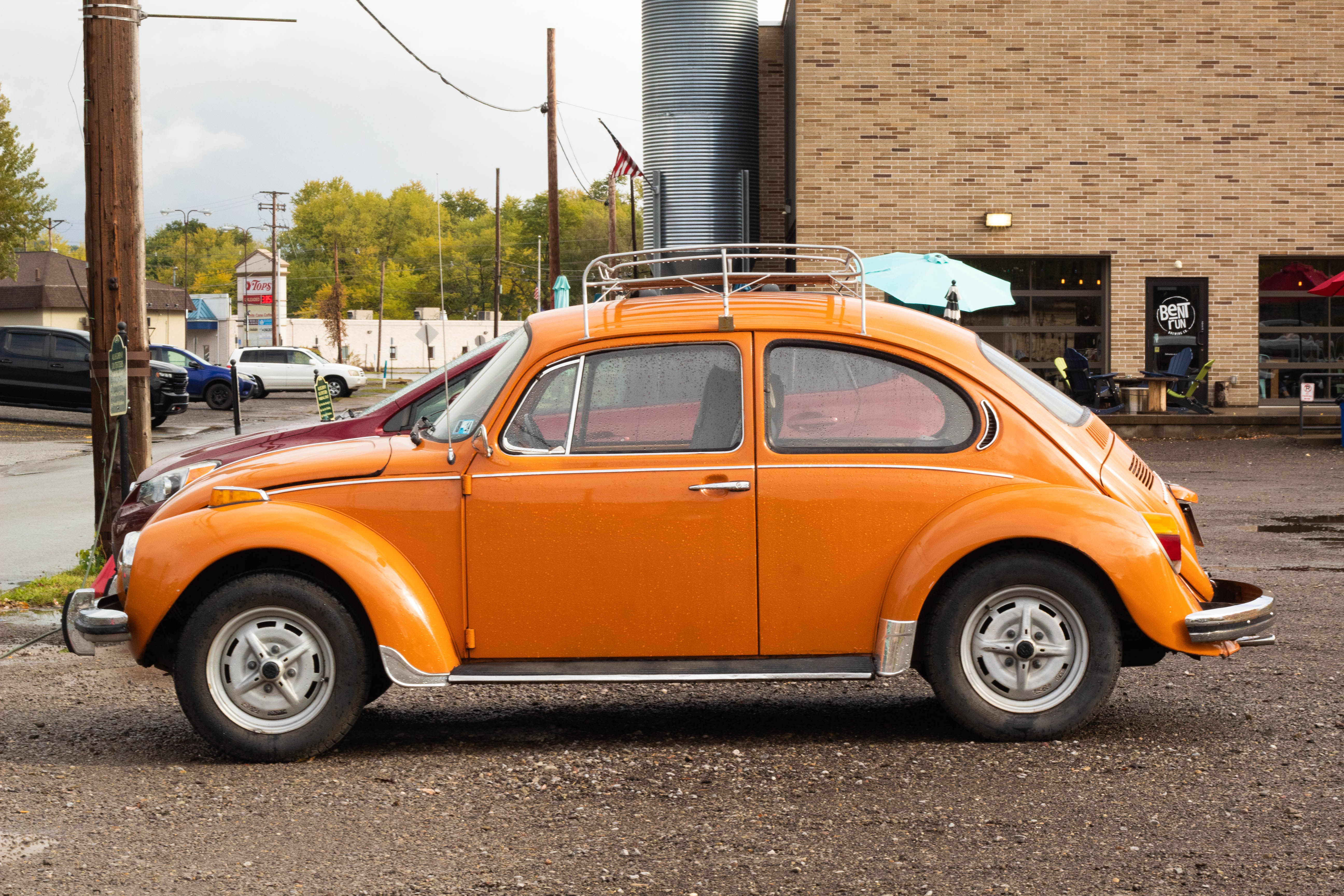
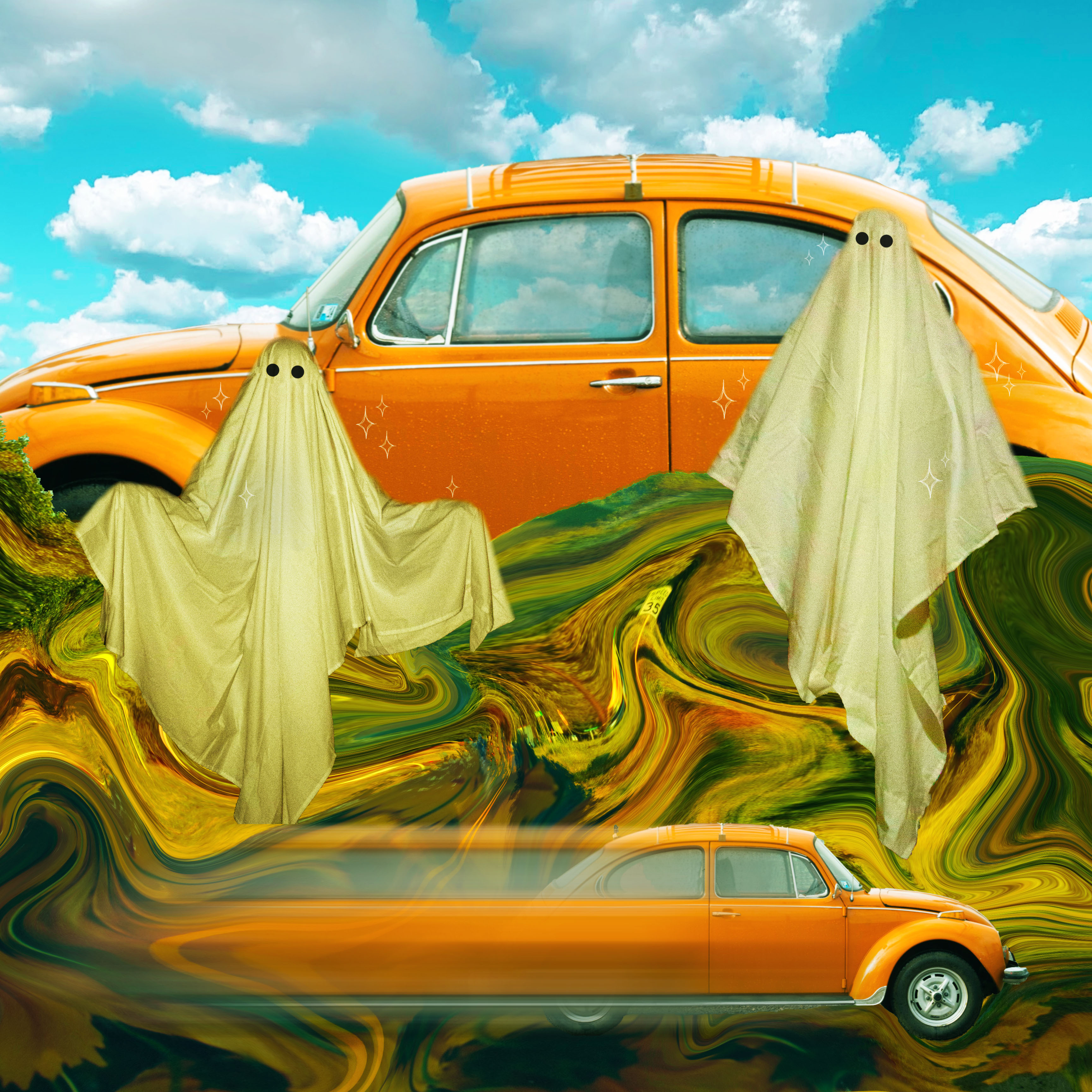
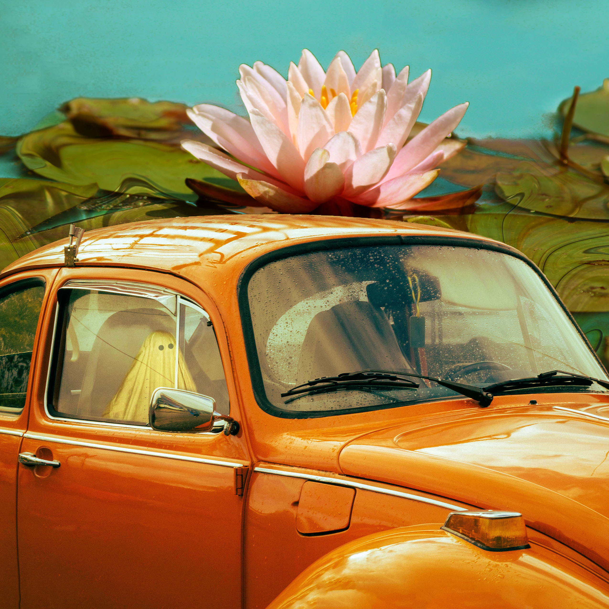
For this composite I used less images and wanted to focus more on shapes and abstracting the scene. It still tells a story but requires more imagination and is less clean cut. I continued with the theme of orange, green, and a teal-ish blue, making that the “star of the show” of this image. To help push the emphasis of geometric shapes I used a different angle of the car and also repeated the object. To get the motion blur effect on the car I duplicated the layer, and on the top layer went to Filter>Blur>Motion Blur, and then adjusted to my liking. Afterwards I erased the blur from the front of the car using a very large soft brush. For the top car I found it distracting when the windows didn’t show the clouds but rather the red car that was parked next to it when I took the original picture, so I cloned out the car and tried to keep the texture of the rain on the windows. I then took the eraser tool at a low opacity and erased over the inside of the windows, keeping any texture in the class visible, but showing the clouds in the layer underneath.
Towards the end of working on this composite I was trying to push it a little further, as I thought it was missing certain elements. I ended up adding a few adjustment layers increasing the vibrancy and contrast, as well as adding a slight blue tint to the overall image via a fill layer with a lowered opacity.
I’m hoping to sell stickers of this composite as I’ve gotten some interest in it, so keep an eye out for those on my Instagram (otter.images) if interested!
This one, while not quite done yet even though it’s been turned in, I think I can do more with and am hoping to expand upon. I’m hoping to have some time over winter break to work on this project further, so stay tuned for updates on that as well!